| variable | description |
|---|---|
| pid | Participant ID |
| name | Participant Name |
| condition | Condition (text-only / text+brain / text+brain+graph) |
| credibility | Credibility rating (0-100) |
Exercises: Scaling | Categorical Predictors
Pictures of a Brain
neuronews.csv
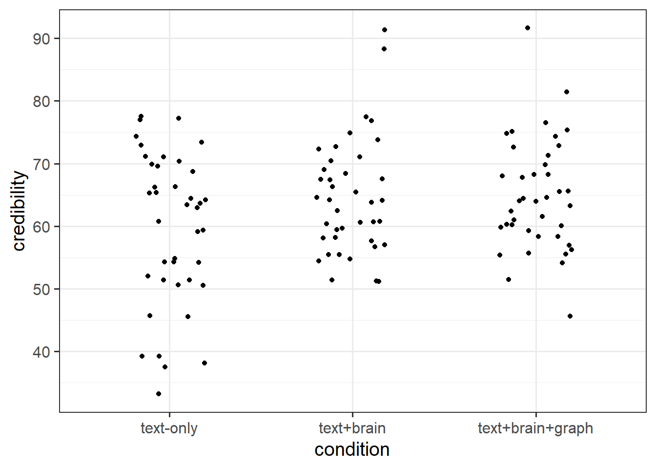
This dataset is from a study1 looking at the influence of presenting scientific news with different pictures on how believable readers interpret the news.
120 participants took part in the study. Participation involved reading a short article about some research in neuroscience, and then rating how credible they found the research. Participants were randomly placed into one of three conditions, in which the article was presented a) in text alone, b) with a picture of a brain, or c) with a picture of a brain and a fancy looking (but unrelated to the research) graph. They rated credibility using a sliding scale from 0 to 100, with higher values indicating more credibility.
The data is available at https://uoepsy.github.io/data/usmr_neuronews.csv.
Question 1
Read in the data and take a look around (this is almost always the first thing to do!)

Question 2
Fit a model examining whether credibility of the research article differs between conditions.
Question 3
Do conditions differ in credibility ratings?
Hints
This is an overall question, not asking about differences between specific levels. You can find a way to test this question either at the bottom of the summary() output, or by comparing it with a model without condition differences in it (see 8B #testing-group-differences).
Question 4
How do groups differ?
Hints
Note that this is a subtly different question to the previous one. It will require us to look at something that tests between specific groups (8B #testing-differences-between-specific-groups).
Question 5
Let’s prove something to ourselves.
Because we have no other predictors in the model, it should be possible to see how the coefficients from our model map exactly to the group means.
Calculate the mean credibility for each condition, and compare with your model coefficients.
Hints
To calculate group means, we can use group_by() and summarise()!
Detectorists
Question 6
We saw this study briefly at the end of last week and we’re going to continue where we left off.
Below is the description of the study, and the code that we had given you to clean the data and fit a model that assessed whether different strategies (e.g. breathing, closing eyes) were associated with changes in heart rate during a lie-detection test. The model also accounts for differences in heart rates due to age and pre-test anxiety.
Run the code given below to ensure that we are all at the same place.
Study: Lie detectors
Law enforcement in some countries regularly rely on ‘polygraph’ tests as a form of ‘lie detection’. These tests involve measuring heart rate, blood pressure, respiratory rate and sweat. However, there is very little evidence to suggest that these methods are remotely accurate in being able to determine whether or not someone is lying.
Researchers are interested in if peoples’ heart rates during polygraph tests can be influenced by various pre-test strategies, including deep breathing, or closing their eyes. They recruited 142 participants (ages 22 to 64). Participants were told they were playing a game in which their task was to deceive the polygraph test, and they would receive financial rewards if they managed successfully. At the outset of the study, they completed a questionnaire which asked about their anxiety in relation to taking part. Participants then chose one of 4 strategies to prepare themselves for the test, each lasting 1 minute. These were “do nothing”, “deep breathing”, “close your eyes” or “cough”2. The average heart rate of each participant was recorded during their test.
| variable | description |
|---|---|
| age | Age of participant (years) |
| anx | Anxiety measure (Z-scored) |
| strategy | Pre-test Strategy (0 = do nothing, 1 = close eyes, 2 = cough, 3 = deep breathing) |
| hr | Average Heart Rate (bpm) during test |
Analysis
Code
# load libraries
library(tidyverse)
library(psych)
# read in the data
liedf <- read_csv("https://uoepsy.github.io/data/usmr_polygraph.csv")
# there seems to be a 5 there..
table(liedf$strategy)
# the other variables look okay though
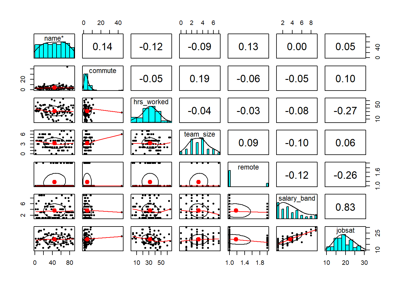
describe(liedf)
pairs.panels(liedf)
liedf <- liedf |>
filter(strategy!=5) |>
mutate(
# strategy is a factor. but currently numbers
# i'm going to give them better labels too..
# to do this is need to tell factor() what "levels" to look for
# and then give it some "labels" to apply to those.
strategy = factor(strategy,
levels = c("0","1","2","3"),
labels = c("do nothing", "close eyes",
"cough", "deep breathing")
)
)
liemod <- lm(hr ~ age + anx + strategy, data = liedf)
# Does HR differ between strategies?
anova(liemod)
# the above is a shortcut for getting this comparison out:
anova(
lm(hr ~ age + anx, data = liedf),
lm(hr ~ age + anx + strategy, data = liedf)
)
Question 7
Our model includes a predictor with 4 levels (the 4 different strategies).
This means we will have 3 coefficients pertaining to this predictor. Take a look at them. Write a brief sentence explaining what each one represents.
Hints
We’re still all using R’s defaults (8B #treatment-contrasts-the-default), so these follow the logic we have seen already above.
Question 8
Calculate the mean heart rate for each strategy group.
Do they match to our model coefficients?
Question 9
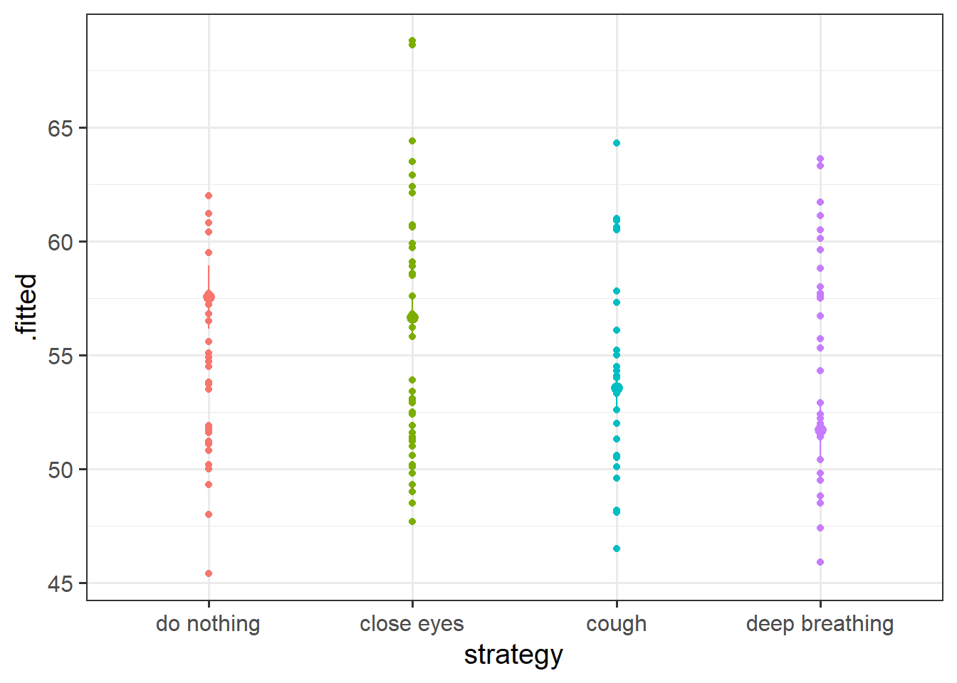
At the end last week’s exercises, we wanted you to make a plot of the model estimated differences in heart rates between the strategies.
Chances are that you followed the logic of 1) create a little plotting data frame, 2) use augment() from the broom package, and 3) shove it into ggplot.
You may have ended up with something like this:
Code
plotdat <- data.frame(
  age = mean(liedf$age),
  anx = mean(liedf$anx),
  strategy = unique(liedf$strategy)
)
broom::augment(liemod,
               newdata=plotdat,
               interval="confidence") |>
  ggplot(aes(x=strategy,y=.fitted, col=strategy))+
  geom_pointrange(aes(ymin=.lower,ymax=.upper)) +
  guides(col="none")
These plots are great, but they don’t really show the underlying spread of the data. They make it seem like everybody in the ‘do nothing’ strategy will have a heart rate between 56 and 59bpm. But that interval is where we expect the mean to be, not where we expect the individuals.
Can you add the original raw datapoints to the plot, to present a better picture?
Hints
This is tricky, and we haven’t actually seen it anywhere in the readings or lectures.
The thing that we’re giving to ggplot (the output of the augment function) doesn’t have the data in it.
With ggplot we can actually pull in data from different sources:
ggplot(data1, aes(x=x,y=y)) +
  geom_point() +
  geom_point(data = data2, aes(x=x,y=newy))


Job Satisfaction, Guaranteed
jobsatpred.csv
A company is worried about employee turnover, and they are trying to figure out what are the main aspects of work life that predict their employees’ job satisfaction. 86 of their employees complete a questionnaire that leads to a ‘job satisfaction score’, that can range between 6 to 30 (higher scores indicate more satisfaction).
The company then linked their responses on the questionnaire with various bits of information they could get from their human resources department, as seen in Table 1.
The data are available at https://uoepsy.github.io/data/usmr_jobsatpred.csv.
| variable | description |
|---|---|
| name | Employee Surname |
| commute | Distance (km) to employee residence (note, records have used a comma in place of a decimal point) |
| hrs_worked | Hours worked in previous week |
| team_size | Size of the team in which the employee works |
| remote | Whether the employee works in the office or remotely (0 = office, 1 = remote) |
| salary_band | Salary band of employee (range 1 to 10, with those on band 10 earning the most) |
| jobsat | Job Satisfaction Score (sum of 6 questions each scored on 1-5 likert scale) |
Question 10
Read in the data. Look around, do any cleaning that might be needed.
Question 11
Explore! Make some quick plots and calculate some quick descriptives.
Question 12
Fit a model to examine the independent associations between job satisfaction and all of the aspects of working patterns collected by the company.
Hints
We want to look at the independent associations, so we want a multiple regression model.
We don’t really have any theoretical order in which to put the predictors in our model. However, this mainly matters when we use anova(model) - if we are just going to look at the coefficients (which is what we will be doing), then we can put them in any order for now.
Question 13
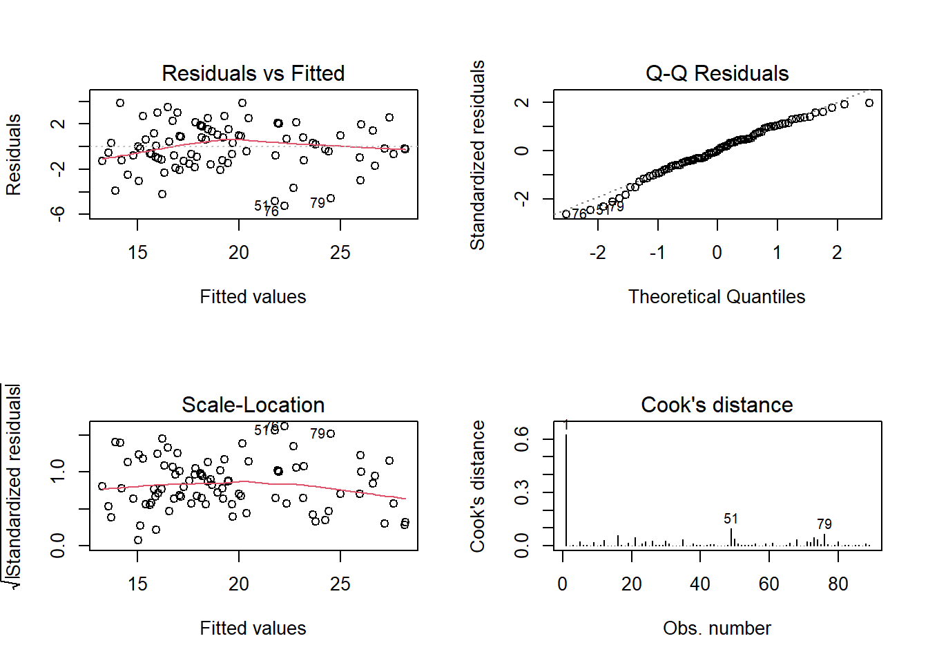
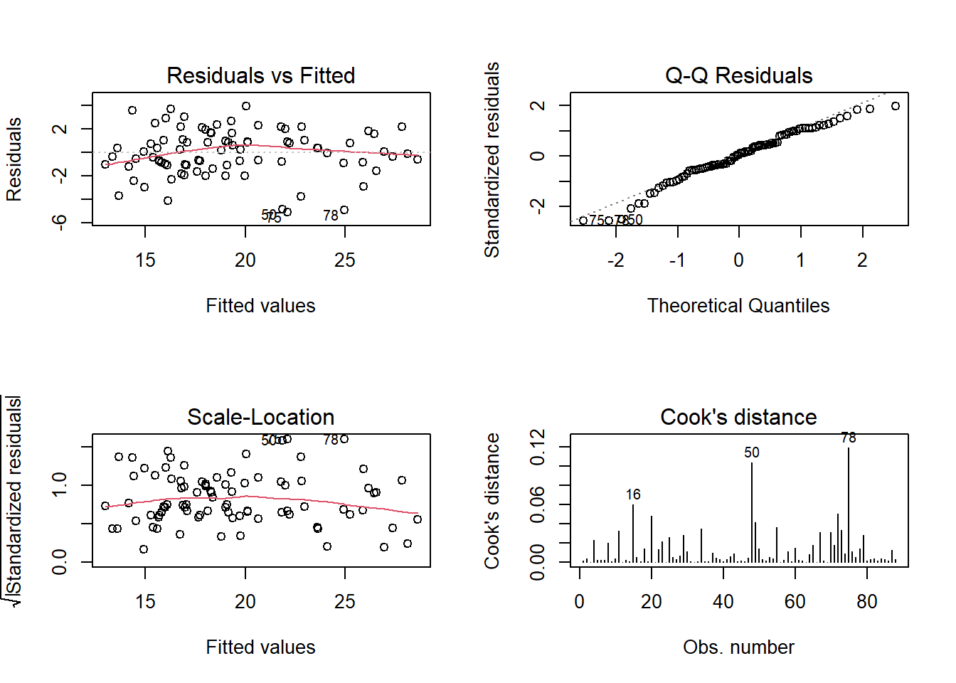
Check the assumption plots from the model. Remember we had that employee who was commuting quite far - are they exerting too much influence on our model?
If so, maybe refit the model without them.
Question 14
Now fit a second model, in which the predictors are standardised (those that can be).
Hints
- You can either standardise just the predictors, or standardise both predictors and outcome (see 8A #standardised-coefficients).
- If you’ve excluded some data in the model from the previous question, you should exclude them here too.
Question 15
Looking at the standardised coefficients, which looks to have the biggest impact on employees’ job satisfaction?
Question 16
The company can’t afford to pay employees anymore, and they are committed to letting staff work remotely. What would you suggest they do to improve job satisfaction?