PCA in 3D
Imagine we had 3 measured variables: y1, y2, and y3, as visualised in 3-dimensional space in Figure 1
The cloud of datapoints in Figure 1 has a shape - it is longer in one direction (sort of diagonally across y1 and y2), slightly shorter in another (across y3), and then quite narrow in another. You can imagine trying to characterise this shape as the ellipse in Figure 2
When faced with trying to characterise the shape of a 3-dimensional object, we might normally think about its length, width and depth. Imagine being given a ruler and being asked to give two numbers to provide a measurement of your smartphone. What do you pick? Chances are, you will measure its length and then its width. You’re likely to ignore the depth because it is much less than the other two dimensions. This is what PCA is doing. If we take three perpendicular dimensions, we can see that the shape in Figure 2 is longer in one dimension, then slightly shorter in another, and very short in another. These dimensions (seen in Figure 4) are our principal components! Our scree plot (indicating the amount of variance captured by each component) would look like Figure 3 - we can see that each dimension captures less and less of the variance.
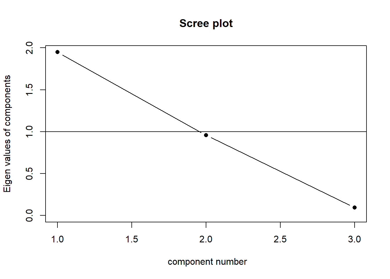
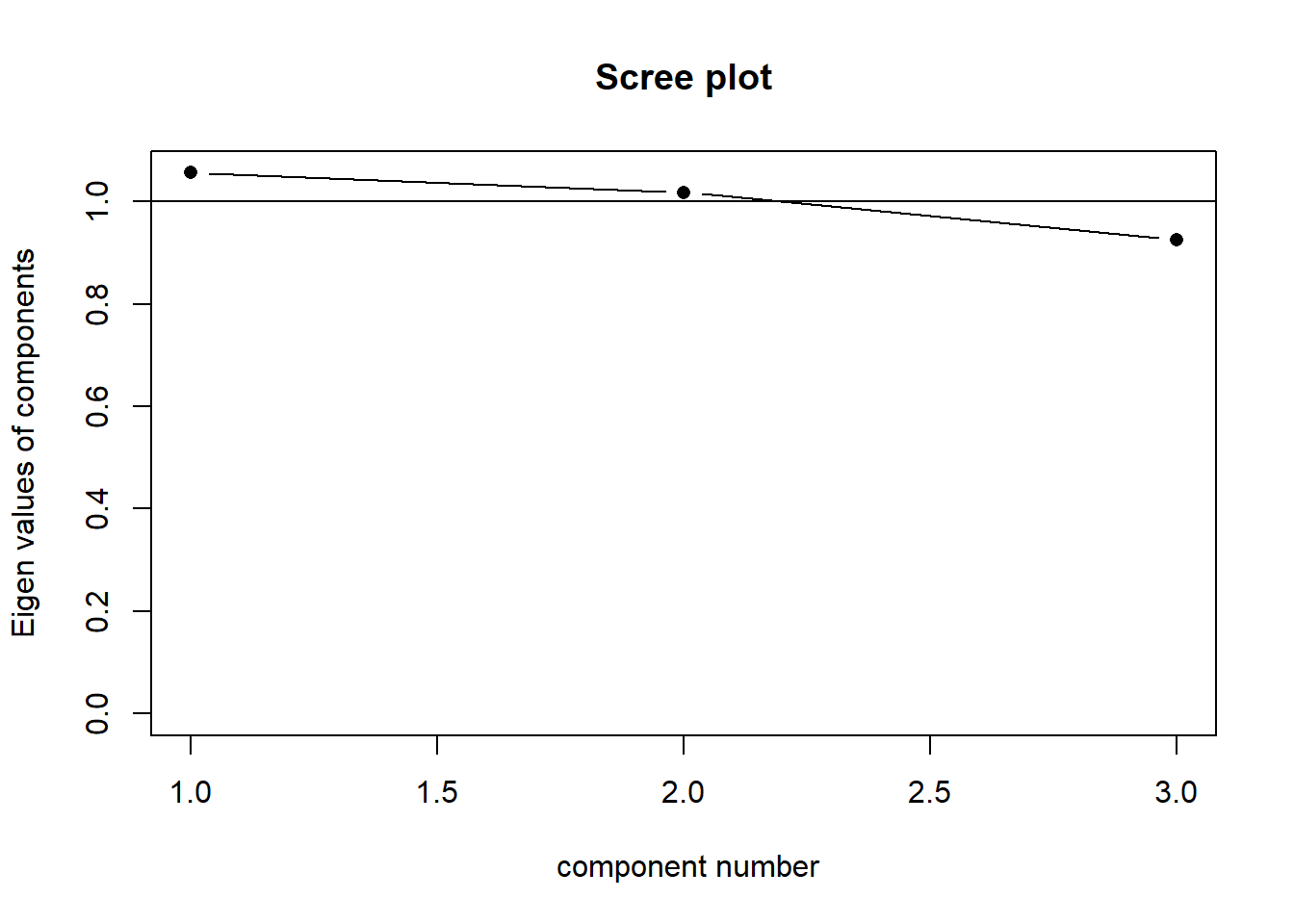
Our principal components capture sequentially the largest dimensions of the shape, which reflect where the most variance is. If there was no correlation between any of our observed variables (i.e. they’re all unrelated), then we would have a shape that was basically a sphere, and the no single dimension would capture much more variance than any other. This would look something like Figure 6. Our scree plot would look like Figure 5 - we can see that each component captures a similar amount.
The “loadings” we get out of a PCA reflect the amount to which each variable changes across the component. Try rotating the plots in Figure 7 and Figure 8, which show the first principal component and second principal component respectively. You will see that the first component (the black line) is much more closely linked to changes in y1 and y2 than it is to changes in y3. The second component is the opposite. This reflected in the relative weight of the loadings below!
Loadings:
   PC1    PC2    PC3
V1  0.967 -0.130 -0.217
V2  0.964 -0.155  0.216
V3  0.288  0.958

                 PC1   PC2   PC3
SS loadings    1.948 0.958 0.094
Proportion Var 0.649 0.319 0.031
Cumulative Var 0.649 0.969 1.000