Each of these pages provides an analysis run through for a different type of design. Each document is structured in the same way:
- First the data and research context is introduced. For the purpose of these tutorials, we will only use examples where the data can be shared - either because it is from an open access publication, or because it is unpublished or simulated.
- Second, we go through any tidying of the data that is required, before creating some brief descriptives and visualizations of the raw data.
- Then, we conduct an analysis. Where possible, we translate the research questions into formal equations prior to fitting the models in lme4. Model comparisons are conducted, along with checks of distributional assumptions on our model residuals.
- Finally, we visualize and interpret our analysis.
Please note that there will be only minimal explanation of the steps undertaken here, as these pages are intended as example analyses rather than additional labs readings. Please also be aware that there are many decisions to be made throughout conducting analyses, and it may be the case that you disagree with some of the choices we make here. As always with these things, it is how we justify our choices that is important. We warmly welcome any feedback and suggestions to improve these examples: please email ug.ppls.stats@ed.ac.uk.
Overview
The idea behind “repeated measures” is that the same variable is measured on the same set of subjects over two or more time periods or under different conditions.
The data used for this worked example are simulated to represent data from 50 participants, each measured at 3 different time-points on an outcome variable of interest. This is a fairly simple design, leading from a question such as “how does [dependent variable] change over time?” You might easily think of the 3 time points as 3 different experimental conditions instead (condition1, condition2, condition3) and ask “how does [dv] change over depending on [independent variable]?”
This is a very simple way to simulate repeated measures data structure (with long data). There are a good number of other approaches, but this will do for now as you may well be familiar with all the functions involved:
Code
set.seed(347)
library(tidyverse)
simRPT <- tibble(
  pid = factor(rep(paste("ID", 1:50, sep=""),each=3)),
  ppt_int = rep(rnorm(50,0,10),each=3), # add some participantz random-ness
  dv = rnorm(150,c(40,50,70),sd=10) + ppt_int,
  iv = factor(rep(c("T1", "T2", "T3"), each=1, 50))
)
If you are unclear about any section of the code above, why not try running small bits of it in your console to see what it is doing?
For instance, try running:
paste("ID", 1:50, sep="")
rep(paste("ID", 1:50, sep=""),each=3)
factor(rep(paste("ID", 1:50, sep=""),each=3))
Data Wrangling
Because we simulated our data, it is already nice and tidy. Each observation is a row, and we have variable indicating participant id (pid).
Code
# A tibble: 6 × 4
  pid   ppt_int    dv iv
  <fct>   <dbl> <dbl> <fct>
1 ID1     -1.92  41.6 T1
2 ID1     -1.92  40.2 T2
3 ID1     -1.92  63.6 T3
4 ID2    -11.1   22.9 T1
5 ID2    -11.1   40.5 T2
6 ID2    -11.1   60.6 T3
Descriptives
Let’ see our summaries per time-point:
Code
sumRPT <-
  simRPT %>%
  group_by(iv) %>%
  summarise(
    n = n_distinct(pid),
    mean.dv = round(mean(dv, na.rm=T),2),
    sd.dv = round(sd(dv, na.rm=T),2)
    )
sumRPT
# A tibble: 3 × 4
  iv        n mean.dv sd.dv
  <fct> <int>   <dbl> <dbl>
1 T1       50    38.8  13.1
2 T2       50    50.8  11.2
3 T3       50    67.8  13.5
We can make this a little prettier:
Code
library(knitr)
library(kableExtra)
kable(sumRPT) %>%
  kable_styling("striped")
| iv |
n |
mean.dv |
sd.dv |
| T1 |
50 |
38.84 |
13.10 |
| T2 |
50 |
50.82 |
11.16 |
| T3 |
50 |
67.81 |
13.48 |
Well…we knew what the answer was going to be, but there we have it, our scores improve across the three administrations of our test.
Visualizations
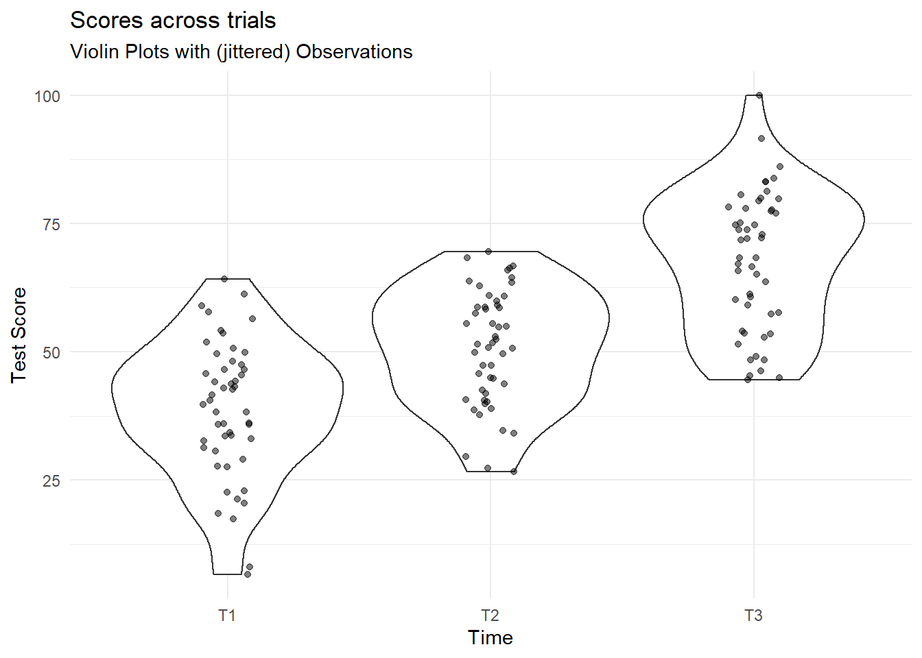
We can construct some simple plots showing distribution of the outcome variable at each level of the independent variable (iv):
Code
simRPT %>%
  ggplot(aes(x = iv, y = dv)) +
  geom_violin() +
  geom_jitter(alpha=.5,width=.1,height=0) +
  labs(x="Time", y = "Test Score",
       title="Scores across trials",
       subtitle = "Violin Plots with (jittered) Observations")+
  theme_minimal()
So what does this show? Essentially we are plotting all responses at each point in time. The points are jittered so that they are not all overlaid on one another. The areas marked at each time point are mirrored density plots (i.e. they show the distribution of the scores at each point in time).
If you want to get an intuitive sense of these plotted areas, look at them against the mean’s and sd’s per time point calculated above.
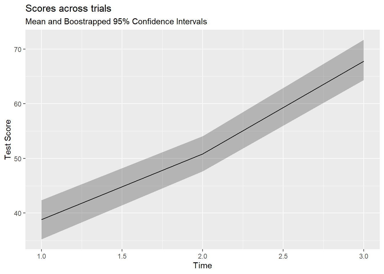
Code
simRPT %>%
  ggplot(aes(as.numeric(iv), dv)) +
  stat_summary(fun.data = mean_cl_boot, geom="ribbon", alpha=.3) +
  stat_summary(fun.y = mean, geom="line") +
  labs(x="Time", y = "Test Score",
       title="Scores across trials",
       subtitle = "Mean and Boostrapped 95% Confidence Intervals")
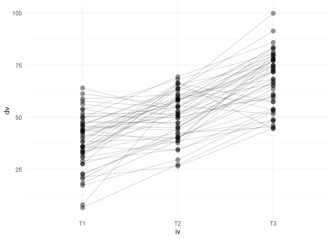
We can also show each participants’ trajectory over time, by using the group aesthetic mapping.
Code
simRPT %>%
  ggplot(aes(x = iv, y = dv)) +
  geom_point(size=3, alpha=.4)+
  geom_line(aes(group=pid), alpha = .2) +
  theme_minimal()
Analysis
Equations
We’re going to fit this model, and examine the change in dv associated with moving from time-point 1 to each subsequent time-point.
Recall that because iv is categorical with 3 levels, we’re going to be estimating 2 (\(3-1\)) coefficients.
\[
\begin{aligned}
\operatorname{dv}_{i[j]} &= \beta_{0i} + \beta_1(\operatorname{iv}_{\operatorname{T2}_j}) + \beta_2(\operatorname{iv}_{\operatorname{T3}_j}) + \varepsilon_{i[j]} \\
\beta_{0i} &= \gamma_{00} + \zeta_{0i} \\
& \text{for }\operatorname{pid}\text{ i = 1,} \dots \text{,I}
\end{aligned}
\]
Fitting the models
Here we run an empty model so that we have something to compare our model which includes our iv. Other than to give us a reference model, we do not have a huge amount of interest in this.
Code
m0 <- lmer(dv ~ 1 + (1 | pid), data = simRPT)
Next, we specify our model. Here we include a fixed effect of our predictor (group membership, iv), and a random effect of participant (iv) to take account of the fact we have three measurements per person.
Code
m1 <- lmer(dv ~ 1 + iv + (1 | pid), data = simRPT)
summary(m1)
Linear mixed model fit by REML ['lmerMod']
Formula: dv ~ 1 + iv + (1 | pid)
   Data: simRPT

REML criterion at convergence: 1144.7

Scaled residuals:
     Min       1Q   Median       3Q      Max
-2.52990 -0.57636 -0.02015  0.56073  2.50816

Random effects:
 Groups   Name        Variance Std.Dev.
 pid      (Intercept) 74.66    8.641
 Residual             84.60    9.198
Number of obs: 150, groups:  pid, 50

Fixed effects:
            Estimate Std. Error t value
(Intercept)   38.842      1.785   21.76
ivT2          11.976      1.840    6.51
ivT3          28.964      1.840   15.74

Correlation of Fixed Effects:
     (Intr) ivT2
ivT2 -0.515
ivT3 -0.515  0.500
And we can compare our models.
Code
library(pbkrtest)
PBmodcomp(m1, m0)
Bootstrap test; time: 57.86 sec; samples: 1000; extremes: 0;
large : dv ~ 1 + iv + (1 | pid)
dv ~ 1 + (1 | pid)
         stat df   p.value
LRT    126.84  2 < 2.2e-16 ***
PBtest 126.84     0.000999 ***
---
Signif. codes:  0 '***' 0.001 '**' 0.01 '*' 0.05 '.' 0.1 ' ' 1
Code
Data: simRPT
Models:
m0: dv ~ 1 + (1 | pid)
m1: dv ~ 1 + iv + (1 | pid)
   npar    AIC    BIC  logLik deviance  Chisq Df Pr(>Chisq)
m0    3 1285.9 1294.9 -639.94   1279.9
m1    5 1163.0 1178.1 -576.52   1153.0 126.83  2  < 2.2e-16 ***
---
Signif. codes:  0 '***' 0.001 '**' 0.01 '*' 0.05 '.' 0.1 ' ' 1
OK, so we can see that we appear to have a significant effect of our repeated factor here. Our parametric bootstrap LRT is in agreement here.
Comparison to aov()
Using anova() to compare multilevel models will not give you a typical ANOVA output.
For piece of mind, it can be useful to compare how we might do this in aov()
Code
m2 <- aov(dv ~ iv + Error(pid), data = simRPT)
Here the term Error(pid) is specifying the within person error, or residual. This is what we are doing with our random effect (1 | pid) in lmer()
And we can compare the model sums of squares from both approaches to see the equivalence:
Code
Error: pid
          Df Sum Sq Mean Sq F value Pr(>F)
Residuals 49  15121   308.6

Error: Within
          Df Sum Sq Mean Sq F value Pr(>F)
iv         2  21183   10591   125.2 <2e-16 ***
Residuals 98   8291      85
---
Signif. codes:  0 '***' 0.001 '**' 0.01 '*' 0.05 '.' 0.1 ' ' 1
Code
Analysis of Variance Table
   npar Sum Sq Mean Sq F value
iv    2  21183   10591  125.19
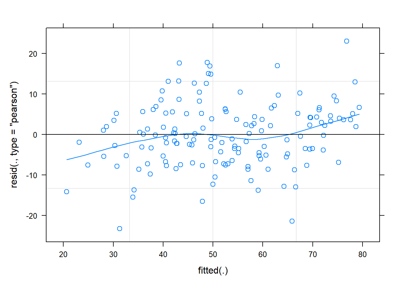
Check model
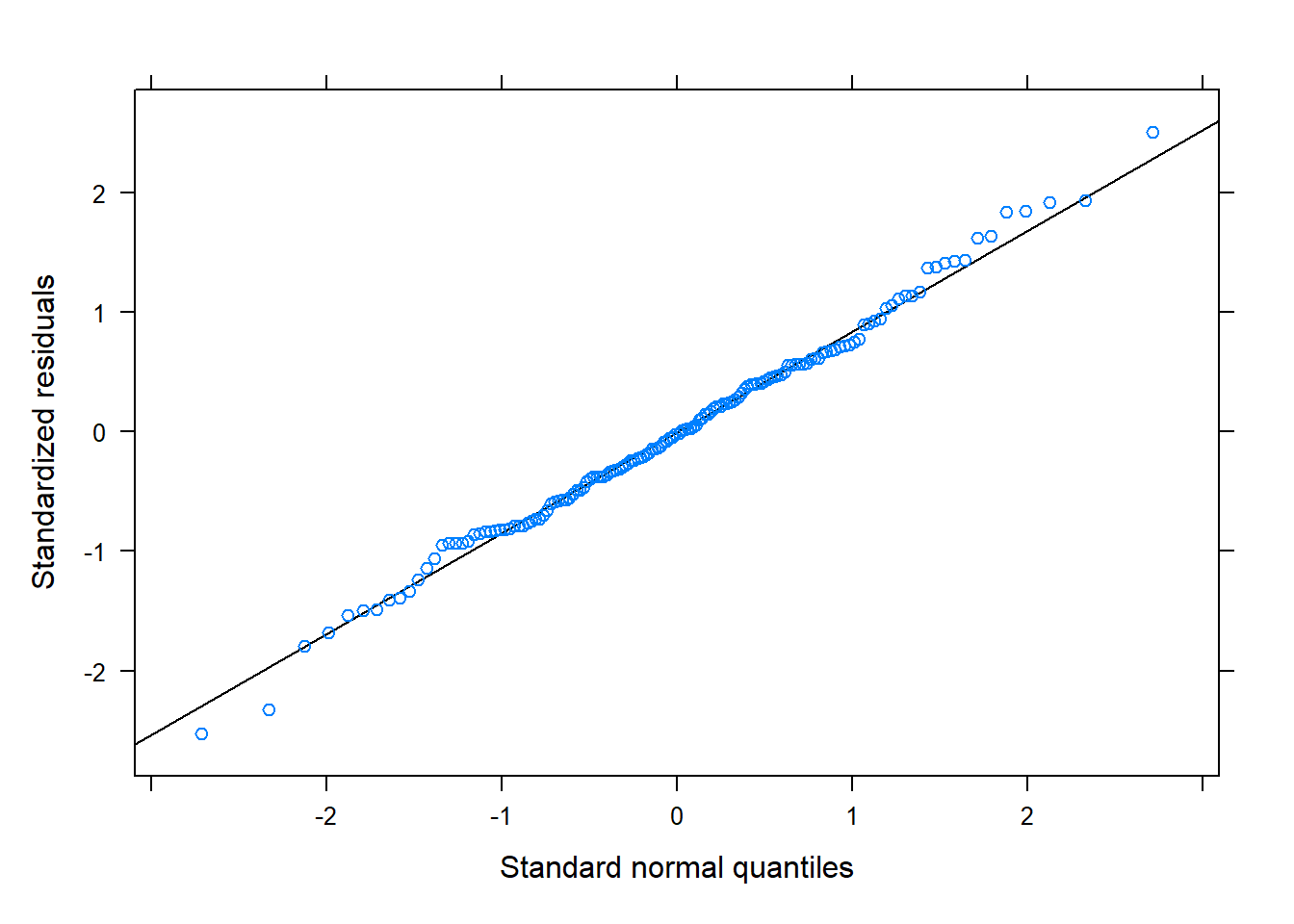
The residuals look reasonably normally distributed, and there seems to be fairly constant variance across the linear predictor. We might be a little concerned about the potential tails of the plot below, at which residuals don’t appear to have a mean of zero
Code
plot(m1, type = c("p","smooth"))
Code
library(lattice)
qqmath(m1)
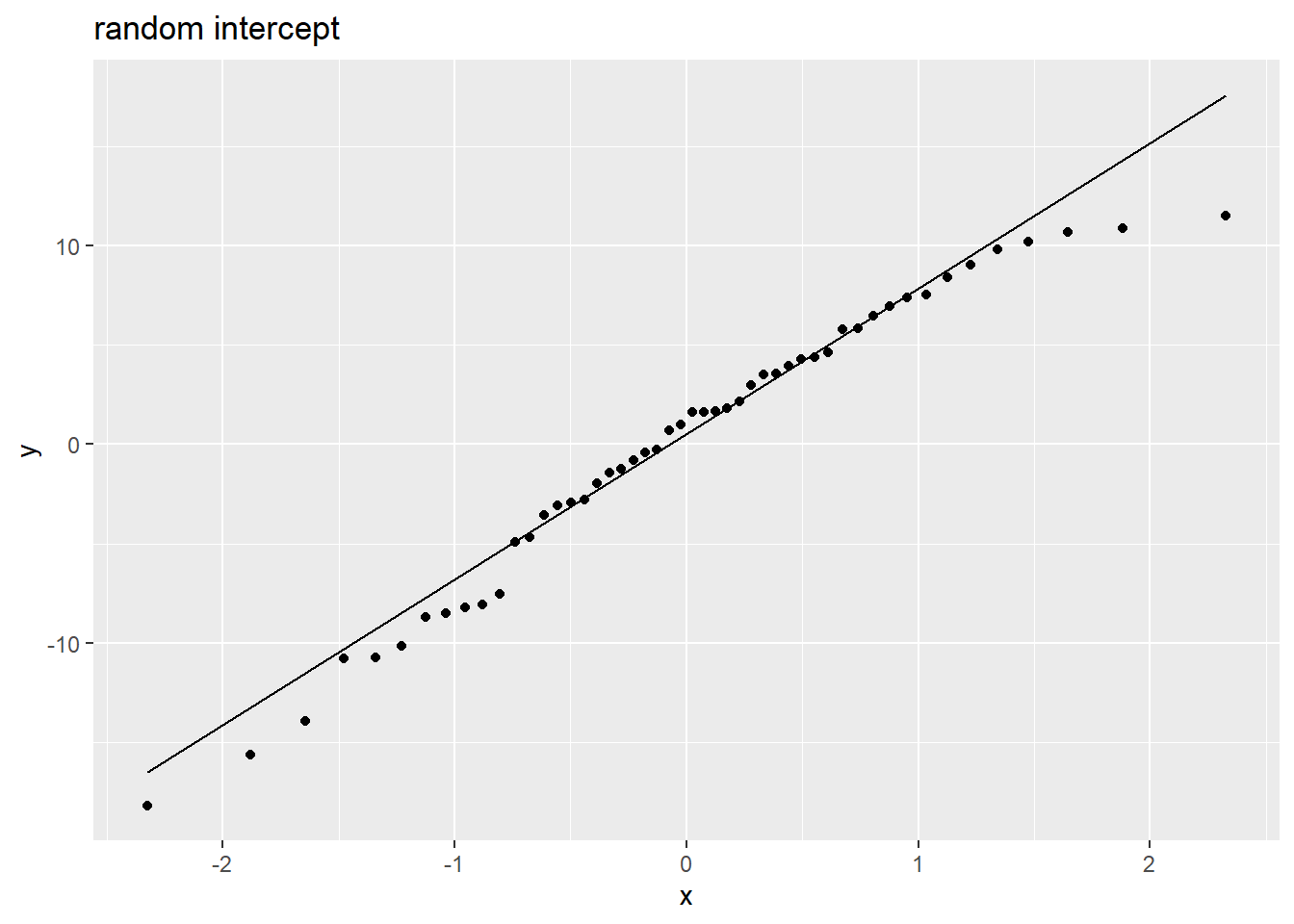
Random effects are (roughly) normally distributed:
Code
rans <- as.data.frame(ranef(m1)$pid)
ggplot(rans, aes(sample = `(Intercept)`)) +
  stat_qq() + stat_qq_line() +
  labs(title="random intercept")
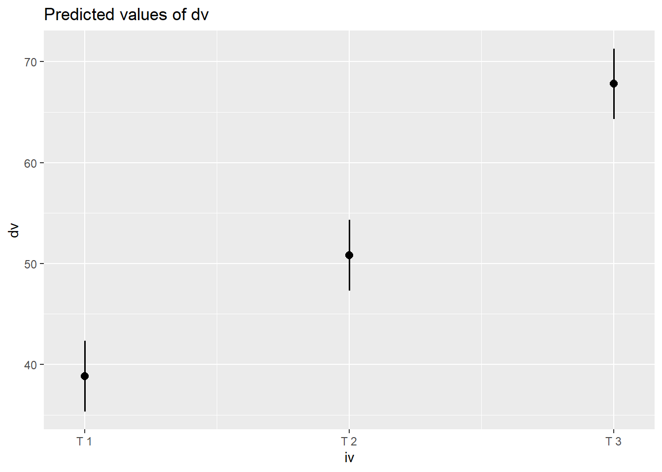
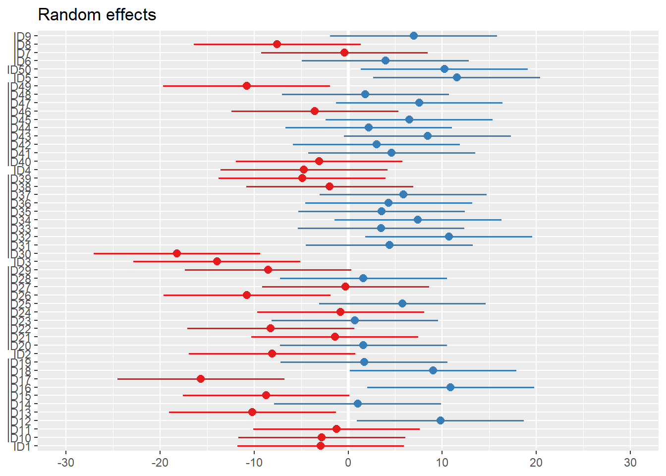
Visualise Model
Code
library(sjPlot)
plot_model(m1, type="pred")
Code
plot_model(m1, type="re") # an alternative: dotplot.ranef.mer(ranef(m1))
Interpret model
Parametric bootstrap 95% CIs:
Code
confint(m1, method = "boot")
                2.5 %   97.5 %
.sig01       5.999069 11.24815
.sigma       7.941403 10.46011
(Intercept) 35.397974 42.37131
ivT2         8.313544 15.62274
ivT3        25.286894 32.52241
Case-resample bootstrap 95% CIs:
Code
library(lmeresampler)
bootmodel <- bootstrap(m1, fixef, type = "case", B = 999, resample = c(TRUE,FALSE))
confint(bootmodel, type = "perc")
# A tibble: 3 × 6
  term        estimate lower upper type  level
  <chr>          <dbl> <dbl> <dbl> <chr> <dbl>
1 (Intercept)     38.8 35.8   42.0 perc   0.95
2 ivT2            12.0  8.44  15.5 perc   0.95
3 ivT3            29.0 25.5   32.6 perc   0.95
Code
res <- confint(bootmodel, type="perc")
res <- res %>% mutate_if(is.numeric,~round(.,2))
res
# A tibble: 3 × 6
  term        estimate lower upper type  level
  <chr>          <dbl> <dbl> <dbl> <chr> <dbl>
1 (Intercept)     38.8 35.8   42.0 perc   0.95
2 ivT2            12.0  8.44  15.5 perc   0.95
3 ivT3            29.0 25.5   32.6 perc   0.95
Writing up an interpretation of this is a bit clunky as we have abstract names for our variables like “dv” and “iv”, but as a rough starting point:
Change in [dv] over [iv] was modeled using a linear mixed effects model, with a fixed effect of [iv] and a by-[pid] random intercepts. At baseline, scores on [dv] were estimated at 38.84 (cluster-resample bootstrap 95% CI: 35.79–42.01). Results indicated that, relative to time-point 1, scores at time-point 2 increased by 11.98 (8.44–15.54), and at time-point 3 had increased by 28.96 (25.48–32.6).