In the first five weeks of the course your group should produce a PDF report using Rmarkdown, to be submitted at the end of week 5. You will receive formative feedback on your submission in week 6.
The submitted report should be a PDF file of 4 pages at most. In week 5, you can add an Appendix in which you will collate all the R code in a chunk with the setting results = 'hide', which does not count towards the page limit.
The report should not include any reference to R code or functions, but be written for a generic reader who is only assumed to have a basic statistical understanding without any R knowledge. You should also avoid any R code output or printout in the PDF file.
To not show the code of an R code chunk, and only show the output, write:
```{r, echo=FALSE}# code goes here```
To show the code of an R code chunk, but hide the output, write:
```{r, results='hide'}# code goes here```
To hide both code and output of an R code chunk, write:
```{r, include=FALSE}# code goes here```
1.1 Data
For formative report A, please only focus on the variables Movie to Year, ignoring anything beyond that. In other words, do not analyse the variables IQ1 to PrivateTransport in the next five weeks of the course, we will use those later in the course.
Hollywood Movies. At the link https://uoepsy.github.io/data/hollywood_movies_subset.csv you will find data on Hollywood movies released between 2012 and 2018 from the top 5 lead studios and top 10 genres. The following variables were recorded:
Genre: One of Action Adventure, Black Comedy, Comedy, Concert, Documentary, Drama, Horror, Musical, Romantic Comedy, Thriller, or Western
TheatersOpenWeek: Number of screens for opening weekend
OpeningWeekend: Opening weekend gross (in millions)
BOAvgOpenWeekend: Average box office income per theater, opening weekend
Budget: Production budget (in millions)
DomesticGross: Gross income for domestic (U.S.) viewers (in millions)
WorldGross: Gross income for all viewers (in millions)
ForeignGross: Gross income for foreign viewers (in millions)
Profitability: WorldGross as a percentage of Budget
OpenProfit: Percentage of budget recovered on opening weekend
Year: Year the movie was released
(Ignore for now) IQ1-IQ50: IQ score of each of 50 audience raters
(Ignore for now) Snacks: How many of the 50 audience raters brought snacks
(Ignore for now) PrivateTransport: How many of the 50 audience raters reached the cinema via private transportation
1.2 Tasks
For formative report A, you will be asked to perform the following tasks, each related to a week of teaching in this course. This week you will only focus on task A2. In the next section you will find some guided sub-steps you may want to consider to complete task A2.
A1) Read the data into R, inspect it, and write a concise introduction to the data and its structure
This week’s task
A2) Display and describe the categorical variables
A3) Display and describe six numerical variables of your choice
A4) Display and describe a relationship of interest between two or three variables of your choice
A5) Finish the report write-up, knit to PDF, and submit the PDF for formative feedback
1.3 A2 sub-tasks
Tip
To see the hints, hover your cursor on the superscript numbers.
In this section you will find some guided sub-steps you may want to consider to complete task A2.
Reopen last week’s Rmd file, as you will continue last week’s work and build on it.1
Selecting a subset of columns
Consider a table of toy data comprising a participant identifier (id: 1 to 5), the participant age, the course (A or B) they are enrolled into, and their height:
# A tibble: 5 × 4
     id   age course height
  <int> <dbl> <chr>   <dbl>
1     1    18 A         171
2     2    20 B         180
3     3    25 A         168
4     4    22 B         193
5     5    19 A         174
To select the first two columns, you can either say the range from:to using numbers or the names of the columns:
toy_data%>%select(1:3)
# A tibble: 5 × 3
     id   age course
  <int> <dbl> <chr>
1     1    18 A
2     2    20 B
3     3    25 A
4     4    22 B
5     5    19 A
toy_data%>%select(id:course)
# A tibble: 5 × 3
     id   age course
  <int> <dbl> <chr>
1     1    18 A
2     2    20 B
3     3    25 A
4     4    22 B
5     5    19 A
However, if you check the data in toy_data, those didn’t change. The result of the above computation was only printed to the screen but not stored.
toy_data
# A tibble: 5 × 4
     id   age course height
  <int> <dbl> <chr>   <dbl>
1     1    18 A         171
2     2    20 B         180
3     3    25 A         168
4     4    22 B         193
5     5    19 A         174
To store it, we need to assign the result:
toy_data<-toy_data%>%select(id:course)
toy_data
# A tibble: 5 × 3
     id   age course
  <int> <dbl> <chr>
1     1    18 A
2     2    20 B
3     3    25 A
4     4    22 B
5     5    19 A
By doing the above, we have overwritten the data stored in toy_data with the selected columns.
Overwrite the data to only include the first 15 variables (i.e. columns).2
Create a plot displaying the frequency distribution of movie genres.3
Create a plot displaying the frequency distribution of the lead studios.4
Would it make sense to create a plot of the frequency distribution of movie names?5
Tip
Before applying a function to your data, you should always ask yourself if what you are about to do is going to convey any insight about the data, compared to just looking at the data itself.
The goal of data analysis is to to go from a multitude of values to insights that provide actionable information from a quick glance.
Describe the distribution of movie genres. You may want to include both the frequency and the percentage frequency.6
Alternative
Consider this code:
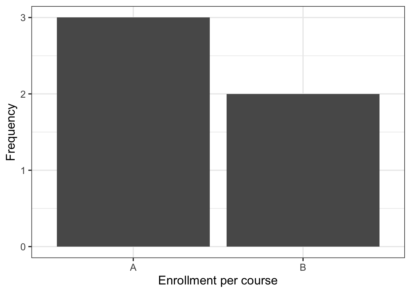
toy_data%>%count(course)%>%mutate( perc =round(n/sum(n)*100, 2))
# A tibble: 2 × 3
  course     n  perc
  <chr>  <int> <dbl>
1 A          3    60
2 B          2    40
You can change the names of the frequency from n to Freq and perc to Perc using:
toy_data%>%count(course, name ="Freq")%>%mutate( Perc =round(Freq/sum(Freq)*100, 2))
# A tibble: 2 × 3
  course  Freq  Perc
  <chr>  <int> <dbl>
1 A          3    60
2 B          2    40
An alternative to the above involves using the group_by(), summarise(), and n() functions from tidyverse. The n() function counts the number of values, and we use it inside summarise() because we are summarising the data with a number. Before summarise, we use group_by(course) to tell R to do the computation for each unique course entry, i.e. for each group of rows defined by course.
toy_data%>%group_by(course)%>%summarise( Freq =n())%>%mutate( Perc =round(Freq/sum(Freq)*100, 2))
# A tibble: 2 × 3
  course  Freq  Perc
  <chr>  <int> <dbl>
1 A          3    60
2 B          2    40
Describe the distribution of lead studios. You may want to include both the frequency and the percentage frequency.7
What is the most common genre and the most common lead studio?8
Day of the week: m=Monday, t=Tuesday, w=Wednesday, th=Thursday, or f=Friday
Server
Code for specific waiter/waitress: A, B, or C
PctTip
Tip as a percentage of the bill
These data were collected by the owner of a bistro in the US, who was interested in understanding the tipping patterns of their customers. The data are adapted from Lock et al. (2020).
library(tidyverse)# we use read_csv and glimpse from tidyversetips<-read_csv("https://uoepsy.github.io/data/RestaurantTips.csv")
# A tibble: 6 × 7
   Bill   Tip Credit Guests Day   Server PctTip
  <dbl> <dbl> <chr>   <dbl> <chr> <chr>   <dbl>
1  23.7 10    n           2 f     A        42.2
2  36.1  7    n           3 f     B        19.4
3  32.0  5.01 y           2 f     A        15.7
4  17.4  3.61 y           2 f     B        20.8
5  15.4  3    n           2 f     B        19.5
6  18.6  2.5  n           2 f     A        13.4
head() shows the top 6 rows of data. Use the n = ... option to change the default behaviour, e.g. head(<data>, n = 10).
Last week, we also saw that if someone tipped more than 100% of the bill size, it was likely a data input error and we decided to replace that value with NA (not available):
You can use the patchwork package to place graphs side by side. Simply create an object for each graph, and concatenate the objects with | for horizontal concatenation and / for vertical concatenation of graphs. You can even combine this by using parentheses, e.g. (plot1 | plot2) / (plot3 | plot4) for 2 rows and 2 columns.
Run install.packages("patchwork") first in your R console
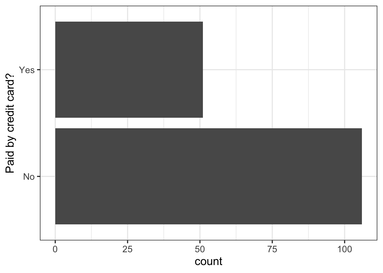
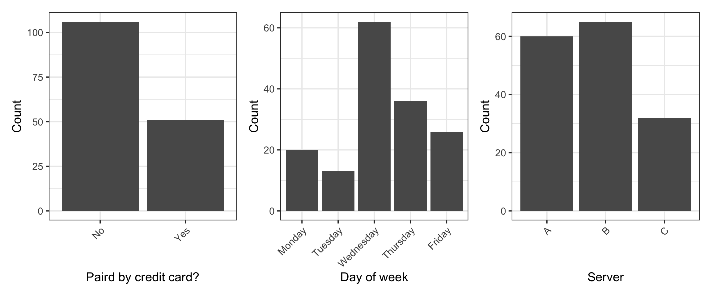
We can display the frequency distribution of all the categorical variables: Credit, Day, and Server:
Rotate x-axis labels
To rotate x-axis labels by 90 degrees, you can use this code: theme(axis.text.x = element_text(angle = 90, vjust = 0.5, hjust=1))
To rotate the labels by 45 degrees, you can use: theme(axis.text.x = element_text(angle = 45, vjust = 1, hjust=1))
Don’t worry, no one remembers it. People always google “rotate x-axis labels ggplot” to find it.
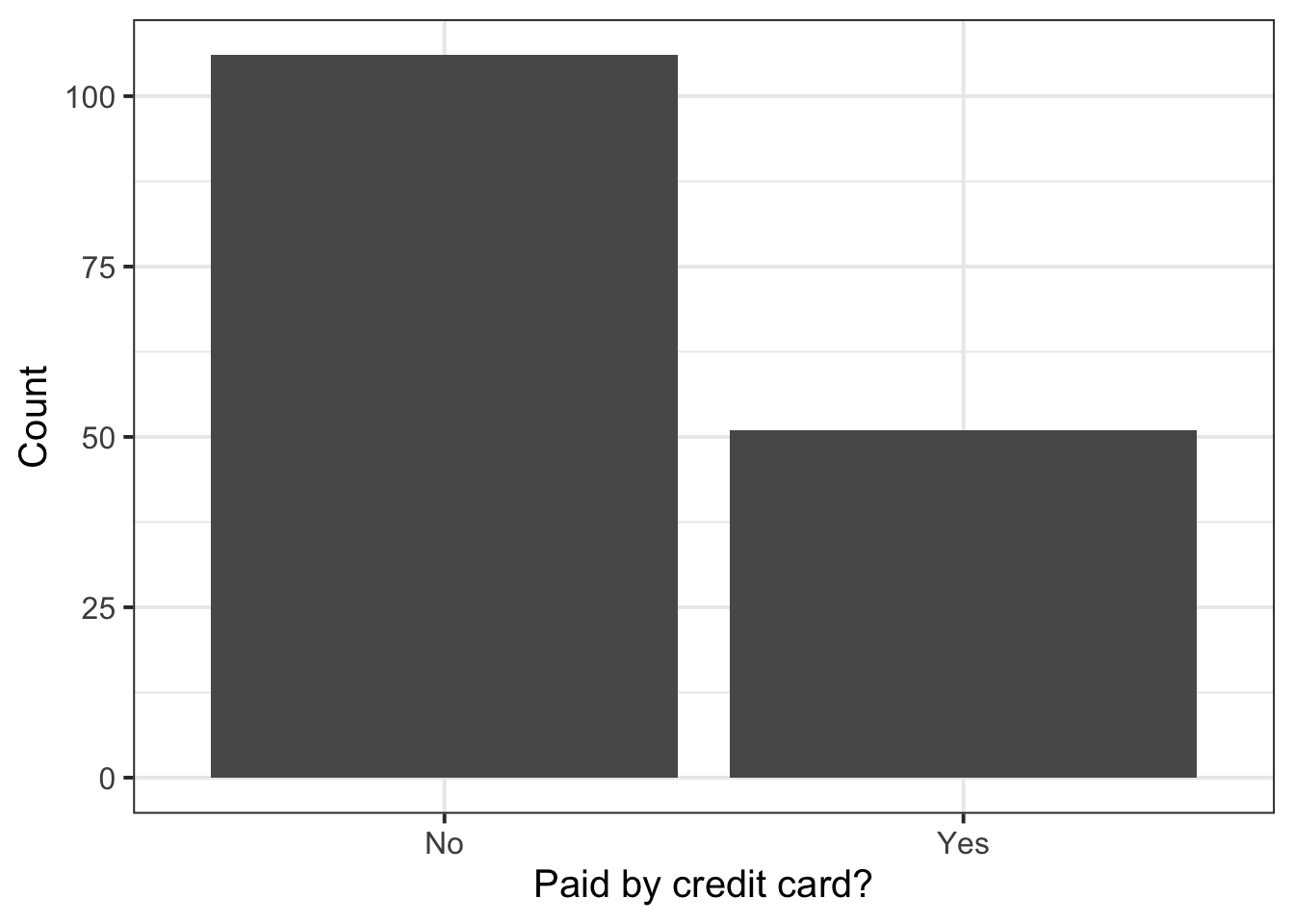
From the univariate distribution (or marginal distribution) of each categorical variable we see that the most common payment method was not a credit card, and the most common day of the week to dine at that restaurant was Wednesday. Finally, most parties were waited on by server B.
The most common value is the mode.
3 Student Glossary
To conclude the lab, add the new functions to the glossary of R functions that you started last week.
Function
Use and package
factor
?
%>%
?
geom_bar
?
labs
?
count
?
mutate
?
sum
?
round
?
coord_flip
?
kbl
?
arrange
?
desc
?
References
Lock, Robin H, Patti Frazer Lock, Kari Lock Morgan, Eric F Lock, and Dennis F Lock. 2020. Statistics: Unlocking the Power of Data. John Wiley & Sons.
Footnotes
Hint: ask last week’s driver for the Rmd file, they should share it with the group via email or Teams.↩︎
Hint: similar to above, but replacing Genre with LeadStudio↩︎
Hint: What is the mode of Genre and LeadStudio? In other words, which category in each of those frequency distributions has the highest frequency?
Tip: You may want to order the frequency tables in descending order. The function arrange(desc(<column_of_freq>)) may help.↩︎