| variable | description |
|---|---|
| age | Age in years of respondent |
| outdoor_time | Self report estimated number of hours per week spent outdoors |
| social_int | Self report estimated number of social interactions per week (both online and in-person) |
| routine | Binary 1=Yes/0=No response to the question 'Do you follow a daily routine throughout the week?' |
| wellbeing | Warwick-Edinburgh Mental Wellbeing Scale (WEMWBS), a self-report measure of mental health and well-being. The scale is scored by summing responses to each item, with items answered on a 1 to 5 Likert scale. The minimum scale score is 14 and the maximum is 70 |
| location | Location of primary residence (City, Suburb, Rural) |
| steps_k | Average weekly number of steps in thousands (as given by activity tracker if available) |
Simple Linear Regression
Learning Objectives
At the end of this lab, you will:
- Be able to specify a simple linear model
- Understand what fitted values and residuals are
- Be able to interpret the coefficients of a fitted model
Requirements
- Be up to date with lectures
- Have watched course intro video in Week 0 folder, and completed associated tasks
Required R Packages
Remember to load all packages within a code chunk at the start of your RMarkdown file using library(). If you do not have a package and need to install, do so within the console using install.packages(" "). For further guidance on installing/updating packages, see Section C here.
For this lab, you will need to load the following package(s):
- tidyverse
- sjPlot
- kableExtra
Presenting Results
All results should be presented following APA guidelines.If you need a reminder on how to hide code, format tables/plots, etc., make sure to review the rmd bootcamp.
The example write-up sections included as part of the solutions are not perfect - they instead should give you a good example of what information you should include and how to structure this. Note that you must not copy any of the write-ups included below for future reports - if you do, you will be committing plagiarism, and this type of academic misconduct is taken very seriously by the University. You can find out more here.
Lab Data
You can download the data required for this lab here or read it in via this link https://uoepsy.github.io/data/wellbeing_rural.csv.
Study Overview
Research Question
Does the number of weekly social interactions influence wellbeing scores?
Setup
- Create a new RMarkdown file
- Load the required package(s)
- Read the wellbeing dataset into R, assigning it to an object named
mwdata
Exercises
Data Exploration
The common first port of call for almost any statistical analysis is to explore the data, and we can do this visually and/or numerically.
| Marginal Distributions | Bivariate Associations | |
|---|---|---|
| Description | The distribution of each variable without reference to the values of the other variables | Describing the association between two numeric variables |
|
Visually |
Plot each variable individually. You could use, for example, geom_density() for a density plot or geom_histogram() for a histogram to comment on and/or examine:
|
Plot associations among two variables. You could use, for example, geom_point() for a scatterplot to comment on and/or examine: |
|
Numerically |
Compute and report summary statistics e.g., mean, standard deviation, median, min, max, etc. You could, for example, calculate summary statistics such as the mean ( mean()) and standard deviation (sd()), etc. within summarize()
|
Compute and report the correlation coefficient. You can use the cor() function to calculate this |
Marginal Distributions
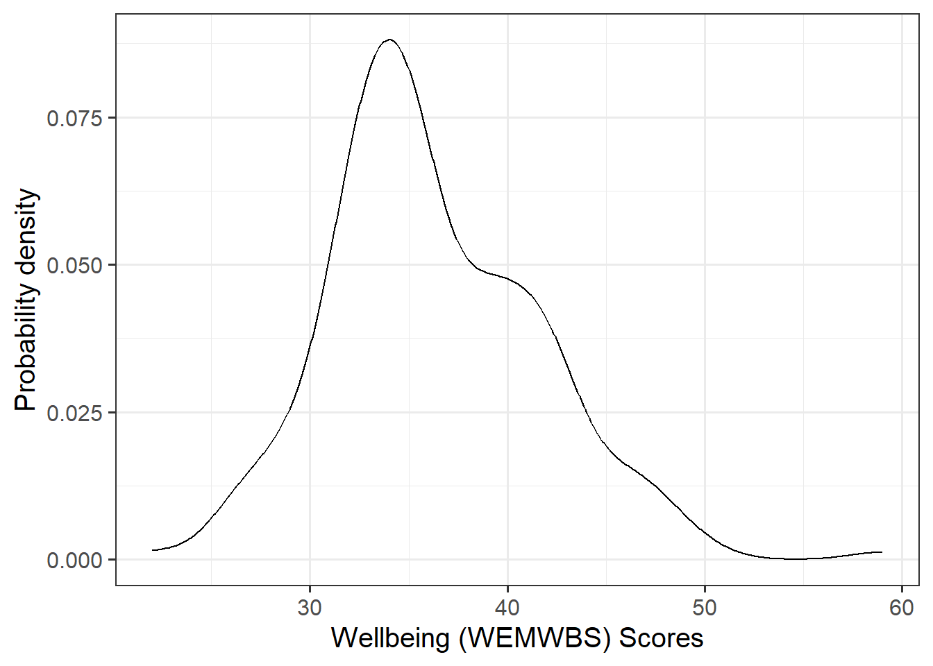
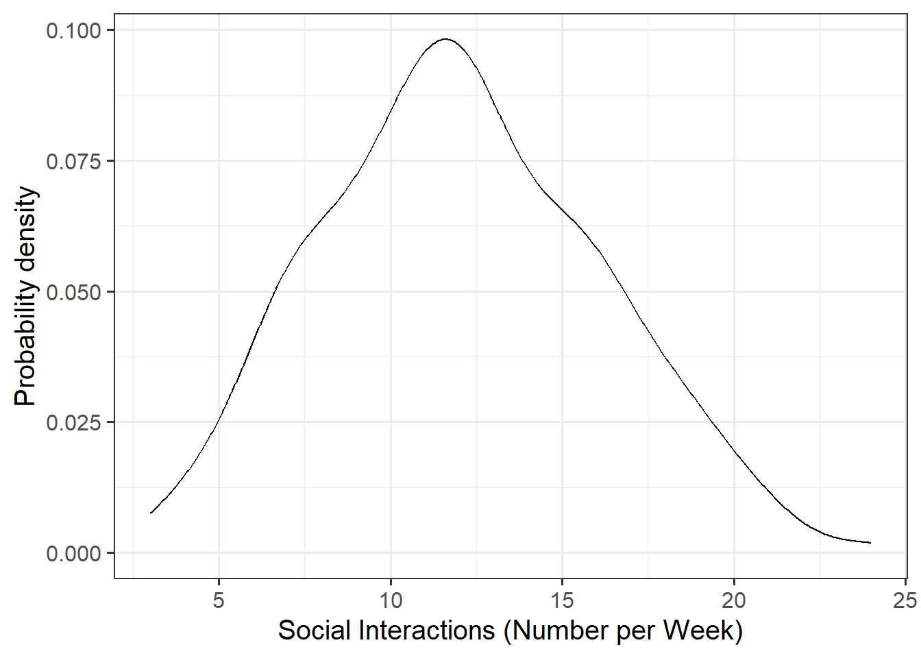
Visualise and describe the marginal distributions of wellbeing scores and social interactions.
Plot interpretation
- The shape, center and spread of the distribution
- Whether the distribution is symmetric or skewed
- Whether the distribution is unimodal or bimodal
Plotting tips
- Use \n to wrap text in your titles and or axis labels
- The patchwork package allows us to arrange multiple plots in two ways - | arranges the plots adjacent to one another, and / arranges the plots on top of one another
Table tips
- The kableExtra package allows us to produce well formatted tables for our descriptive statistics. To do so, you need to specify the kable() and kable_styling() arguments
- Review the guidance on the rmd bootcamp, particularly Lesson 4
Associations among Variables
Correlation Matrix
A table showing the correlation coefficients - \(r_{(x,y)}=\frac{\mathrm{cov}(x,y)}{s_xs_y}\) - between variables. Each cell in the table shows the association between two variables. The diagonals show the correlation of a variable with itself (and are therefore always equal to 1).
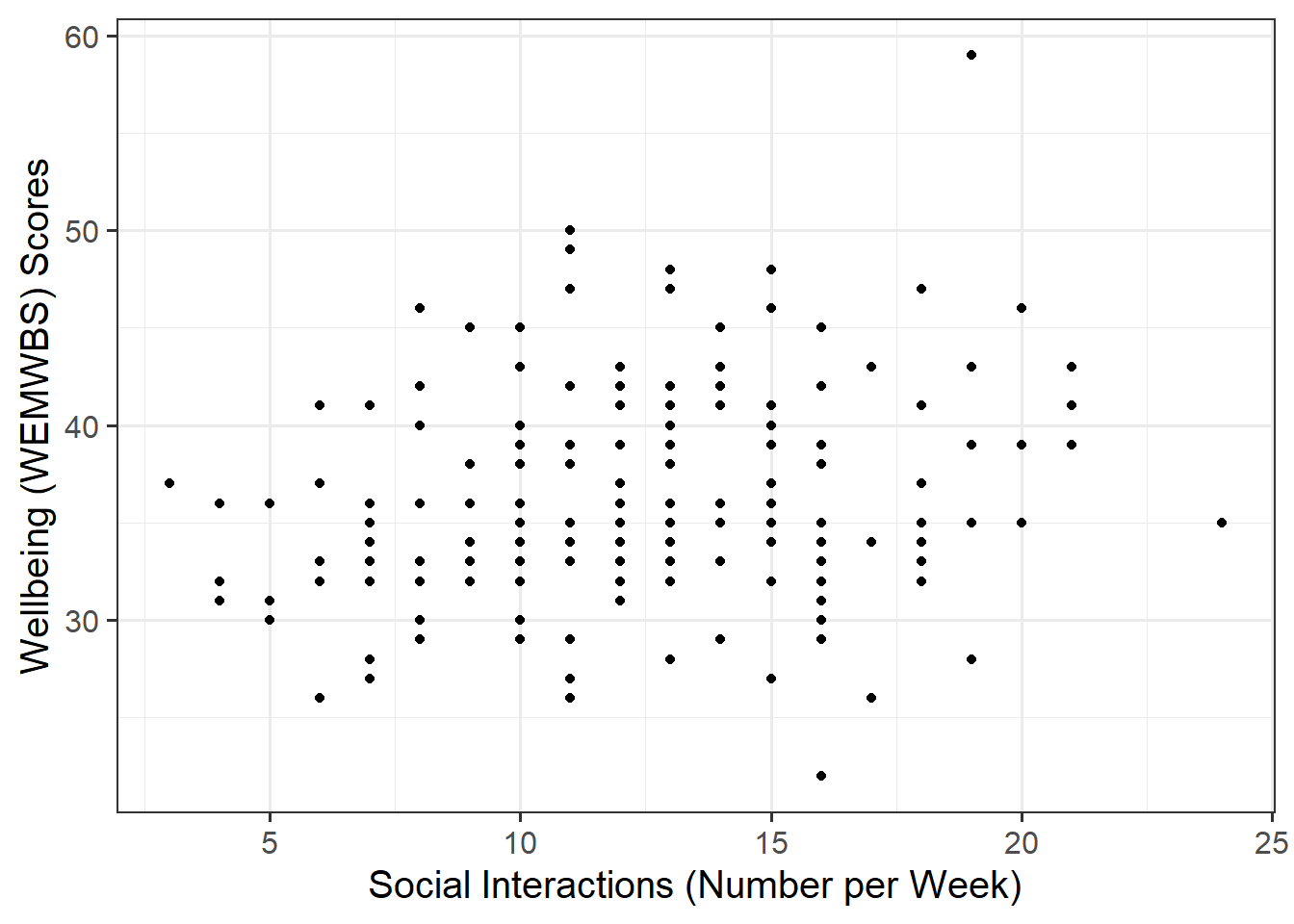
Create a scatterplot of wellbeing score and social interactions before calculating the correlation between them.
Making reference to both the plot and correlation coefficient, describe the association between wellbeing and social interactions among participants in the Edinburgh & Lothians sample.
Plot
We are trying to investigate how wellbeing varies by varying numbers of weekly social interactions. Hence, wellbeing is the dependent variable (on the y-axis), and social interactions is the independent variable (on the x-axis).
Correlation
Make sure to round your numbers in-line with APA 7th edition guidelines. The round() function will come in handy here, as might this APA numbers and statistics guide!
Model Specification and Fitting
The scatterplot highlighted a linear association, where the data points were scattered around an underlying linear pattern with a roughly-constant spread as x varied.
Hence, we will try to fit a simple (i.e., one x variable only) linear regression model:
\[ y_i = \beta_0 + \beta_1 x_i + \epsilon_i \\ \quad \text{where} \quad \epsilon_i \sim N(0, \sigma) \text{ independently} \]
First, write the equation of the fitted line.
Next, using the lm() function, fit a simple linear model to predict wellbeing (DV) by social interactions (IV), naming the output mdl.
Lastly, update your equation of the fitted line to include the estimated coefficients.
The syntax of the lm() function is:
model name <- lm(dependent variable ~ independent variable, data = dataframe)
Explore the following equivalent ways to obtain the estimated regression coefficients — that is, \(\hat \beta_0\) and \(\hat \beta_1\) — from the fitted model:
mdlmdl$coefficientscoef(mdl)coefficients(mdl)summary(mdl)
Explore the following equivalent ways to obtain the estimated standard deviation of the errors — that is, \(\hat \sigma\) — from the fitted model mdl:
sigma(mdl)summary(mdl)
Interpret the estimated intercept, slope, and standard deviation of the errors in the context of the research question.
To interpret the estimated standard deviation of the errors we can use the fact that about 95% of values from a normal distribution fall within two standard deviations of the center.
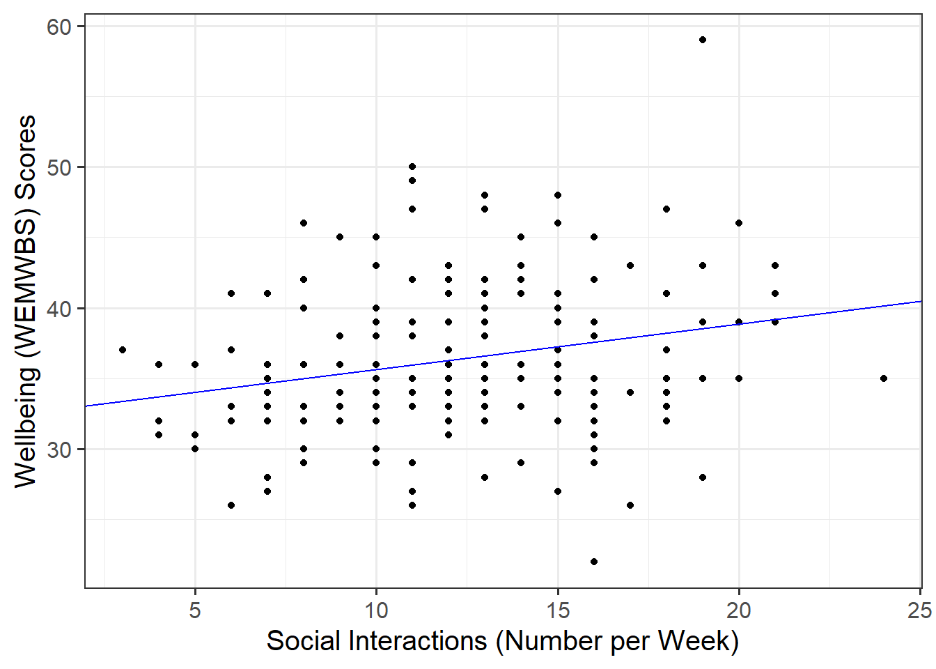
Plot the data and the fitted regression line. To do so:
- Extract the estimated regression coefficients e.g., via
betas <- coef(mdl) - Extract the first entry of
betas(i.e., the intercept) viabetas[1] - Extract the second entry of
betas(i.e., the slope) viabetas[2] - Provide the intercept and slope to the function
Extracting values
The function coef(mdl) returns a vector (a sequence of numbers all of the same type). To get the first element of the sequence you append [1], and [2] for the second.
Plotting
In your ggplot(), you will need to specify geom_abline(). This might help get you started:
geom_abline(intercept = intercept, slope = slope)
Predicted Values & Residuals
Predicted Values (\(\hat y_i\))
Model predicted values for sample data:
We can get out the model predicted values for \(y\), the “y hats” (\(\hat y\)), for the data in the sample using various functions:
predict(<fitted model>)fitted(<fitted model>)fitted.values(<fitted model>)mdl$fitted.values
For example, this will give us the estimated wellbeing score (point on our regression line) for each observed value of social interactions for each of our 200 participants.
predict(mdl)For space saving purposes (i.e., we don’t need to see all 200 values for this demonstration!), we can return the first six predicted values via head():
Model predicted values for other (unobserved) data:
To compute the model-predicted values for unobserved data (i.e., data not contained in the sample), we can use the following function:
predict(<fitted model>, newdata = <dataframe>)
For this example, we first need to remember that the model predicts wellbeing using the independent variable social_int. Hence, if we want predictions for new (unobserved) data, we first need to create a tibble with a column called social_int containing the number of weekly social interactions for which we want the prediction, and store this as a dataframe.
#Create dataframe 'newdata' containing 2, 25, and 28 weekly social interactions
newdata <- tibble(social_int = c(2, 25, 28))
newdata
# A tibble: 3 × 1
social_int
<dbl>
1 2
2 25
3 28Then we take newdata and add a new column called wellbeing_hat, computed as the prediction from the fitted mdl using the newdata above:
Residuals (\(\hat \epsilon_i\))
The residuals represent the deviations between the actual responses and the predicted responses and can be obtained either as
mdl$residualsresid(mdl)residuals(mdl)- computing them as the difference between the response (\(y_i\)) and the predicted response (\(\hat y_i\))
Use predict(mdl) to compute the fitted values and residuals. Mutate the mwdata dataframe to include the fitted values and residuals as extra columns.
Assign to the following symbols the corresponding numerical values:
- \(y_{3}\) (response variable for unit \(i = 3\) in the sample data)
- \(\hat y_{3}\) (fitted value for the third unit)
- \(\hat \epsilon_{5}\) (the residual corresponding to the 5th unit, i.e., \(y_{5} - \hat y_{5}\))
Writing Up & Presenting Results
Provide key model results in a formatted table.
Use tab_model() from the sjPlot package.
You can rename your DV and IV labels by specifying dv.labels and pred.labels. To do so, specify your variable name on the left, and what you would like this to be named in the table on the right.
Describe the design of the study (see Study Overview codebook), and the analyses that you undertook. Interpret your results in the context of the research question and report your model results in full.
Make reference to your descriptive plots and/or statistics and regression table.
Compile Report
Knit your report to PDF, and check over your work. To do so, you should make sure:
- Only the output you want your reader to see is visible (e.g., do you want to hide your code?)
- Check that the tinytex package is installed
- Ensure that the ‘yaml’ (bit at the very top of your document) looks something like this:
---
title: "this is my report title"
author: "B1234506"
date: "07/09/2024"
output: bookdown::pdf_document2
---If you are having issues knitting directly to PDF, try the following:
- Knit to HTML file
- Open your HTML in a web-browser (e.g. Chrome, Firefox)
- Print to PDF (Ctrl+P, then choose to save to PDF)
- Open file to check formatting
To not show the code of an R code chunk, and only show the output, write:
```{r, echo=FALSE}
# code goes here
```
To show the code of an R code chunk, but hide the output, write:
```{r, results='hide'}
# code goes here
```
To hide both code and output of an R code chunk, write:
```{r, include=FALSE}
# code goes here
```You must make sure you have tinytex installed in R so that you can “Knit” your Rmd document to a PDF file:
install.packages("tinytex")
tinytex::install_tinytex()


