| LeadStudio | n | M | SD | SE |
|---|---|---|---|---|
| Lionsgate | 52 | 60.54 | 15.74 | 2.18 |
| Paramount Pictures | 52 | 56.75 | 18.68 | 2.59 |
| Twentieth Century Fox | 46 | 61.93 | 20.66 | 3.05 |
| Universal Pictures | 66 | 59.21 | 15.56 | 1.91 |
| Warner Bros. | 83 | 61.37 | 15.72 | 1.73 |
Formative report B
Semester 1 - Week 11
1 Formative Report B
Instructions and data were released in week 7.
This week: Submission of Formative Report B
- Your group must submit one PDF file for formative report B by 12 noon on Friday 1st December 2023.
- No extensions are possible for group-based reports, see “Assessment Information” page on LEARN.
- To submit, go to the course Learn page > click “Assessment” > click “Submit Formative Report B (PDF file only)”.
- Only one person per group is required to submit on behalf of the entire group.
- Ensure that everyone in the group has joined the group on LEARN. Otherwise, you won’t see the feedback.
- The submitted report must be a PDF file of max 6 sides of A4 paper.
- Keep the default settings in terms of Rmd knitting font and page margins.
- Ensure your report title includes the group name: Group NAME.LETTER
- In the author section, ensure the report lists the exam numbers of all group members: B000001, B000002, …
- At the end of the file, you will place the appendices and these will not count towards the six-page limit.
You can include an optional appendix for additional tables and figures which you can’t fit in the main part of the report;
-
You must include a compulsory appendix listing all of the R code used in the report. This is done automatically if you end your file with the following section, which is already included in the template Rmd file:
# Appendix: R code

```{r ref.label=knitr::all_labels(), echo=TRUE, eval=FALSE}

```
Excluding the Appendix, the report should not include any reference to R code or functions, but be written for a generic reader who is only assumed to have a basic statistical understanding without any R knowledge.
- In Week 12 (next week)
- There will be no lectures
- The labs are still on - please go to the labs.
- In the labs (a) check the formative feedback for your submission, and (b) study the example solutions and ask questions to tutors on code that is unclear.
1.1 Tasks
For formative report B, you will be asked to perform the following tasks, each related to a week of teaching in this course.
This week’s task is highlighted in bold below. Please only focus on completing that task this week. In the next section, you will also find the guided sub-steps that you need to consider to complete this week’s task.
B1) Create a new categorical variable, Rating, taking the value ‘Good’ if the audience score is > 50, and ‘Bad’ otherwise. Inspect and describe the joint probability distribution of movie genre and rating.
B2) Investigate if a movie receiving a good rating is independent of the genre.
B3) Computing and plotting probabilities with a binomial distribution.
B4) Computing and plotting probabilities with a normal distribution.
B5) Plot standard error of the mean, and finish the report write-up (i.e., knit to PDF, and submit the PDF for formative feedback).
1.2 B5 sub-tasks
This week you will only focus on task B5. Below there are sub-steps you need to consider to complete task B5.
Tip
To see the hints, hover your cursor on the superscript numbers.
Context
An investor has gotten in touch and has asked you to consult on what Lead Studio they should invest in, based on audience scores of the top three movie genres. They want to be presented with two options:
A. High risk option: Highest average audience score, irrespectively of the standard error
B. Low risk option: Small spread in audience scores, but with highest average audience score possible among those
- Reopen last week’s Rmd file, and continue building on last week’s work. Make sure you are still using the movies dataset filtered to only include the top 3 genres.1
README: Mean and Standard Error
This box contains a recap of the sample mean and its standard error.
Mean: The sample mean \(\bar{x}\) (pronounced x-bar) is the mean computed from the sample data (sample statistic). As this is an estimate of the population mean \(\mu\), it can also be denoted \(\hat{\mu}\) (pronounced mu-hat). Because the sample mean depends on the data sample, it will vary from random sample to random sample. The distribution of all possible values of the mean, across all possible random samples, is called the sampling distribution of the mean.
\[ \bar{x} = \frac{\sum_{i=1}^n x_i}{n} \]
Standard error: The standard error of the mean, denoted \(SE\) or \(SE_{\bar x}\), is the standard deviation of the sampling distribution of the mean. The standard error is \(SE_{\bar x} = \sigma / \sqrt{n}\) but, as we often don’t know the population standard deviation (\(\sigma\)), we must estimate it with the sample standard deviation (\(s\)). This leads to the following formula for the standard error of the mean when only one sample is available:
\[ SE_{\bar x} = \frac{s}{\sqrt{n}} \]
- To advise the investor on what studio to invest in, calculate the sample mean and standard error of audience scores across Lead Studios. Make sure to also interpret your output.2
Pause For Thought
Is the variation of means equal to or less than the variability of the sample data?
Compare the standard errors to the standard deviations. The SEs are all smaller than the SDs.
Recall that the standard deviation tells you how much each data point varies around the mean. Conversely, the standard error of the mean tells you how much the means (from many different random samples) vary with respect to their mean (the unknown population mean).
In rough terms, the SE tells you how much the different means that you would have obtained from other possible random samples would differ from the mean you have obtained!
- Visualise the average audience scores and SEs - how do these vary between the Lead Studios3?
Based on what you have reported above, what high and low risk options will you present to the investor? Justify your answer.
In the analysis section of your report, write up a summary of what you have reported above, using proper rounding to 2 decimal places and avoiding any reference to R code or functions.
-
Organise the Rmd file to have the the same structure as the last formative report: Introduction, Analysis, Discussion:
- In the Introduction briefly introduce the data, the questions of interest that you have investigated, and introduce the variables that you have used to answer those questions. In other words, you don’t need to introduce all of the variables in the dataset, but only those that you actually used to answer the questions.
- In the Analysis section present and interpret your results. This section should only contain text, figures, and tables. No R code or R code output should be visible.
- In the Discussion summarise the key findings and provide take-home messages that directly answer the questions of interest.
-
Knit the document to PDF (RStudio > File > Knit Document). Next, submit the PDF file on Learn:
- Go to the course Learn page
- Click “Assessment”
- Click “Submit Formative report B (PDF file only)”
- Follow the instructions
2 Worked Example
The dataset available at https://uoepsy.github.io/data/RestaurantTips.csv was collected by the owner of a US bistro, and contains 157 observations on 7 variables.4
The bistro servers are concerned that some shifts are more profitable than others, and that their rota needs to be updated so that they all get the chance to maximise their tips. They have asked the owner to find out what days the highest percentage of tips are given, on average. They have also asked the owner to tell them the days on which variation in percentage tips is highest and lowest. We need to advise the bistro owner so that they can update their servers with the requested information.
| Variable Name | Description |
|---|---|
| Bill | Size of the bill (in dollars) |
| Tip | Size of the tip (in dollars) |
| Credit | Paid with a credit card? n or y |
| Guests | Number of people in the group |
| Day | Day of the week: m=Monday, t=Tuesday, w=Wednesday, th=Thursday, or f=Friday |
| Server | Code for specific waiter/waitress: A, B, or C |
| PctTip | Tip as a percentage of the bill |
library(tidyverse)
library(patchwork)
tips <- read_csv("https://uoepsy.github.io/data/RestaurantTips.csv")
head(tips)
# A tibble: 6 × 7
Bill Tip Credit Guests Day Server PctTip
<dbl> <dbl> <chr> <dbl> <chr> <chr> <dbl>
1 23.7 10 n 2 f A 42.2
2 36.1 7 n 3 f B 19.4
3 32.0 5.01 y 2 f A 15.7
4 17.4 3.61 y 2 f B 20.8
5 15.4 3 n 2 f B 19.5
6 18.6 2.5 n 2 f A 13.4- First we want to prepare our data, and check for any unusual or impossible values (e.g., outliers). One useful way to do this would be to plot our data:
ggplot(tips, aes(x = PctTip)) +
    geom_histogram()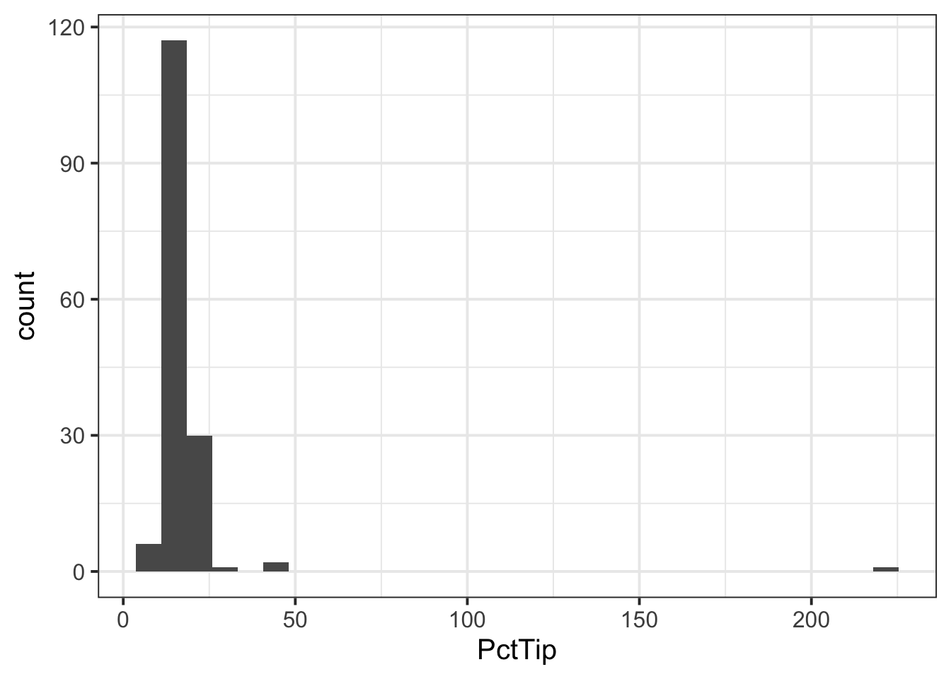
We can see one outlier (on the far right of the plot), where the percentage tip appears to be more than 2 x the total bill(!), so lets inspect that outlier:
# A tibble: 1 × 7
   Bill   Tip Credit Guests Day   Server PctTip
  <dbl> <dbl> <chr>   <dbl> <chr> <chr>   <dbl>
1  49.6    NA y           4 th    C         221
We can see that the ‘Tip’ column has an NA value, so perhaps the ‘PctTip’ value of 221 was a data input error? If so, we want to remove the outlier:
- Since we are interested in looking at the percentage tips across weekdays, we may want to give our ‘Day’ variable better labels for levels:
- If we were asked to visualise the shape of the distribution of the ‘PctTip’ variable, we could use either a histogram, a density plot, or a boxplot:
ggplot(tips, aes(x = PctTip)) +
    geom_histogram(colour = 'white')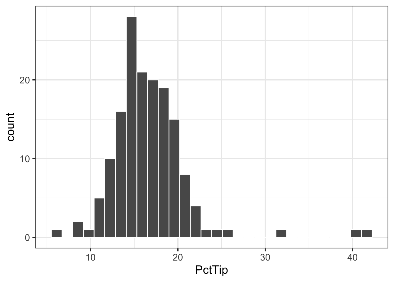
ggplot(tips, aes(x = PctTip)) +
    geom_density()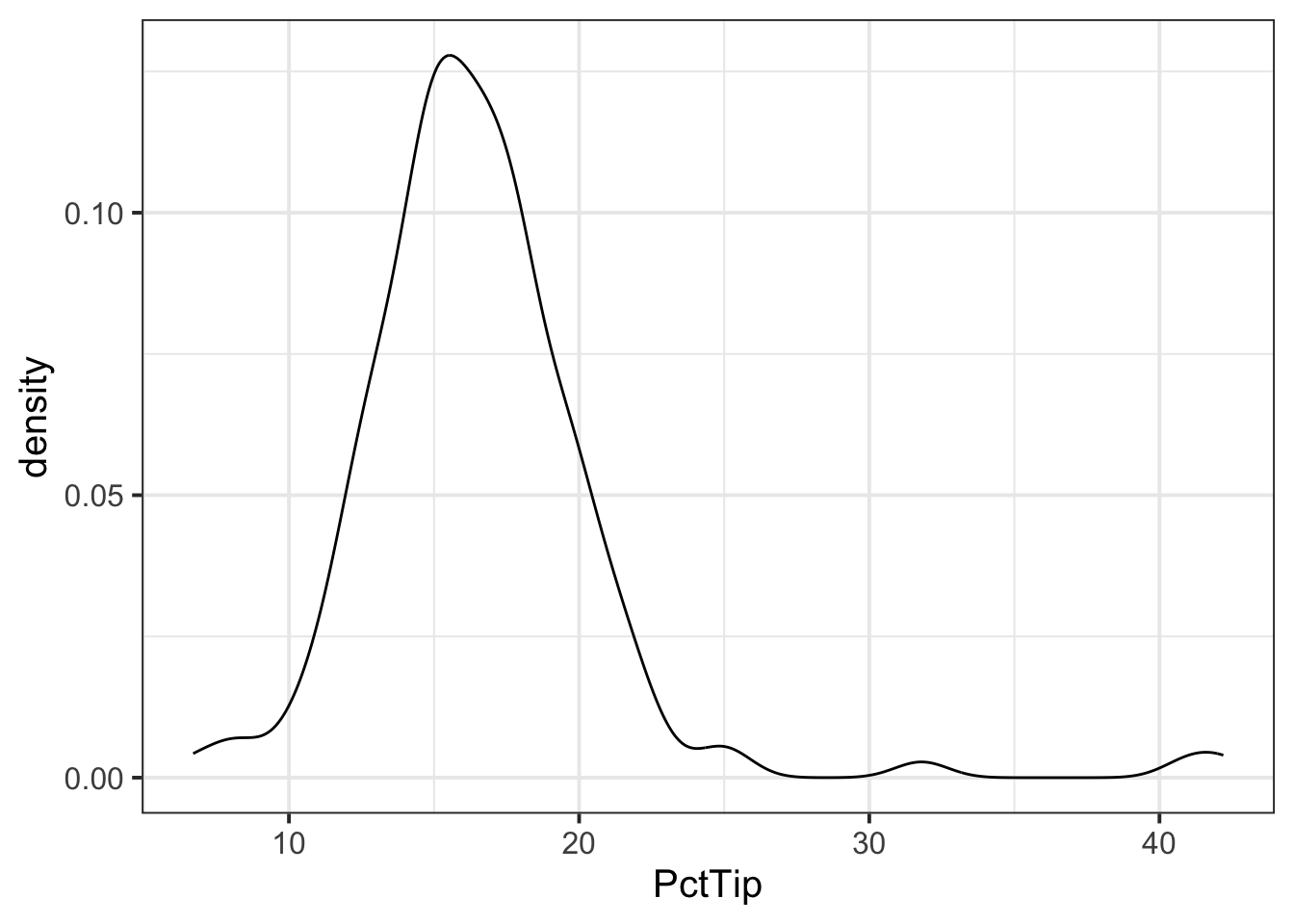
ggplot(tips, aes(x = PctTip)) +
    geom_boxplot()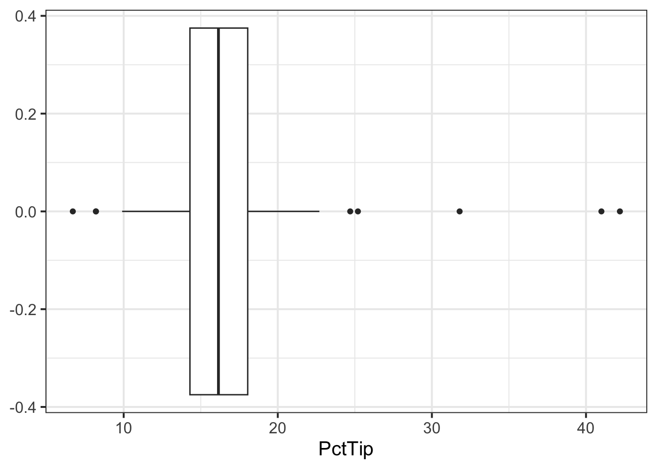
The distribution of percentage tip is not exactly normal as it shows a slight skew to the right. This suggests that there were more individuals tipping well above the mean than below (i.e., more extremely high tips)
- Now that we have visualised our distribution, it would be useful to estimate the centre and spread of our data. In other words, calculate the sample mean and standard error of the mean.
We can calculate our sample statistics as follows:
n_tips <- nrow(tips)
n_tips
[1] 156xbar_tips <- mean(tips$PctTip)
xbar_tips[1] 16.59103[1] 0.3511618- We can then check how our sample statistics vary across each day of the week:
| Day | n | M | SE |
|---|---|---|---|
| Mon | 20 | 15.94 | 0.72 |
| Tue | 13 | 18.02 | 2.11 |
| Wed | 62 | 16.55 | 0.44 |
| Thu | 35 | 16.75 | 0.57 |
| Fri | 26 | 16.26 | 1.21 |
-
If we were asked to interpret the sample statistics for each day, we could summarise as below:
- Interpreting \(\bar{x}\) / \(\hat{\mu}\)
- Of the days of the week, Tuesday was when the highest average percentage tips were received, and Monday the lowest.
- Apart from Tuesday (when the average percentage tip is likely to be above average), the other days of the week are very close to 16%.
- Interpreting \(SE\)
- The percentage of tips varied most on Tuesdays on Fridays, where tips could either be very generous or measly.
- Interpreting \(\bar{x}\) / \(\hat{\mu}\)
Next we want to visualise the association between days and percentage tip. We can do this using
ggplot()and the tibble we created above (tbl_tips):
plt_tips <- ggplot(tbl_tips) +
    geom_pointrange(aes(x = Day, y = M,
                        ymin = M - 2 * SE,
                        ymax = M + 2 * SE)) +
    ylim(0,50)
plt_tips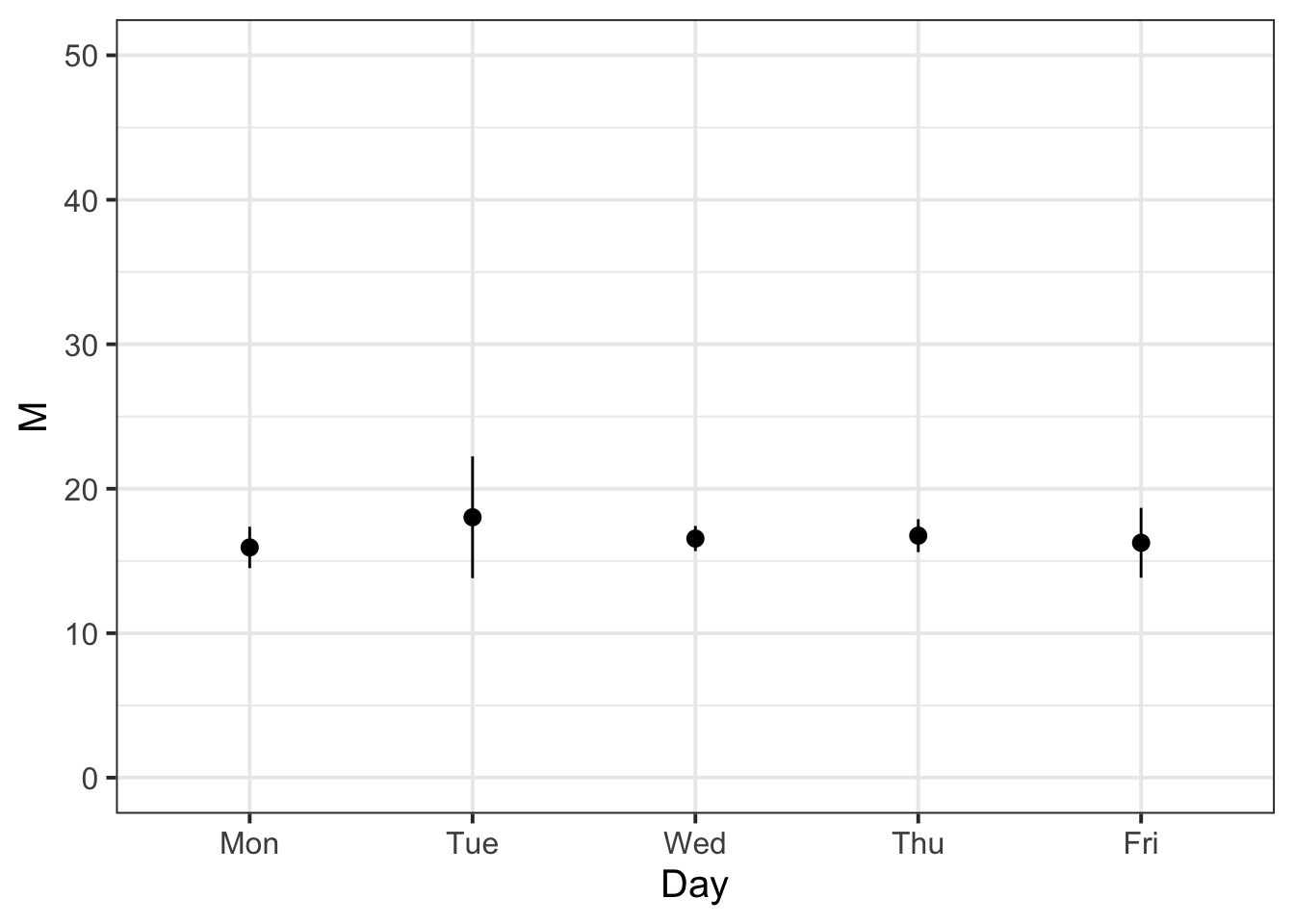
- We know that the variability of the mean Percentage Tip across each day of the week should be less than or equal to the variability of the sample data. We can check that this is the case with the following:
tips %>%
    group_by(Day) %>%
    summarise(n = n(),
              M = mean(PctTip),
              SD = sd(PctTip),
              SE = SD / sqrt(n)) %>%
    mutate(IsSESmaller = SE < SD)
# A tibble: 5 × 6
Day n M SD SE IsSESmaller
<fct> <int> <dbl> <dbl> <dbl> <lgl>
1 Mon 20 15.9 3.20 0.716 TRUE
2 Tue 13 18.0 7.60 2.11 TRUE
3 Wed 62 16.6 3.43 0.436 TRUE
4 Thu 35 16.8 3.37 0.569 TRUE
5 Fri 26 16.3 6.17 1.21 TRUE For each entry in the ‘IsSESmaller’ column, we can see that it is true!
Example writeup
The bistro servers are correct - percentage tips do vary by day (see Table 1). These differences are displayed in Figure 1, showing that Tuesdays are when servers received the highest average percentage tips (18.02%), and Mondays were the lowest (15.94%). The other days of the week had average percentage tips roughly close to 16%.
In terms of variability, Tuesday also had the highest variability of average percentage tips (SE = 2.11), followed by Friday (SE = 1.21). This indicates that, while customers tend to tip higher than other days on average, there is also more variability - meaning that there may be very generous or measly tips.
3 Student Glossary
To conclude the lab, add the new functions to the glossary of R functions.
| Function | Use and package |
|---|---|
filter |
? |
factor |
? |
group_by() |
? |
geom_histogram() |
? |
geom_boxplot() |
? |
geom_density() |
? |
geom_line() |
? |
after_stat() |
? |
References
Lock, Robin H, Patti Frazer Lock, Kari Lock Morgan, Eric F Lock, and Dennis F Lock. 2020. Statistics: Unlocking the Power of Data. John Wiley & Sons.
Footnotes
Hint: Ask last week’s driver for the Rmd file, they should share it with the group via the group discussion space or email. To download the file from the server, go to the RStudio Files pane, tick the box next to the Rmd file, and select More > Export.↩︎
-
Hint: You can calculate the mean and standard error for each Lead Studio by using
group_by()followed by thesummarise()function.In
group_by(), you want to put Lead Studio, as you are computing the mean and SE separately for each studio.Inside summarise() you want to define two columns:
- M = mean(DATA$COLUMN)
- SE = sd(DATA$COLUMN) / sqrt(n())
If you want, you can also have a column with the sample sizes.↩︎
-
Hint: Use the function
geom_pointrange()to draw a point with error bars. Withinaes()provide the following:-
x: is the lead studio -
y: is the sample mean -
ymin: is the lower end of the error bars (mean - 2 * SE) -
ymax: is the upper end of the error bars (mean + 2 * SE)
If you think it makes it easier to read your plot, you can also use the
coord_flip()function to ‘flip’ your axes.↩︎ -