Categorical data

Semester 1 - Week 2

1 Formative report A

Instructions and data were released in week 1.

1.1 Tasks

For formative report A, you will be asked to perform the following tasks, each related to a week of teaching in this course.
This week’s task is highlighted in bold below. Please only focus on completing that task this week. In the next section, you will also find guided sub-steps you may want to consider to complete this week’s task.

A1) Read the data into R, inspect it, and write a concise introduction to the data and its structure
A2) Display and describe the categorical variables
A3) Display and describe six numerical variables of your choice
A4) Display and describe a relationship of interest between two or three variables of your choice
A5) Finish the report write-up, knit to PDF, and submit the PDF for formative feedback

1.2 A2 sub-tasks

This week you will only focus on task A2. Below there are some guided sub-steps you may want to consider to complete task A2.

Tip

To see the hints, hover your cursor on the superscript numbers.

  • Reopen last week’s Rmd file, as you will continue last week’s work and build on it.1

Consider a table of toy data comprising a participant identifier (id: 1 to 5), the participant age, the course (A or B) they are enrolled into, and their height:

toy_data <- tibble(
    id = 1:5,
    age = c(18, 20, 25, 22, 19),
    course = c("A", "B", "A", "B", "A"),
    height = c(171, 180, 168, 193, 174)
)
toy_data
# A tibble: 5 × 4
     id   age course height
  <int> <dbl> <chr>   <dbl>
1     1    18 A         171
2     2    20 B         180
3     3    25 A         168
4     4    22 B         193
5     5    19 A         174

To select columns to keep you can either (1) specify the range from:to, if the columns are sequential, or (2) list the columns one by one.

If the columns you want to keep are sequential, you can just specify the first and last by using numbers:

toy_data %>%
    select(1:3)
# A tibble: 5 × 3
     id   age course
  <int> <dbl> <chr> 
1     1    18 A     
2     2    20 B     
3     3    25 A     
4     4    22 B     
5     5    19 A     

or using their names:

toy_data %>%
    select(id:course)
# A tibble: 5 × 3
     id   age course
  <int> <dbl> <chr> 
1     1    18 A     
2     2    20 B     
3     3    25 A     
4     4    22 B     
5     5    19 A     

Either option keeps columns id up to course.

If the columns you want to keep are not in sequential order, you have to list all of the columns you want to keep. This can be tedious if you have many.

You can do so using numbers:

toy_data %>%
    select(1, 2, 3)
# A tibble: 5 × 3
     id   age course
  <int> <dbl> <chr> 
1     1    18 A     
2     2    20 B     
3     3    25 A     
4     4    22 B     
5     5    19 A     

Or column names:

toy_data %>%
    select(id, age, course)
# A tibble: 5 × 3
     id   age course
  <int> <dbl> <chr> 
1     1    18 A     
2     2    20 B     
3     3    25 A     
4     4    22 B     
5     5    19 A     

However, if you check the data in toy_data, those didn’t change. The result of the above computation was only printed to the screen but not stored.

toy_data
# A tibble: 5 × 4
     id   age course height
  <int> <dbl> <chr>   <dbl>
1     1    18 A         171
2     2    20 B         180
3     3    25 A         168
4     4    22 B         193
5     5    19 A         174

To store it, we need to assign the result:

toy_data <- toy_data %>%
    select(id:course)
toy_data
# A tibble: 5 × 3
     id   age course
  <int> <dbl> <chr> 
1     1    18 A     
2     2    20 B     
3     3    25 A     
4     4    22 B     
5     5    19 A     

By doing the above, we have overwritten the data stored in toy_data with the selected columns.

  • Overwrite the data to only include the first 15 variables (i.e. columns).2

  • Create a plot displaying the frequency distribution of movie genres.3

  • Create a plot displaying the frequency distribution of the lead studios.4

  • Would it make sense to create a plot of the frequency distribution of movie names?5

Tip

Before applying a function to your data, you should always ask yourself if what you are about to do is going to convey any insight about the data, compared to just looking at the data itself.
The goal of data analysis is to to go from a multitude of values to insights that provide actionable information from a quick glance.

  • Describe the distribution of movie genres. You may want to include both the frequency and the percentage frequency.6

Consider this code:

toy_data %>%
    count(course) %>%
    mutate(
        perc = round(n / sum(n) * 100, 2)
    )
# A tibble: 2 × 3
  course     n  perc
  <chr>  <int> <dbl>
1 A          3    60
2 B          2    40

You can change the names of the frequency from n to Freq and perc to Perc using:

toy_data %>%
    count(course, name = "Freq") %>%
    mutate(
        Perc = round(Freq / sum(Freq) * 100, 2)
    )
# A tibble: 2 × 3
  course  Freq  Perc
  <chr>  <int> <dbl>
1 A          3    60
2 B          2    40

An alternative to the above involves using the group_by(), summarise(), and n() functions from tidyverse. The following code creates a table of absolute frequencies (or counts):

toy_data %>%
    group_by(course) %>%
    summarise(
        Freq = n()
    )
# A tibble: 2 × 2
  course  Freq
  <chr>  <int>
1 A          3
2 B          2

In the code above, we take toy_data and perform a grouped computation for each separate course (because of group_by). The computation says to summarise the data by creating a new column named Freq which stores the counts of the values in each group (n()).

The following code mutates the frequency table and adds a new column storing the percentages, which is given the name Perc:

toy_data %>%
    group_by(course) %>%
    summarise(
        Freq = n()
    ) %>%
    mutate(
        Perc = round(Freq / sum(Freq) * 100, 2)
    )
# A tibble: 2 × 3
  course  Freq  Perc
  <chr>  <int> <dbl>
1 A          3    60
2 B          2    40

The function round(<values>, 2) tells R to round the percentages to 2 decimal places.

  • Describe the distribution of lead studios. You may want to include both the frequency and the percentage frequency.7

  • What is the most common genre and the most common lead studio?8

  • Format your frequency tables properly using the kbl() function from the kableExtra package.9

2 Worked example

Consider the dataset available at https://uoepsy.github.io/data/RestaurantTips.csv, containing 157 observations on the following 7 variables:

Variable Name Description
Bill Size of the bill (in dollars)
Tip Size of the tip (in dollars)
Credit Paid with a credit card? n or y
Guests Number of people in the group
Day Day of the week: m=Monday, t=Tuesday, w=Wednesday, th=Thursday, or f=Friday
Server Code for specific waiter/waitress: A, B, or C
PctTip Tip as a percentage of the bill

These data were collected by the owner of a bistro in the US, who was interested in understanding the tipping patterns of their customers. The data are adapted from Lock et al. (2020).

We load the tidyverse package as we will use the functions read_csv and glimpse from this package.

tips <- read_csv("https://uoepsy.github.io/data/RestaurantTips.csv")

read_csv is the function to read CSV (comma separated values) files. Once we have read the file, it is stored into an object called tips using the arrow (<-).

head(tips)
# A tibble: 6 × 7
   Bill   Tip Credit Guests Day   Server PctTip
  <dbl> <dbl> <chr>   <dbl> <chr> <chr>   <dbl>
1  23.7 10    n           2 f     A        42.2
2  36.1  7    n           3 f     B        19.4
3  32.0  5.01 y           2 f     A        15.7
4  17.4  3.61 y           2 f     B        20.8
5  15.4  3    n           2 f     B        19.5
6  18.6  2.5  n           2 f     A        13.4

head() shows the top 6 rows of data. Use the n = ... option to change the default behaviour, e.g. head(<data>, n = 10).

glimpse(tips)
Rows: 157
Columns: 7
$ Bill   <dbl> 23.70, 36.11, 31.99, 17.39, 15.41, 18.62, 21.56, 19.58, 23.59, …
$ Tip    <dbl> 10.00, 7.00, 5.01, 3.61, 3.00, 2.50, 3.44, 2.42, 3.00, 2.00, 1.…
$ Credit <chr> "n", "n", "y", "y", "n", "n", "n", "n", "n", "n", "n", "n", "n"…
$ Guests <dbl> 2, 3, 2, 2, 2, 2, 2, 2, 2, 2, 1, 1, 1, 2, 2, 3, 2, 2, 1, 5, 5, …
$ Day    <chr> "f", "f", "f", "f", "f", "f", "f", "f", "f", "f", "f", "f", "f"…
$ Server <chr> "A", "B", "A", "B", "B", "A", "B", "A", "A", "B", "B", "A", "B"…
$ PctTip <dbl> 42.2, 19.4, 15.7, 20.8, 19.5, 13.4, 16.0, 12.4, 12.7, 10.7, 11.…

glimpse is part of the tidyverse package and is used to check the type of each variable.

We can use better and more descriptive labels for the categorical variables:

tips$Day <- factor(tips$Day, 
                   levels = c("m", "t", "w", "th", "f"),
                   labels = c("Monday", "Tuesday", "Wednesday", "Thursday", "Friday"))

tips$Day, i.e. the column Day within the data tips, is converted to a factor in R (the appropriate storage mode for categorical variables). Furthermore, it replaces the level “m” with the new label “Monday”, “t” with the new label “Tuesday”, and so on.

tips$Credit <- factor(tips$Credit, 
                      levels = c("n", "y"),
                      labels = c("No", "Yes"))

We don’t have better labels for Server (current values A , B, or C), so we will just convert it to a factor by keeping the current levels:

tips$Server <- factor(tips$Server)

Check the relabelled columns:

glimpse(tips)
Rows: 157
Columns: 7
$ Bill   <dbl> 23.70, 36.11, 31.99, 17.39, 15.41, 18.62, 21.56, 19.58, 23.59, …
$ Tip    <dbl> 10.00, 7.00, 5.01, 3.61, 3.00, 2.50, 3.44, 2.42, 3.00, 2.00, 1.…
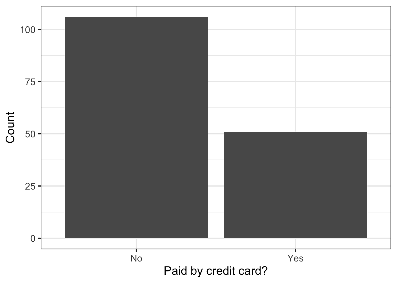
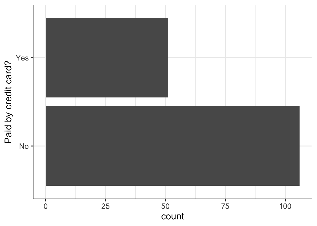
$ Credit <fct> No, No, Yes, Yes, No, No, No, No, No, No, No, No, No, No, No, N…
$ Guests <dbl> 2, 3, 2, 2, 2, 2, 2, 2, 2, 2, 1, 1, 1, 2, 2, 3, 2, 2, 1, 5, 5, …
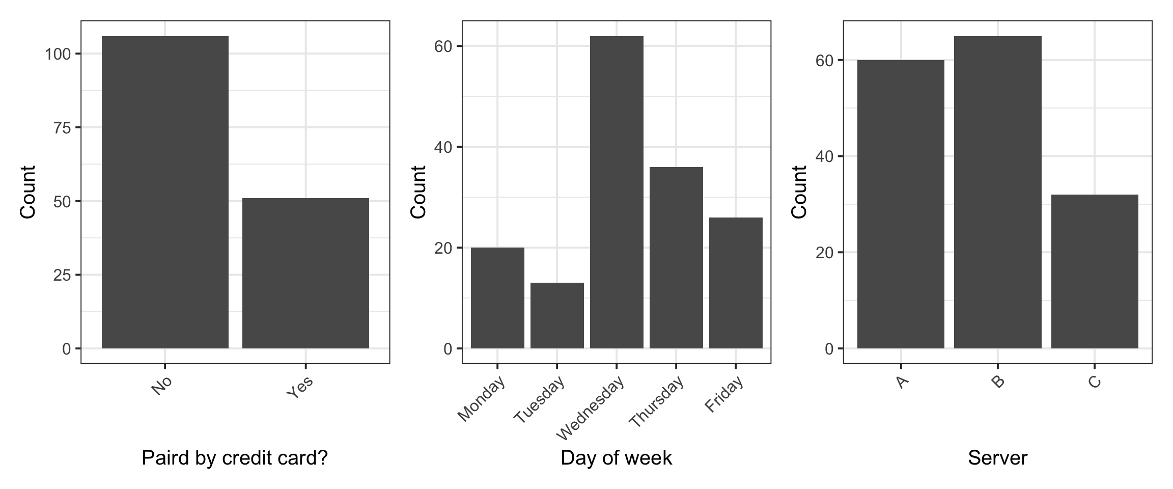
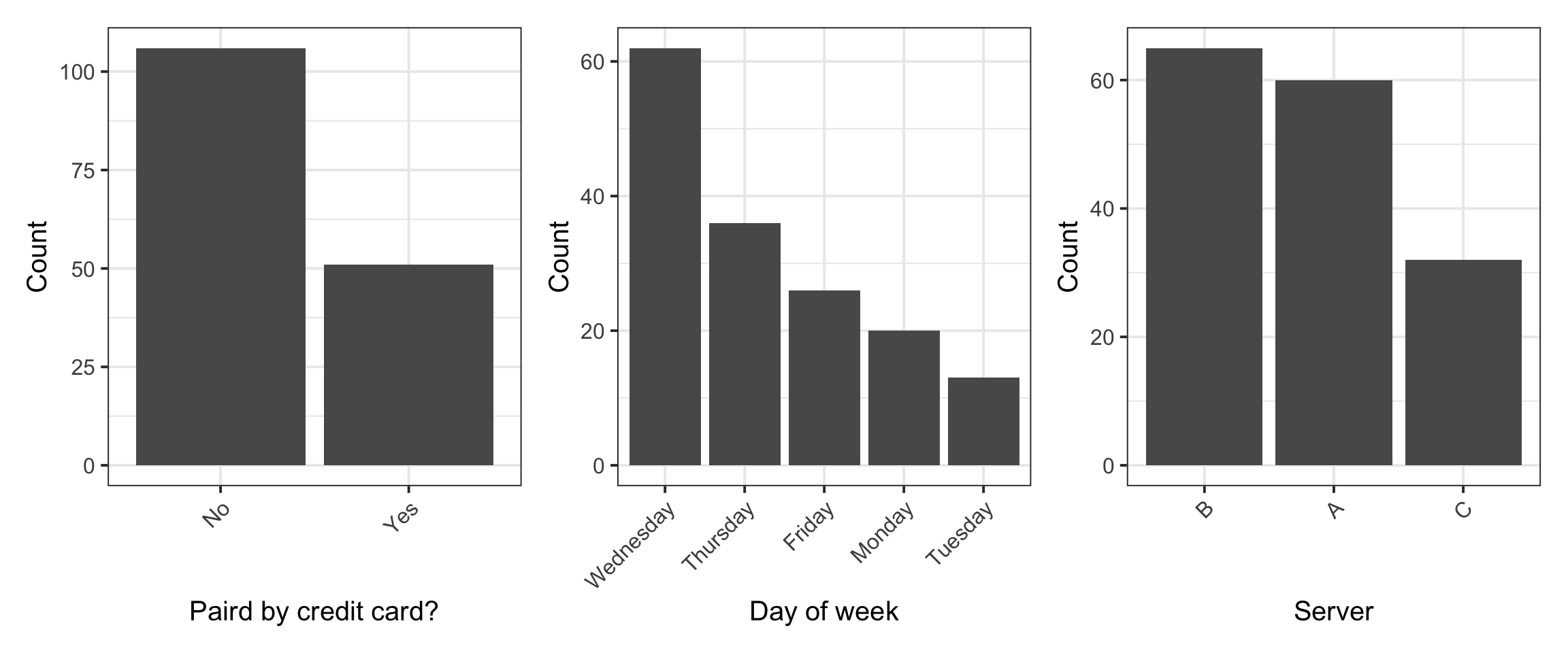
$ Day    <fct> Friday, Friday, Friday, Friday, Friday, Friday, Friday, Friday,…
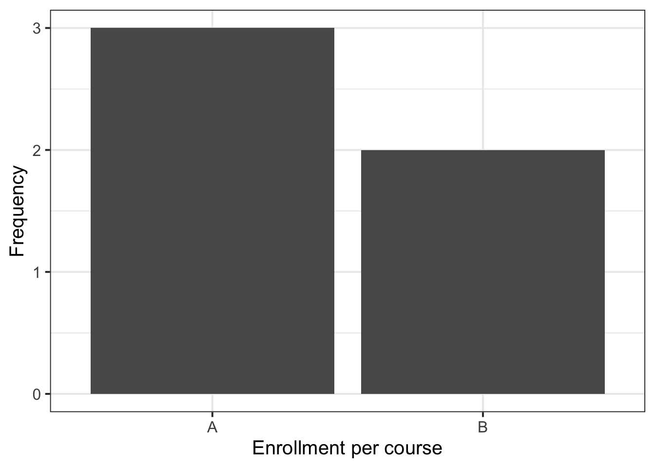
$ Server <fct> A, B, A, B, B, A, B, A, A, B, B, A, B, B, B, B, C, C, C, C, C, …
$ PctTip <dbl> 42.2, 19.4, 15.7, 20.8, 19.5, 13.4, 16.0, 12.4, 12.7, 10.7, 11.…

Last week, we also saw that if someone tipped more than 100% of the bill size, it was likely a data input error and we decided to replace that value with NA (not available):

The mutate function takes as arguments:

  • column name
  • =
  • how to compute that column

The syntax for ifelse is:

ifelse(test_condition, 
       value_if_true, 
       avalue_if_false)
tips <- tips %>%
    mutate(
        PctTip = ifelse(PctTip > 100, NA, PctTip)
    )

This displays the frequency distribution of credit card payers:

plt_credit <- ggplot(tips, aes(x = Credit)) +
    geom_bar() +
    labs(x = "Paid by credit card?", y = "Count")
plt_credit

You can even flip the coordinates, if you wish to, using the coord_flip() function:

ggplot(tips, aes(x = Credit)) +
    geom_bar() +
    labs(x = "Paid by credit card?") +
    coord_flip()

You can use the patchwork package to place graphs side by side. Simply create an object for each graph, and concatenate the objects with | for horizontal concatenation and / for vertical concatenation of graphs. You can even combine this by using parentheses, e.g. (plot1 | plot2) / (plot3 | plot4) for 2 rows and 2 columns.

Run install.packages("patchwork") first in your R console

We can display the frequency distribution of all the categorical variables: Credit, Day, and Server:

To rotate x-axis labels by 90 degrees, you can use this code:
theme(axis.text.x = element_text(angle = 90, vjust = 0.5, hjust=1))
To rotate the labels by 45 degrees, you can use: theme(axis.text.x = element_text(angle = 45, vjust = 1, hjust=1))
Don’t worry, no one remembers it. People always google “rotate x-axis labels ggplot” to find it.

library(patchwork)

plt1 <- ggplot(tips, aes(x = Credit)) +
    geom_bar() +
    labs(x = "Paird by credit card?", y = "Count") +
    theme(axis.text.x = element_text(angle = 45, vjust = 1, hjust=1))

plt2 <- ggplot(tips, aes(x = Day)) +
    geom_bar() +
    labs(x = "Day of week", y = "Count") +
    theme(axis.text.x = element_text(angle = 45, vjust = 1, hjust=1))

plt3 <- ggplot(tips, aes(x = Server)) +
    geom_bar() +
    labs(y = "Count") +
    theme(axis.text.x = element_text(angle = 45, vjust = 1, hjust=1))

plt1 | plt2 | plt3

If wanted, you can sort the bars in order of frequency by using the fct_infreq() function.

In the last plot, plt3, this involves changing the first row from ggplot(tips, aes(x = Server)) to ggplot(tips, aes(x = fct_infreq(Server))).

In these plot I have preferred not to do so, as changing the order of levels may confuse the reader when the factors have easily understood ordering: credit (No/Yes), day (Mon,Tue,Wed,Thu,Fri), server (A,B,C)

library(patchwork)

plt1 <- ggplot(tips, aes(x = fct_infreq(Credit))) +
    geom_bar() +
    labs(x = "Paird by credit card?", y = "Count") +
    theme(axis.text.x = element_text(angle = 45, vjust = 1, hjust=1))

plt2 <- ggplot(tips, aes(x = fct_infreq(Day))) +
    geom_bar() +
    labs(x = "Day of week", y = "Count") +
    theme(axis.text.x = element_text(angle = 45, vjust = 1, hjust=1))

plt3 <- ggplot(tips, aes(x = fct_infreq(Server))) +
    geom_bar() +
    labs(x = "Server", y = "Count") +
    theme(axis.text.x = element_text(angle = 45, vjust = 1, hjust=1))

plt1 | plt2 | plt3

A frequency table can be obtained using:

tbl_credit <- tips %>%
    count(Credit) %>%
    mutate(
        perc = round((n / sum(n)) * 100, 2)
    )
tbl_credit
# A tibble: 2 × 3
  Credit     n  perc
  <fct>  <int> <dbl>
1 No       106  67.5
2 Yes       51  32.5
tbl_day <- tips %>%
    count(Day) %>%
    mutate(
        perc = round((n / sum(n)) * 100, 2)
    )
tbl_day
# A tibble: 5 × 3
  Day           n  perc
  <fct>     <int> <dbl>
1 Monday       20 12.7 
2 Tuesday      13  8.28
3 Wednesday    62 39.5 
4 Thursday     36 22.9 
5 Friday       26 16.6 
tbl_server <- tips %>%
    count(Server) %>%
    mutate(
        perc = round((n / sum(n)) * 100, 2)
    )
tbl_server
# A tibble: 3 × 3
  Server     n  perc
  <fct>  <int> <dbl>
1 A         60  38.2
2 B         65  41.4
3 C         32  20.4

You can create nice tables with the kbl command from the kableExtra package.

Run install.packages("kableExtra") first in your R console

library(kableExtra)

kbl(list(tbl_credit, tbl_day, tbl_server), booktabs = TRUE)

Frequency tables of categorical variables

Paid with a credit card
Credit n perc
No 106 67.52
Yes 51 32.48
Day of the week
Day n perc
Monday 20 12.74
Tuesday 13 8.28
Wednesday 62 39.49
Thursday 36 22.93
Friday 26 16.56
Server
Server n perc
A 60 38.22
B 65 41.40
C 32 20.38

Add arrange(desc(<column_of_freq>)). For example:

tbl_day <- tips %>%
    count(Day) %>%
    mutate(
        perc = round((n / sum(n)) * 100, 2)
    ) %>%
    arrange(desc(n))
tbl_day
# A tibble: 5 × 3
  Day           n  perc
  <fct>     <int> <dbl>
1 Wednesday    62 39.5 
2 Thursday     36 22.9 
3 Friday       26 16.6 
4 Monday       20 12.7 
5 Tuesday      13  8.28

If you just did arrange(n), it would be in ascending order.

You can specify a different name for the column of counts by using name = "new name". If you don’t specify it, the default is n.

You can specify any valid name for the percentages inside of mutate.

For example:

tbl_day <- tips %>%
    count(Day, name = "Freq") %>%
    mutate(
        Perc = round((Freq / sum(Freq)) * 100, 2)
    ) %>%
    arrange(desc(Freq))
tbl_day
# A tibble: 5 × 3
  Day        Freq  Perc
  <fct>     <int> <dbl>
1 Wednesday    62 39.5 
2 Thursday     36 22.9 
3 Friday       26 16.6 
4 Monday       20 12.7 
5 Tuesday      13  8.28

From the univariate distribution (or marginal distribution) of each categorical variable we see that the most common payment method was not a credit card, and the most common day of the week to dine at that restaurant was Wednesday, followed by Thursday and Friday. Finally, most parties were waited on by server B.

The mode of a variable is the value that appears most often.

The term comes from the French expression “à la mode”, i.e. in fashion. If you think about it, something is considered to be in fashion if it’s worn very often.

To reference a table in text you first give the code chunk a unique label, e.g. tableLabel, and a caption to the table, e.g. “My table caption is this”

```{r tableLabel}
tbl_credit %>%
    kbl(digits = 2, booktabs = TRUE, caption = "My table caption is this")
```

This creates

Table 1: My table caption is this
Credit n perc
No 106 67.52
Yes 51 32.48

Then you reference it in text using \@ref(tab:tableLabel). For example:

Table \@ref(tab:tableLabel) displays etc.

Which renders as:

Table 1 displays etc.

3 Student Glossary

To conclude the lab, add the new functions to the glossary of R functions that you started last week.

Function Use and package
factor ?
%>% ?
geom_bar ?
labs ?
count ?
mutate ?
sum ?
round ?
coord_flip ?
kbl ?
arrange ?
desc ?
Back to top

References

Lock, Robin H, Patti Frazer Lock, Kari Lock Morgan, Eric F Lock, and Dennis F Lock. 2020. Statistics: Unlocking the Power of Data. John Wiley & Sons.

Footnotes

  1. Hint: ask last week’s driver for the Rmd file, they should share it with the group via email or Teams.↩︎

  2. Hint: the select() function from tidyverse↩︎

  3. Hint: we display categorical variables with barplots. Consider the geom_bar() function.

    Example: For the toy_data from above, the frequency distribution of course enrollment is:

    ggplot(toy_data, aes(x = course)) +
        geom_bar() +
        labs(x = "Enrollment per course", y = "Frequency")

    ↩︎
  4. Hint: similar to above, change the column to LeadStudio.↩︎

  5. Hint: what would be the height of each bar? Would adding such a plot to a report bring any insights and be useful to a decision maker?

    In the data, Movie, which stores the movie title, is what is known is statistics as the “identifier” or “ID”. This uniquely identifies each unit in the study. If your study involved several participants, your ID would be the unique participant identifier. It doesn’t make sense to plot the frequency distribution of an identifier variable as it will have vertical bars all of height equal 1.↩︎

  6. Hint: We describe categorical variables with frequency distributions.

    Consider using the count function from tidyverse and mutate for adding percentages.

    Example:

    toy_data %>%
        count(course) %>%
        mutate(
            perc = round(n / sum(n) * 100, 2)
        )
    # A tibble: 2 × 3
      course     n  perc
      <chr>  <int> <dbl>
    1 A          3    60
    2 B          2    40

    Advanced: count(course) is equivalent to group_by(course) %>% summarise(n = n()). See the box below for more details.↩︎

  7. Hint: similar to above, but replacing Genre with LeadStudio↩︎

  8. Hint: What is the mode of Genre and LeadStudio? In other words, which category in each of those frequency distributions has the highest frequency?

    Tip: You may want to order the barplots and/or frequency tables in descending order. For barplots, the function fct_infreq() may help. For tables, the function arrange(desc(<column_of_freq>)) may help.↩︎

  9. Hint: See the worked example below.↩︎