# PCA with as many components as there are variables:
my_pca <- principal(dataset, nfactors = ncol(dataset),
                    rotate = 'none')
# PCA with a chosen number of components
#(replace .. with your number)
my_pca <- principal(dataset, nfactors = ...,
rotate = 'none')R8: Principal Component Analysis (PCA)
The goal of PCA
The goal of principal component analysis (PCA) is to find a smaller number of uncorrelated variables which are linear combinations of the original ( many ) variables and explain most of the variation in the data.
Take a moment to think about the various constructs that you are often interested in as a researcher. This might be anything from personality traits, to language proficiency, social identity, anxiety etc. How we measure such constructs is a very important consideration for research. The things we’re interested in are very rarely the things we are directly measuring.
Consider how we might assess levels of anxiety or depression. Can we ever directly measure anxiety?1 More often than not, we measure these things using a set of different measures which ‘look at’ the underlying construct from a different angle. In psychology, this is often questionnaire based methods, with a set of questions each of which might ask about “anxiety” from a slightly different angle. Twenty questions all measuring different aspects of anxiety are (we hope) going to correlate with one another if they are capturing some commonality (the construct of “anxiety”).
But they introduce a problem for us, which is how to deal with 20 variables that represent (in broad terms) the same thing. How can we assess “effects on anxiety”, rather than “effects on anxiety q1 + effects on anxiety q2 + …”, etc.
In addition, not all constructs might have a single dimension - we often talk about “narcissm”, but this could arguably be comprised of 3 dimensions of “grandiosity”, “vulnerability” and “antagonism”.
This leads us to the idea of reducing the dimensionality of our data. Can we capture a reasonable amount of the information from our 20 questions in a smaller number of variables? How many, and what would they represent?
When might we want to reduce dimensionality?
There are many reasons we might want to reduce the dimensionality of data:
- Theory testing
- What are the number and nature of dimensions that best describe a theoretical construct?
- Test construction
- How should I group my items into sub-scales?
- Which items are the best measures of my constructs?
- Pragmatic
- I have multicollinearity issues/too many variables, how can I defensibly combine my variables?
PCA is most often used for the latter - we are less interested in the theory behind our items, we just want a useful way of simplifying lots of variables down to a smaller number. For one use of PCA, consider what might happen if we have a lot of predictors in a linear model that are all quite highly related. We’re not interested specifically in any one of them, and the high correlations between them may hinder our ability to draw accurate inferences. This is borne out in our variance inflation factor (VIF).
When the original variables are highly correlated, it is possible to reduce the dimensionality of the problem under investigation without losing too much information. If the correlation between the variables under study are weak, a larger number of components is needed in order to explain sufficient variability.
Performing PCA
Using the principal() function from the psych package, we can perform a PCA like so, and we can save the object much like we save any other model:
Note that the first argument is an entire dataset, so if there are other things in our data, we will need to subset the ones we want first!
myitems <- dataset |> select(item1, item2, item3, item4, item5)
my_pca <- principal(myitems, nfactors = ...,
                    rotate = 'none')
Dataset: physfunc.csv
These data contain measurements on 220 individuals on various measures of physical functioning:
- Mobility: 6-Minute Walk Test (distance in metres walked in 6 minutes).
- Balance: Single-Leg Stance Test (time in seconds standing on one leg).
- Endurance: Stair Climb Test (time in seconds taken to climb a set number of stairs).
- Flexibility: Sit and Reach Test (distance in cm reached beyond the feet while seated).
- Strength: Grip Strength Test (measured in kilograms using a dynamometer).
- Fine Motor Skills: Nine-Hole Peg Test (time in seconds to place and remove pegs from a board).
- Respiratory Function: Forced Expiratory Volume in 1 Second (FEV1) (measured in Liters per second using a spirometer).
library(tidyverse)
library(psych)
# read in the data
# read_csv() TODO
# take a look at it
head(physfunc)
mobility balance endurance flexibility strength coordination fine_motor
1 587 23.7 13.1 11 43 1.61 20.8
2 594 23.8 12.9 9 33 1.56 20.8
3 554 29.1 14.3 12 50 1.69 22.0
4 525 17.9 16.6 8 20 1.62 20.1
5 541 17.5 19.9 9 43 1.45 20.6
6 540 21.7 16.2 10 40 1.51 20.1
respiratory
1 429
2 493
3 521
4 495
5 723
6 541# do a PCA! as many components as variables:
physPCA <- principal(physfunc, nfactors = 8,
rotate = "none")PCA is ultimately based on a correlation or covariance matrix, not the full dataset. When we give the principal() function the dataset, it will internally create a correlation matrix and will use that to conduct the PCA.
So we can actually do any of these:
principal(data)
principal(cor(data))
principal(cov(data), covar = TRUE)
The first two will be identical, but the third will conduct PCA on the covariance matrix instead.
This will be different depending on the differences in the scales of the variables. If we use the covariance matrix, and if the variables have large differences in their variances, then the variables with the largest variances will tend to dominate the first few principal components.
So often it is more straightforward to standardise the variables prior to computing the covariance matrix - i.e., to use the correlation matrix!
We need to be careful though as to whether the differences in variability of the individual variables is actually something we want to preserve. If I have 5 Likert questions scored 1-9, and for 1 question people used the entire range, but for the other four questions they just used the middle of the scale (all responding 4,5,6), then by using the correlation matrix we lose that information because we are standardising the questions before doing the PCA.
In our example of the physical functioning data, variables are measured on very different scales (some are in 10s of seconds, some are in the 100s of meters!). In this instance, we don’t want this aspect of measurement to influence things - we don’t want to give more weight to variables like mobility and respiratory just because they were measured on a bigger scale, and less weight to coordination for which there is very low numerical range.
PCA output
We can print the output by just typing the name of our PCA:
physPCAPrincipal Components Analysis
Call: principal(r = physfunc, nfactors = 8, rotate = "none")
Standardized loadings (pattern matrix) based upon correlation matrix
PC1 PC2 PC3 PC4 PC5 PC6 PC7 PC8 h2 u2 com
mobility 0.89 0.04 -0.11 0.35 -0.21 0.01 -0.18 0.01 1 0.0e+00 1.6
balance 0.90 0.04 0.03 -0.33 0.22 0.10 -0.18 0.01 1 1.1e-15 1.5
endurance -0.12 0.95 0.01 0.01 -0.07 0.27 0.05 0.00 1 -1.3e-15 1.2
flexibility 0.74 0.08 0.58 0.27 0.19 -0.01 0.06 -0.02 1 1.6e-15 2.4
strength 0.83 0.07 0.39 -0.27 -0.26 -0.08 0.09 0.02 1 1.1e-15 1.9
coordination 0.88 -0.01 -0.40 0.10 0.17 0.00 0.16 0.04 1 1.1e-16 1.6
fine_motor 0.92 0.01 -0.36 -0.09 -0.10 -0.02 0.06 -0.05 1 7.8e-16 1.4
respiratory -0.07 0.95 -0.08 -0.02 0.08 -0.27 -0.05 0.00 1 -1.1e-15 1.2
PC1 PC2 PC3 PC4 PC5 PC6 PC7 PC8
SS loadings 4.46 1.82 0.80 0.39 0.24 0.16 0.11 0.01
Proportion Var 0.56 0.23 0.10 0.05 0.03 0.02 0.01 0.00
Cumulative Var 0.56 0.79 0.89 0.93 0.96 0.99 1.00 1.00
Proportion Explained 0.56 0.23 0.10 0.05 0.03 0.02 0.01 0.00
Cumulative Proportion 0.56 0.79 0.89 0.93 0.96 0.99 1.00 1.00
Mean item complexity = 1.6
Test of the hypothesis that 8 components are sufficient.
The root mean square of the residuals (RMSR) is 0
with the empirical chi square 0 with prob < NA
Fit based upon off diagonal values = 1The output is made up of two parts.
First, it shows the loading matrix. In each column of the loading matrix we find how much each of the measured variables contributes to the computed new axis/direction. These are the correlations between each variable and each “component” (each of our new dimensions). Notice that there are as many principal components as variables because that’s what we asked for!
The second part of the output displays the contribution of each component to the total variance:
- SS loadings: The sum of the squared loadings (the eigenvalues). These represent the amount of variance explained by each component, out of the total variance (which is 8, because we have 8 variables.2)
- Proportion Var: The proportion the overall variance the component accounts for out of all the variables.
- Cumulative Var: The cumulative sum of Proportion Var.
- Proportion Explained: relative amount of variance explained (\(\frac{\text{Proportion Var}}{\text{sum(Proportion Var)}}\).
- Cumulative Proportion: cumulative sum of Proportion Explained.
Let’s focus on the row of that output called “Cumulative Var”. This displays the cumulative sum of the variances of each principal component. Taken all together, the 8 principal components taken explain all of the total variance in the original data. In other words, the total variance of the principal components (the sum of their variances) is equal to the total variance in the original data (the sum of the variances of the variables). This makes sense - we have simply gone from having 8 correlated variables to having 8 orthogonal (unrelated) components - we haven’t lost any variance.
However, our goal is to reduce the dimensionality of our data, so it comes natural to wonder which of the principal components explain most of the variability, and which components instead do not contribute substantially to the total variance.
To that end, the second row “Proportion Var” displays the proportion of the total variance explained by each component, i.e. the variance of the principal component divided by the total variance.
The last row, as we saw, is the cumulative proportion of explained variance: 0.56, 0.56 + 0.23, 0.56 + 0.23 + 0.1, and so on.
We also notice that the first PC alone explains 56% of the total variability, while the first 2 components together explain almost 80% of the total variability. From the third component onwards, we do not see such a big increase in the proportion of explained variance, and the cumulative proportion slowly reaches the total ratio of 1 (or 100%).
How many components to keep?
There is no single best method to select the optimal number of components to keep, while discarding the remaining ones (which are then considered as noise components).
The following heuristic rules are commonly used in the literature:
- The cumulative proportion of explained variance criterion
- Kaiser’s rule
- The scree plot
- Velicer’s Minimum Average Partial method
- Parallel analysis
The rule suggests to keep as many principal components as needed in order to explain approximately 80-90% of the total variance.
physPCA$Vaccounted PC1 PC2 PC3 PC4 PC5 PC6 PC7 PC8
SS loadings 4.462 1.823 0.7974 0.3943 0.2423 0.1649 0.1104 0.005247
Proportion Var 0.558 0.228 0.0997 0.0493 0.0303 0.0206 0.0138 0.000656
Cumulative Var 0.558 0.786 0.8854 0.9346 0.9649 0.9855 0.9993 1.000000
Proportion Explained 0.558 0.228 0.0997 0.0493 0.0303 0.0206 0.0138 0.000656
Cumulative Proportion 0.558 0.786 0.8854 0.9346 0.9649 0.9855 0.9993 1.000000According to Kaiser’s rule, we should keep the principal components having variance larger than 1. Standardized variables have a variance equal 1. If we have 8 variables in the data set, and the total variance is 8, the value 1 represents the average variance in the data: \[ \frac{1 + 1 + 1 + 1 + 1 + 1 + 1 + 1}{8} = 1 \]
The scree plot is a graphical criterion which involves plotting the variance for each principal component. This can be easily done by using the scree() function from the psych package, and giving it the correlation matrix.
It will default to also showing “factors” (FA) as well as components (PC). For PCA, we’re just going to attend to the PC line. The function also draws a horizontal line at y = 1. So, if you are making a decision about how many PCs to keep by looking at where the plot falls below the y = 1 line, you are basically following Kaiser’s rule. In fact, Kaiser’s criterion tells you to keep as many PCs as are those with a variance (= eigenvalue) greater than 1.
cor(physfunc) |>
  scree()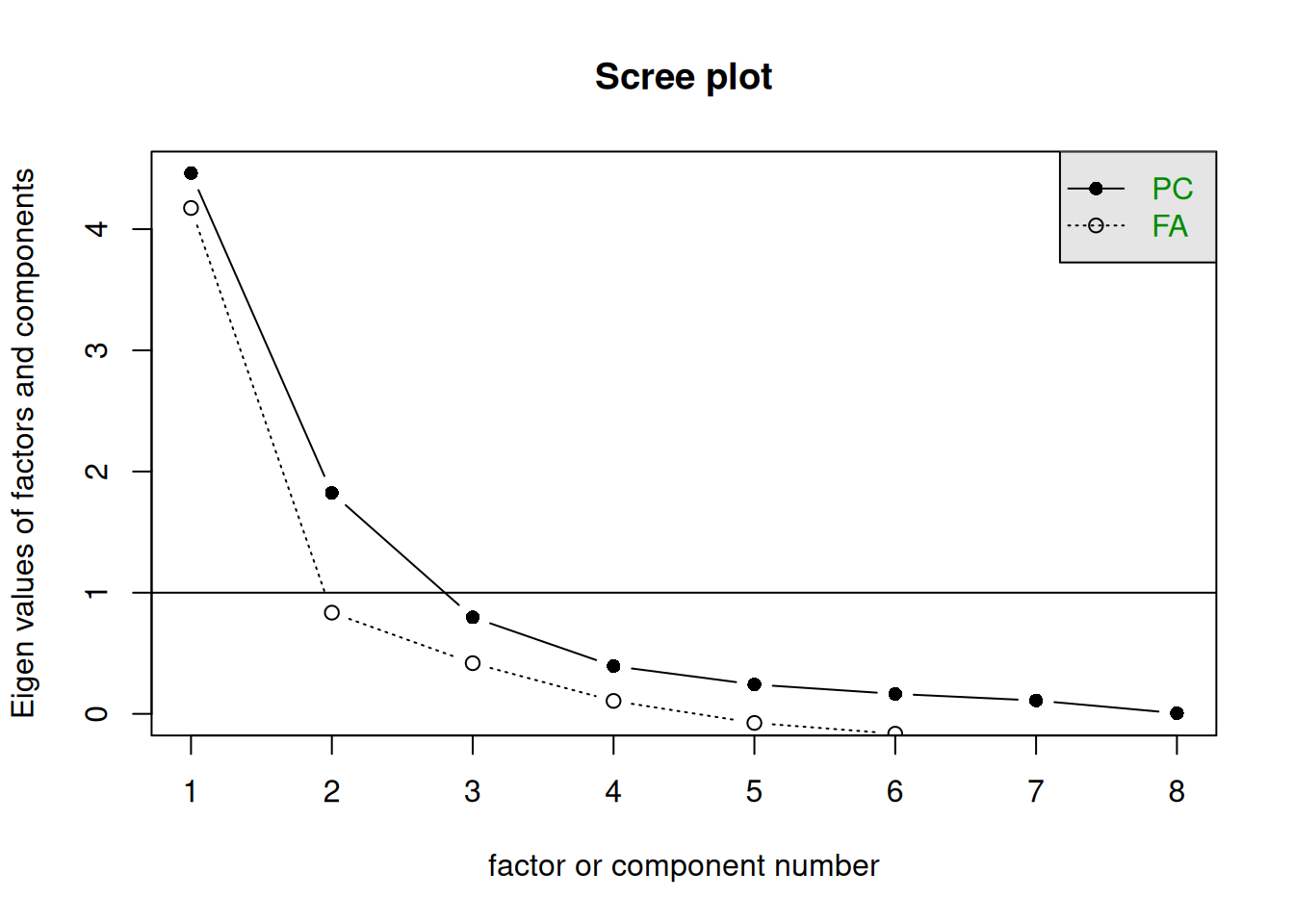
A typical scree plot features higher variances for the initial components and quickly drops to small variances where the line is almost flat. The flat part represents the noise components, which are not able to capture the main sources of variability in the system.
According to the scree plot criterion, we should keep as many principal components as where the “elbow” in the plot occurs. By elbow we mean the point where the line flattens out.
NOTE: Scree plots are subjective and may have multiple or no obvious kinks/elbows, making them hard to interpret
The Minimum Average Partial (MAP) test computes the partial correlation matrix (removing and adjusting for a component from the correlation matrix), sequentially partialling out each component. At each step, the partial correlations are squared and their average is computed.
At first, the components which are removed will be those that are most representative of the shared variance between 2+ variables, meaning that the “average squared partial correlation” will decrease. At some point in the process, the components being removed will begin represent variance that is specific to individual variables, meaning that the average squared partial correlation will increase.
The MAP method is to keep the number of components for which the average squared partial correlation is at the minimum.
We can conduct MAP in R using the code below. (be aware there is a lot of other information in this output too! For now just focus on the map column)
VSS(physfunc, plot = FALSE, method="pc", n = ncol(physfunc))
Very Simple Structure
Call: vss(x = x, n = n, rotate = rotate, diagonal = diagonal, fm = fm,
    n.obs = n.obs, plot = plot, title = title, use = use, cor = cor,
    method = "pc")
VSS complexity 1 achieves a maximimum of 0.95  with  2  factors
VSS complexity 2 achieves a maximimum of 0.98  with  3  factors

The Velicer MAP achieves a minimum of 0.14  with  1  factors
BIC achieves a minimum of  133  with  4  factors
Sample Size adjusted BIC achieves a minimum of  140  with  4  factors

Statistics by number of factors
  vss1 vss2  map dof   chisq     prob sqresid  fit RMSEA BIC SABIC complex
1 0.82 0.00 0.14  20 1.1e+03 6.9e-211   4.330 0.82  0.49 947  1011     1.0
2 0.95 0.96 0.15  13 8.0e+02 2.6e-162   1.069 0.96  0.52 729   770     1.0
3 0.69 0.98 0.19   7 5.1e+02 5.7e-107   0.376 0.98  0.57 477   499     1.4
4 0.67 0.93 0.28   2 1.4e+02  5.4e-32   0.234 0.99  0.57 133   140     1.5
5 0.66 0.84 0.43  -2 3.6e+01       NA   0.101 1.00    NA  NA    NA     1.7
6 0.66 0.78 0.83  -5 2.5e-03       NA   0.057 1.00    NA  NA    NA     1.7
7 0.66 0.78 1.00  -7 6.6e-04       NA   0.043 1.00    NA  NA    NA     1.7
8 0.66 0.78   NA  -8 6.6e-04       NA   0.043 1.00    NA  NA    NA     1.7
   eChisq    SRMR eCRMS  eBIC
1 3.7e+02 1.7e-01 0.205 263.5
2 6.9e+01 7.5e-02 0.110  -1.4
3 1.1e+01 3.0e-02 0.060 -26.6
4 1.8e+00 1.2e-02 0.046  -8.9
5 1.2e-02 9.9e-04    NA    NA
6 1.1e-06 9.6e-06    NA    NA
7 6.1e-08 2.2e-06    NA    NA
8 6.1e-08 2.2e-06    NA    NA
NOTE: The MAP method will sometimes tend to under-extract (suggest too few components)
Parallel analysis involves simulating lots of datasets of the same dimension but in which the variables are uncorrelated. For each of these simulations, a PCA is conducted on its correlation matrix, and the eigenvalues are extracted. We can then compare our eigenvalues from the PCA on our actual data to the average eigenvalues across these simulations. In theory, for uncorrelated variables, no components should explain more variance than any others, and eigenvalues should be equal to 1. In reality, variables are rarely truly uncorrelated, and so there will be slight variation in the magnitude of eigenvalues simply due to chance. The parallel analysis method suggests keeping those components for which the eigenvalues are greater than those from the simulations.
It can be conducted in R using:
fa.parallel(physfunc, fa="pc", n.iter = 500)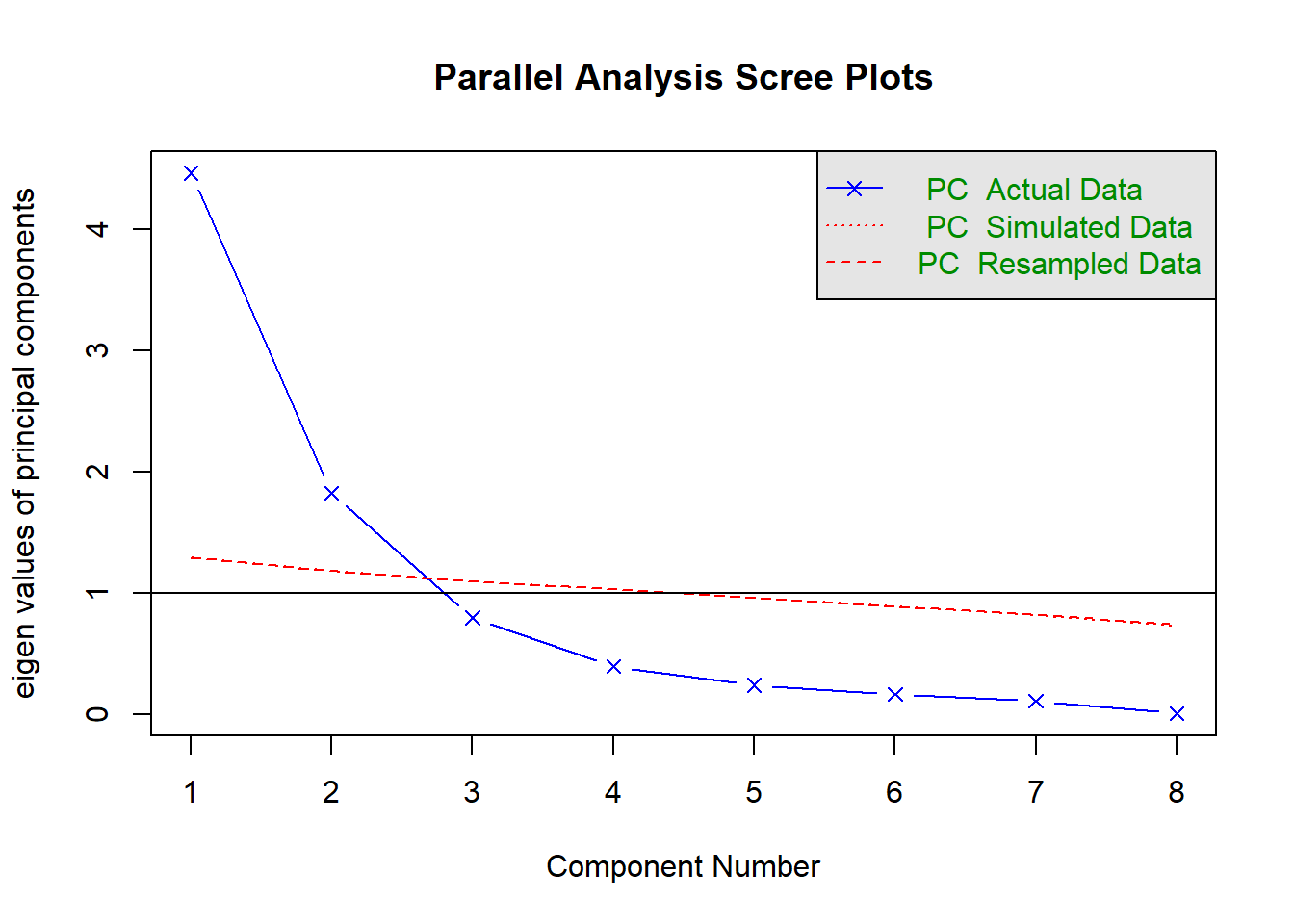
Parallel analysis suggests that the number of factors = NA and the number of components = 2 NOTE: Parallel analysis will sometimes tend to over-extract (suggest too many components)
Retaining \(P\) Components
Based on the set of criteria, we then make a decision on how many components we will keep.
Sometimes, there may also be pragmatic reasons for keeping a certain number (e.g. if you want specifically 1 dimension, you may be willing to accept a lower proportion of explained variance).
It’s a common thing to see disagreement between the methods to determine how many components we keep, and ultimately this is a decision that we as researchers have to make and explain.
For the Physical Functioning data we’ve got here, we have some different suggestions:
| method | recommendation | note |
|---|---|---|
| explaining >80% variance | keep 3 components | |
| kaiser’s rule | keep 2 components | |
| scree plot | keep 1/2/3 components | subjective |
| MAP | keep 1 component | tends to underextract |
| parallel analysis | keep 2 components | tends to overextract |
In part we should also remember what our ultimate aim is in doing PCA. It might be that I literally do want just one single measure of physical functioning - not 2, or 3, or 8. If that’s the case, then that can factor in to this decision making too, and give me extra reason to keep just 1 component.
The five selection criteria above suggest to me either retaining 1 or 2 components. Given my reading of the scree plot, I’m going to keep 2. But it’s important to note that this while solution explains a reasonable proportion of the variance (79%), we are ultimately losing 21% of the variability in our measurements. If we’re not happy with that, then we should keep more components.
We’ve made our decision, let’s now do our PCA and retain just the 2 components:
physPCA2 <- principal(physfunc, nfactors = 2,
                      rotate = "none")
Examining loadings
Let’s have a look at the selected principal components:
physPCA2$loadings
Loadings:
             PC1    PC2
mobility      0.889
balance       0.895
endurance    -0.115  0.951
flexibility   0.738
strength      0.833
coordination  0.877
fine_motor    0.919
respiratory          0.952

                 PC1   PC2
SS loadings    4.462 1.823
Proportion Var 0.558 0.228
Cumulative Var 0.558 0.786
As we know, our two components account for 79% of the total variability. The loadings for the first component are fairly similar for all variables except endurance and respiratory function. Conversely for the second component those two are the only variables with high loadings.
What we can start to think about is that these two components are essentially getting at two distinct aspects of “physical functioning”. The first component captures variability in all the variables that are loosely about “motor control” (i.e. how precise/strong/adaptable your muscle movements are). By contrast, the second component captures variability in two variables related to cardiovascular health (endurance and respiratory functioning).
So someone who does lots of yoga and climbing might score high on the first component but low on the second, whereas someone who does a lot of running might be the opposite.
We now focus our attention on the following question: Are all the observations well represented in the 2D plot?
The 2D representation of the original data, which comprise 8 measured variables, is an approximation and henceforth it may happen that not all units are well represented in this new space.
Typically, it is good to assess the approximation for each statistical unit by inspecting the scores on the discarded principal components. If a unit has a high score on those components, then this is a sign that the unit might be highly misplaced in the new space and misrepresented.
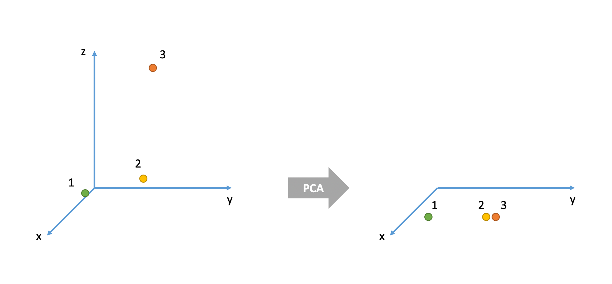
Consider the 3D example below. There are three cases (= units or individuals). In the original space they are all very different from each other. For example, cases 1 and 2 are very different in their x and y values, but very similar in their z value. Cases 2 and 3 are very similar in their x and y values but very different in their z value. Cases 1 and 3 have very different values for all three variables x, y, and z.
However, when represented in the 2D space given by the two principal components, units 2 and 3 seems like they are very similar when, in fact, they were very different in the original space which also accounted for the z variable.
We typically measure how badly a unit is represented in the new coordinate system by considering the sum of squared scores on the discarded principal components:
scores_discarded <- physPCA$scores[, -(1:2)]
sum_sq <- rowSums(scores_discarded^2)
Units with a high score should be considered for further inspection as it may happen that they are represented as close to another unit when, in fact, they might be very different.
boxplot(sum_sq)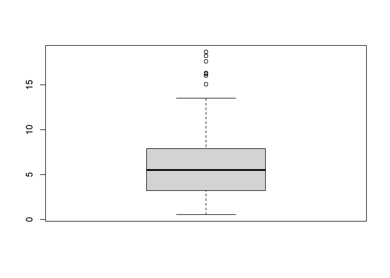
PCA scores
Now that we have decided to reduce our eight variables down to two principal components, we can, for each of our observations, get their scores on each of our components.
head(physPCA2$scores) PC1 PC2
[1,] 0.8441 -0.9183
[2,] 0.3018 -0.7338
[3,] 1.4056 -0.1059
[4,] -0.6217 -0.0871
[5,] -0.0558 1.9470
[6,] 0.2330 0.2594PCA scores are essentially weighted combinations of an individuals responses to the items.
\[
\text{score}_{\text{component j}} = w_{1j}x_1 + w_{2j}x_2 + w_{3j}x_3 +\, ... \, + w_{pj}x_p
\] Where \(w\) are the weights, \(x\) the variable scores.
The weights are calculated from the eigenvectors as \[ w_{ij} = \frac{a_{ij}}{\sqrt(\lambda_j)} \] where \(w_{ij}\) is the weight for a given variable \(i\) on component \(j\) , \(a_{ij}\) is the value from the eigenvector for item \(i\) on component \(j\) and \(\lambda_{j}\) is the eigenvalue for that component.
The correlations between the scores and the measured variables are what we saw in the “loadings” bit of the output:
# First PC
cor(physPCA2$scores[,1], physfunc)
mobility balance endurance flexibility strength coordination fine_motor
[1,] 0.889 0.895 -0.115 0.738 0.833 0.877 0.919
respiratory
[1,] -0.0749We can also visualise our observations (the people in our dataset) in the reduced space given by the retained principal component scores.
tibble(pc1 = physPCA2$scores[, 1],
      pc2 = physPCA2$scores[, 2]) %>%
ggplot(.,aes(x=pc1,y=pc2))+
geom_point()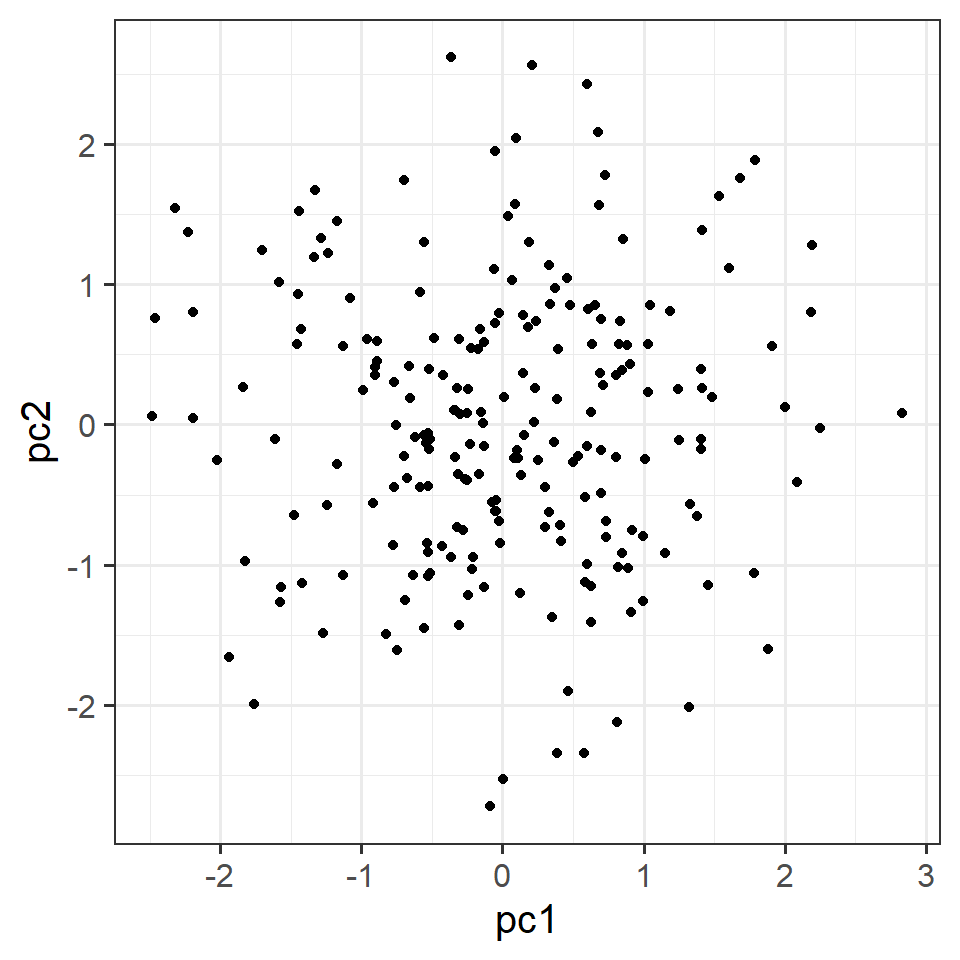
Now that we’ve got those scores, we can go and use them in some further analysis!
A visual intuition for PCA
Imagine we had 3 measured variables: y1, y2, and y3, as visualised in 3-dimensional space in Figure 1
The cloud of datapoints in Figure 1 has a shape - it is longer in one direction (sort of diagonally across y1 and y2), slightly shorter in another (across y3), and then quite narrow in another. You can imagine trying to characterise this shape as the ellipse in Figure 2
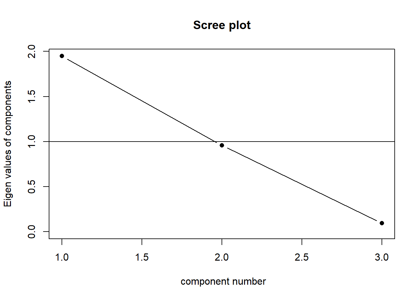
When faced with trying to characterise the shape of a 3-dimensional object, we might normally think about its length, width and depth. Imagine being given a ruler and being asked to give two numbers to provide a measurement of your smartphone. What do you pick? Chances are, you will measure its length and then its width. You’re likely to ignore the depth because it is much less than the other two dimensions. This is what PCA is doing. If we take three perpendicular dimensions, we can see that the shape in Figure 2 is longer in one dimension, then slightly shorter in another, and very short in another. These dimensions (seen in Figure 4) are our principal components! Our scree plot (indicating the amount of variance captured by each component) would look like Figure 3 - we can see that each dimension captures less and less of the variance.
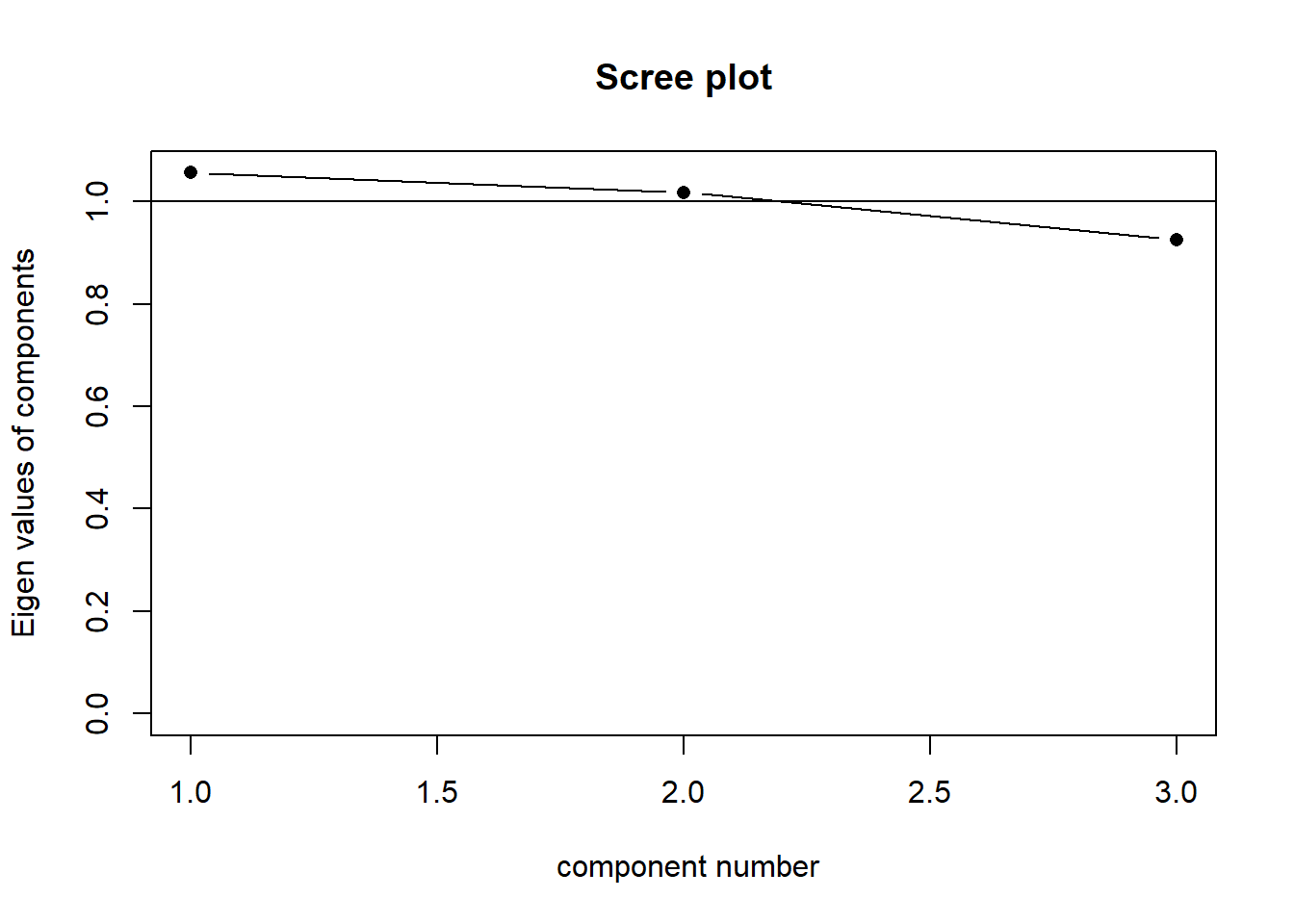
Our principal components capture sequentially the largest dimensions of the shape, which reflect where the most variance is. If there was no correlation between any of our observed variables (i.e. they’re all unrelated), then we would have a shape that was basically a sphere, and the no single dimension would capture much more variance than any other. This would look something like Figure 6. Our scree plot would look like Figure 5 - we can see that each component captures a similar amount.
The “loadings” we get out of a PCA reflect the amount to which each variable changes across the component. Try rotating the plots in Figure 7 and Figure 8, which show the first principal component and second principal component respectively. You will see that the first component (the black line) is much more closely linked to changes in y1 and y2 than it is to changes in y3. The second component is the opposite. This reflected in the relative weight of the loadings below!
Loadings:
   PC1    PC2    PC3
V1  0.967 -0.130 -0.217
V2  0.964 -0.155  0.216
V3  0.288  0.958

                 PC1   PC2   PC3
SS loadings    1.948 0.958 0.094
Proportion Var 0.649 0.319 0.031
Cumulative Var 0.649 0.969 1.000Footnotes
Even if we cut open someone’s brain, it’s unclear what we would be looking for in order to ‘measure’ it. It is unclear whether anxiety even exists as a physical thing, or rather if it is simply the overarching concept we apply to a set of behaviours and feelings.↩︎
The variables are all standardised, meaning they each have a variance of 1. \(8 \times 1 = 8\) so we can think of the total variance as 8!↩︎