| variable | description |
|---|---|
| patient | A patient code in which the labels take the form <Therapist initials>_<group>_<patient number>. |
| visit_0 | Score on the GAD7 at baseline |
| visit_1 | GAD7 at 1 month assessment |
| visit_2 | GAD7 at 2 month assessment |
| visit_3 | GAD7 at 3 month assessment |
| visit_4 | GAD7 at 4 month assessment |
W3 Exercises: Nested and Crossed Structures
Psychoeducation Treatment Effects
Data: gadeduc.csv
This is synthetic data from a randomised controlled trial, in which 30 therapists randomly assigned patients (each therapist saw between 2 and 28 patients) to a control or treatment group, and monitored their scores over time on a measure of generalised anxiety disorder (GAD7 - a 7 item questionnaire with 5 point likert scales).
The control group of patients received standard sessions offered by the therapists. For the treatment group, 10 mins of each sessions was replaced with a specific psychoeducational component, and patients were given relevant tasks to complete between each session. All patients had monthly therapy sessions. Generalised Anxiety Disorder was assessed at baseline and then every visit over 4 months of sessions (5 assessments in total).
The data are available at https://uoepsy.github.io/data/lmm_gadeduc.csv
You can find a data dictionary below:
Question 1
Uh-oh… these data aren’t in the same shape as the other datasets we’ve been giving you..
Can you get it into a format that is ready for modelling?
Hints
- It’s wide, and we want it long.
- Once it’s long. “visit_0”, “visit_1”,.. needs to become the numbers 0, 1, …
- One variable (
patient) contains lots of information that we want to separate out. There’s a handy function in the tidyverse calledseparate(), check out the help docs!
Question 2
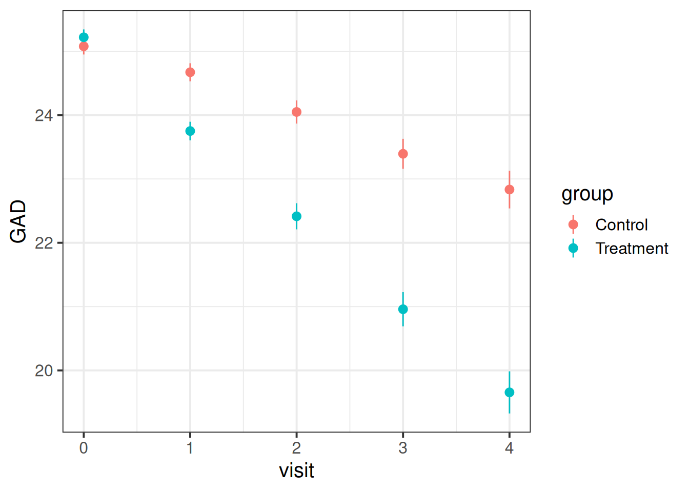
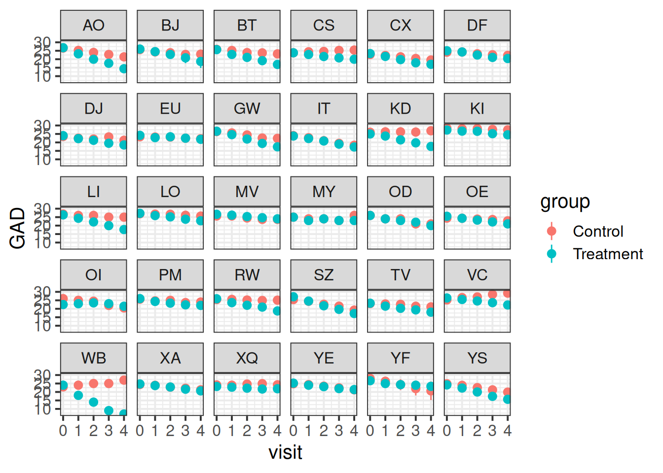
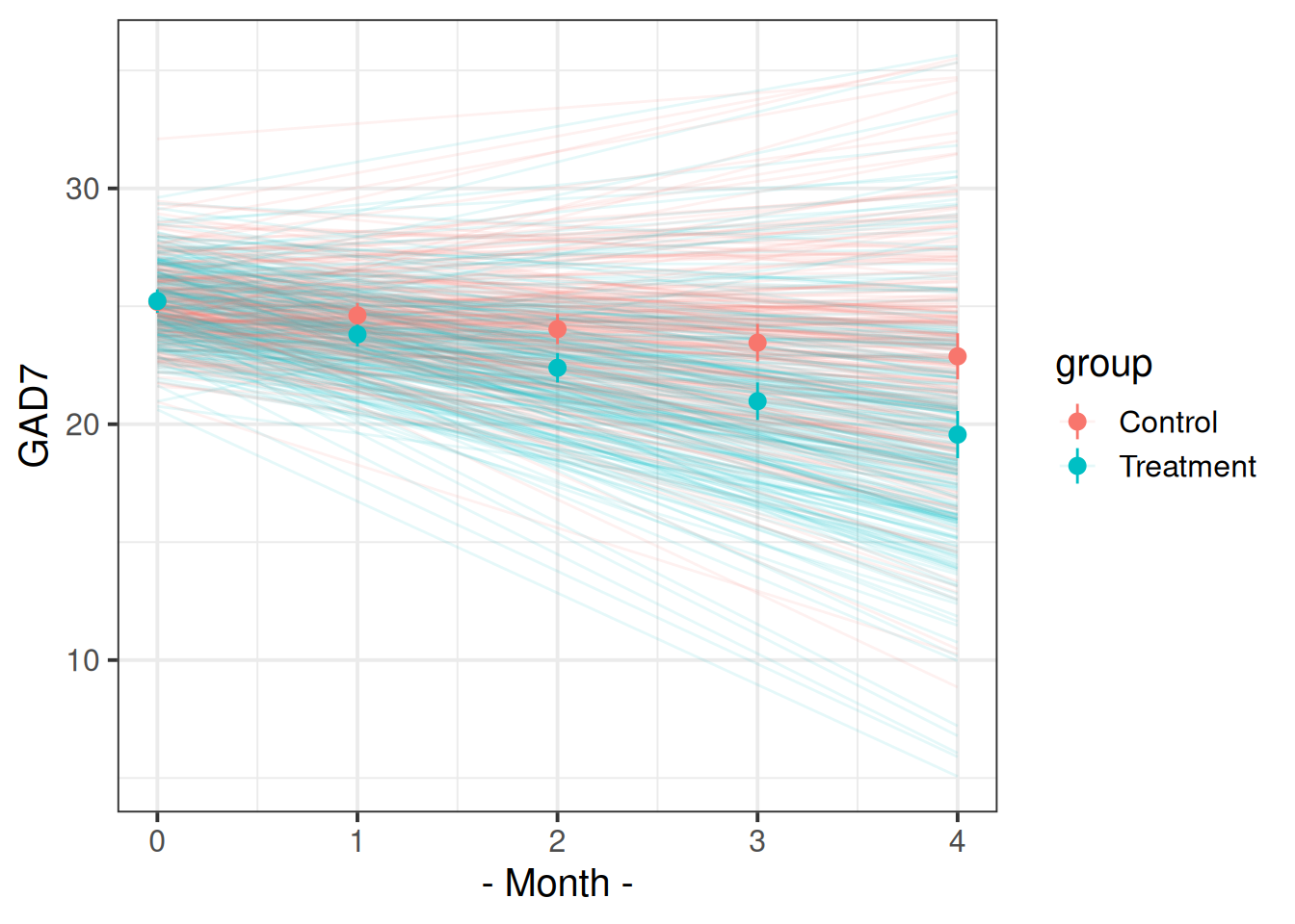
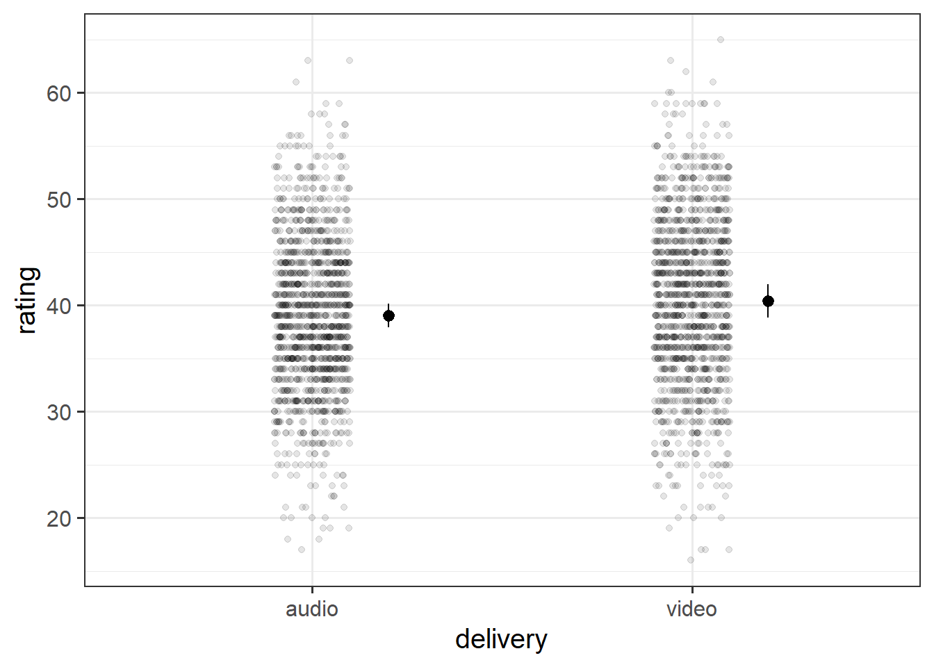
Visualise the data. Does it look like the treatment had an effect?
Does it look like it worked for every therapist?
Hints
- remember,
stat_summary()is very useful for aggregating data inside a plot.
Question 3
Fit a model to test if the psychoeducational treatment is associated with greater improvement in anxiety over time.
Question 4
For each of the models below, what is wrong with the random effect structure?
modelA <- lmer(GAD ~ visit*group +
               (1+visit*group|therapist)+
               (1+visit|patient),
             geduc_long)
modelB <- lmer(GAD ~ visit*group +
(1+visit*group|therapist/patient),
geduc_long)
Question 5
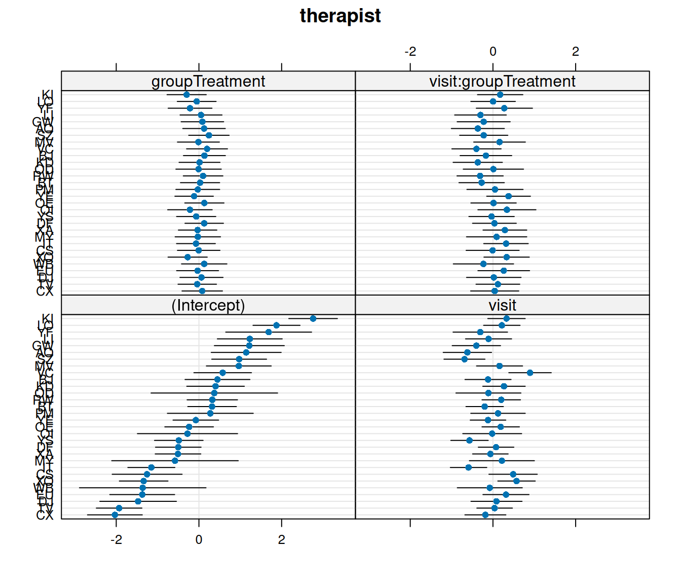
Let’s suppose that I don’t want the psychoeducation treatment, I just want the standard therapy sessions that the ‘Control’ group received. Which therapist should I go to?
Hints
dotplot.ranef.mer() might help here!
You can read about ranef in Chapter 2 #making-model-predictions.
Question 6
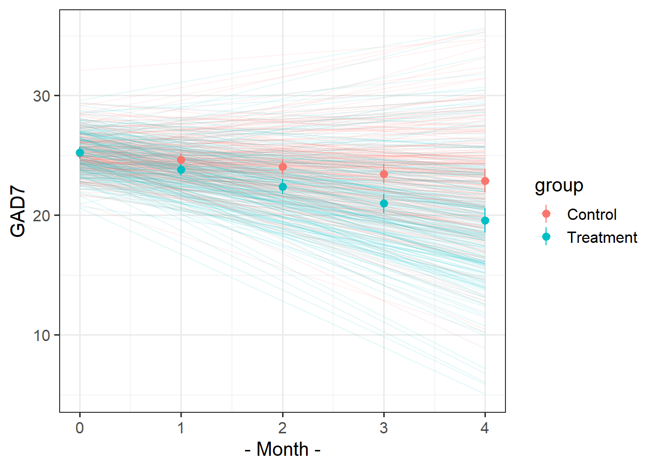
Recreate this plot.
The faint lines represent the model estimated lines for each patient. The points and ranges represent our fixed effect estimates and their uncertainty.
Hints
- you can get the patient-specific lines using
augment()from the broom.mixed package, and the fixed effects estimates using the effects package. - remember that the “patient” column doesn’t group observations into unique patients.
- remember you can pull multiple datasets into ggplot:
ggplot(data = dataset1, aes(x=x,y=y)) +
  geom_point() + # points from dataset1
geom_line(data = dataset2) # lines from dataset2- see more in Chapter 2 #visualising-models
Jokes
Data: lmm_laughs.csv
These data are simulated to imitate an experiment that investigates the effect of visual non-verbal communication (i.e. gestures, facial expressions) on joke appreciation. 90 Participants took part in the experiment, in which they each rated how funny they found a set of 30 jokes. For each participant, the order of these 30 jokes was randomly set for each run of the experiment. For each participant, the set of jokes was randomly split into two halves, with the first half being presented in audio-only, and the second half being presented in audio and video. This meant that each participant saw 15 jokes with video and 15 without, and each joke would be presented in with video roughly half of the times it was seen.
The researchers want to investigate whether the delivery (audio/audiovideo) of jokes is associated with differences in humour-ratings.
Data are available at https://uoepsy.github.io/data/lmm_laughs.csv
| variable | description |
|---|---|
| ppt | Participant Identification Number |
| joke_label | Joke presented |
| joke_id | Joke Identification Number |
| delivery | Experimental manipulation: whether joke was presented in audio-only ('audio') or in audiovideo ('video') |
| rating | Humour rating chosen on a slider from 0 to 100 |
Question 7
Prior to getting hold of any data or anything, we should be able to write out the structure of our ideal “maximal” model.
Can you do so?
Hints
Don’t know where to start? Try following the steps in Chapter 8 #maximal-model.
Question 8
Read in and clean the data (if necessary).
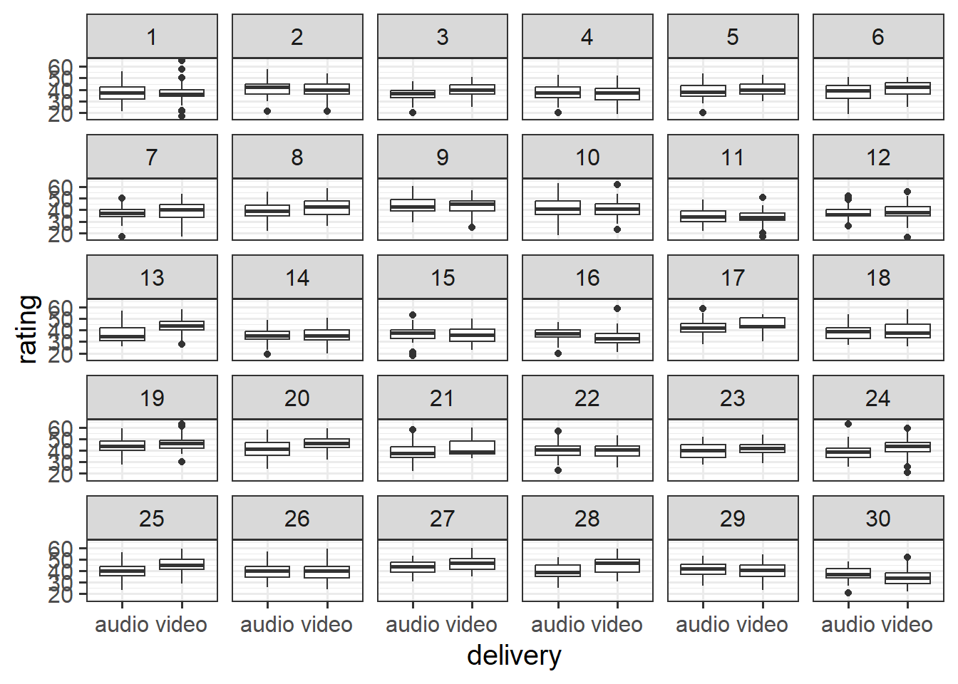
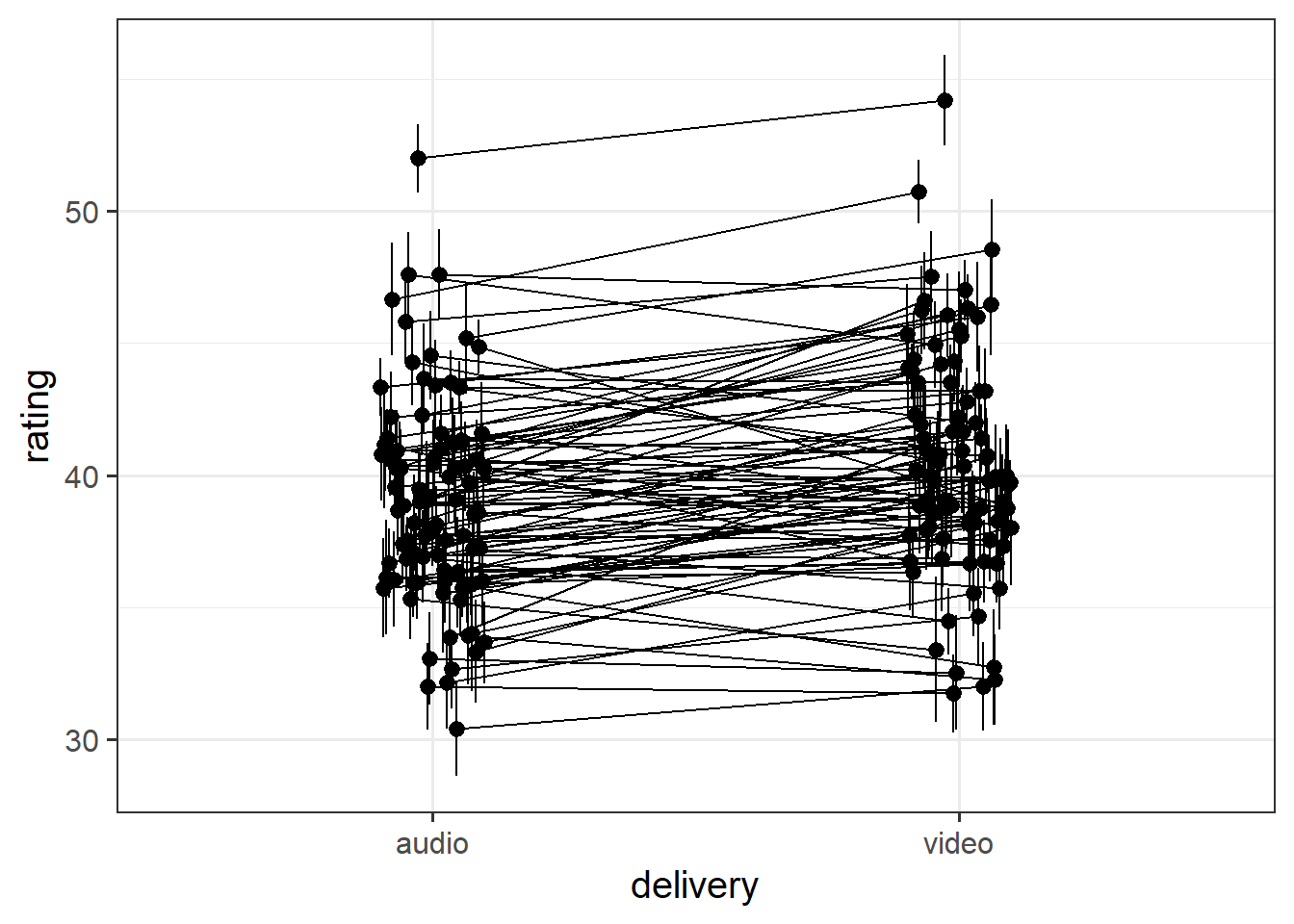
Create some plots showing:
- the average rating for audio vs audio+video for each joke
- the average rating for audio vs audio+video for each participant
Hints
- you could use
facet_wrap, or evenstat_summary!
- you might want to use
joke_id, rather thanjoke_label(the labels are very long!)
Question 9
Fit an appropriate model to address the research aims of the study.
Hints
This should be the one you came up with a couple of questions ago!
Question 10
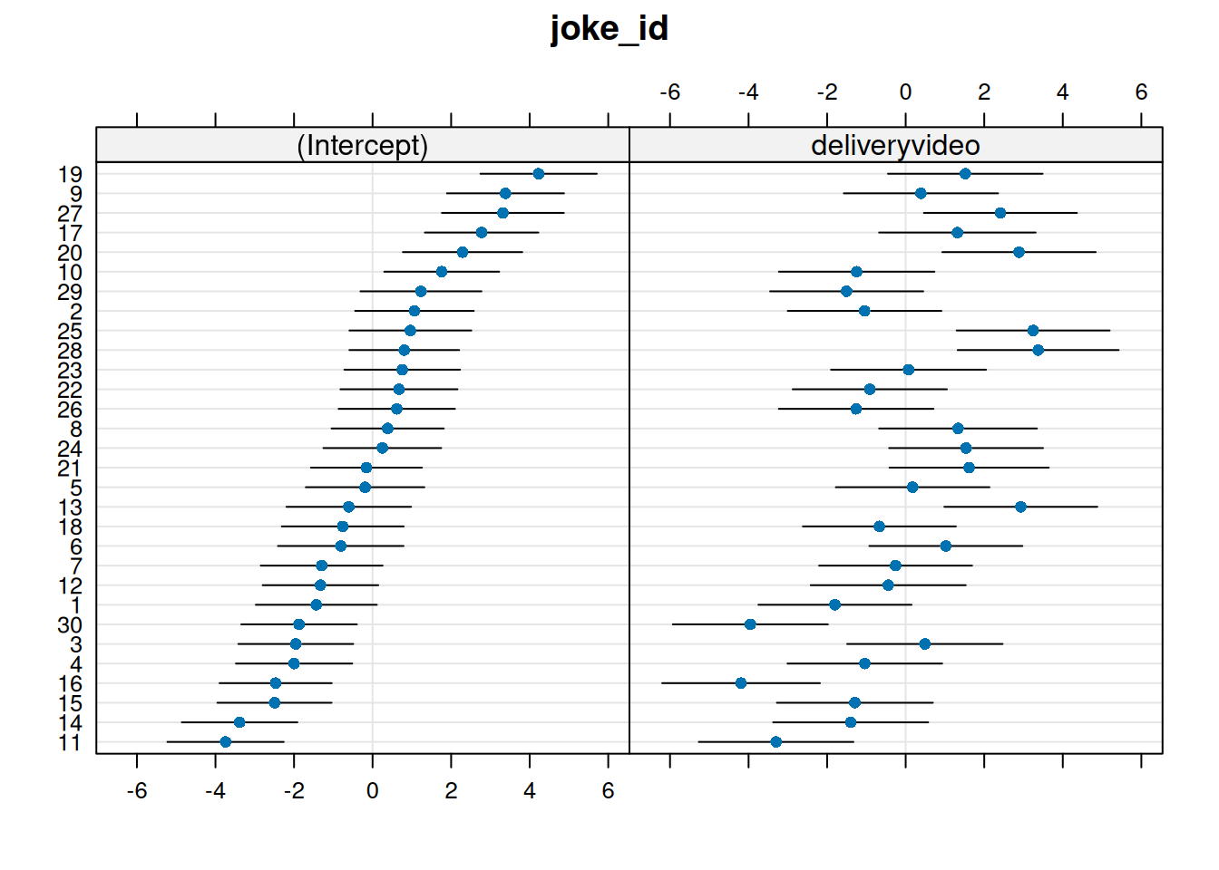
Which joke is funniest when presented just in audio? For which joke does the video make the most difference to ratings?
Hints
These can all be answered by examining the random effects with ranef().
See Chapter 2 #making-model-predictions.
If you’re using joke_id, can you find out the actual joke that these correspond to?
Question 11
Do jokes that are rated funnier when presented in audio-only tend to also benefit more from the addition of video?
Hints
Think careful about this question. The random effects show us that jokes vary in their intercepts (ratings in audio-only) and in their effects of delivery (the random slopes). We want to know if these are related..
Question 12
Create a plot of the estimated effect of video on humour-ratings. Try to plot not only the fixed effects, but the raw data too.
Hints
See e.g. Chapter 2 #visualising-models
Extra: Test Enhanced Learning
Data: Test-enhanced learning
An experiment was run to conceptually replicate “test-enhanced learning” (Roediger & Karpicke, 2006): two groups of 25 participants were presented with material to learn. One group studied the material twice (StudyStudy), the other group studied the material once then did a test (StudyTest). Recall was tested immediately (one minute) after the learning session and one week later. The recall tests were composed of 175 items identified by a keyword (Test_word).
The critical (replication) prediction is that the StudyStudy group perform better on the immediate test, but the StudyTest group will retain the material better and thus perform better on the 1-week follow-up test.
Test performance is measured as the speed taken to correctly recall a given word.
The following code loads the data into your R environment by creating a variable called tel:
load(url("https://uoepsy.github.io/data/testenhancedlearning.RData"))| variable | description |
|---|---|
| Subject_ID | Unique Participant Identifier |
| Group | Group denoting whether the participant studied the material twice (StudyStudy), or studied it once then did a test (StudyTest) |
| Delay | Time of recall test ('min' = Immediate, 'week' = One week later) |
| Test_word | Word being recalled (175 different test words) |
| Correct | Whether or not the word was correctly recalled |
| Rtime | Time to recall word (milliseconds) |
Question 13
Here is the beginning of our modelling.
Code
# load in the data
load(url("https://uoepsy.github.io/data/testenhancedlearning.RData"))

# performance is measured by time taken to *correctly*
# recall a word.
# so we're going to have to discard all the incorrects:
tel <- tel |> filter(Correct == 1)

# preliminary plot
# makes it look like studytest are better at immediate (contrary to prediction)
# both groups get slower from immediate > week,
# but studystudy slows more than studytest
ggplot(tel, aes(x = Delay, y = Rtime, col = Group)) +
  stat_summary(geom="pointrange")

mmod <- lmer(Rtime ~ Delay*Group +
             (1 + Delay | Subject_ID) +
             (1 + Delay * Group | Test_word),
             data=tel)
Footnotes
if it does, head back to where we learned about interactions in the single level regressions
lm(). It’s just the same here.↩︎