Numerical Data
Preliminaries
- Be sure to check the solutions to last week’s exercises. You can still ask any questions about previous weeks’ materials if things aren’t clear!
Open Rstudio, make sure you have the USMR project open, and create a new R Script (giving it a title for this topic).
Make sure you regularly save the R scripts you are writing in, and it might help to close the ones from previous topics to make your RStudio experience less busy. You should still be able to see in the bottom right window of RStudio, there is a “Files” tab. When this is open, you are able to see the various files within your project.
Tidyverse and pipes!
Before we get started on the statistics, we’re going to briefly introduce a crucial bit of R code.
We have seen already seen a few examples of R code such as:
# show the dimensions of the data
dim(somedata)
# show the frequency table of values in a variable
table(somedata$somevariable)
And we have seen how we might wrap functions inside functions:
barplot(table(somedata$somevariable))R evaluates code from the inside-out!
You can end up with functions inside functions inside functions …
# Don't worry about what all these functions do,
# it's just an example -
round(mean(log(cumsum(diff(1:10)))))
Piping
We can write in a different style, however, and this may help to keep code tidy and easily readable - we can write sequentially:
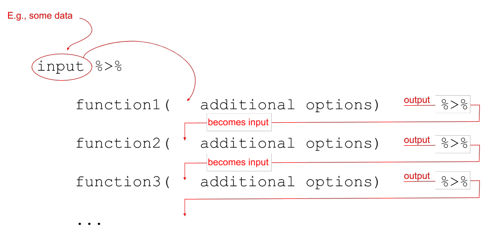
Notice that what we are doing is using a new symbol: %>%
This symbol takes the output of whatever is on it’s left-hand side, and uses it as an input for whatever is on the right-hand side.
The %>% symbol gets called a “pipe.”
Let’s see it in action with the starwars2 dataset from the previous lab. First we need to load the tidyverse packages, because that is where %>% and read_csv() are found.
library(tidyverse)
starwars2 <- read_csv("https://uoepsy.github.io/data/starwars2.csv")
Reading data from a URL
Note that when you have a url for some data, such as https://uoepsy.github.io/data/starwars2.csv, you can read it in directly by giving functions like read_csv() the url inside quotation marks.
starwars2 %>%
    summary()
## name height hair_color eye_color
## Length:75 Min. : 79.0 Length:75 Length:75
## Class :character 1st Qu.:167.5 Class :character Class :character
## Mode :character Median :180.0 Mode :character Mode :character
## Mean :176.1
## 3rd Qu.:191.0
## Max. :264.0
## homeworld species
## Length:75 Length:75
## Class :character Class :character
## Mode :character Mode :character
##
##
## We can now write code that requires reading it from the inside-out:
barplot(table(starwars2$species))or which reads from left to right:
starwars2$species %>%
    table() %>%
    barplot()
Both of which do exactly the same thing! They create the plot below:
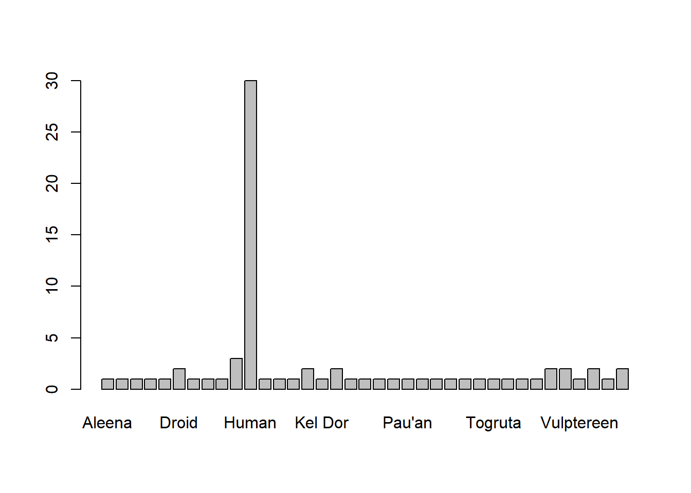
Similarly, that long line of code from above:
# again, don't worry about all these functions,
# just notice the difference in the two styles.
round(mean(log(cumsum(diff(1:10)))))
becomes:
1:10 %>%
    diff() %>%
    cumsum() %>%
    log() %>%
    mean() %>%
    round()
We’re going to use this way of writing a lot throughout the course, and it pairs really well with a group of functions in the tidyverse packages, which were designed to be used in conjunction with %>%:
select()extracts columns
filter()subsets data based on conditions
mutate()adds new variables
group_by()group related rows together
summarise()/summarize()reduces values down to a single summary
We introduce a couple of these in more detail in the refresher and exercises below.
Sampling
Copy the code below and explore what it does.
Note that tibble() is the tidyverse name for a data.frame().
If you want to get exactly the same data as this page, this is what the set.seed(1234) bit does. It basically means that all our randomly generated numbers (the rnorm bit) are the same.
library(tidyverse)
set.seed(1234)
simdata <-
  tibble(
    id = 1:10000,
    height = rnorm(10000, mean = 178, sd = 10)
  )

simdata
## # A tibble: 10,000 x 2
## id height
## <int> <dbl>
## 1 1 166.
## 2 2 181.
## 3 3 189.
## 4 4 155.
## 5 5 182.
## 6 6 183.
## 7 7 172.
## 8 8 173.
## 9 9 172.
## 10 10 169.
## # ... with 9,990 more rows
For now, let’s imagine that the 10,000 entries we created in simdata are the entire population of interest.
Calculate the mean height of the population.
mutate()
The mutate() function is used to add or modify variables to data.
# take the data
# %>%
# mutate it, such that there is a variable called "newvariable", which
# has the values of a variable called "oldvariable" multiplied by two.
data %>%
  mutate(
    newvariable = oldvariable * 2
  )
Note: Inside mutate(), we don’t have to keep using the dollar sign $, as we have already told it what data to look for variables in.
To ensure that our additions/modifications of variables are stored in R’s environment (rather than simply printed out), we need to reassign the name of our dataframe:
data <-
  data %>%
  mutate(
    ...
  )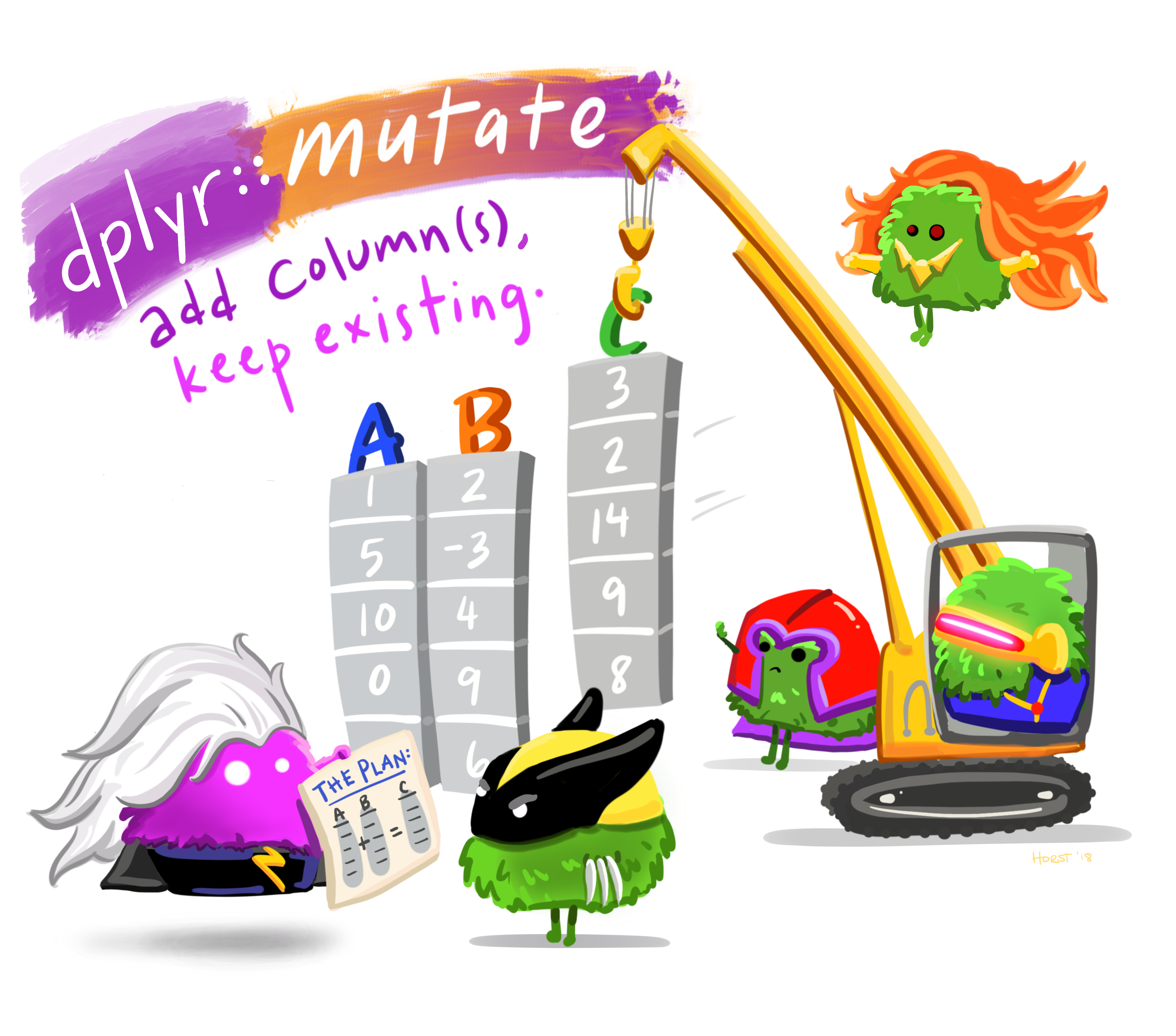
Figure 1: Artwork by @allison_horst
Add a new variable to simdata which is TRUE for those in the population who are over 6 foot (182.88cm) and FALSE for those who are under.
You can do this with or without using mutate(), why not see if you can do both?
Calculate the proportion of the population are over 6 foot?
In real life, we rarely have data on the entire population that we’re interested in. Instead, we collect a sample. Statistical inference is the use of a sample statistic to estimate a population parameter. For example, we can use the mean height from a sample of 20 as an estimate of the mean height of the population!
The thing is, samples vary. Using sample(), take a sample of size \(n=20\) from the simdata population.
Calculate the mean height of the sample.
Run the code a couple of times (each time you run sample() it will draw a new sample), to see how the mean of the samples vary.
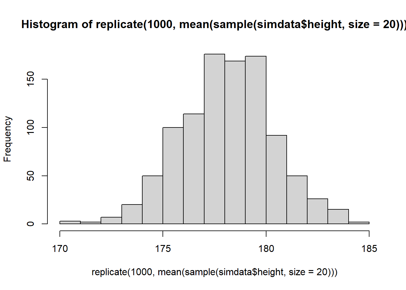
Using replicate(), calculate the means of 1000 samples of size \(n=20\) drawn randomly from the heights in simdata.
You can make a quick visualisation of the distribution of sample means using hist().
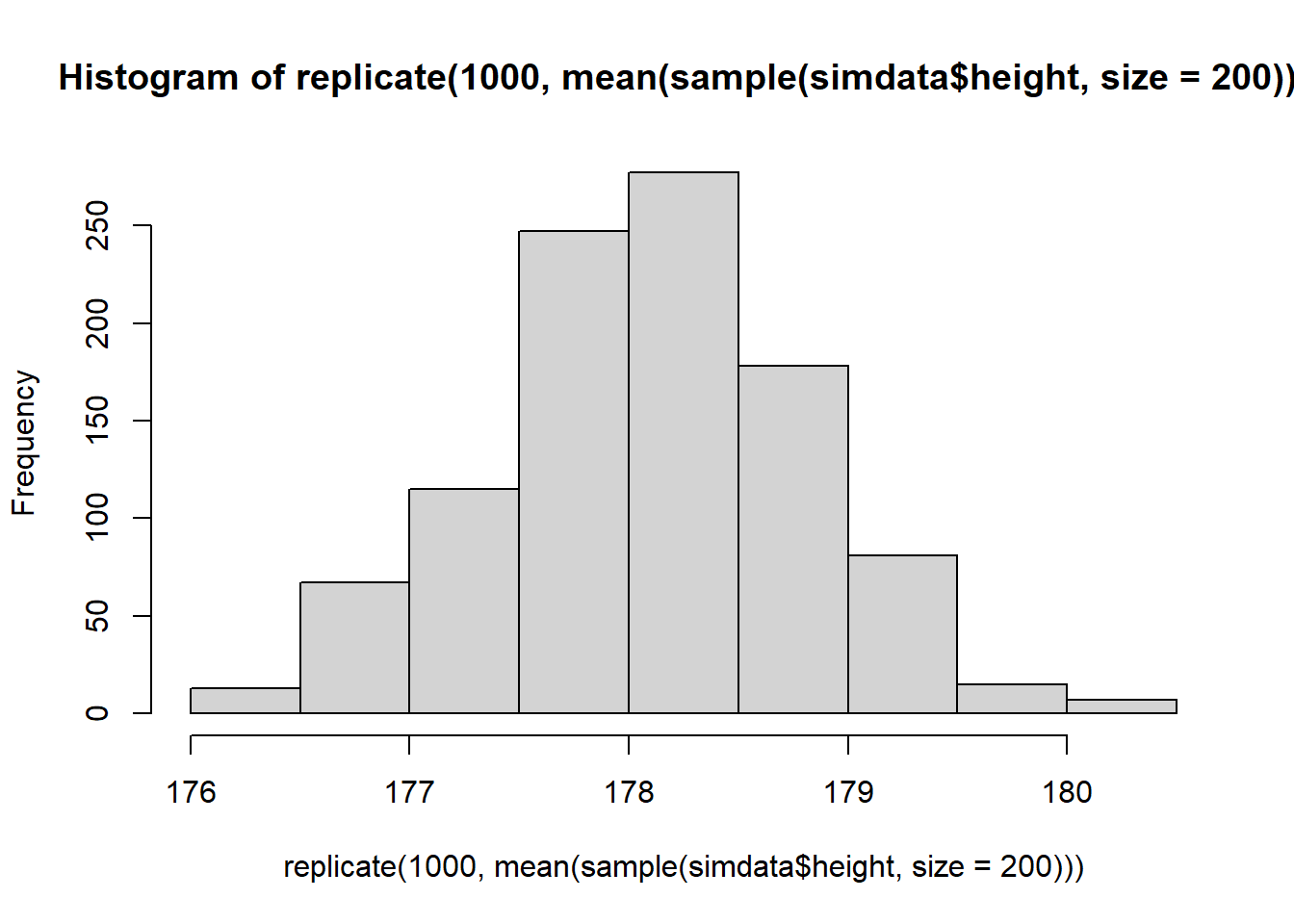
What happens to the shape of the distribution if you take 1000 means of samples of size \(n=200\), rather than \(n=20\)?
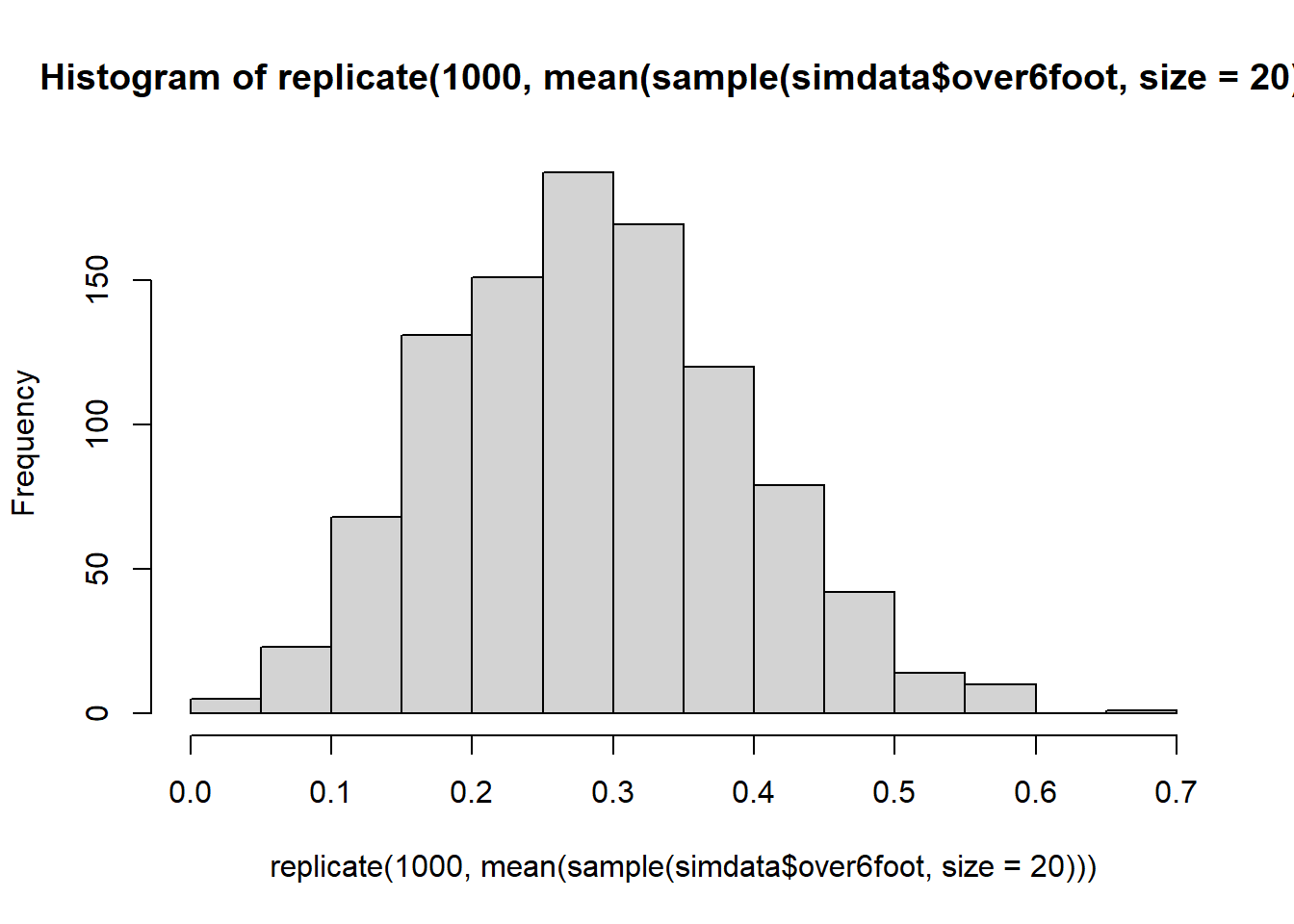
For 1000 samples of size \(n=20\), calculate the proportion of the sample which is over 6 foot. Plot the distribution of the 1000 sample proportions.
At what value would you expect the distribution to be centred?
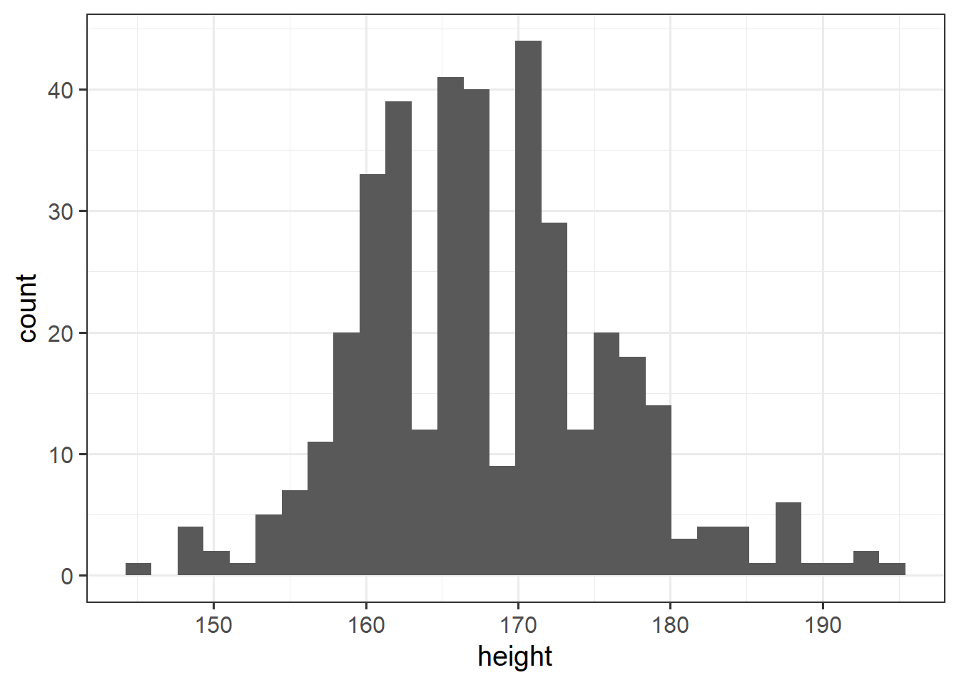
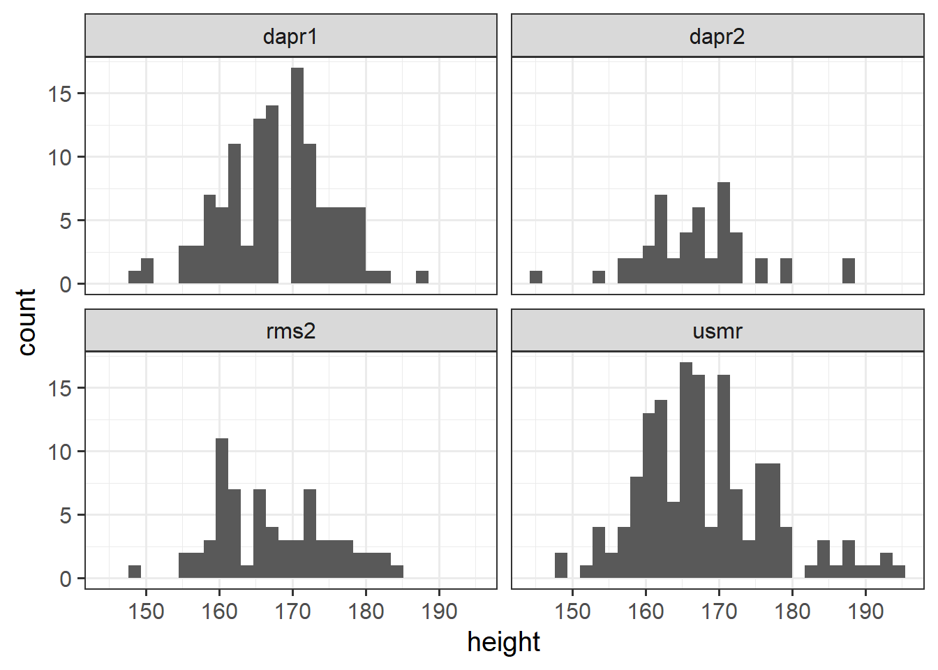
Plot the distribution of heights of you and your fellow students.
In the last couple of years during welcome week, we have asked students of the statistics courses in the Psychology department to fill out a little survey. Anonymised data are available at https://uoepsy.github.io/data/surveydata_allcourse.csv.
Can you think of how you might make a separate histogram for the distributions of heights in different courses?
Reading: Central Tendency and Spread
In the following examples, we are going to use some data on 120 participants’ IQ scores (measured on the Wechsler Adult Intelligence Scale (WAIS)), their ages, and their scores on 2 other tests.
The data are available at https://uoepsy.github.io/data/wechsler.csv
wechsler <- read_csv("https://uoepsy.github.io/data/wechsler.csv")
summary(wechsler)
## participant iq age test1
## Length:120 Min. : 58.00 Min. :20.00 Min. :30.00
## Class :character 1st Qu.: 88.00 1st Qu.:29.50 1st Qu.:45.75
## Mode :character Median :100.50 Median :37.00 Median :49.00
## Mean : 99.33 Mean :36.63 Mean :49.33
## 3rd Qu.:109.00 3rd Qu.:44.00 3rd Qu.:53.25
## Max. :137.00 Max. :71.00 Max. :67.00
## test2
## Min. : 2.00
## 1st Qu.:42.00
## Median :52.50
## Mean :51.24
## 3rd Qu.:62.00
## Max. :80.00Mode and median revisited
For categorical data there are two different measures of central tendency:
- Mode: The most frequent value (the value that occurs the greatest number of times).
- Median: The value for which 50% of observations a lower and 50% are higher. It is the mid-point of the values when they are rank-ordered.
We can apply these to categorical data, but we can also use them for numeric data.
| Mode | Median | Mean | |
|---|---|---|---|
| Nominal (unordered categorical) | ✔ | ✘ | ✘ |
| Ordinal (ordered categorical) | ✔ | ✔ | ? (you may see it sometimes for certain types of ordinal data - there’s no consensus) |
| Numeric Continuous | ✔ | ✔ | ✔ |
The mode of numeric variables is not frequently used. Unlike categorical variables where there are a distinct set of possible values which the data can take, for numeric variables, data can take a many more (or infinitely many) different values. Finding the “most common” is sometimes not possible.
The most frequent value (the mode) of the iq variable is 97:
# take the "wechsler" dataframe %>%
# count() the values in the "iq" variable (creates an "n" column), and
# from there, arrange() the data so that the "n" column is descending - desc()
wechsler %>%
    count(iq) %>%
    arrange(desc(n))
## # A tibble: 53 x 2
## iq n
## <dbl> <int>
## 1 97 7
## 2 108 6
## 3 92 5
## 4 103 5
## 5 105 5
## 6 110 5
## 7 85 4
## 8 99 4
## 9 107 4
## 10 113 4
## # ... with 43 more rowsRecall that the median is found by ordering the data from lowest to highest, and finding the mid-point. In the wechsler dataset we have IQ scores for 120 participants. We find the median by ranking them from lowest to highest IQ, and finding the mid-point between the \(60^{th}\) and \(61^{st}\) participants’ scores.
We can also use the median() function with which we are already familiar:
median(wechsler$iq)## [1] 100.5Mean
One of the most frequently used measures of central tendency for numeric data is the mean.
Mean: \(\bar{x}\)
The mean is calculated by summing all of the observations together and then dividing by the total number of obervations (\(n\)).
When we have sampled some data, we denote the mean of our sample with the symbol \(\bar{x}\) (sometimes referred to as “x bar”). The equation for the mean is:
\[\bar{x} = \frac{\sum\limits_{i = 1}^{n}x_i}{n}\]
We can do the calculation by summing the iq variable, and dividing by the number of observations (in our case we have 120 participants):
# get the values in the "iq" variable from the "wechsler" dataframe, and
# sum them all together. Then divide this by 120
sum(wechsler$iq)/120
## [1] 99.33333Or, more easily, we can use the mean() function:
mean(wechsler$iq)## [1] 99.33333Summarising variables
Functions such as mean(), median(), min() and max() can quickly summarise data, and we can use them together really easily in combination with summarise().
Summarise()
The summarise() function is used to reduce variables down to a single summary value.
# take the data %>%
# summarise() it, such that there is a value called "summary_value", which
# is the sum() of "variable1" column, and a value called
# "summary_value2" which is the mean() of the "variable2" column.
data %>%
  summarise(
    summary_value = sum(variable1),
    summary_value2 = mean(variable2)
  )
Note: Just like with mutate() we don’t have to keep using the dollar sign $, as we have already told it what dataframe to look for the variables in.
So if we want to show the mean IQ score and the mean age of our participants:
# take the "wechsler" dataframe %>%
# summarise() it, such that there is a value called "mean_iq", which
# is the mean() of the "iq" variable, and a value called
# "mean_age" which is the mean() of the "age" variable.
wechsler %>%
    summarise(
        mean_iq = mean(iq),
        mean_age = mean(age)
    )
## # A tibble: 1 x 2
## mean_iq mean_age
## <dbl> <dbl>
## 1 99.3 36.6Interquartile range
If we are using the median as our measure of central tendency and we want to discuss how spread out the spread are around it, then we will want to use quartiles (recall that these are linked: the \(2^{nd}\) quartile = the median).
We have already briefly introduced how for ordinal data, the 1st and 3rd quartiles give us information about how spread out the data are across the possible response categories. For numeric data, we can likewise find the 1st and 3rd quartiles in the same way - we rank-order all the data, and find the point at which 25% and 75% of the data falls below.
The difference between the 1st and 3rd quartiles is known as the interquartile range (IQR).
( Note, we couldn’t take the difference for ordinal data, because “difference” would not be quantifiable - the categories are ordered, but intervals between categories are unknown)
In R, we can find the IQR as follows:
IQR(wechsler$age)## [1] 14.5Alternatively, we can use this inside summarise():
# take the "wechsler" dataframe %>%
# summarise() it, such that there is a value called "median_age", which
# is the median() of the "age" variable, and a value called "iqr_age", which
# is the IQR() of the "age" variable.
wechsler %>%
  summarise(
    median_age = median(age),
    iqr_age = IQR(age)
  )
## # A tibble: 1 x 2
## median_age iqr_age
## <dbl> <dbl>
## 1 37 14.5Variance
If we are using the mean as our as our measure of central tendency, we can think of the spread of the data in terms of the deviations (distances from each value to the mean).
Recall that the mean is denoted by \(\bar{x}\). If we use \(x_i\) to denote the \(i^{th}\) value of \(x\), then we can denote deviation for \(x_i\) as \(x_i - \bar{x}\).
The deviations can be visualised by the red lines in Figure 2.

Figure 2: Deviations from the mean
The sum of the deviations from the mean, \(x_i - \bar x\), is always zero
\[ \sum\limits_{i = 1}^{n} (x_i - \bar{x}) = 0 \]
The mean is like a center of gravity - the sum of the positive deviations (where \(x_i > \bar{x}\)) is equal to the sum of the negative deviations (where \(x_i < \bar{x}\)).
Because deviations around the mean always sum to zero, in order to express how spread out the data are around the mean, we must we consider squared deviations.
Squaring the deviations makes them all positive. Observations far away from the mean in either direction will have large, positive squared deviations. The average squared deviation is known as the variance, and denoted by \(s^2\)
Variance: \(s^2\)
The variance is calculated as the average of the squared deviations from the mean.
When we have sampled some data, we denote the mean of our sample with the symbol \(\bar{x}\) (sometimes referred to as “x bar”). The equation for the variance is:
\[s^2 = \frac{\sum\limits_{i=1}^{n}(x_i - \bar{x})^2}{n-1}\]
We can get R to calculate this for us using the var() function:
wechsler %>%
  summarise(
    variance_iq = var(iq)
  )
## # A tibble: 1 x 1
## variance_iq
## <dbl>
## 1 238.Standard deviation
One difficulty in interpreting variance as a measure of spread is that it is in units of squared deviations. It reflects the typical squared distance from a value to the mean.
Conveniently, by taking the square root of the variance, we can translate the measure back into the units of our original variable. This is known as the standard deviation.
Standard Deviation: \(s\)
The standard deviation, denoted by \(s\), is a rough estimate of the typical distance from a value to the mean.
It is the square root of the variance (the typical squared distance from a value to the mean).
\[ s = \sqrt{\frac{\sum\limits_{i=1}^{n}(x_i - \bar{x})^2}{n-1}} \]
We can get R to calculate the standard deviation of a variable sd() function:
wechsler %>%
  summarise(
    variance_iq = var(iq),
    sd_iq = sd(iq)
  )
## # A tibble: 1 x 2
## variance_iq sd_iq
## <dbl> <dbl>
## 1 238. 15.4Visualising Distributions
Boxplots
Boxplots provide a useful way of visualising the interquartile range (IQR). You can see what each part of the boxplot represents in Figure 3.
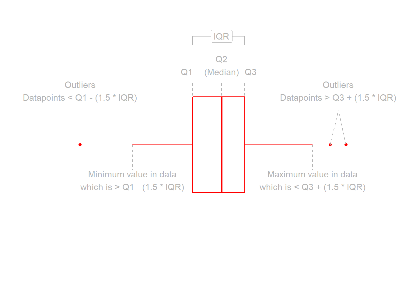
Figure 3: Anatomy of a boxplot
We can create a boxplot of our age variable using the following code:
# Notice, we put age on the x axis, making the box plot vertical.
# If we had set aes(y = age) instead, then it would simply be rotated 90 degrees
ggplot(data = wechsler, aes(x = age)) +
  geom_boxplot()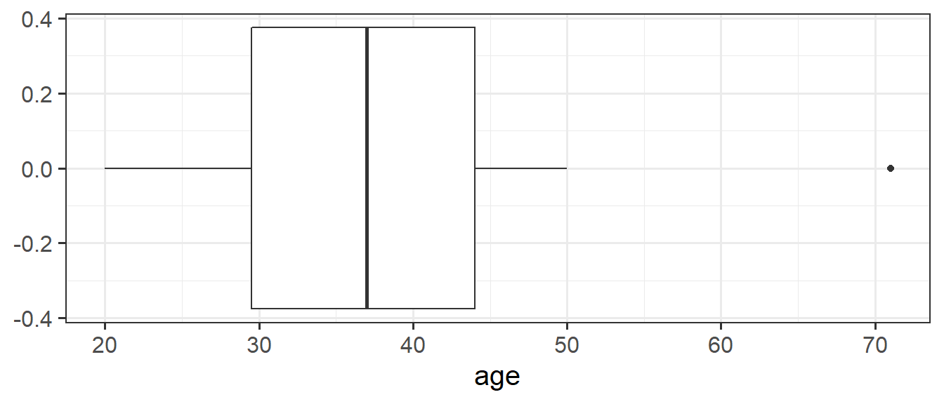
Histograms
Now that we have learned about the different measures of central tendency and of spread, we can look at how these influence visualisations of numeric variables.
We can visualise numeric data using a histogram, which shows the frequency of values which fall within bins of an equal width.
# make a ggplot with the "wechsler" data.
# on the x axis put the possible values in the "iq" variable,
# add a histogram geom (will add bars representing the count
# in each bin of the variable on the x-axis)
ggplot(data = wechsler, aes(x = iq)) +
geom_histogram()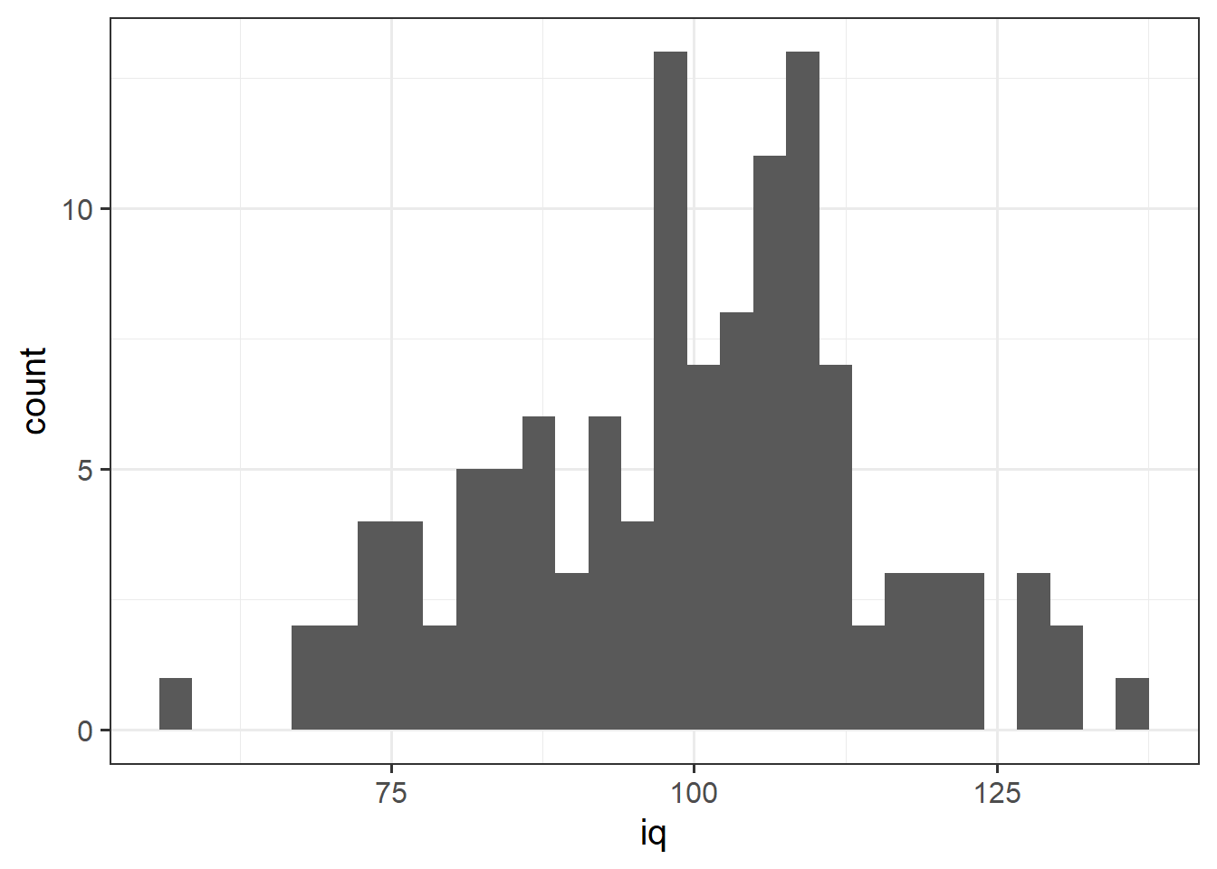 We can specifiy the width of the bins:
ggplot(data = wechsler, aes(x = iq)) +
  geom_histogram(binwidth = 5)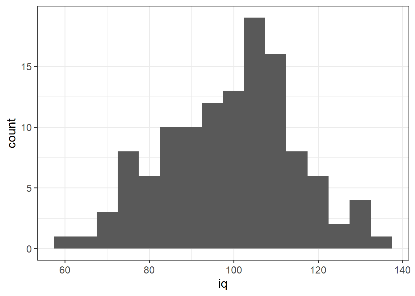
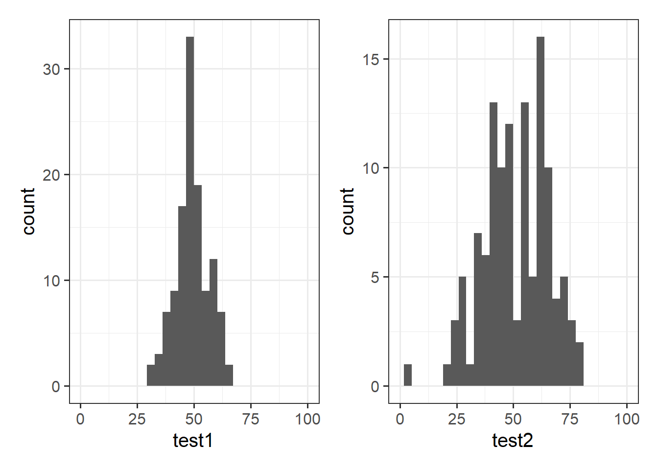
Let’s take a look at the means and standard deviations of participants’ scores on the other tests (the test1 and test2 variables):
wechsler %>%
  summarise(
    mean_test1 = mean(test1),
    sd_test1 = sd(test1),
    mean_test2 = mean(test2),
    sd_test2 = sd(test2)
  )
## # A tibble: 1 x 4
## mean_test1 sd_test1 mean_test2 sd_test2
## <dbl> <dbl> <dbl> <dbl>
## 1 49.3 7.15 51.2 14.4Tests 1 and 2 have similar means (around 50), but the standard deviation of Test 2 is almost double that of Test 1. We can see this distinction in the visualisation below - the histograms are centered at around the same point (50), but the one for Test 2 is a lot wider than that for Test 1.
Density curves
In addition to grouping numeric data into bins in order to produce a histogram, we can also visualise a density curve.
For the time being, you can think of the density as a bit similar to the notion of relative frequency, in that for a density curve, the values on the y-axis are scaled so that the total area under the curve is equal to 1. Because there are infinitely many values that numeric variables could take (e.g., 50, 50.1, 50.01, 5.001, …), we could group the data into infinitely many bins. In creating a curve for which the total area underneath is equal to one, we can use the area under the curve in a range of values to indicate the proportion of values in that range.
ggplot(data = wechsler, aes(x = iq)) +
  geom_density()+
  xlim(50,150)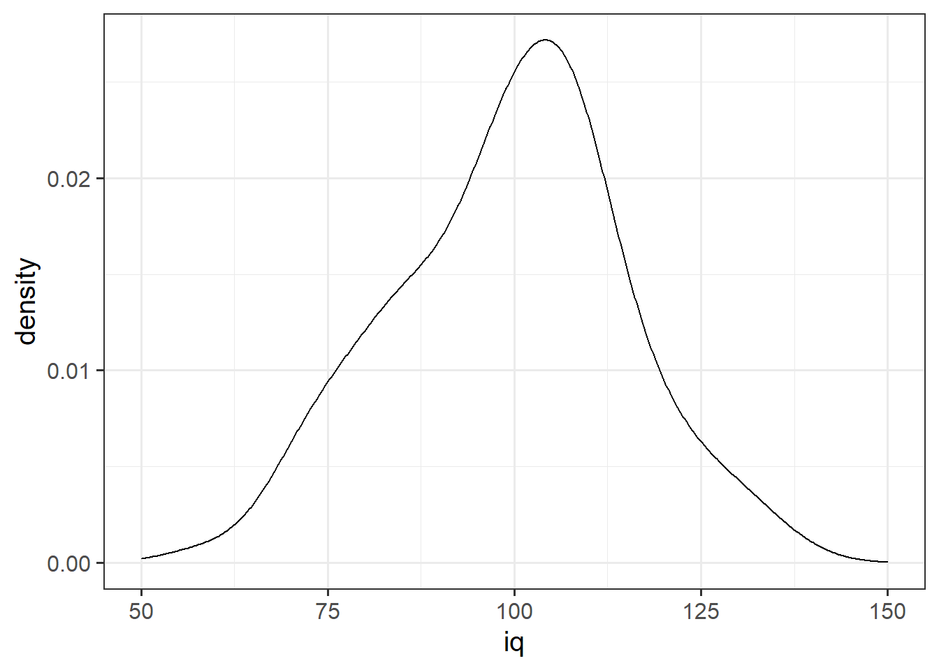
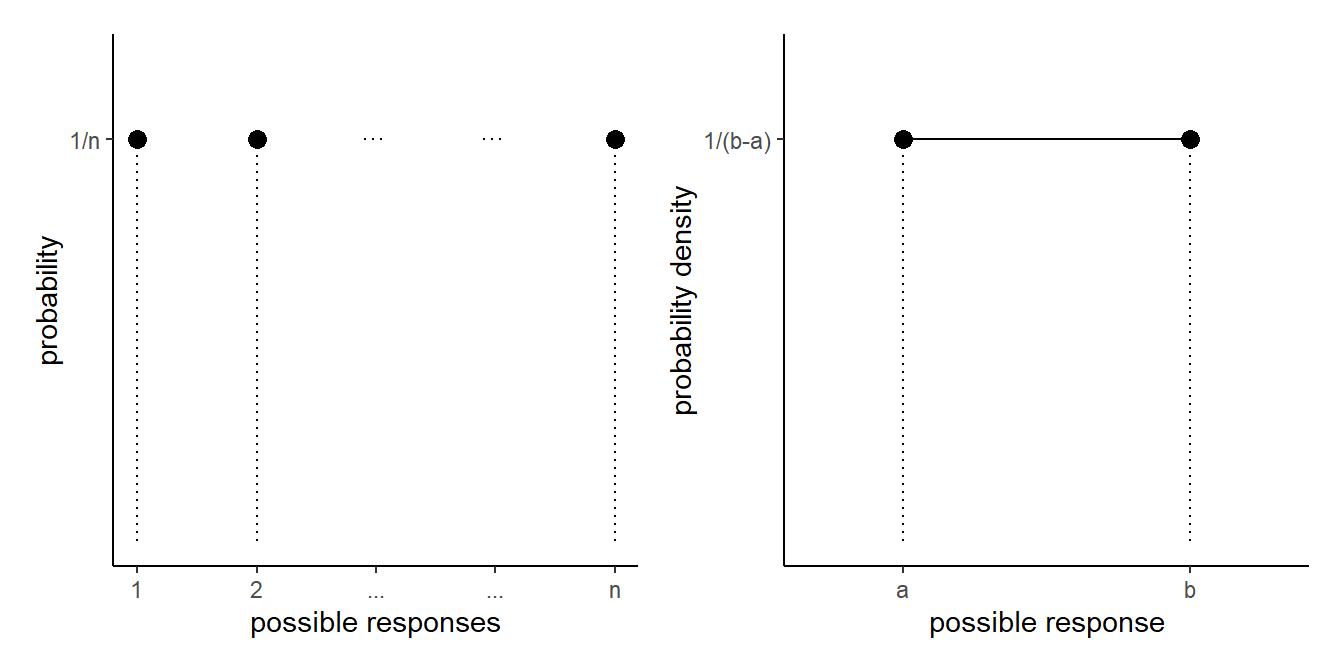
This idea may be familiar - think about what this looks like when there is an equal probability assigned to each value - it’s not a curve but is flat, and is known as the uniform distribution:
Skew
Skewness is a measure of asymmetry in a distribution. Distributions can be positively skewed or negatively skewed, and this influences our measures of central tendency and of spread to different degrees (see Figure 4).
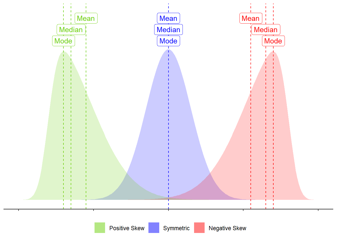
Figure 4: Skew influences the mean and median to different degrees.
Stroop Experiment Exercises
130 participants completed an online task in which they saw two sets of coloured words. Participants spoke out loud the colour of each word, and timed how long it took to complete each set. In the first set of words, the words matched the colours they were presented in (e.g., word “blue” was coloured blue). In the second set of words, the words mismatched the colours (e.g., the word “blue” was coloured red, see Figure 5). Participants’ recorded their times for each set (matching and mismatching).
Participants were randomly assigned to either do the task once only, or to record their times after practicing the task twice.
You can try out the experiment at https://faculty.washington.edu/chudler/java/ready.html.
The data are available at https://uoepsy.github.io/data/strooptask.csv

Figure 5: Stroop Task - Color word interference. Images from https://faculty.washington.edu/chudler/java/ready.html
Create a new heading for these exercises and read in the data. Be sure to assign it a clear name.
using summarise(), show the minimum, maximum, mean and median of the times taken to read the matching word set, and then do the same for the mismatching word set.
What we are interested in is the differences between these times. For someone who took 10 seconds for the matching set, and 30 seconds for the mismatching set, we want to record the difference of 20 seconds.
Create a new variable called stroop_effect which is the difference between the mismatching and matching variables.
Hint: Remember we can use the mutate() function to add a new variable. Recall also that we need to reassign this to the name of your dataframe, to make the changes appear in the environment (rather than just printing them out).
stroopdata <-
  stroopdata %>%
  mutate(
    ?? = ??
  )
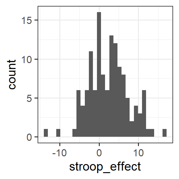
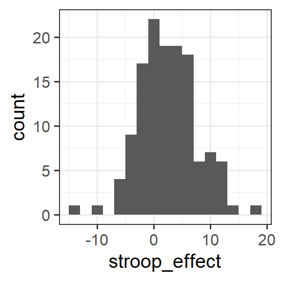
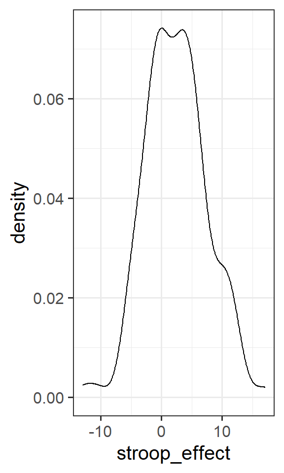
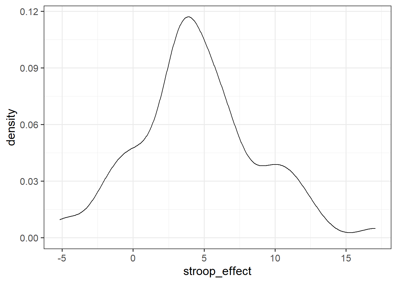
For the stroop_effect variable you just created, produce both a histogram and a density curve.
What is the more appropriate guess for the mean of this variable?
- 0
- 2
- 6
- 8
Introducing filter() and select()
We know how to use [] and $ in order to manipulate data by specifying rows/columns/conditions which we want to access:
# In the stroopdata dataframe, give me all the rows for which the
# condition stroopdata$practice=="no" is TRUE, and give me all the columns.
stroopdata[stroopdata$practice == "no", ]
In the tidyverse way of doing things, there are two functions which provide similar functionality - filter() and select().
They are designed to work well with the rest of tidyverse (e.g., mutate() and summarise()) and are often used in conjunction with the %>% operator to tell the functions where to find the variables (meaning we don’t need to use data$variable, we can just use the variable name)
filter()
The filter() function allows us to filter a dataframe down to those rows which meet a given condition. It will return all columns.
# take the data
# and filter it to only the rows where the "variable1" column is
# equal to "value1".
data %>%
  filter(variable1 == value1)
select()
The select() function allows us to choose certain columns in a dataframe. It will return all rows.
# take the data
# and select the "variable1" and "variable2" columns
data %>%
select(variable1, variable2)Filter the data to only participants who are at least 40 years old and did not have any practice, and calculate the mean stroop effect for these participants.
Create a density plot of the stroop effect for those who had no practice.
If the experimental manipulation had no effect, what would you expect the mean to be?
Tip: You can pass data to a ggplot using %>%. It means you can do sequences of data → manipulation → plot, without having to store the manipulated data as a named object in R’s memory. For instance:
data %>%
  filter(condition) %>%
  mutate(
    new_variable = variable1 * variable2
  )
  ggplot(aes(x = variable1, y = new_variable)) +
  geom....
Simulating Many Samples
Let’s assume that in the population, the Stroop task doesn’t do anything - i.e., in the population there is no difference in reaction times between the matching and mismatching conditions. In other words, the mean in the population “stroop_effect” is zero (indicating no difference between conditions).
Let’s also assume, for this example, that the standard deviation of the population is the same as the standard deviation of the sample we collected (sd(stroopdata$stroop_effect) = 5.0157738).
We can now generate an hypothetical sample of the “stroop_effect” variable, of the same \(n\) as our experiment.
# generate a sample of 131, drawn from population with mean 0 and sd 5.02
rnorm(n = 131, mean = 0, sd = 5.015774)
## [1] 0.90278727 -3.60269731 5.80092037 4.73583890 13.35992457
## [6] -11.51891225 7.90803942 -1.54484144 -5.50514614 -0.34839943
## [11] 1.56246402 12.99496280 -6.69232577 -3.16749501 4.18512455
## [16] -1.02957939 -5.06678778 -4.01163505 -11.64313443 1.06495573
## [21] 0.01726885 -8.10096526 -2.92775308 0.26313572 -4.88211561
## [26] -0.21883025 -0.68747898 -5.67390201 4.02764895 -5.61796556
## [31] -5.99589721 -4.43911760 5.90270120 -4.37572892 -1.94341104
## [36] 6.33287884 -11.39816559 4.68452830 2.63002785 4.61456343
## [41] -0.18049207 9.14568461 -1.62838889 2.36049607 -1.55388781
## [46] 3.52044898 -3.87374042 3.23559873 -2.81431979 -1.16830733
## [51] 4.66321961 -7.55538146 10.50682834 14.84991937 5.75079404
## [56] -0.60707839 -3.53853333 3.49217247 -11.08378163 0.91987863
## [61] 2.33873388 0.76224840 0.37519824 5.32592578 -1.02053421
## [66] -3.65026856 5.23391251 1.25643332 0.02446880 -3.39649007
## [71] 1.44274894 3.85071093 2.11566131 -5.90737598 1.45497304
## [76] -8.09965509 1.23060622 -2.29738680 -4.60409396 -1.82718268
## [81] 4.22527993 0.21196628 -1.16195315 -1.21711888 -1.91327617
## [86] -1.84278848 0.77058929 -3.13513554 -1.31443661 0.57570867
## [91] -11.43292153 -3.45770526 3.36965743 -0.85500639 -4.85862893
## [96] -6.14593861 11.49161068 0.03055091 1.29661888 -4.89382789
## [101] -2.41353265 3.00941504 -4.97809267 3.96273196 -3.61827787
## [106] -1.59084776 1.35679059 -1.51268633 4.33517728 -3.63855424
## [111] -7.64173405 5.66932972 -1.42503365 2.80409266 1.45673873
## [116] -1.52802625 6.50772342 5.42224911 0.90182692 1.28997009
## [121] -1.98825860 4.91518560 -13.83364736 10.84761442 -0.38719464
## [126] -5.90261291 -8.43628531 8.06474739 1.39047792 -2.86519267
## [131] 4.94987512Now that we know how to generate a sample, wrap the whole thing with the mean() function to find the mean of a randomly generated hypothetical sample.
Run this again and again, and notice that your hypothetical sample means change each time. Why?
Using replicate(), calculate the means of 2000 hypothetical samples of \(n = 131\).
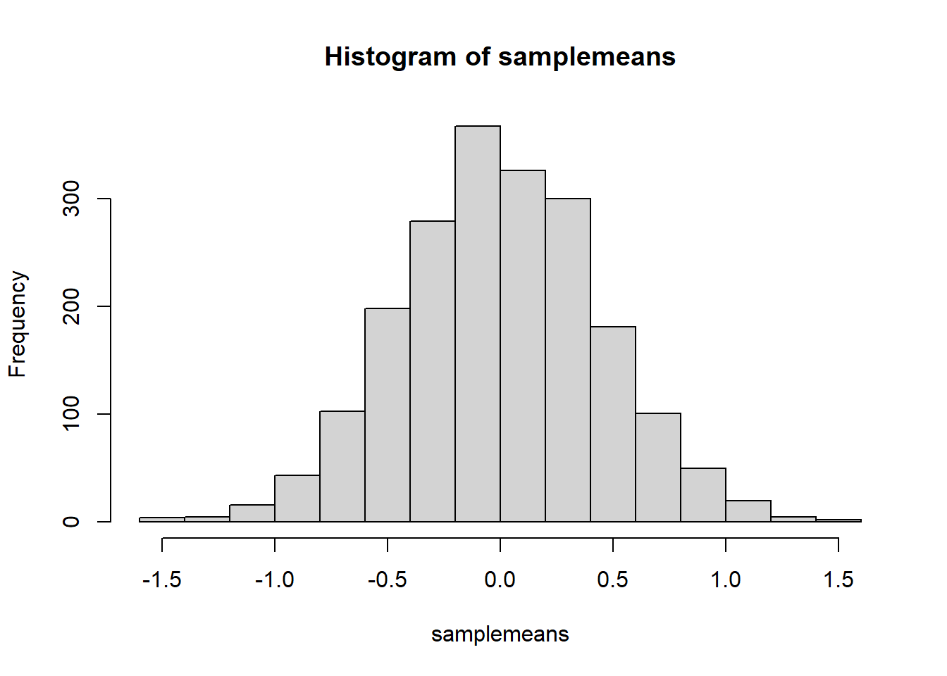
Store the sample means as a named object and make a quick histogram of them using hist().

Figure 6: Got a boring task you want doing thousands of times over? Computers!
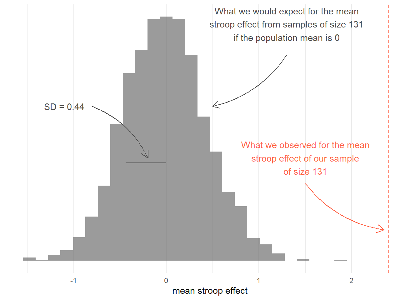
Write a sentence explaining what the histogram you just created shows.
How can we use the histogram to inform us about the observed mean which we calculated from our collected data?
# observed mean
mean(stroopdata$stroop_effect)
## [1] 2.402977

This workbook was written by Josiah King, Umberto Noe, and Martin Corley, and is licensed under a Creative Commons Attribution 4.0 International License.
