Week 7 Exercises: PCA & EFA
New packages
We’re going to be needing some different packages this week (no more lme4!).
Make sure you have these packages installed:
- psych
- GPArotation
- car
PCA & EFA
Overview
Both Principal Component Analysis (PCA) and Exploratory Factor Analysis (EFA) are methods of “dimension reduction” — i.e. we start with lots of correlated variables and we reduce down to a smaller set of dimensions which capture how people vary in those original variables. PCA & EFA are quite similar, and many use them interchangeably, but the theoretical assumptions underpinning them are quite different.
| Principal Component Analysis | Factor Analysis | |
|---|---|---|
| what it does | take a set of correlated variables, reduce to orthogonal dimensions that capture variability | take a set of correlated variables, ask what set of dimensions (not necessarily orthogonal!) explain variability |
| what the dimensions are | dimensions are referred to as “components” - they are simply “composites” and do not necessarily exist | dimensions are referred to as “factors”. They are assumed to be underlying latent variables that are the cause of why people have different scores on the observed variables |
| example | Socioeconomic status (SES) might be a composite measure of family income, parental education, etc. If my SES increases, that doesn’t mean my parents suddenly get more education (it’s the other way around) | Anxiety (the unmeasurable construct) is a latent factor. My underlying anxiety is what causes me to respond “strongly agree” to “I am often on edge” |
A Note: In Psychology, the distinction between the two can sometimes become blurred, and people will interpret and give meaning to the components of a PCA
In Diagrams
One way to think about this is to draw the two approaches in diagrammatic form, mapping the relationships between variables. There are conventions for these sort of diagrams:
- squares = variables we observe
- circles = variables we don’t observe
- single-headed arrows = regression paths (pointed at outcome)
- double-headed arrows = correlation
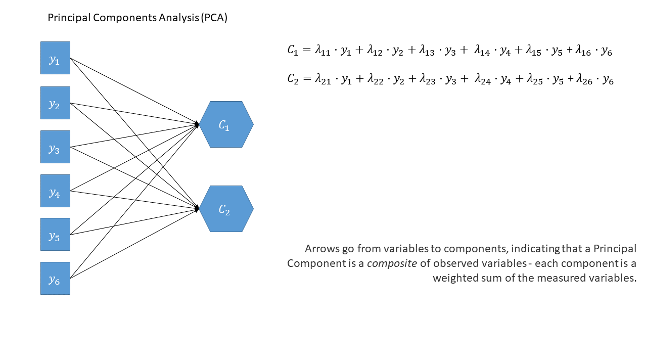
In the diagrams below, note how the directions of the arrows are different between PCA and FA - in PCA, each component \(C_i\) is the weighted combination of the observed variables \(y_1, ...,y_n\), whereas in FA, each measured variable \(y_i\) is seen as generated by some latent factor(s) \(F_i\) plus some unexplained variance \(u_i\).
PCA as a diagram
Note that the idea of a ‘composite’ requires us to use a special shape (the hexagon), but many people would just use a square.
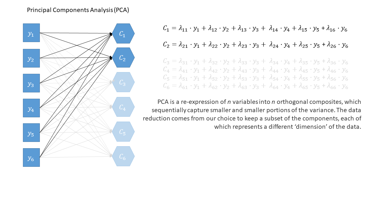
optional: PCA in full
Principal components sequentially capture the orthogonal (i.e., perpendicular) dimensions of the dataset with the most variance. The data reduction comes when we retain fewer components than we have dimensions in our original data. So if we were being pedantic, the diagram for PCA would look something like the diagram below.
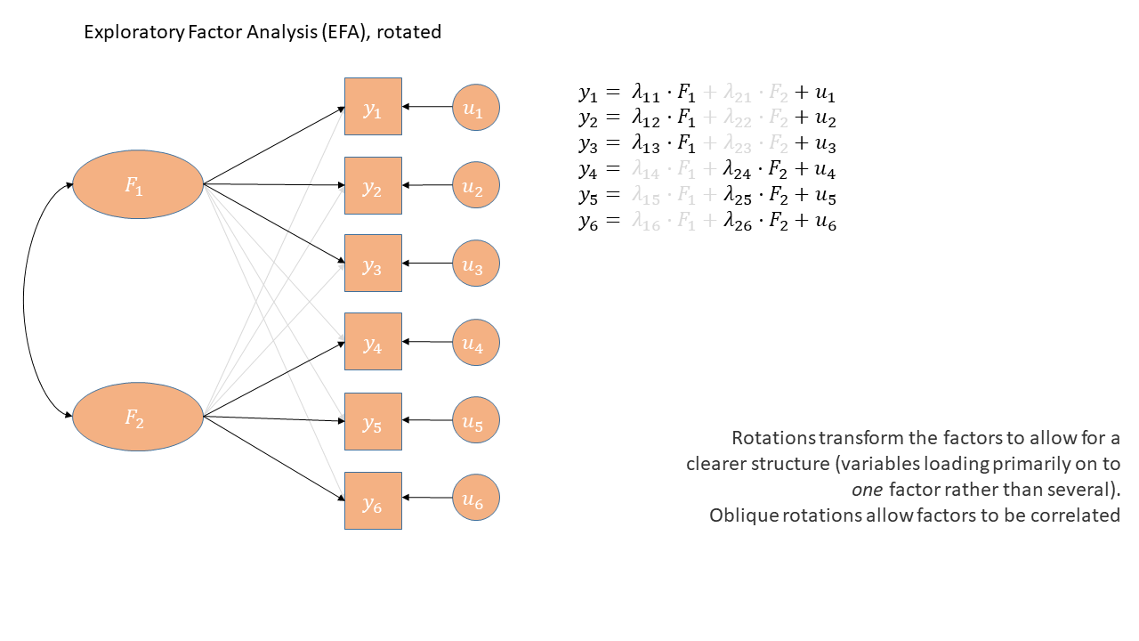
EFA as a diagram
Exploratory Factor Analysis as a diagram has arrows going from the factors to the observed variables. Unlike PCA, we also have ‘uniqueness’ factors for each variable, representing the various stray causes that are specific to each variable. Sometimes, these uniqueness are represented by an arrow only, but they are technically themselves latent variables, and so can be drawn as circles.
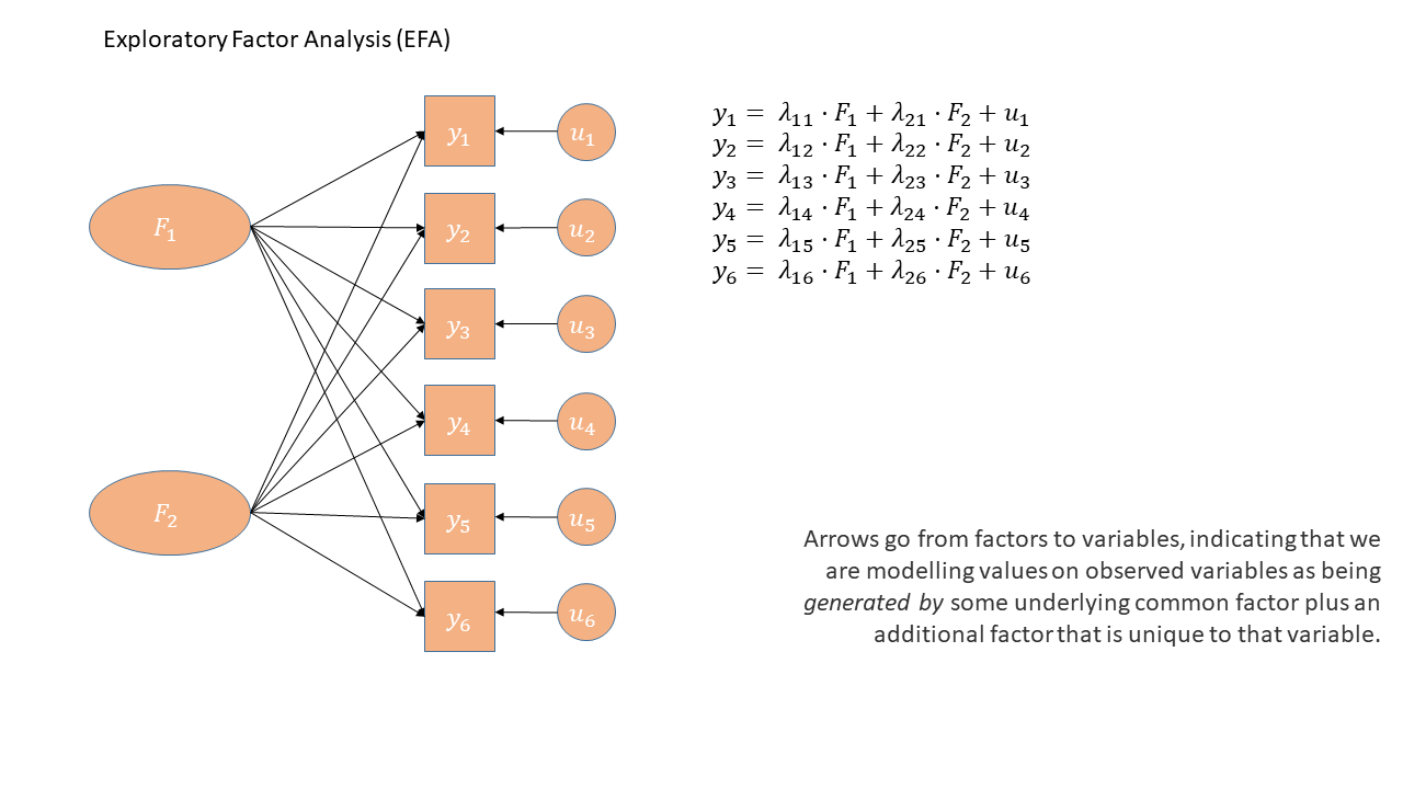
It might help to read the \(\lambda\)s as beta-weights like in regression (\(b\), or \(\beta\)), because that’s all they really are. The equation \(y_i = \lambda_{1i} F_1 + \lambda_{2i} F_2 + u_i\) is just our way of saying that the variable \(y_i\) is the manifestation of some amount (\(\lambda_{1i}\)) of an underlying factor \(F_1\), some amount (\(\lambda_{2i}\)) of some other underlying factor \(F_2\), and some error (\(u_i\)). It’s just a set of regressions!
Reducing the dimensionality of job performance
Data: jobperfbonus.csv
A company has asked line managers to fill out a questionnaire that asks them to rate the performance of each employee. The dataset we are providing contains each employee’s rating on 15 different aspects of their performance.
The company doesn’t know what to do with so much data, and wants us to reduce it to a smaller number of distinct variables.
It can be downloaded at https://uoepsy.github.io/data/jobperfbonus.csv
| variable | question |
|---|---|
| name | employee name |
| q1 | How effectively do they prioritize tasks to ensure project deadlines are met? |
| q2 | Rate their ability to create and maintain project schedules and timelines. |
| q3 | How well do they allocate resources to ensure efficient project execution? |
| q4 | Rate their proficiency in identifying and mitigating project risks. |
| q5 | How effectively do they communicate project progress and updates to stakeholders? |
| q6 | How well do they collaborate with team members to achieve common goals? |
| q7 | Rate their ability to actively listen to and consider the ideas and opinions of others. |
| q8 | How effectively do they contribute to a positive team environment? |
| q9 | Rate their willingness to provide support and assistance to team members when needed. |
| q10 | How well do they resolve conflicts and disagreements within the team? |
| q11 | How proficient are they in applying technical concepts and principles relevant to their role? |
| q12 | Rate their ability to stay updated with the latest developments and trends in their field. |
| q13 | How effectively do they troubleshoot technical issues and find innovative solutions? |
| q14 | Rate their skill in translating complex technical information into understandable terms for non-technical stakeholders. |
| q15 | How well do they leverage technical expertise for problem-solving? |
Question 1
Load the data, and take a look at it.
We’re going to want to reduce these 15 variables (or “items”) down into a smaller set. Should we use PCA or EFA?
Question 2
Explore the relationships between variables in the data. Below are various ways to do this.
You’re probably going to want to subset out just the relevant variables (q1 to q15).
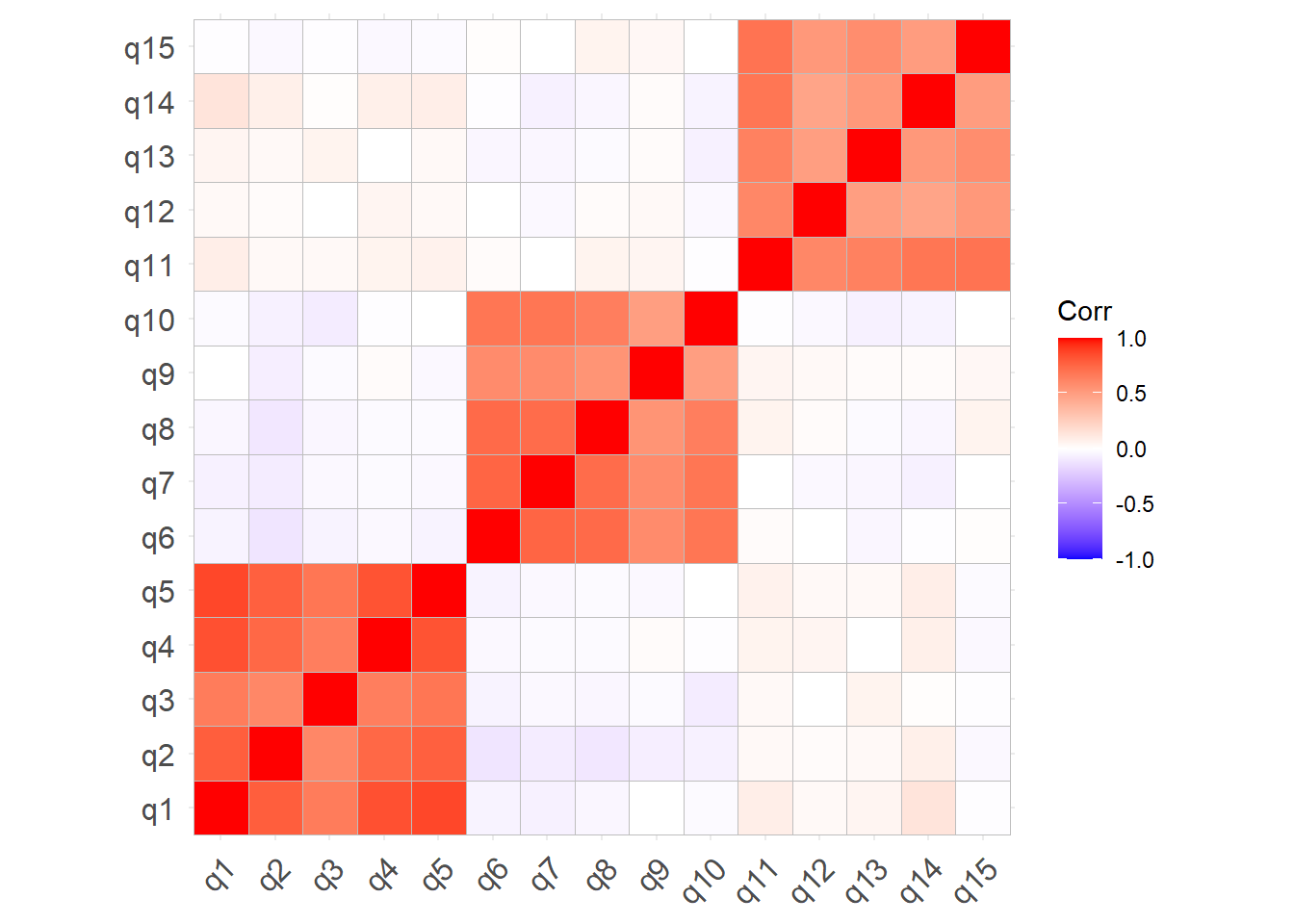
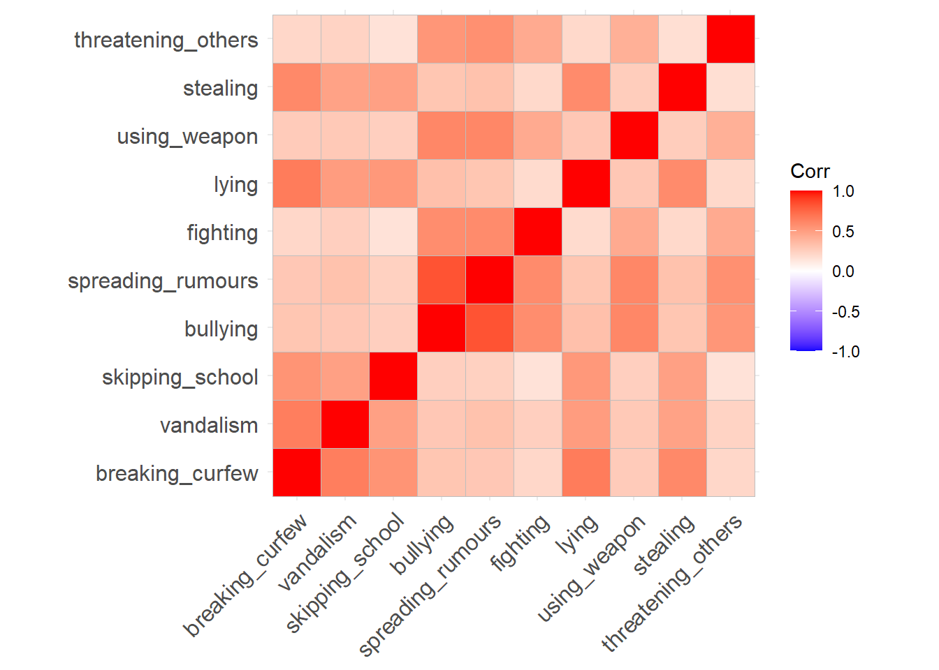
Correlation Matrix
You can give the cor() function a dataset and it will show you the correlations between all pairs of variables.
It returns a ‘correlation matrix’ - which has a row for each variable and a column for each variable. Correlation matrices are square (same number of rows as columns), and symmetric (rotate it 90 degrees and it looks the same). The diagonals of the correlation matrix are all 1, because every variable is perfectly correlated with itself.
cor(eg_data) |>
  round(2)
item_1 item_2 item_3 item_4 item_5
item_1 1.00 0.74 0.56 -0.61 -0.67
item_2 0.74 1.00 0.44 -0.53 -0.55
item_3 0.56 0.44 1.00 -0.35 -0.42
item_4 -0.61 -0.53 -0.35 1.00 0.46
item_5 -0.67 -0.55 -0.42 0.46 1.00Correlation matrices can get big! For \(k\) variables, the correlation matrix contains \(\frac{k(k+1)}{2}\) unique numbers. Sometimes you can get more from visualising the correlation matrix.
library(ggcorrplot)
ggcorrplot(cor(eg_data))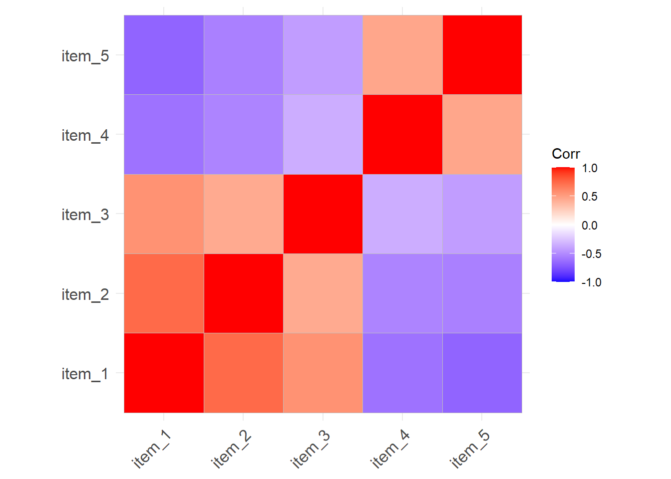
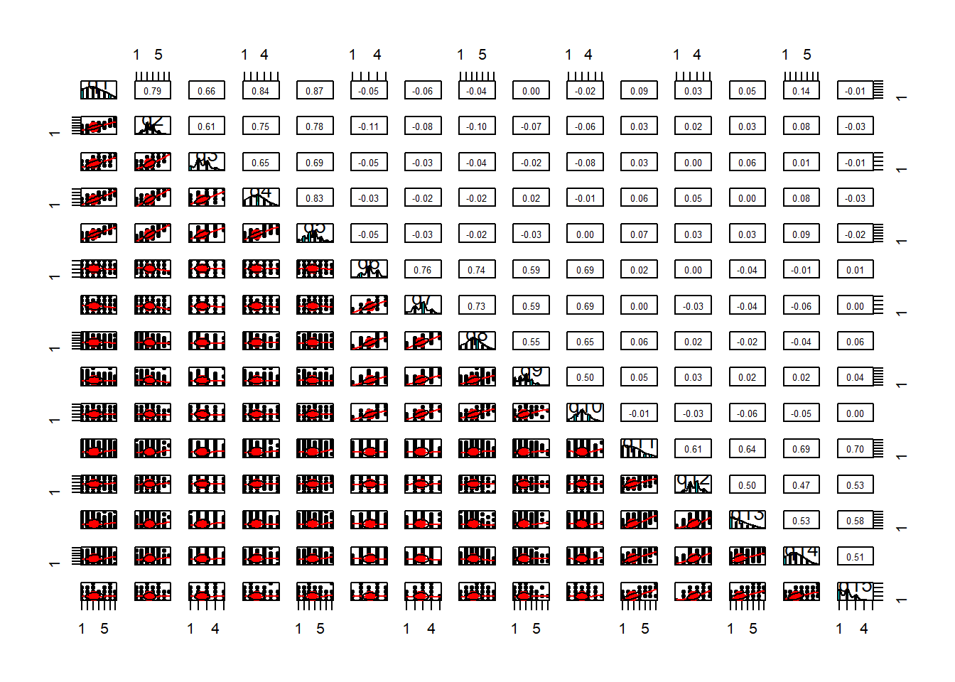
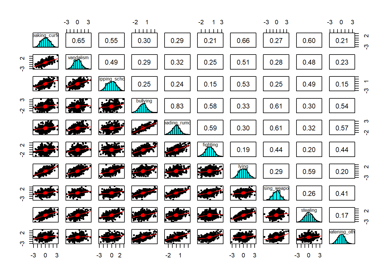
Scatterplot Matrix
A Scatterplot Matrix is basically the same idea as a correlation matrix, but instead of the numeric correlation coefficient between each pair, we have a scatterplot between each pair.
It’s a good way to check for linearity of relationships prior to data reduction. These methods of data reduction are all based on correlations, which assume the relations we are capturing are linear.
We can check linearity of relations using pairs() and also pairs.panels(data) (from the psych package), and you can view the histograms on the diagonals, allowing you to check univariate normality (which is usually a good enough proxy for multivariate normality).
pairs(data)- make a scatterplot matrix- from psych,
pairs.panels(data)- make a scatterplot matrix with correlations on the upper triangle - from car,
scatterplotMatrix(data)
Additionally, also from psych, the multi.hist(data) function will give us the individual histograms for each variable
Question 3
How much variance in the data will be captured by 15 principal components?
Hints
We can figure this out without having to do anything - it’s a theoretical question!
Question 4
How many components should we keep? Below are some reminders of the various criteria we can use to help us come to a decision.
Kaiser’s rule
According to Kaiser’s rule, we should keep the principal components having variance larger than 1.
The variances of each PC are shown in the row of the output named SS loadings and also in the $values from the object created by principal().
Standardized variables have a variance equal 1, and if we have \(k\) standardised variables, then the total variance in the data is \(k\). An eigenvalue of <1 represents that it is accounting for less variance than any individual original variable.
NOTE: Kaiser’s Rule will very often lead to over-extracting (keeping too many components)
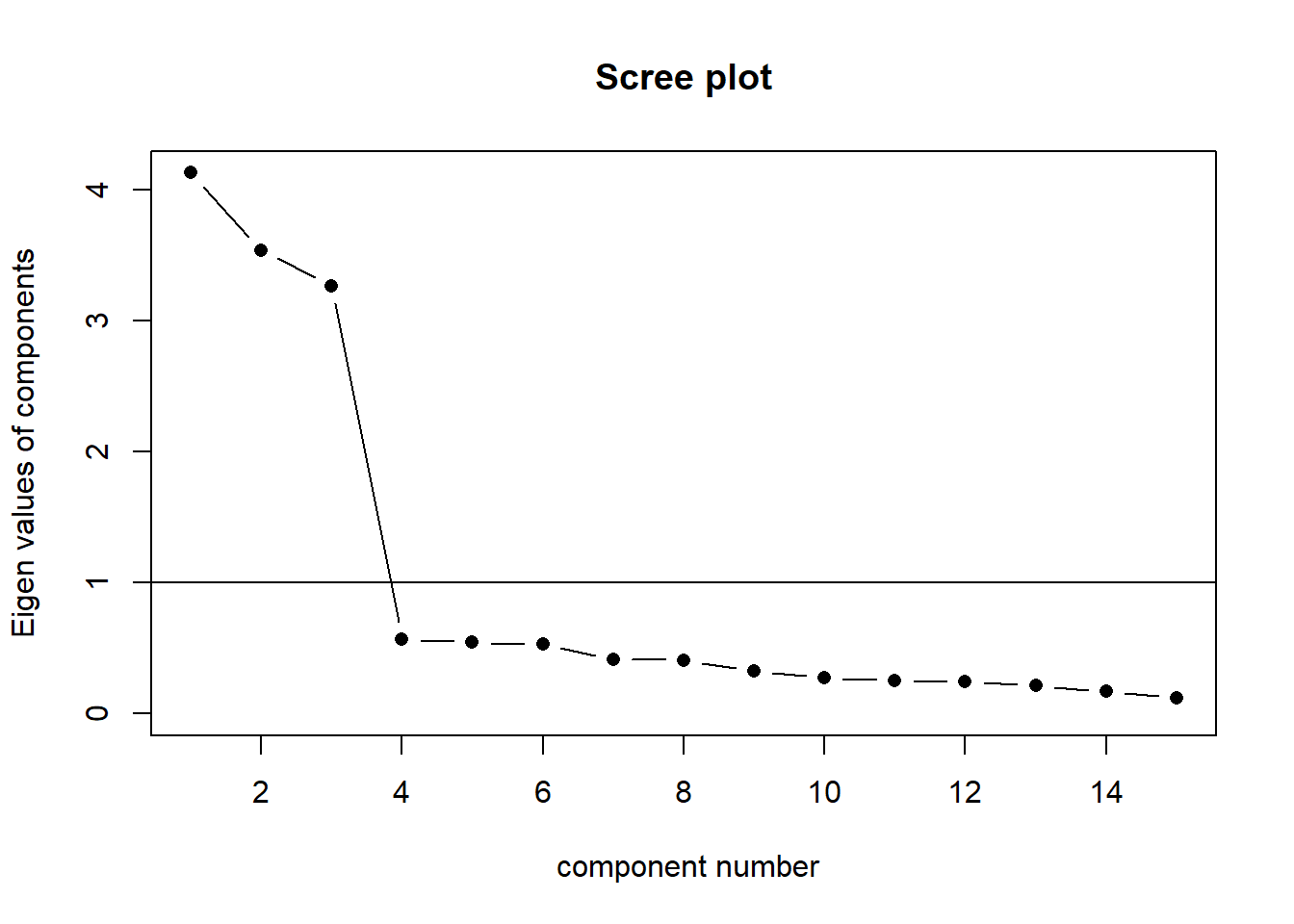
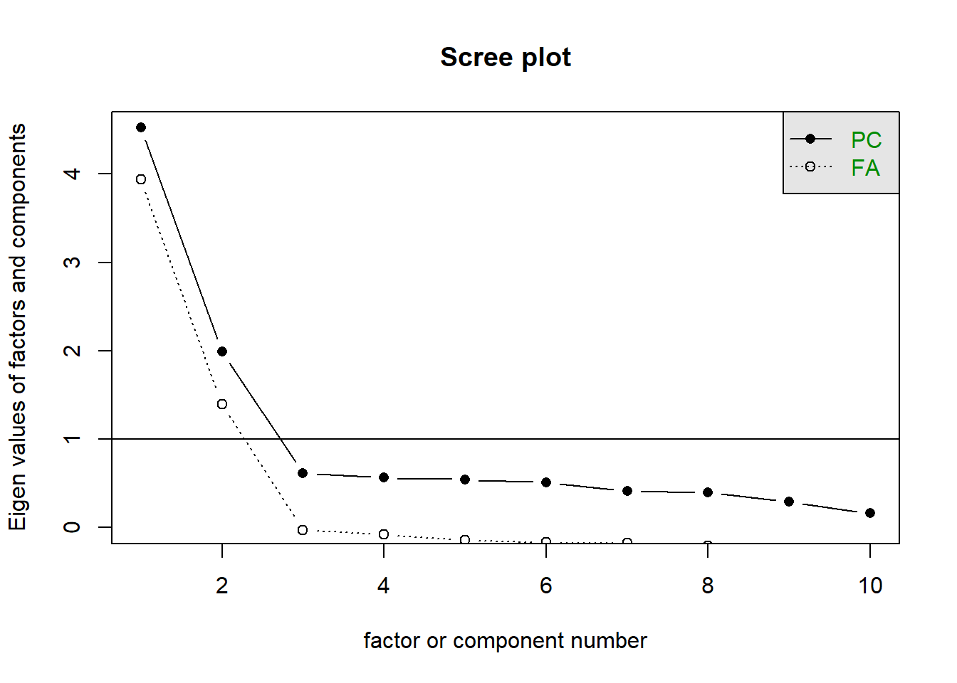
The scree plot
The scree plot is a graphical criterion which involves plotting the variance for each principal component. This can be easily done by calling plot on the variances, which are stored in $values of the object created by principal(), or by using the scree() function from the psych package.
When conducting an EFA as opposed to a PCA, you can remove the factors = FALSE bit.
library(psych)
scree(eg_data, factors = FALSE)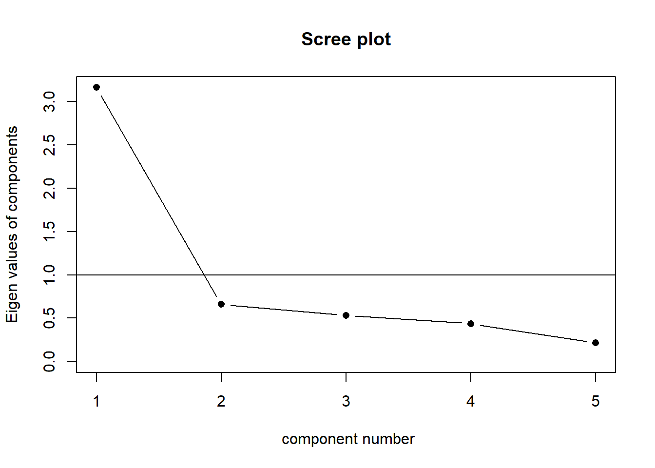
A typical scree plot features higher variances for the initial components and quickly drops to small variances where the curve is almost flat. The flat part of the curve represents the noise components, which are not able to capture the main sources of variability in the system.
According to the scree plot criterion, we should keep as many principal components up to where the “elbow” in the plot occurs. So in the above plot, the elbow occurs at 2, so we would keep 1.
NOTE: Scree plots are subjective and may have multiple or no obvious kinks/elbows, making them hard to interpret
Velicer’s Minimum Average Partial (MAP) method
The Minimum Average Partial (MAP) test computes the partial correlation matrix (removing and adjusting for a component from the correlation matrix), sequentially partialling out each component. At each step, the partial correlations are squared and their average is computed.
At first, the components which are removed will be those that are most representative of the shared variance between 2+ variables, meaning that the “average squared partial correlation” will decrease. At some point in the process, the components being removed will begin represent variance that is specific to individual variables, meaning that the average squared partial correlation will increase.
The MAP method is to keep the number of components for which the average squared partial correlation is at the minimum.
We can conduct MAP in R using the VSS() function.
When conducting an EFA as opposed to a PCA, you can set fm and rotate to the factor extraction method and rotation of your choosing.
library(psych)
VSS(eg_data, rotate = "none",
    plot = FALSE, fm="pc", n = ncol(eg_data))
Very Simple Structure
Call: vss(x = x, n = n, rotate = rotate, diagonal = diagonal, fm = fm,
    n.obs = n.obs, plot = plot, title = title, use = use, cor = cor)
VSS complexity 1 achieves a maximimum of 0.91  with  1  factors
VSS complexity 2 achieves a maximimum of 0.95  with  2  factors

The Velicer MAP achieves a minimum of 0.06  with  1  factors
BIC achieves a minimum of Inf with factorsSample Size adjusted BIC achieves a minimum of Inf with factors
Statistics by number of factors
vss1 vss2 map dof chisq prob sqresid fit RMSEA BIC SABIC complex eChisq
1 0.91 0.00 0.065 0 NA NA 9.5e-01 0.91 NA NA NA NA NA
2 0.78 0.95 0.225 0 NA NA 5.2e-01 0.95 NA NA NA NA NA
3 0.61 0.90 0.523 0 NA NA 2.4e-01 0.98 NA NA NA NA NA
4 0.51 0.81 1.000 0 NA NA 4.5e-02 1.00 NA NA NA NA NA
5 0.43 0.69 NA 0 NA NA 1.6e-29 1.00 NA NA NA NA NA
SRMR eCRMS eBIC
1 NA NA NA
2 NA NA NA
3 NA NA NA
4 NA NA NA
5 NA NA NA(be aware there is a lot of other information in this output too! For now just focus on the map column), and the part of the output that says “The Velicer MAP achieves a minimum of 0.06 with ?? factors”.
NOTE: The MAP method will sometimes tend to under-extract (suggest too few components)
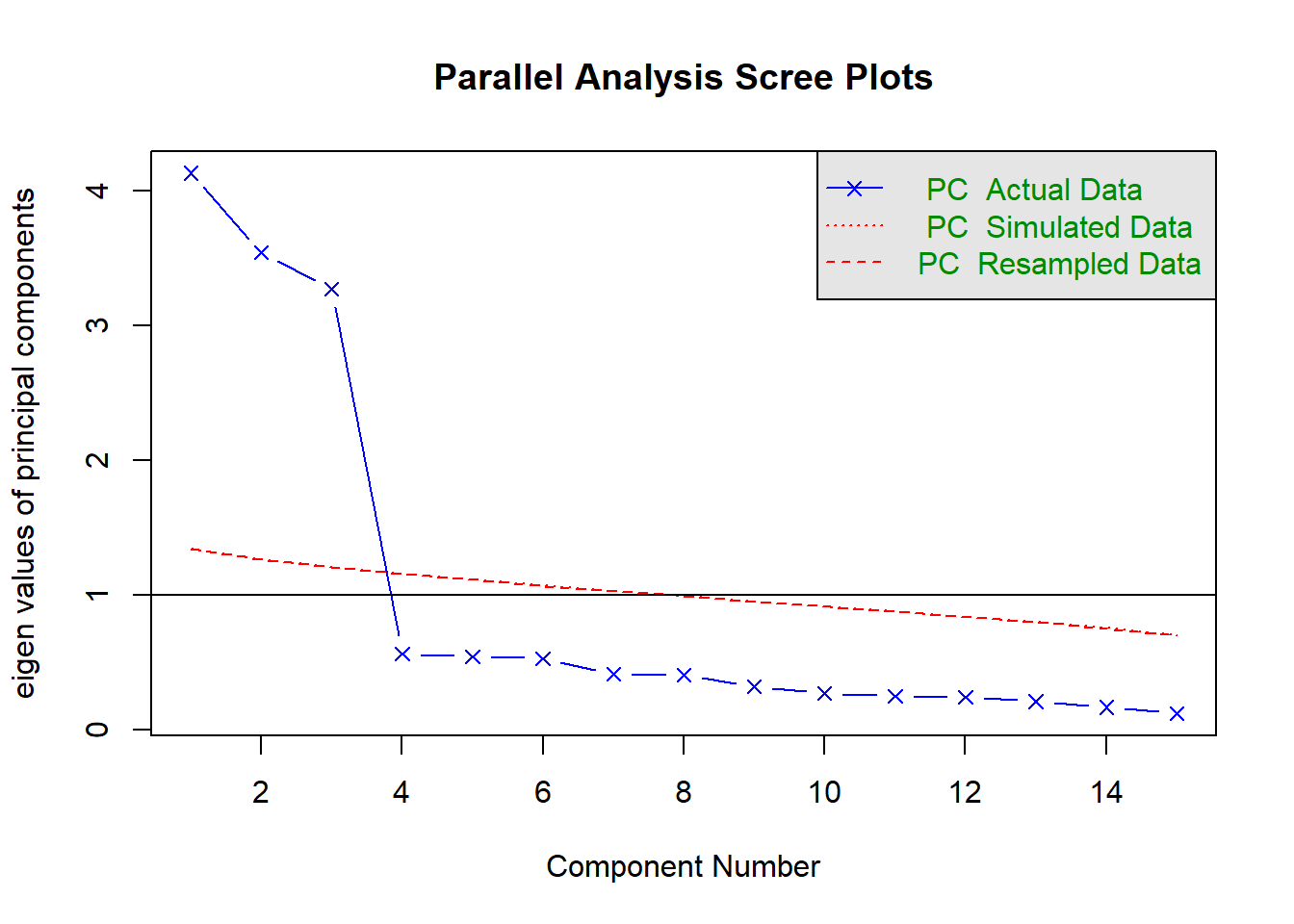
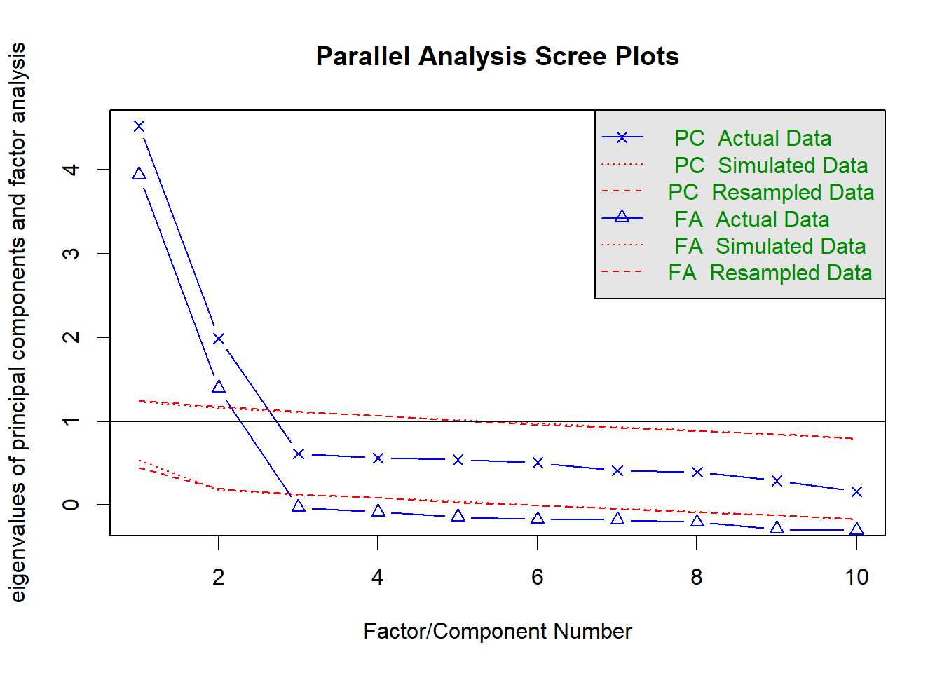
Parallel analysis
Parallel analysis involves simulating lots of datasets of the same dimension but in which the variables are uncorrelated. For each of these simulations, a PCA is conducted on its correlation matrix, and the eigenvalues are extracted. We can then compare our eigenvalues from the PCA on our actual data to the average eigenvalues across these simulations. In theory, for uncorrelated variables, no components should explain more variance than any others, and eigenvalues should be equal to 1. In reality, variables are rarely truly uncorrelated, and so there will be slight variation in the magnitude of eigenvalues simply due to chance. The parallel analysis method suggests keeping those components for which the eigenvalues are greater than those from the simulations.
It can be conducted in R using the fa.parallel() function.
When conducting an EFA as opposed to a PCA, you can set fa = "both" to do this for both factor extraction and principal components.
library(psych)
fa.parallel(eg_data, fa="pc", n.iter = 500)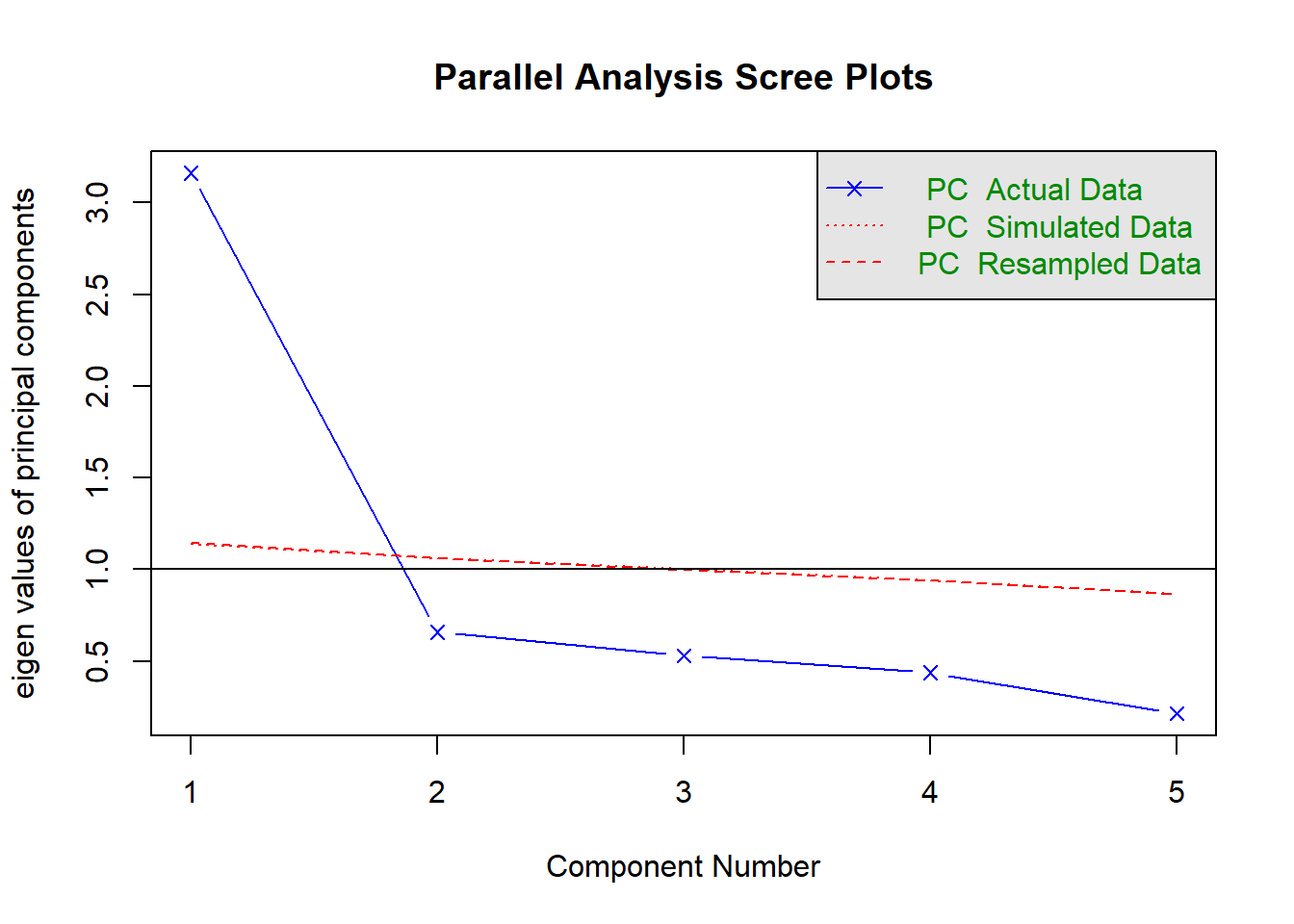
Parallel analysis suggests that the number of factors = NA and the number of components = 1 NOTE: Parallel analysis will sometimes tend to over-extract (suggest too many components)
Question 5
Conduct a principal components analysis extracting the number of components you decided on from the previous question.
Be sure to set rotate = "none" (a conventional PCA does not use rotations - it is simply about data reduction. The line is a bit blurred here, but once we start introducing rotations, we are moving more towards a form of EFA).
Examine the loadings for the components. By thinking in relation to the questions that were asked (refer back to Table 1), what do you think each component is capturing?
Question 6
Extract the scores on the principal components.
The company wants to reward teamwork. Pick 10 people they should give a bonus to.
Hints
As seen in the reading, we can extract scores (a score on each component for each row of our original dataset) using the $scores from the object fitted with principal().
This will contain as many sets of scores as there are components. One of these (given the previous question) might be of use here.
You’ll likely want to join them back to the column of names. So we can figure out who gets the bonus. cbind() or bind_cols() might help here.
Conduct Problems
Data: Conduct Problems
A researcher is developing a new brief measure of Conduct Problems. She has collected data from n=450 adolescents on 10 items, which cover the following behaviours:
- Breaking curfew
- Vandalism
- Skipping school
- Bullying
- Spreading malicious rumours
- Fighting
- Lying
- Using a weapon
- Stealing
- Threatening others
Our task is to use the dimension reduction techniques we learned about in the lecture to help inform how to organise the items she has developed into subscales.
The data can be found at https://uoepsy.github.io/data/conduct_probs_scale.csv
Question 7
Read in the dataset.
Create a correlation matrix for the items, and inspect the items to check their suitability for exploratory factor analysis (below are a couple of ways we can do this).
Bartlett’s Test
The function cortest.bartlett(cor(data), n = nrow(data)) conducts “Bartlett’s test”. This tests against the null that the correlation matrix is proportional to the identity matrix (a matrix of all 0s except for 1s on the diagonal).
- Null hypothesis: observed correlation matrix is equivalent to the identity matrix
- Alternative hypothesis: observed correlation matrix is not equivalent to the identity matrix.
What is the identity matrix?
The “Identity matrix” is a matrix of all 0s except for 1s on the diagonal.
e.g. for a 3x3 matrix:
\[
\begin{bmatrix}
1 & 0 & 0 \\
0 & 1 & 0 \\
0 & 0 & 1 \\
\end{bmatrix}
\] If a correlation matrix looks like this, then it means there is no shared variance between the items, so it is not suitable for factor analysis
Kaiser, Meyer, Olkin Measure of Sampling Adequacy
You can check the “factorability” of the correlation matrix using KMO(data) (also from psych!).
- Rules of thumb:
- \(0.8 < MSA < 1\): the sampling is adequate
- \(MSA <0.6\): sampling is not adequate
- \(MSA \sim 0\): large partial correlations compared to the sum of correlations. Not good for FA
Kaiser’s suggested cuts
These are Kaiser’s corresponding adjectives suggested for each level of the KMO:
- 0.00 to 0.49 “unacceptable”
- 0.50 to 0.59 “miserable”
- 0.60 to 0.69 “mediocre”
- 0.70 to 0.79 “middling”
- 0.80 to 0.89 “meritorious”
- 0.90 to 1.00 “marvelous”
Question 8
How many dimensions should be retained?
This question can be answered in the same way as we did above for PCA - use a scree plot, parallel analysis, and MAP test to guide you.
You can use fa.parallel(data, fa = "both") to conduct both parallel analysis and view the scree plot!
Question 9
Use the function fa() from the psych package to conduct and EFA to extract 2 factors (this is what we suggest based on the various tests above, but you might feel differently - the ideal number of factors is subjective!). Use a suitable rotation (rotate = ?) and extraction method (fm = ?).
myfa <- fa(data, nfactors = ?, rotate = ?, fm = ?)
Hints
Would you expect factors to be correlated? If so, you’ll want an oblique rotation.
Rotations
When we apply a rotation to an EFA, we make it so that some loadings are smaller and some are higher - essentially creating a ‘simple structure’ (where each variable loads strongly on only one factor and weakly on all other factors). This structure simplifies the interpretation of factors, making them more distinct and easily understandable.
There are two types of rotations - “orthogonal” and “oblique”. Orthogonal rotations preserve the orthogonality of the factors (i.e. ensure they are uncorrelated, and therefore capturing completely distinct things). Oblique rotations allow the factors to be correlated and estimates that correlation (as indicated by the double headed arrow between them in the diagram below)
It’s pretty hard to find an intuition for “rotations” because they are a mathematical transformation applied to a matrix (and none of that is really ‘intuitive’). At the broadest level, think of a rotation as allowing the dimensions to no longer be perpendicular when viewed in the space of our observed variables.
Factor Extraction Methods
PCA (using eigendecomposition) is itself a method of extracting the different dimensions from our data. However, there are lots more available for factor analysis.
You can find a lot of discussion about different methods both in the help documentation for the fa() function from the psych package, and there are lots of discussions both in papers and on forums.
As you can see, this is a complicated issue, but when you have a large sample size, a large number of variables, for which you have similar communalities, then the extraction methods tend to agree. For now, don’t fret too much about the factor extraction method.1
The main contenders are Maximum Likelihood (ml), Minimum Residuals (minres) and Principal Axis Factoring (paf).
Maximum Likelihood has the benefit of providing standard errors and fit indices that are useful for model testing, but the disadvantage is that it is sensitive to violations of normality, and can sometimes fail to converge, or produce solutions with impossible values such as factor loadings >1 (known as “Heywood cases”), or factor correlations >1.
Minimum Residuals (minres) and Principal Axis Factoring (paf) will both work even when maximum likelihood fails to converge, and are slightly less susceptible to deviations from normality. They are a bit more sensitive to the extent to which the items share variance with one another.
Question 10
Inspect your solution. Make sure to look at and think about the loadings, the variance accounted for, and the factor correlations (if estimated).
Hints
Just printing an fa object:
myfa <- fa(data, ..... )
myfa
Will give you lots and lots of information.
You can extract individual parts using:
myfa$loadingsfor the loadingsmyfa$Vaccountedfor the variance accounted for by each factormyfa$Phifor the factor correlation matrix
You can find a quick guide to reading the fa output here: efa_output.pdf.
Question 11
Look back to the description of the items, and suggest a name for your factors based on the patterns of loadings.
Hints
To sort the loadings, you can use
print(myfa$loadings, sort = TRUE)
Question 12
Compare your three different solutions:
- your current solution from the previous questions
- one where you fit 1 more factor
- one where you fit 1 fewer factors
Which one looks best?
Hints
We’re looking here to assess:
- how much variance is accounted for by each solution
- do all factors load on 3+ items at a salient level?
- do all items have at least one loading at a salient level?
- are there any “Heywood cases” (communalities or standardised loadings that are >1)?
- should we perhaps remove some of the more complex items?
- is the factor structure (items that load on to each factor) coherent, and does it make theoretical sense?
Question 13
Drawing on your previous answers and conducting any additional analyses you believe would be necessary to identify an optimal factor structure for the 10 conduct problems, write a brief text that summarises your method and the results from your chosen optimal model.
Hints
Write about the process that led you to the number of factors. Discuss the patterns of loadings and provide definitions of the factors.