Dimensionality of Data
Take a moment to think about the various things that you are often interested in when discussing psychology. This might be anything from personality traits, to language proficiency, social identity, anxiety etc. How we measure such constructs is a very important consideration for research. The things we’re interested in are very rarely the things we are directly measuring.
Consider how we might assess levels of anxiety or depression. Can we ever directly measure anxiety?1 More often than not, we measure these things using a set of different measures which ‘look at’ an intended construct from a different angle. In psychology, this is often questionnaire based methods, with a set of questions each of which might ask about “anxiety” from a slightly different angle. Twenty questions all measuring different aspects of anxiety are (we hope) going to correlate with one another if they are capturing some commonality (the construct of “anxiety”).
But this introduces a problem for us: how do we deal with, e.g., 10 variables that represent (in broad terms) the same one idea? How can we analyse that key idea that we’re interested in (e.g., “changes in anxiety”), and not have to talk separately about every individual variable (“changes on anxiety Q1” and “changes on anxiety Q2” and so on)?
In addition, not all of our intended constructs (the concepts we’re actually interested in) will necessarily exist as one distinct thing — for instance, we often talk about “narcissism”, but people argue that this is actually comprised of 3 slightly distinct (but related) constructs of “grandiosity”, “vulnerability” and “antagonism”.
What we are touching upon here gets referred to as dimensionality of a measurement tool, and the questions we are going to look at are all about how we can go from the big set of observed variables to working with the underlying constructs that we are actually interested in.
What is a “dimension”?
Broadly speaking, when we use the term “dimension” here, we are more or less referring to something like the number of rows and columns in a dataset. If I measure \(n\) people on 10 questions about anxiety, then my resulting dataset will have \(n \times 10\) dimensions.
But in many cases this contrasts with our research questions, which are concerned with a construct (e.g., the idea of “anxiety”) that we consider to be a single dimension (e.g., people are high on anxiety or low on anxiety) rather than 10.
When might we want to reduce dimensionality?
There are many reasons we might want to “reduce the dimensionality” of data:
- Pragmatic
- I have multicollinearity issues/too many variables, how can I defensibly combine my variables?
- Test construction
- How should I group my questionnaire items into subsets?
- Which items are the best measures of my construct(s)?
- What are the number and nature of underlying constructs that best explain the pattern of responses to a set of questions?
- Theory testing
- Does a pre-defined theory about the number and nature of underlying constructs fit well to this dataset?
New Dimensions
Let’s suppose we are interested in capturing how tired people are, and we have data on three different related variables:
- Subjective Mental Fatigue
- Subjective Physical Fatigue
- Subjective Sleepiness
We can visualise these in the 3-dimensional space of the measured variables, which would give us a 3D plot such as Figure 1.
Because we have 3 variables in this example, that means 3 dimensions, and this is why we can actually visualise it as a 3D plot. But we could also think of this shape in Figure 1 as being described by all the correlations between each pair of variables.
Each of these correlations is characterising the plot of each pair of variables, and these are just like viewing the 3D plot above but looking at it from straight on at each side.2 So in cases where we have lots and lots of variables, we might not be able to visualise the n-dimensional shape itself, but we can look at it from all different angles through the correlation matrix!
cor(mydata) M P S
M 1.000 0.598 0.749
P 0.598 1.000 0.767
S 0.749 0.767 1.000pairs(mydata)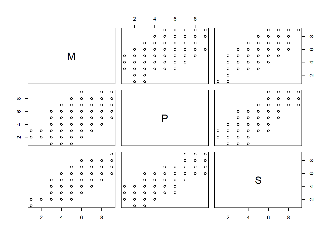
When faced with trying to describe the shape of the 3-Dimensional cloud of datapoints in Figure 1, we might be inclined to think about its length, width and depth. You can imagine trying to characterise this shape as the ellipse in Figure 2. It looks a little like a baguette or something! It’s longer in one direction (green line), wide-ish in another direction (red line), and not very deep (blue line). We can think of those coloured lines as a new set “dimensions” that we could opt to use to characterise the shape of data.
Think a little about what these new dimensions (the coloured axes in Figure 2) represent - they capture “the ways in which observations vary” across the set of observed variables.
The long dimension captures that all three variables tend to co-vary (there are lots of people who are high on all of them, and lots who are low on all of them - there aren’t many who might rate one question an 8 and the other two questions a 2).
One way to see this is to just follow the green line to each end of the ellipse and figure out roughly what the scores would be at that point. At one end of the green line we have people scoring 2 on all of the variables, and at the other end we have them scoring 8 on all of them.
The next longest dimension of the ellipse (the red line) shows another way in which people vary - there are people with similar sleepiness scores but some people are high on physical fatigue and low on mental fatigue, and others are low on physical fatigue but high on mental fatigue (i.e., at one end of the red line we have scores of MF=6, PF=4, S=5, and at the other end we have MF=4, PF=6, S=5). Notice also that people don’t vary as much along this red line as they did on the green line (we’re talking differences of ~2 points, rather than of ~6).
Finally the blue dimension of the ellipse is the shortest, capturing the least variability. This dimension seems to differentiate between people who are more sleepy but less fatigued, and those who are less sleepy but more fatigued. It makes sense that there isn’t much variability here - we would expect people who are sleepy to be fatigued and vice versa!
Discarding Dimensions
Often it helps to take ideas to the extremes, so think about what these sorts of 3D plots would look like if we no correlations or perfect correlations between the three variables. If the variables are uncorrelated, then we have a sort of spherical cloud of data, and for any set of three dimensions we try to use to express this shape there is not going to be any one dimension that is longer than the other (Figure 3). By contrast, if we have perfect correlations between the variables, then we actually don’t even need 3 dimensions in order to identify exactly where each datapoint is: we only really need one dimension - the line upon which all observations fall (Figure 4) - and we can precisely capture all of the variability.
The core idea of dimension reduction is that some re-expression of our data into a new set of dimensions might allow us to then discard some of the dimensions, without losing too much of the shape (i.e., while still capturing a lot of how observations vary).
For an analogy, imagine being given a ruler and being asked to give two numbers to provide a measurement of your smartphone. What do you pick? I would take a bet that you will measure its length and then its width. You’re likely to ignore the depth because it is much smaller than the other two dimensions. This is pretty much the concept of dimension reduction.
The idea here is that we can — without losing too much — preserve the general shape of our data using fewer dimensions. In our Fatigue/Sleepiness example, we could, discard one of our new dimensions (the blue line — the narrowest dimension of the baguette in Figure 2), and consider where our data falls when projected onto the 2-dimensional surface shown in Figure 5. Or we could discard yet a further dimension and reduce down to only 1 dimension, as in Figure 6. This would essentially be us choosing to use where the observations fall on the green line in Figure 2, instead of using the three original variables of Physical Fatigue, Mental Fatigue and Sleepiness.
A (slightly) larger example
The conceptual idea of these new ‘dimensions’ that we’re working with here is pretty abstract, and it only gets weirder to think about when we have more than 3 variables and we can no longer easily visualise it in a single plot.
Take as an example what we would expect to see if we asked 100 people to rate how much they like each of these snacks:
- digestive biscuits
- hobnobs
- oreos
- walkers crisps
- pringles
- kettle chips
We wouldn’t be able to plot all of these at once like we did in the 3D plot (it would have to be a 6D plot!), but we can look at all the different pairwise relationships:
data
head(snackdata) oreos digestive hobnob walkers pringles kettle
1 4 3 4 2 3 3
2 5 7 4 4 3 3
3 3 3 5 7 5 3
4 2 3 6 5 6 3
5 2 1 1 2 1 3
6 2 5 6 5 4 5correlation matrix
cor(snackdata) oreos digestive hobnob walkers pringles kettle
oreos 1.0000 0.421 0.334 0.0695 0.0253 0.115
digestive 0.4212 1.000 0.288 0.1049 0.0870 0.109
hobnob 0.3344 0.288 1.000 0.1493 0.3161 0.281
walkers 0.0695 0.105 0.149 1.0000 0.4271 0.341
pringles 0.0253 0.087 0.316 0.4271 1.0000 0.408
kettle 0.1154 0.109 0.281 0.3412 0.4082 1.000correlation heatmap
heatmap(cor(snackdata))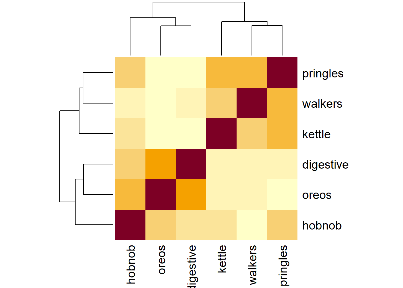
scatterplot matrix
pairs(snackdata)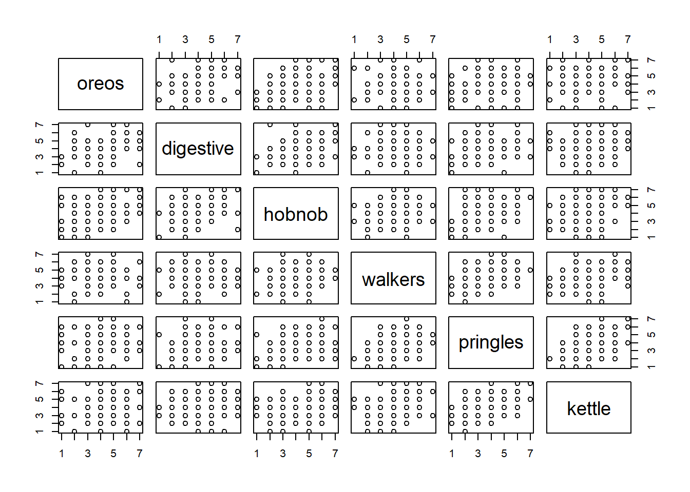
It’s a little hard to see, but if we look carefully, we’ll notice that questions 1, 2, 3 all correlate higher with one another and less with the other variables, and questions 4, 5 and 6 do the same! This makes complete sense when we reflect on the questions themselves - the first 3 are getting at something different from the last 3. What we’re seeing is that peoples’ responses vary in two key ways: people vary on how much they like biscuits (oreos, digestives, hobnobs), but then separately from this biscuit angle, they vary in how much they like crisps (walkers, pringles, kettle). And within each of these sets of variables (the biscuit variables, and the crisp variables), there is less variability — i.e., we don’t often see people rating high on hobnobs and low on digestives. What we are seeing here is that instead of having to work with 6 variables, we might be able to get away with only 2 things.
Footnotes
Even if we cut open someone’s brain, it’s unclear what we would be looking for in order to ‘measure’ it. It is unclear whether anxiety even exists as a physical thing, or rather if it is simply the overarching concept we apply to a set of behaviours and feelings.↩︎
Rotate the 3D plot to make it match the 2D plots below!↩︎