Categorical data
Be sure to check the solutions to last week’s exercises.
You can still ask any questions about previous weeks’ materials if things aren’t clear!
LEARNING OBJECTIVES
- LO1: Understand the appropriate visualization for categorical data.
- LO2: Understand methods to calculate the spread of categorical data.
- LO3: Understand methods to calculate central tendency for categorical data
Before we get started on the statistics, we’re going to briefly introduce a crucial bit of R code.
Data Exploration
Once we have collected some data, one of the first things we want to do is explore it - and we can do this through describing (or summarising) and visualising variables.
We are already familiar with the function summary(), which provides high-level information about our data, showing us things such as the minimum and maximum and mean of continuous variables, or the numbers of entries falling into each possible response level for a categorical variable:
summary(starwars2)## name height hair_color eye_color
## Length:75 Min. : 79.0 Length:75 Length:75
## Class :character 1st Qu.:167.5 Class :character Class :character
## Mode :character Median :180.0 Mode :character Mode :character
## Mean :176.1
## 3rd Qu.:191.0
## Max. :264.0
## homeworld species
## Length:75 Length:75
## Class :character Class :character
## Mode :character Mode :character
##
##
## What we are doing here is providing numeric descriptions of the distributions of values in each variable.
Distribution
The distribution of a variable shows how often different values occur. In this lab, we’re going to focus on describing and visualising distributions of categorical data.
The graph showing the distribution of a variable shows us where the values are centred, how the values vary, and gives some information about where a typical value might fall. It can also alert you to the presence of outliers (unexpected observations).
Unordered Categorical (Nominal) Data
For variables with a discrete number of response options, we can easily measure “how often” values occur in terms of their frequency.
Frequency distribution
A frequency distribution is an overview of all distinct values in some variable and the number of times they occur.
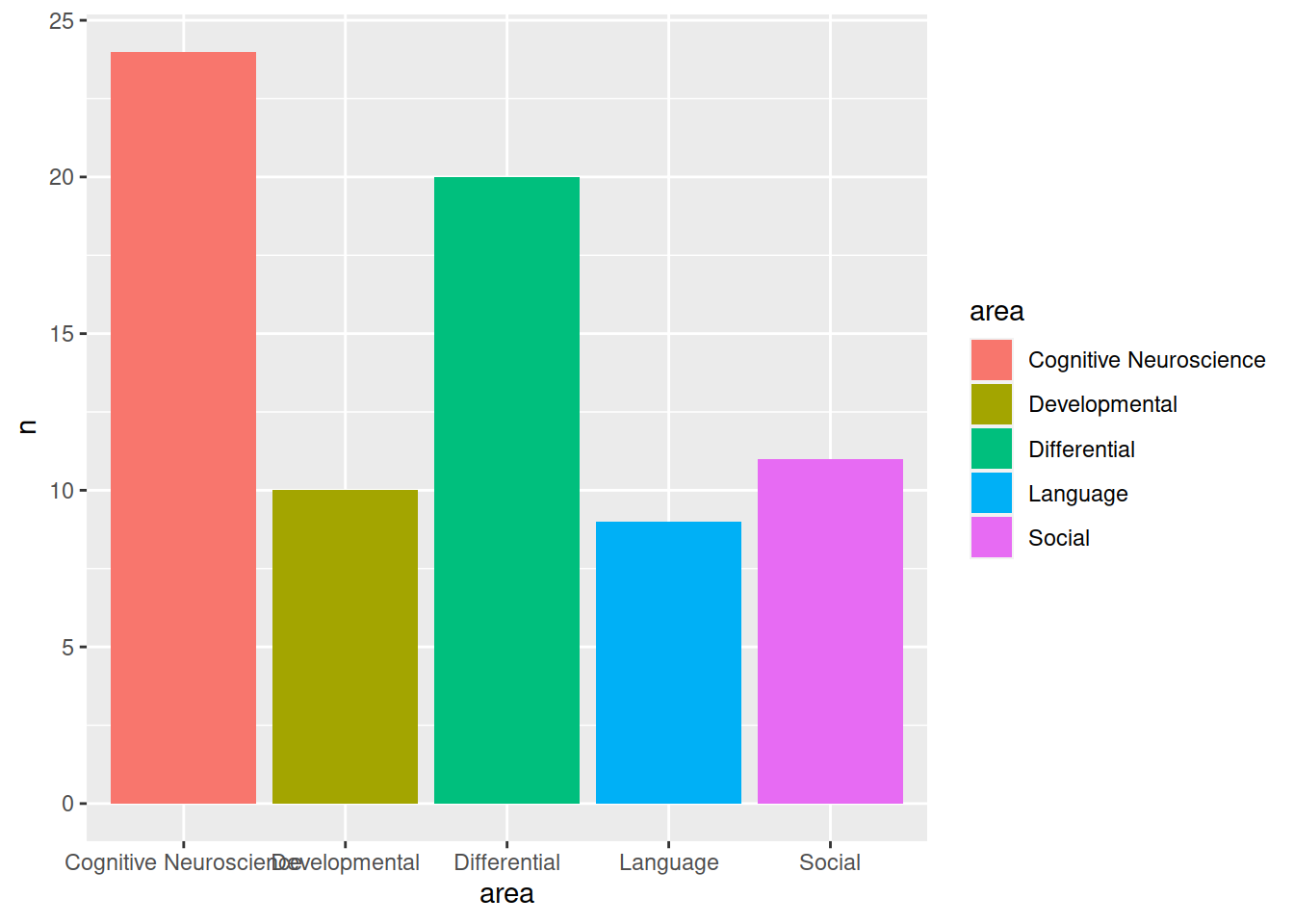
Supposing that we have surveyed the people working in a psychology department and asked them what sub-discipline of psychological research they most strongly identify as working within (If you would like to work along with the reading, the data is available at https://uoepsy.github.io/data/psych_survey.csv).
| Variable Name | Description |
|---|---|
| participant | Subject identifier |
| area | Respondent’s sub-discpline of psychology |
First, we read our data in to R and store it in an object called “psych_disciplines”:
psych_disciplines <- read_csv("https://uoepsy.github.io/data/psych_survey.csv")
psych_disciplines
## # A tibble: 74 x 2
## participant area
## <chr> <chr>
## 1 respondent_1 Differential
## 2 respondent_2 Social
## 3 respondent_3 Differential
## 4 respondent_4 Social
## 5 respondent_5 Differential
## 6 respondent_6 Differential
## 7 respondent_7 Language
## 8 respondent_8 Language
## 9 respondent_9 Cognitive Neuroscience
## 10 respondent_10 Language
## # … with 64 more rowsWe can get the frequencies of different response levels of the discipline variable by using the following code:
# start with the psych_disciplines dataframe
# %>%
# count() the values in the "area" variable
psych_disciplines %>%
    count(area)
## # A tibble: 5 x 2
## area n
## <chr> <int>
## 1 Cognitive Neuroscience 24
## 2 Developmental 10
## 3 Differential 20
## 4 Language 9
## 5 Social 11
Frequency table
To describe a distribution like this, we can simply provide the frequency table.
Let’s store it as an object in R:
# make a new object called "freq_table", and assign it:
# the counts of values of "area" variable in
# the psych_discipline dataframe.
freq_table <-
    psych_disciplines %>%
    count(area)

# show the object called "freq_table"
freq_table
## # A tibble: 5 x 2
## area n
## <chr> <int>
## 1 Cognitive Neuroscience 24
## 2 Developmental 10
## 3 Differential 20
## 4 Language 9
## 5 Social 11For a report, we might want to make it a little more easily readable:
Central tendency
Often, we might want to summarise data into a single summary value, reflecting the point at (or around) which most of the values tend to cluster. This is known as a measure of central tendency. For numeric data, we can use measures such as the mean, which you will likely have heard of. For nominal data (unordered categorical data), however, our only option is to use the mode.
Mode
The most frequent value (the value that occurs the greatest number of times).
In our case, the mode is the “Cognitive Neuroscience” category.
Relative frequencies
We might alternatively want to show the percentage of respondents in each category, rather than the raw frequencies.
The percentages show the relative frequency distribution
Relative frequency distribution
A relative frequency distribution shows the proportion of times each value occurs
(contrast this with the frequency distribution which shows the number of times).
Relative frequencies can be written as fractions, percents, or decimals.
In the object “freq_table”, we have a variable called n, which is the frequencies (the number in each category).
The total of this column is equal to the total number of respondents:
# sum all the values in the "n" variable in the "freq_table" object
sum(freq_table$n)
## [1] 74And therefore, each value in freq_table$n, divided by the total, is equal to the proportion in each category:
( Tip: Proportions are percentages/100. So 0.4 is another way of expressing 40%)
# take the values in the "n" variable from the "freq_table" object,
# and divide by the sum of all the values in the "n" variable in "freq_table"
freq_table$n/sum(freq_table$n)
## [1] 0.3243243 0.1351351 0.2702703 0.1216216 0.1486486We can then simply add the proportions as a new column to our table of frequencies by assigning the values we just calculated to a new variable:
# the variable "prop" in the "freq_table" object is now assigned
# the values we calculated above (the proportions)
freq_table$prop <- freq_table$n/sum(freq_table$n)

# print the "freq_table" object
freq_table
## # A tibble: 5 x 3
## area n prop
## <chr> <int> <dbl>
## 1 Cognitive Neuroscience 24 0.324
## 2 Developmental 10 0.135
## 3 Differential 20 0.270
## 4 Language 9 0.122
## 5 Social 11 0.149
However, we can also do this within a sequence of pipes (%>%). To do so, we use a new function called mutate().
mutate()
The mutate() function is used to add or modify variables to data.
# take the data
# %>%
# mutate it, such that there is a variable called "newvariable", which
# has the values of a variable called "oldvariable" multiplied by two.
data %>%
  mutate(
    newvariable = oldvariable * 2
  )
Note: Inside mutate(), we don’t have to keep using the dollar sign $, as we have already told it what data to look for variables in.
To ensure that our additions/modifications of variables are stored in R’s environment (rather than simply printed out), we need to reassign the name of our dataframe:
data <-
  data %>%
  mutate(
    newvariable = oldvariable * 2
  )
We can actually add this step to our earlier code:
# make a new object called "freq_table", and assign it:
# the counts of values of "area" variable in
# the psych_discipline dataframe.
# from there, 'mutate' such that there is a variable called "prop" which
# has the values of the "n" variable divided by the sum of the "n" variable.
freq_table <-
  psych_disciplines %>%
  count(area) %>%
  mutate(
    prop = n/sum(n)
  )

# show the object called "freq_table"
freq_table
## # A tibble: 5 x 3
## area n prop
## <chr> <int> <dbl>
## 1 Cognitive Neuroscience 24 0.324
## 2 Developmental 10 0.135
## 3 Differential 20 0.270
## 4 Language 9 0.122
## 5 Social 11 0.149Visualising
“By visualizing information, we turn it into a landscape that you can explore with your eyes. A sort of information map. And when you’re lost in information, an information map is kind of useful.” – David McCandless
We’re going to now make our first steps into the world of data visualisation. R is an incredibly capable language for creating visualisations of almost any kind. It is used by many media companies (e.g., the BBC), and has the capability of producing 3d visualisations, animations, interactive graphs, and more.
We are going to use the most popular R package for visualisation, ggplot2. This is actually part of the tidyverse, so if we have an Rmarkdown document and have loaded the tidyverse packages at the start (by using library(tidyverse)), then ggplot2 will be loaded too).
Recall our frequency distribution table:
# show the object called "freq_table"
freq_table
## # A tibble: 5 x 3
## area n prop
## <chr> <int> <dbl>
## 1 Cognitive Neuroscience 24 0.324
## 2 Developmental 10 0.135
## 3 Differential 20 0.270
## 4 Language 9 0.122
## 5 Social 11 0.149We can plot these values as a bar chart:
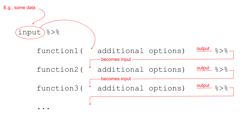
ggplot(data = freq_table, aes(x = area, y = n)) +
    geom_col()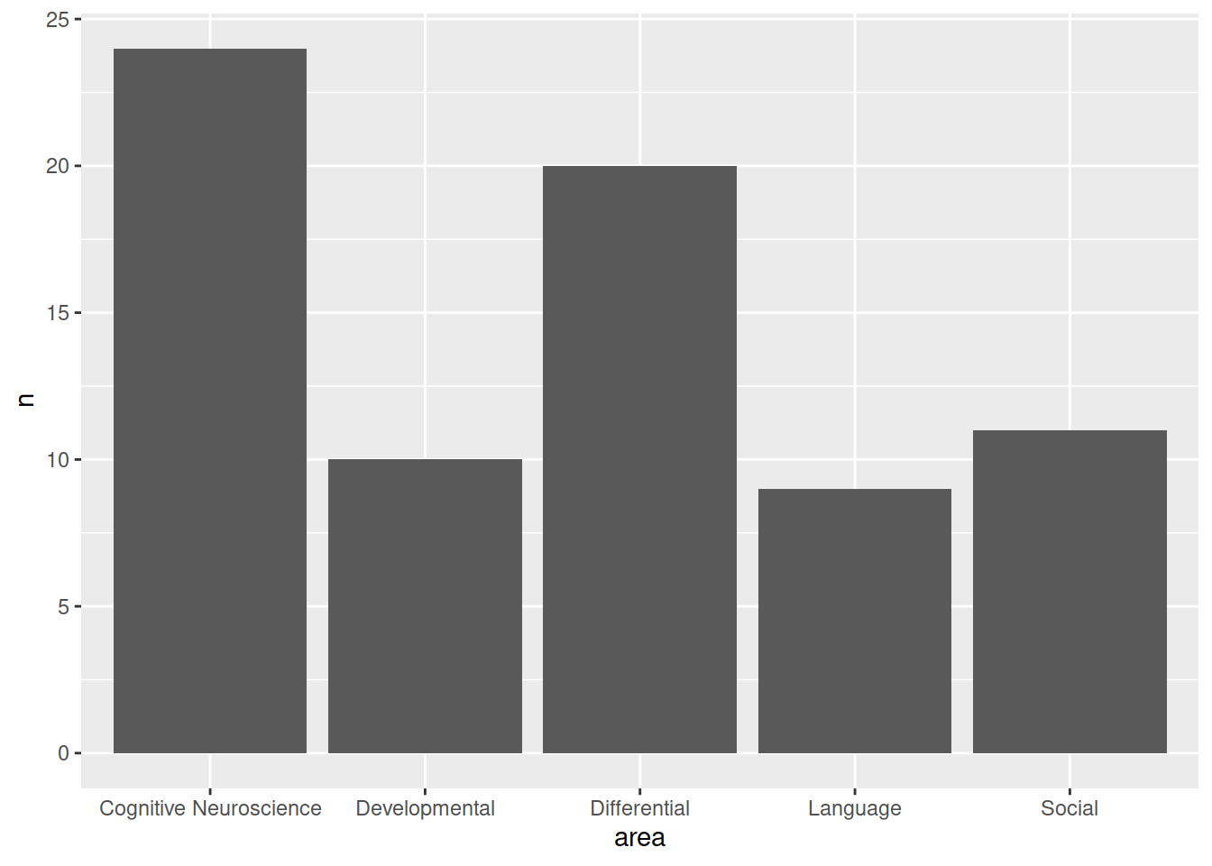
Figure 1: Artwork by @allison_horst
ggplot components
Note the key components of the ggplot code.
data =where we provide the name of the dataframe.aes =where we provide the aesthetics. These are things which we map from the data to the graph. For instance, the x-axis, or if we wanted to colour the columns/bars according to some aspect of the data.
Then we add (using +) some geometry. These are the shapes (in our case, the columns/bars), which will be put in the correct place according to what we specified in aes().
+ geom_col()Adds columns to the plot.
 2. Change the axis labels:
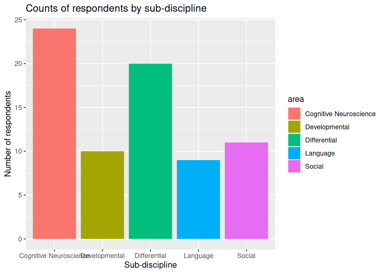 3. Change the geom:
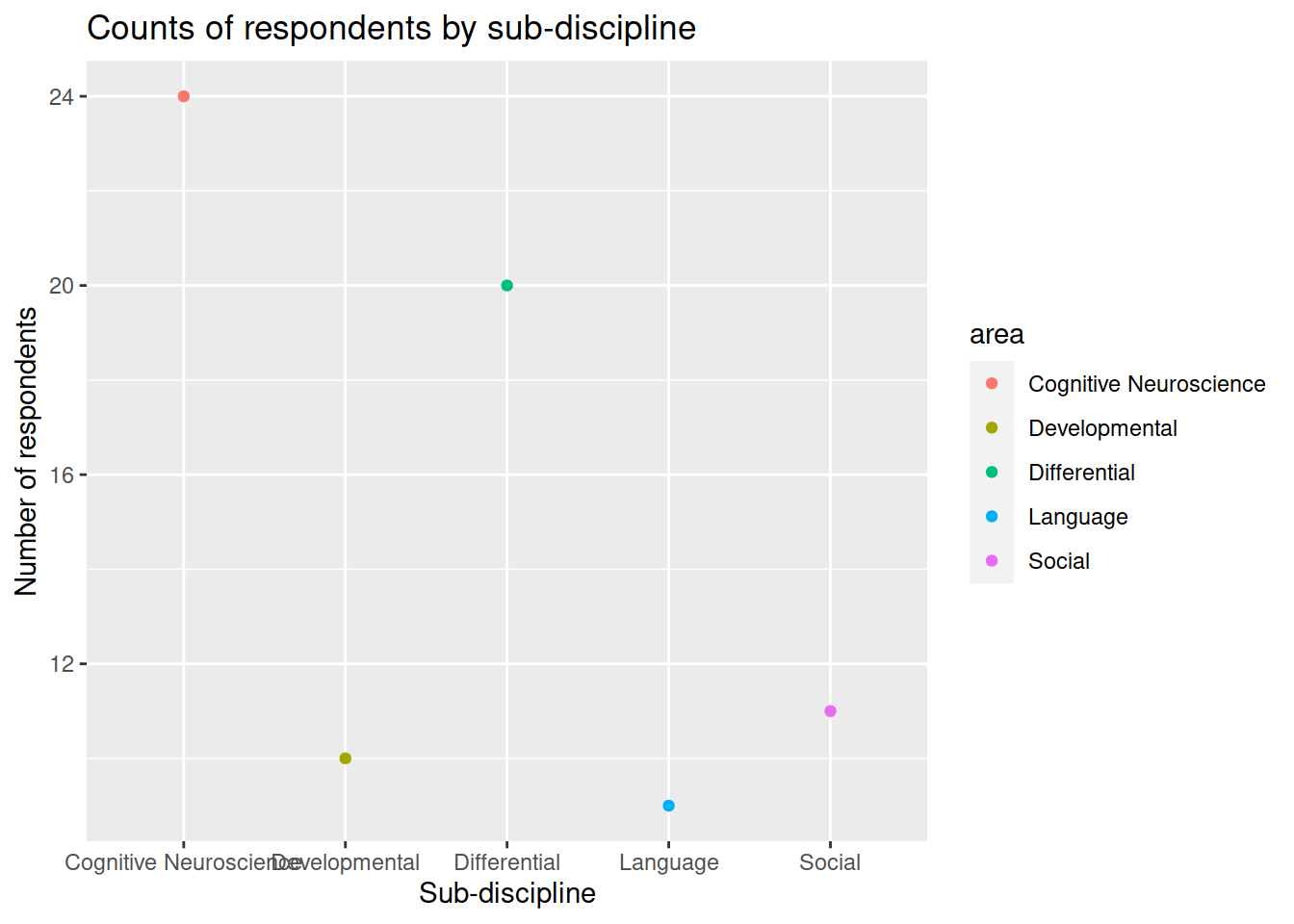 4. Change the limits of the axes:
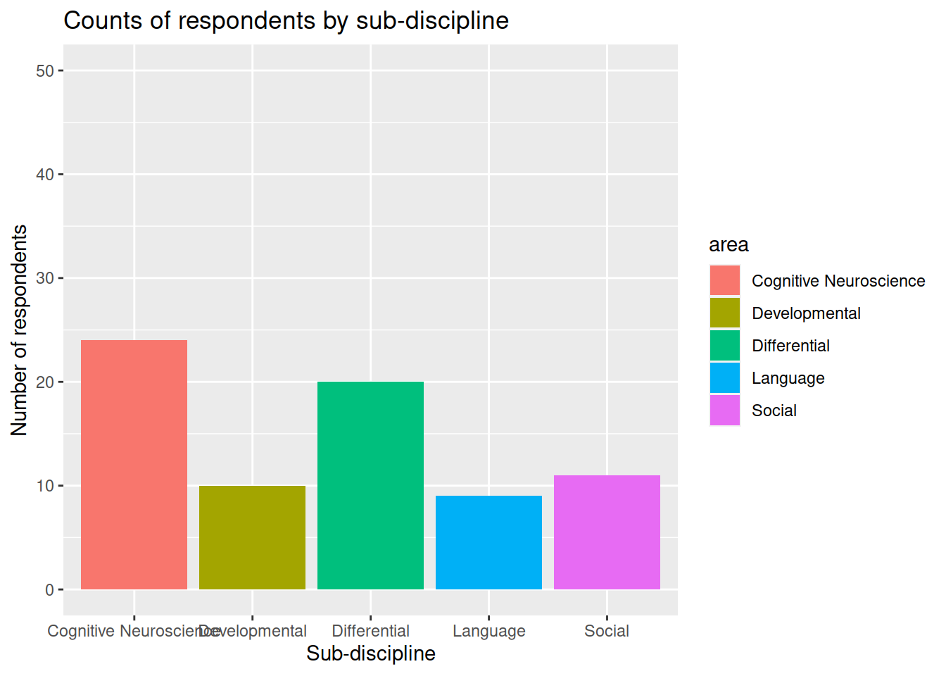 5. Remove (or reposition) the legend:
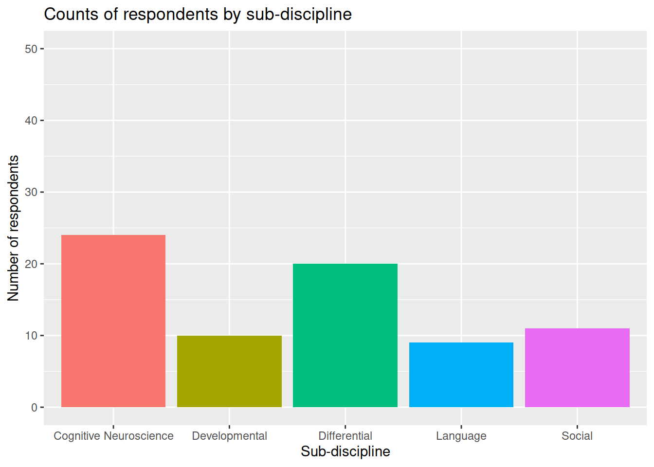 6. Changing the theme:
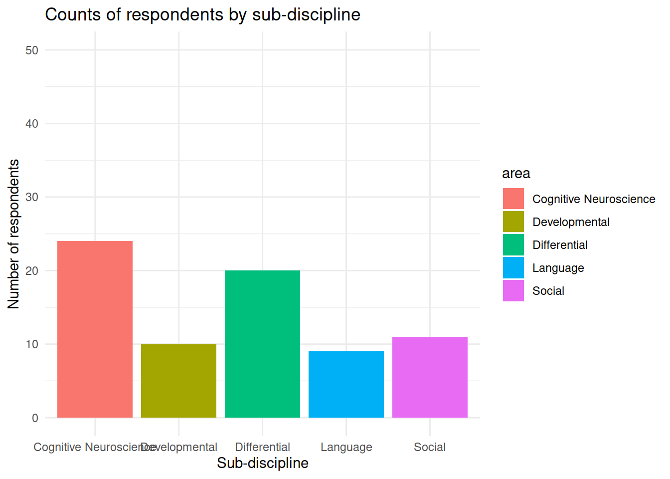
Ordered Categorical (Ordinal) Data
Recall that ordinal data is categorical data which has a natural ordering of the possible responses. One of the most common examples of ordinal data which you will encounter in psychology is the Likert Scale. You will probably have come across these before, perhaps when completing online surveys or questionnaires.
Likert Scale
A five or seven point scale on which an individual express how much they agree or disagree with a particular statement.
With Likert data, there is a set of discrete response options (it is categorical data). The response options can be ranked, making it ordered categorical ( strongly disagree < disagree < neither < agree < strongly agree ). Importantly, the distance between responses is not measurable.
Frequency table
Let’s suppose that as well as collecting information on the sub-discipline of psychology they identified with, we also asked our respondents to rate their level of happiness from 1 to 5, as well as their job satisfaction from 1 to 5.
| Variable Name | Description |
|---|---|
| participant | Subject identifier |
| happiness | Respondent’s level of happiness from 1 to 5 |
| job_sat | Respondent’s level of job satisfaction from 1 to 5 |
psych_survey <- read_csv("https://uoepsy.github.io/data/psych_survey2.csv")
psych_survey
## # A tibble: 74 x 3
## participant happiness job_sat
## <chr> <dbl> <dbl>
## 1 respondent_1 3 3
## 2 respondent_2 3 4
## 3 respondent_3 2 5
## 4 respondent_4 4 5
## 5 respondent_5 3 5
## 6 respondent_6 4 4
## 7 respondent_7 4 2
## 8 respondent_8 5 5
## 9 respondent_9 1 5
## 10 respondent_10 3 4
## # … with 64 more rowsFor these questions (variables happiness and job_sat), we could do the same thing as we did above for unordered categorical data, and summarise this into frequencies:
# take the "psych_survey" dataframe %>%
# count() the values in the "happiness" variable
psych_survey %>%
    count(happiness)
## # A tibble: 5 x 2
## happiness n
## <dbl> <int>
## 1 1 6
## 2 2 13
## 3 3 27
## 4 4 21
## 5 5 7# take the "psych_survey" dataframe %>%
# count() the values in the "job_sat" variable
psych_survey %>%
count(job_sat)## # A tibble: 5 x 2
## job_sat n
## <dbl> <int>
## 1 1 3
## 2 2 6
## 3 3 11
## 4 4 16
## 5 5 38Central tendency
We could again use the Mode - the most common value - to summarise this data. However, because the responses are ordered, it can be more useful to think about the percentages of respondents in and below/above each category. For instance, we might want to talk about asking which category has 50% of the observations in a lower category, and 50% of the observations in a higher category. This is mid-point is known as the Median.
Median
The value for which 50% of observations a lower and 50% are higher. It is the mid-point of a list of ordered values.
To find the median:
- rank order the values
- find the middle value:
- If there are \(n\) values, find the value at position \(\frac{n+1}{2}\).
- If \(n\) is even, \(\frac{n+1}{2}\) will not be a whole number.
For instance, if \(n = 20\), you are looking for the \(\frac{n+1}{2} = \frac{20+1}{2} = 10.5^{th}\) value.- When calculating the median for ordinal data, if the \(\frac{n}{2}^{th}\) and \(\frac{n+1}{2}^{th}\) values are different, report both.
- When calculating the median for numeric data, report the midpoint of the \(\frac{n}{2}^{th}\) and \(\frac{n+1}{2}^{th}\) values.
- If there are \(n\) values, find the value at position \(\frac{n+1}{2}\).
In the previous lab we discussed how to tell R explicitly that a variable is of a certain type using functions such as as.factor(), as.numeric(), and so on.
You may notice that we haven’t done this yet with the data we have been working with in so far today:
# inside the "psych_survey" dataframe, take ($) the "happiness" variable,
# and tell me what type/class it is
class(psych_survey$happiness)
## [1] "numeric"This is because there are some benefits to letting R think your data is numeric, even when it is not.
It means we can use functions such as median() to quickly find the median:
# inside the "psych_survey" dataframe, take ($) the "happiness" variable,
# and find the median
median(psych_survey$happiness)
## [1] 3Be careful
While we can make R treat this data is numeric, it is important to remember that it is actually measured on an ordinal scale.
For example, if the median falls between levels, R will tell us that the median is the mid-point:
# for the values 2,1,2,3,4,5,
# find the median
median(c(2,1,2,3,5,4))
## [1] 2.5But because our data is ordinal, then we know that 2.5 is not a valid response.
We can also use functions such as min() and max() to find the minimum and maximum values:
# inside the "psych_survey" dataframe, take ($) the "happiness" variable,
# and find the minimum value
min(psych_survey$happiness)
## [1] 1# and find the maximum value
max(psych_survey$happiness)## [1] 5Cumulative percentages, Quartiles
In calculating the median, we are going beyond talking about the relative frequencies (i.e., the percentage in each category), to talking about the cumulative percentage.
Cumulative percentage
Cumulative percentages are another way of expressing a frequency distribution.
They are the successive addition of percentages in each category. For example, the cumulative percentage for the 3rd category is the percentage of respondents in the 1st, 2nd and 3rd category:
| Category | Frequency count (n) | Relative frequency (%) | Cumulative frequency | Cumulative percentage |
|---|---|---|---|---|
| Response 1 | 10 | 13.33333 | 10 | 13.33333 |
| Response 2 | 10 | 13.33333 | 20 | 26.66667 |
| Response 3 | 20 | 26.66667 | 40 | 53.33333 |
| Response 4 | 25 | 33.33333 | 65 | 86.66667 |
| Response 5 | 10 | 13.33333 | 75 | 100.00000 |
We saw before how we can calculate the proportions/percentages in each category:
( Note: We multiply by 100 here to turn the proportion into a percentage)
# take the "psych_survey" dataframe %>%
# count() the values in the "happiness" variable (creates an "n" column), and
# from there, 'mutate' such that there is a variable called "percent" which
# has the values of the "n" variable divided by the sum of the "n" variable.
psych_survey %>%
  count(happiness) %>%
  mutate(
    percent = n/sum(n)*100
  )
## # A tibble: 5 x 3
## happiness n percent
## <dbl> <int> <dbl>
## 1 1 6 8.11
## 2 2 13 17.6
## 3 3 27 36.5
## 4 4 21 28.4
## 5 5 7 9.46We can add another variable, and make it the cumulative percentage, by using the cumsum() function.
# take the "psych_survey" dataframe %>%
# count() the values in the "happiness" variable (creates an "n" column), and
# from there, 'mutate' such that there is a variable called "percent" which
# has the values of the "n" variable divided by the sum of the "n" variable,
# and also make a variable called "cumulative_percent" which is the
# successive addition of the values in the "percent" variable
psych_survey %>%
  count(happiness) %>%
  mutate(
    percent = n/sum(n)*100,
    cumulative_percent = cumsum(percent)
  )
## # A tibble: 5 x 4
## happiness n percent cumulative_percent
## <dbl> <int> <dbl> <dbl>
## 1 1 6 8.11 8.11
## 2 2 13 17.6 25.7
## 3 3 27 36.5 62.2
## 4 4 21 28.4 90.5
## 5 5 7 9.46 100
While the median splits the data in two (50% either side), you will often see data being split into four equal blocks.
The points which divide the four blocks are known as quartiles.
Quartiles
Quartiles are the points in rank-ordered data below which falls 25%, 50%, and 75% of the data.
- The first quartile is the first category for which the cumulative percentage is \(\geq 25\%\).
- The median is the first category for which the cumulative percentage is \(\geq 50\%\).
- The third quartile is the first category for which the cumulative percentage is \(\geq 75\%\).
By looking at the quartiles, it gives us an idea of how spread out the data is.
As an example, if we had 10 categories A, B, C, D, E, F, G, H, I, J, and we knew that:
- \(Q_1\) (the \(1^{st}\) quartile) = G,
- \(Q_2\) (the \(2^{nd}\) quartile, the median) = H,
- \(Q_3\) (the \(3^{rd}\) quartile) = H,
This tells us that the first 25% of the data falls in one of the categories from A to G (quite a large range), the second 25% falls in categories G and H (a small range), and the third 25% of the data falls entirely in category H.
So a lot of the data is between G and H, with the data being more sparse in the lower and higher categories.
Looking ahead to numeric data
We will talk about quartiles in numeric data too, where we commonly use the difference between the first and third quartile as a measure of how spread out the data are. This gets known as the inter-quartile range (IQR).
Visualising
We can visualise ordered categorical data in the same way we did for unordered.
First we save our frequencies/percentages as a new object:
freq_table2 <- psych_survey %>%
  count(happiness) %>%
  mutate(
    percent = n/sum(n)*100
  )
Then we give that object to our ggplot code, with the appropriate aes() mappings:
# make a ggplot with the object "freq_table2".
# on the x axis put the possible values in the "happiness" variable,
# on the y axis put the possible values in the "n" variable.
# add columns for each entry in the data.
ggplot(data = freq_table2, aes(x = happiness, y = percent)) +
  geom_col()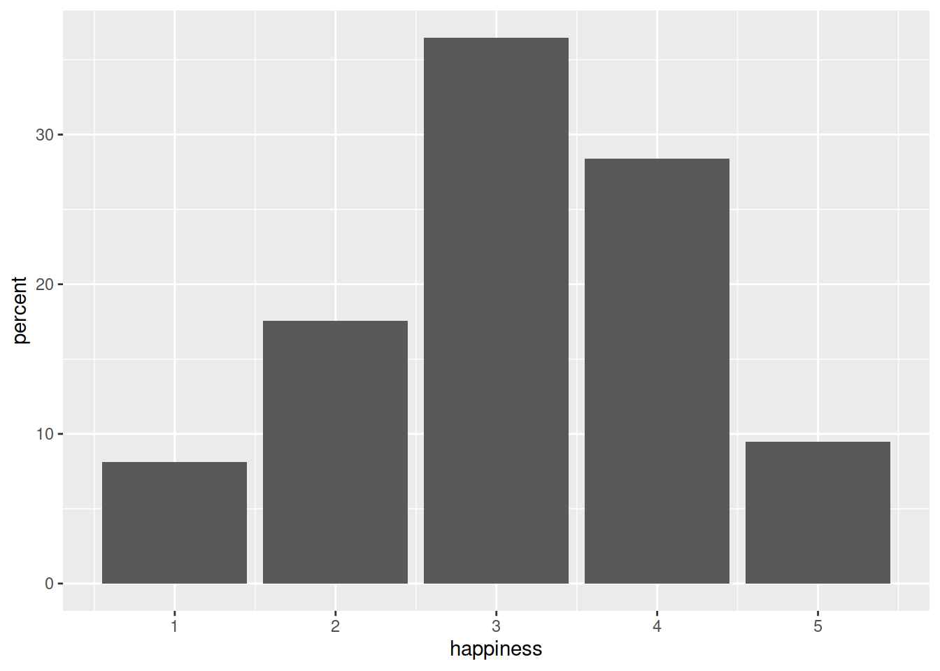
Glossary
- distribution: How often different possible values in a variable occur.
- frequency: Number of occurrences (count) in a given response value.
- relative frequency: Percentage/proportion of occurrences in a given response value.
- cumulative percentage: Percentage of occurrences in or below a given reponse value (requires ordered data).
- mode: Most common value.
- median: Middle value.
%>%Takes the output of whatever is on the LHS and gives it as the input of whatever is on the RHS.count()Counts the number of occurrences of each unique value in a variable.mutate()Used to add variables to the dataframe, or modify existing variables.min()Returns the minimum value of a variable.max()Returns the maximum value of a variable.median()Returns the median value of a variable.ggplot()Creates a plot. Takesdata=and a set of mappingsaes()from the data to properties of the plot (e.g., x/y axes, colours).geom_col()Adds columns to a ggplot.
Exercises
Open a new Rmarkdown document for this set of exercises.
File > New File > R Markdown..
In your first code-chunk, load the tidyverse packages with the following command:
library(tidyverse)Make sure you run the chunk.
We’re going to use the data on popular passwords which we saw in the previous lab.
The data is available online at https://uoepsy.github.io/data/passworddata.csv.
Read in the data from the link.
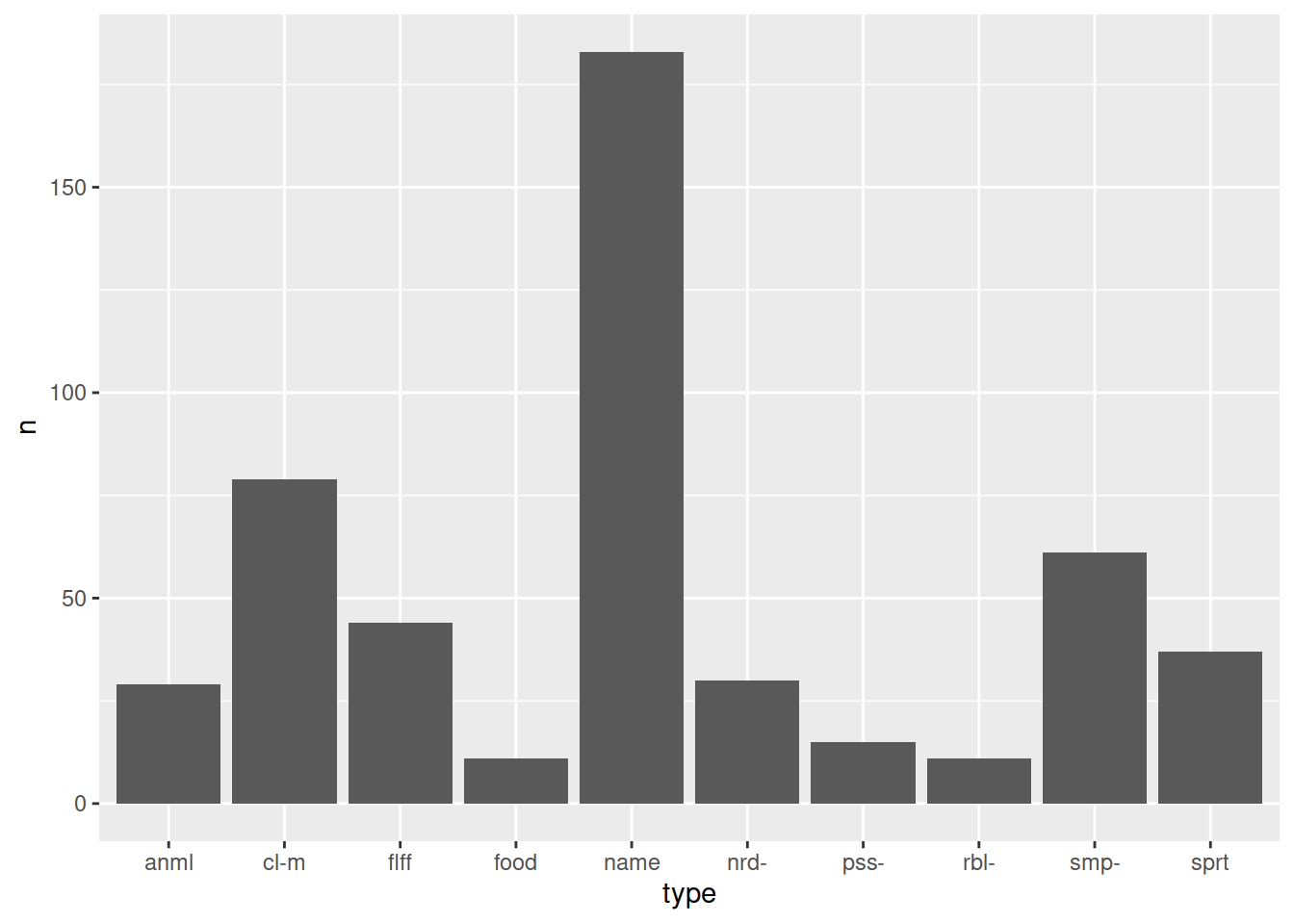
Produce a table of frequencies and relative frequencies (percentages/proportions) of different types of passwords
What is the mode of password type? and what is the least common?
Produce a plot of the frequencies of password types:
In the previous exercises using this dataset we worked with the strength_cat variable, and made R treat it as an ordered categorical variable (weak < medium < strong).
The strength variable is also an ordered categorical variable, but contains more levels, measuring password strength on values from 1 to 10.
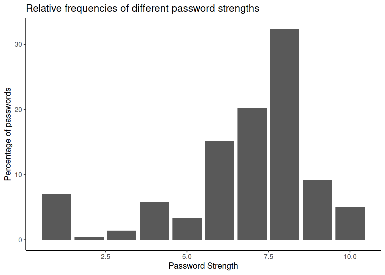
Produce a table showing the frequencies and cumulative percentages of the different strength levels of passwords in the data
From looking only at the table you made in the previous question, what is the median strength level?
Check that your answer is correct by passing the strength variable to the median() function.
Find also the minimum and maximum values.
Note: Did you make the strength variable a factor in one of the earlier questions? If so, median(pwords$strength) will not work, because median() needs it to be numeric.
If needed, you can convert the variable back to numeric:
pwords$strength <- as.numeric(pwords$strength).
Or simply do so temporarily:
median(as.numeric(pwords$strength))
Create a plot of the percentages of passwords in each strength level
Think back at the definition of quartiles.
At what point is the fourth quartile?
- The maximum value
- The first category for which the cumulative percentage is \(\geq 100\%\).
- Both of the above
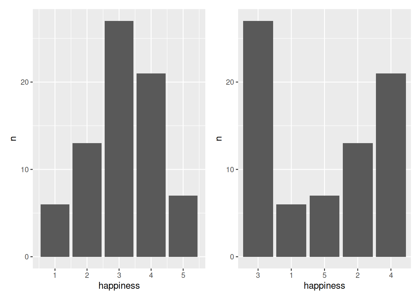
Take a look at the two plots below. Why is one more useful than the other?