| variable | description |
|---|---|
| age | Age (years) |
| lifesat | Life Satisfaction score |
| dwelling | Dwelling (town/city in Scotland) |
| size | Size of Dwelling (> or <100k people) |
Plot random effects
To explore the patterns that your model has identified, it’s often useful to plot the random effects, that is, the group-level adjustments to the fixed effect parameters.
This kind of plot is often nice to include in the appendix of a report or (mini)dissertation.
For the kind of plot that’s best for the Results section, see Plot model-fitted values.
Example: Life satisfaction in Scotland
These data come from 112 people across 12 different Scottish dwellings (cities and towns). Information is captured on their ages and a measure of life satisfaction. The researchers are interested in if there is an association between age and life-satisfaction.
Data are available at https://uoepsy.github.io/data/lmm_lifesatscot.csv.
lifesatscot <- read_csv("https://uoepsy.github.io/data/lmm_lifesatscot.csv")Our model is the following (to see how we figured out this random effect structure, see Identify possible random effects).
lifesat_mod <- lmer(
  lifesat ~ age + (1 + age | dwelling),
  data = lifesatscot
)
Plot group-level adjustments
The function dotplot.ranef.mer() will take the model’s group-level adjustments (extracted via ranef(); see Extract estimates from a fitted model) and plot them.
dotplot.ranef.mer(ranef(lifesat_mod))$dwelling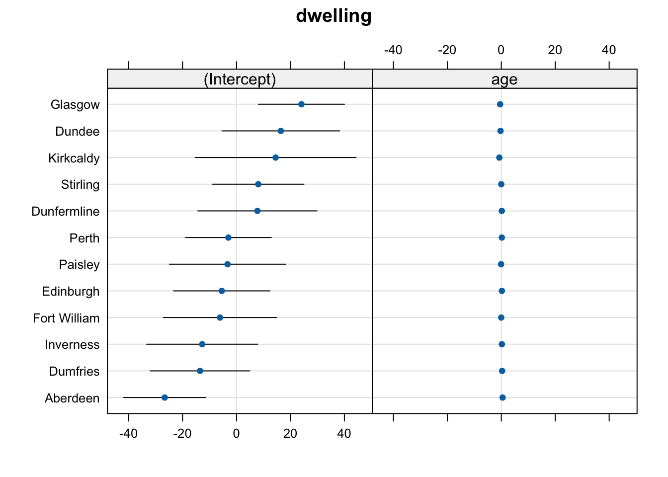
In the plot above, the age adjustments all appear tightly clustered around 0. This is because their magnitude (i.e., the size of the numbers) is a lot smaller than the magnitude of the intercept adjustments.
To “zoom in” on the age adjustments for each dwelling, we can add a bit of extra code that allows the scales of each subplot to vary:
dotplot.ranef.mer(
  ranef(lifesat_mod),
  scales = list(x = list(relation = 'free'))  # allow scales of subplots to vary
)$dwelling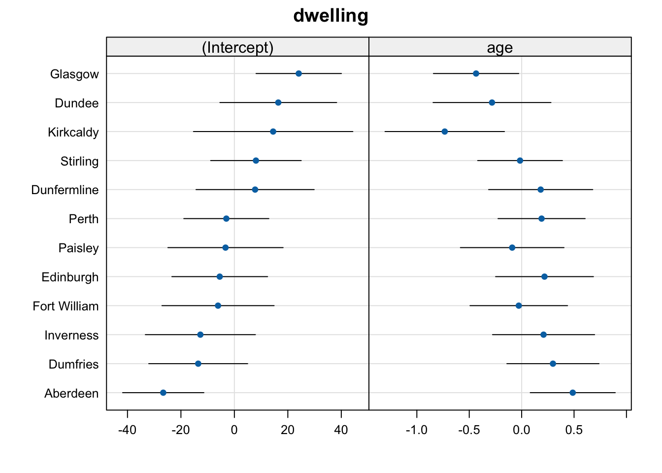
Much better!
Reading random effects plots
In general:
- Each subplot/panel/facet contains the adjustments to one fixed effect parameter.
- Each “row” represents one level of the grouping variable.
- The dots represent the estimated adjustment values for each dwelling place for each fixed effect.
- The black error bars represent the 95% confidence interval for each adjustment value.
Things to notice about this plot in particular:
- Dwellings with negative intercept adjustments tend to have positive adjustments to the slope over
age. This suggests that the intercept and slope adjustments for each dwelling are negatively correlated. Let’s check:
VarCorr(lifesat_mod) Groups Name Std.Dev. Corr
dwelling (Intercept) 17.853
age 0.421 -0.87
Residual 7.969 Yes indeed: the Corr column shows a correlation between intercept and slope of –0.87 (see Interpret LMM summary > The random effects and Interpret LMM summary > Interpreting the numbers: Correlation).
Linked flash cards
Outgoing links
- TODO
Backlinks
- TODO