| variable | description |
|---|---|
| age | Age (years) |
| lifesat | Life Satisfaction score |
| dwelling | Dwelling (town/city in Scotland) |
| size | Size of Dwelling (> or <100k people) |
Plot model-fitted values
The plots shown on this page are good examples of what you might include in the Results section of a report or (mini)dissertation.
Continuous predictor example: Life satisfaction in Scotland
These data come from 112 people across 12 different Scottish dwellings (cities and towns). Information is captured on their ages and a measure of life satisfaction. The researchers are interested in if there is an association between age and life-satisfaction.
Data are available at https://uoepsy.github.io/data/lmm_lifesatscot.csv.
lifesatscot <- read_csv("https://uoepsy.github.io/data/lmm_lifesatscot.csv")Our model is the following (to see how we figured out this random effect structure, see Identify possible random effects).
lifesat_mod <- lmer(
  lifesat ~ age + (1 + age | dwelling),
  data = lifesatscot
)
Plot fixed effects
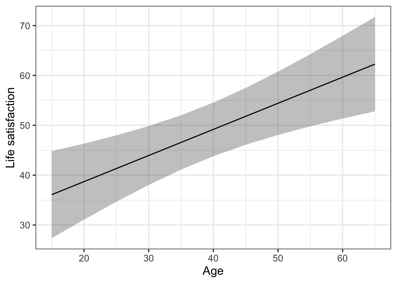
With the effects library, we get the function effect(). This function tells us the model-fitted outcome values (in column fit) for each value of age, along with the lower and upper bounds of the 95% CI around those fitted values.
library(effects)

effect(term = "age", mod = lifesat_mod) |>
  as.data.frame()
age fit se lower upper
1 20 38.7 3.85 31.1 46.4
2 30 43.9 2.98 38.0 49.9
3 40 49.2 2.71 43.8 54.6
4 50 54.4 3.20 48.1 60.8
5 60 59.6 4.19 51.3 67.9effect() by default gives five equally-spaced values across the range of the predictor. But we have observed ages outside this range: we have ages 15 in our data, as well as ages of 65.
So, we need an extra trick: to make effect() give us fitted values for the whole observed range of age, we define the values of age we want to see and then tell that to effects() using the xlevels= argument:
# Get fitted values every five years between the min age and max age
age_range <- seq(
  min(lifesatscot$age),  # this is the first value in the sequence (15)
  max(lifesatscot$age),  # this is the final value in the sequence (65)
  5  # this is how spaced out the numbers should be (gives us every fifth number)
)

effect(term = "age", mod = lifesat_mod, xlevels = list(age = age_range)) |>
  as.data.frame()
age fit se lower upper
1 15 36.1 4.41 27.4 44.8
2 20 38.7 3.85 31.1 46.4
3 25 41.3 3.36 34.7 48.0
4 30 43.9 2.98 38.0 49.9
5 35 46.6 2.75 41.1 52.0
6 40 49.2 2.71 43.8 54.6
7 45 51.8 2.87 46.1 57.5
8 50 54.4 3.20 48.1 60.8
9 55 57.0 3.65 49.8 64.3
10 60 59.6 4.19 51.3 67.9
11 65 62.3 4.78 52.8 71.7We can pipe this data into ggplot to visualise the model-fitted values as follows:
effect(term = "age", mod = lifesat_mod, xlevels = list(age = age_range)) |>
  as.data.frame() |>
  ggplot(aes(x = age, y = fit)) +
  geom_line() +
  geom_ribbon(aes(ymin = lower, ymax = upper), alpha = 0.3) +
  labs(
    y = 'Life satisfaction',
    x = 'Age'
  )
More advanced plotting: Including the group-level lines
First plot group-level lines on their own
With the package broom.mixed, we get the function augment(). Think of this function as the group-level version of effects::effect(): it gives us model-fitted values (in the column .fitted) for each level of our grouping variable. We can pipe its output into ggplot and plot lines for each dwelling.
library(broom.mixed)

augment(lifesat_mod) |>
  ggplot(aes(x = age, y = .fitted, group = dwelling)) +
  geom_line()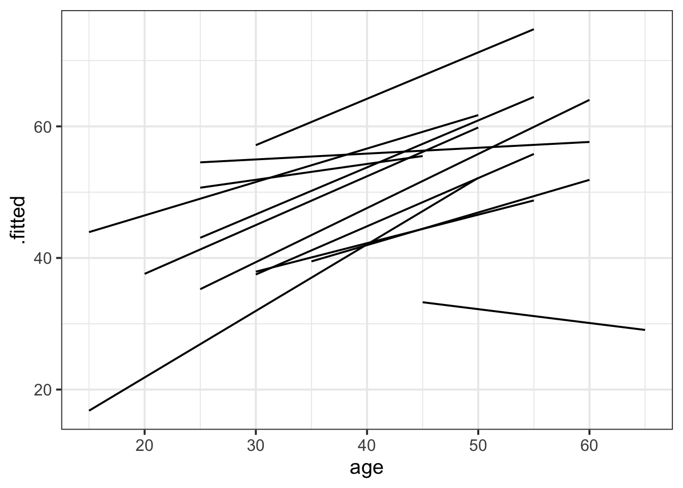
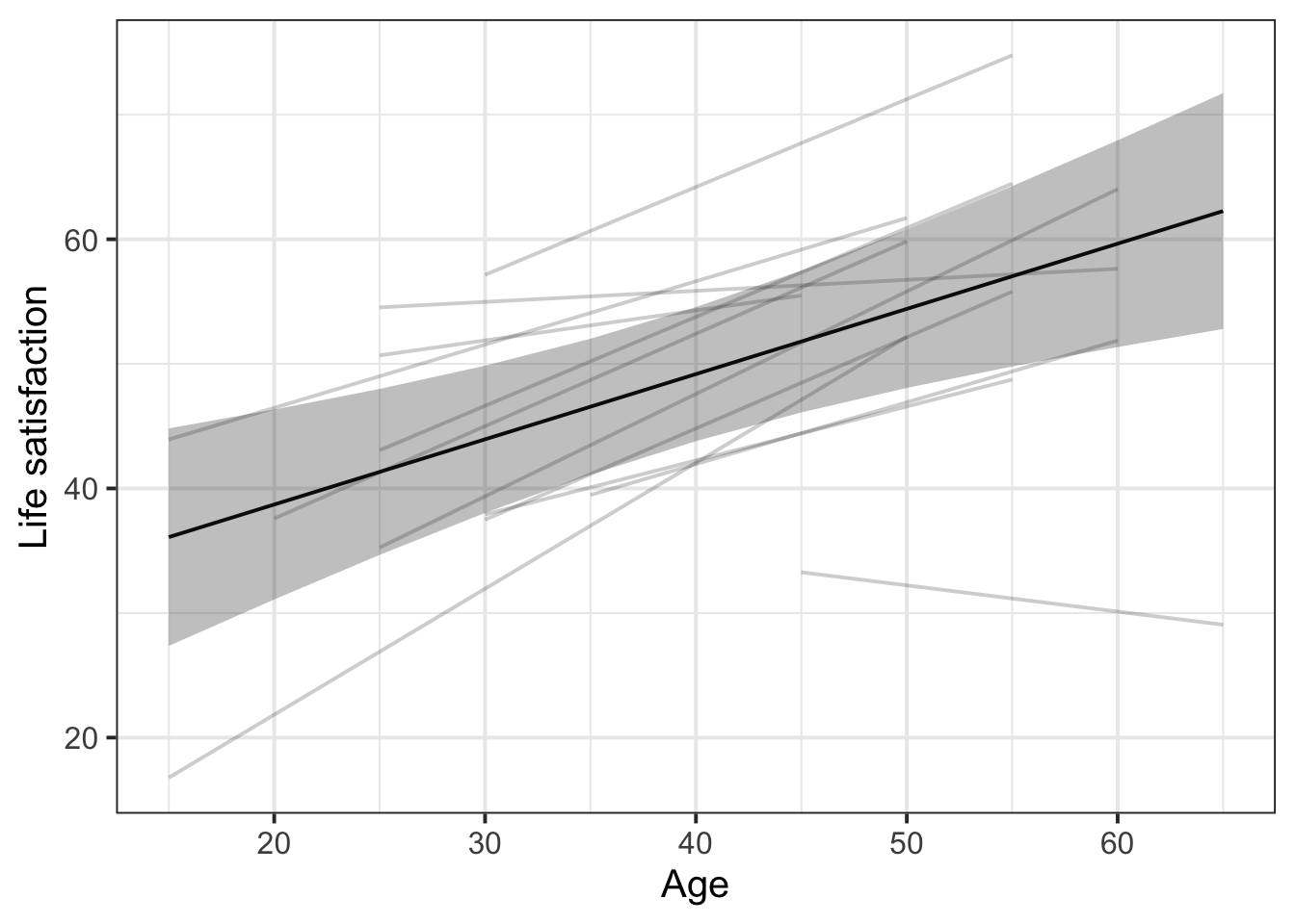
Combine fixed effects and group-level lines
This plot is a bit more complex, since it combines data coming from two different places: effects() and augment().
# Store the fitted estimates for the fixed effects
eff_df <- effect(term = "age", mod = lifesat_mod, xlevels = list(age = age_range)) |>
  as.data.frame()

# Create the ggplot based on `augment()`
augment(lifesat_mod) |>

  # Both augment() and eff_df have the same variable called `age` for the x axis,
  # so we can define that x axis for the whole ggplot:
  ggplot(aes(x = age)) +

  # Create the group-level lines with the variable names specific to augment()
  geom_line(aes(y = .fitted, group = dwelling), alpha = 0.2) +

  # Drawing on data from eff_df, which has different column names,
  # create the fixed effect line and 95% CI ribbon
  geom_line(data = eff_df, aes(y = fit)) +
  geom_ribbon(data = eff_df, aes(y = fit, ymin = lower, ymax = upper), alpha = 0.3) +

  # Cosmetics: adjust axis labels
  labs(
    x = 'Age',
    y = 'Life satisfaction'
  )
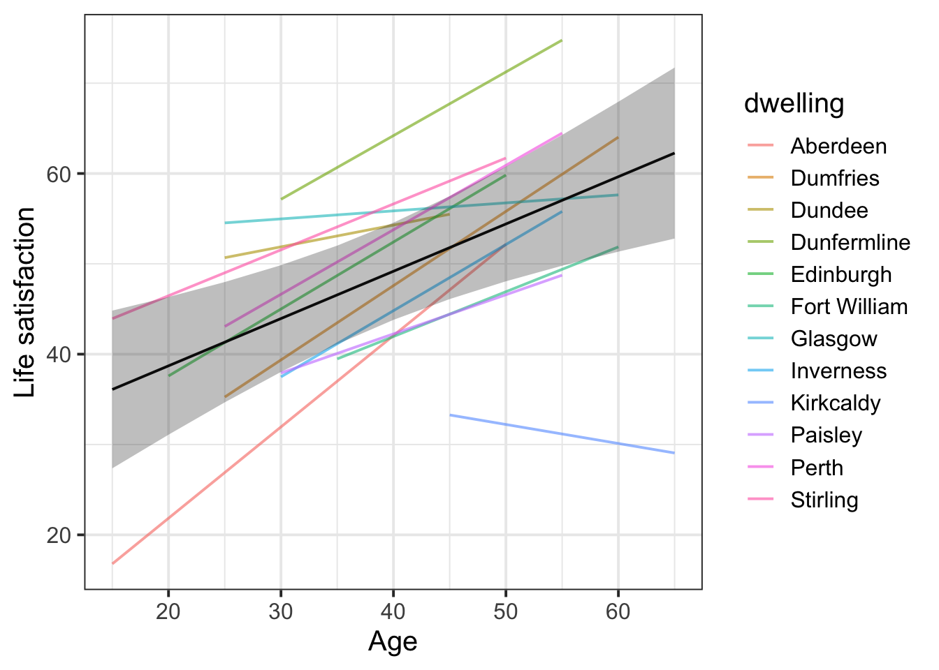
Add colour by dwelling
The only change is to rewrite group = dwelling as colour = dwelling in the first geom_line() call!
Caution: adding colour is only really useful if there are few enough levels of the grouping variable. If there are lots of levels, it’s hard for the reader to map different colours to different levels, so the colours would not add useful information.
# Store the fitted estimates for the fixed effects
eff_df <- effect(term = "age", mod = lifesat_mod, xlevels = list(age = age_range)) |>
  as.data.frame()

# Create the ggplot based on `augment()`
augment(lifesat_mod) |>

  # Both augment() and eff_df have the same variable called `age` for the x axis,
  # so we can define that x axis for the whole ggplot:
  ggplot(aes(x = age)) +

  # Create the group-level lines, now colouring by dwelling!
  geom_line(aes(y = .fitted, colour = dwelling), alpha = 0.6) +  # <- THE ONLY CHANGE!

  # Drawing on data from eff_df, which has different column names,
  # create the fixed effect line and 95% CI ribbon
  geom_line(data = eff_df, aes(y = fit)) +
  geom_ribbon(data = eff_df, aes(y = fit, ymin = lower, ymax = upper), alpha = 0.3) +

  # Cosmetics: adjust axis labels
  labs(
    x = 'Age',
    y = 'Life satisfaction'
  )
Categorical predictor example: Life satisfaction in Scotland
Let’s imagine we want to see life satisfaction as predicted by the population size of the area, rather than by people’s age.
The maximal model is the following.
lifesat_size_mod <- lmer(
lifesat ~ size + (1 | dwelling),
data = lifesatscot
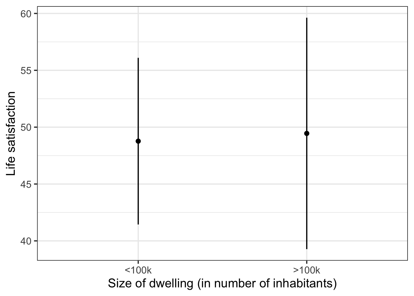
)Again we can use effect() to tell us the model-fitted outcome values (in column fit) for each of the two levels of our predictor size, along with the lower and upper bounds of their corresponding 95% CIs.
effect(term = "size", mod = lifesat_size_mod) |>
  as.data.frame()
size fit se lower upper
1 <100k 48.8 3.70 41.4 56.1
2 >100k 49.4 5.13 39.3 59.6We’ll pipe this data into ggplot and visualise each fitted value as a point and the 95% CIs as error bars.
effect(term = "size", mod = lifesat_size_mod) |>
  as.data.frame() |>
  ggplot(aes(x = size, y = fit)) +
  geom_point() +
  geom_errorbar(aes(ymin = lower, ymax = upper), width = 0) +
  labs(
    x = 'Size of dwelling (in number of inhabitants)',
    y = 'Life satisfaction'
  )
More advanced plotting: Including the group-level points
First plot group-level points on their own
augment() will add model predictions onto the existing data frame, which can often be very useful, but in the case of categorical predictors, often data gets repeated. Notice that there are two rows for Glasgow with identical .fitted values, two rows for Dundee with identical .fitted values, etc.:
augment(lifesat_size_mod) |> head()# A tibble: 6 × 14
lifesat size dwelling .fitted .resid .hat .cooksd .fixed .mu .offset
<dbl> <fct> <fct> <dbl> <dbl> <dbl> <dbl> <dbl> <dbl> <dbl>
1 31 >100k Aberdeen 38.1 -7.08 0.0924 0.0263 49.4 38.1 0
2 56 >100k Glasgow 55.6 0.393 0.0924 0.0000813 49.4 55.6 0
3 51 >100k Glasgow 55.6 -4.61 0.0924 0.0112 49.4 55.6 0
4 55 >100k Dundee 53.8 1.19 0.0924 0.000745 49.4 53.8 0
5 41 >100k Dundee 53.8 -12.8 0.0924 0.0862 49.4 53.8 0
6 69 <100k Perth 51.3 17.7 0.0912 0.162 48.8 51.3 0
# ℹ 4 more variables: .sqrtXwt <dbl>, .sqrtrwt <dbl>, .weights <dbl>,
# .wtres <dbl>So before plotting, we’ll deduplicate this data frame so we only have one row per dwelling.
augment(lifesat_size_mod) |>
  select(size, dwelling, .fitted) |>  # keep only these three columns
  distinct()  # keep only one instance of each duplicated row
# A tibble: 12 × 3
size dwelling .fitted
<fct> <fct> <dbl>
1 >100k Aberdeen 38.1
2 >100k Glasgow 55.6
3 >100k Dundee 53.8
4 <100k Perth 51.3
5 <100k Fort William 44.1
6 <100k Dunfermline 66.2
7 <100k Stirling 56.6
8 <100k Paisley 43.6
9 <100k Dumfries 48.3
10 <100k Kirkcaldy 34.2
11 >100k Edinburgh 50.3
12 <100k Inverness 45.8Now, to plot each dwelling’s model-fitted life satisfaction score:
augment(lifesat_size_mod) |>
  select(size, dwelling, .fitted) |>
  distinct() |>
  ggplot(aes(x = size, y = .fitted)) +
  geom_jitter(width = 0.1)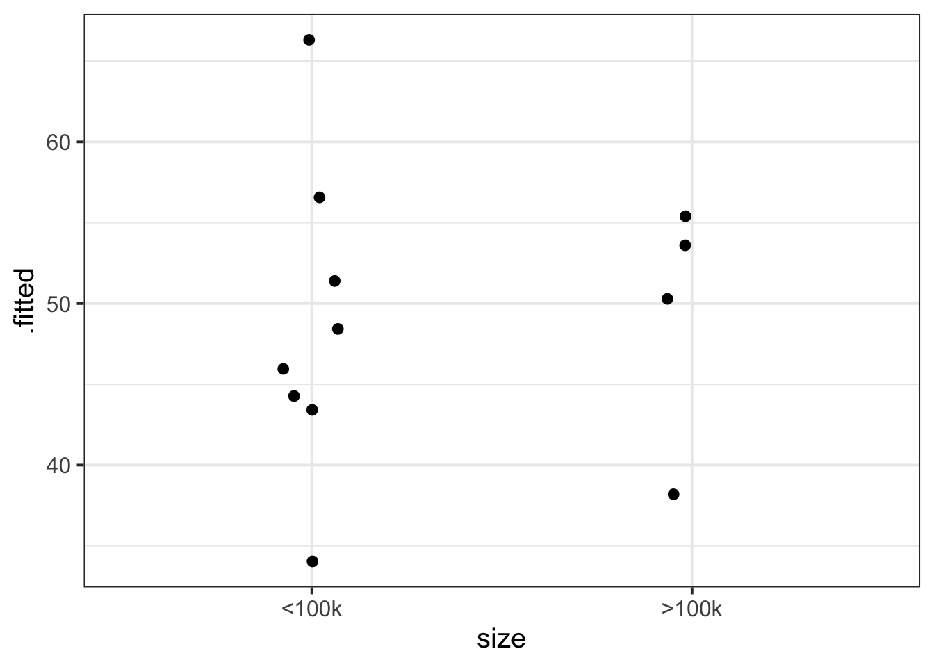
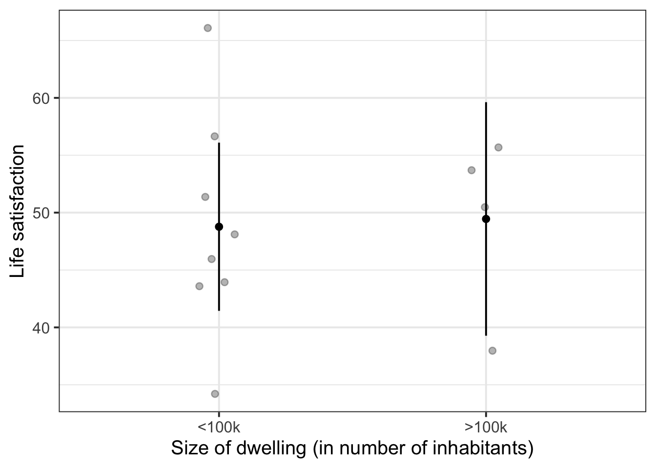
Combine fixed effects and group-level points
eff_df <- effect(term = "size", mod = lifesat_size_mod) |>
  as.data.frame()

augment(lifesat_size_mod) |>
  select(size, dwelling, .fitted) |>
  distinct() |>
  ggplot(aes(x = size)) +
  geom_jitter(aes(y = .fitted), width = 0.1, alpha = 0.3) +
  geom_point(data = eff_df, aes(y = fit)) +
  geom_errorbar(data = eff_df, aes(ymin = lower, ymax = upper), width = 0) +
  labs(
    x = 'Size of dwelling (in number of inhabitants)',
    y = 'Life satisfaction'
  )
Num/num interaction example: School grades, motivation, and funding
This dataset contains information on 900 children from 30 different schools across Scotland. The data was collected as part of a study looking at whether education-related motivation is associated with school grades. This is expected to be different for state vs privately funded schools.
All children completed an ‘education motivation’ questionnaire, and their end-of-year grade average has been recorded.
Data are available at https://uoepsy.github.io/data/schoolmot.csv.
| variable | description |
|---|---|
| motiv | Child's Education Motivation Score (range 0 to 10) |
| funding | Funding ('state' or 'private') |
| schoolid | Name of School that the child attends |
| grade | Child's end-of-year grade average (0 to 100) |
schoolmot <- read_csv('https://uoepsy.github.io/data/schoolmot.csv')The maximal model will be the following:
grade_mod <- lmer(
  grade ~ motiv * funding + (1 + motiv | schoolid),
  data = schoolmot)
We are predicting schoolchildren’s grades as a function of their motivation, their school’s funding, and the interaction between those two variables. We are also including by-school adjustments to the fixed intercept and to the fixed slope over motiv. (For the steps to identify random effect structures, see Identify possible random effects.)
Plot fixed effects
Because we’ve got an interaction model, we include both interacting predictors in the term= argument of effect().
effect(term = "motiv * funding", mod = grade_mod) |>
  as.data.frame() |>
  ggplot(aes(x = motiv)) +
  geom_line(aes(y = fit, colour = funding)) +
  geom_ribbon(aes(y = fit, ymin = lower, ymax = upper, fill = funding), alpha = .3)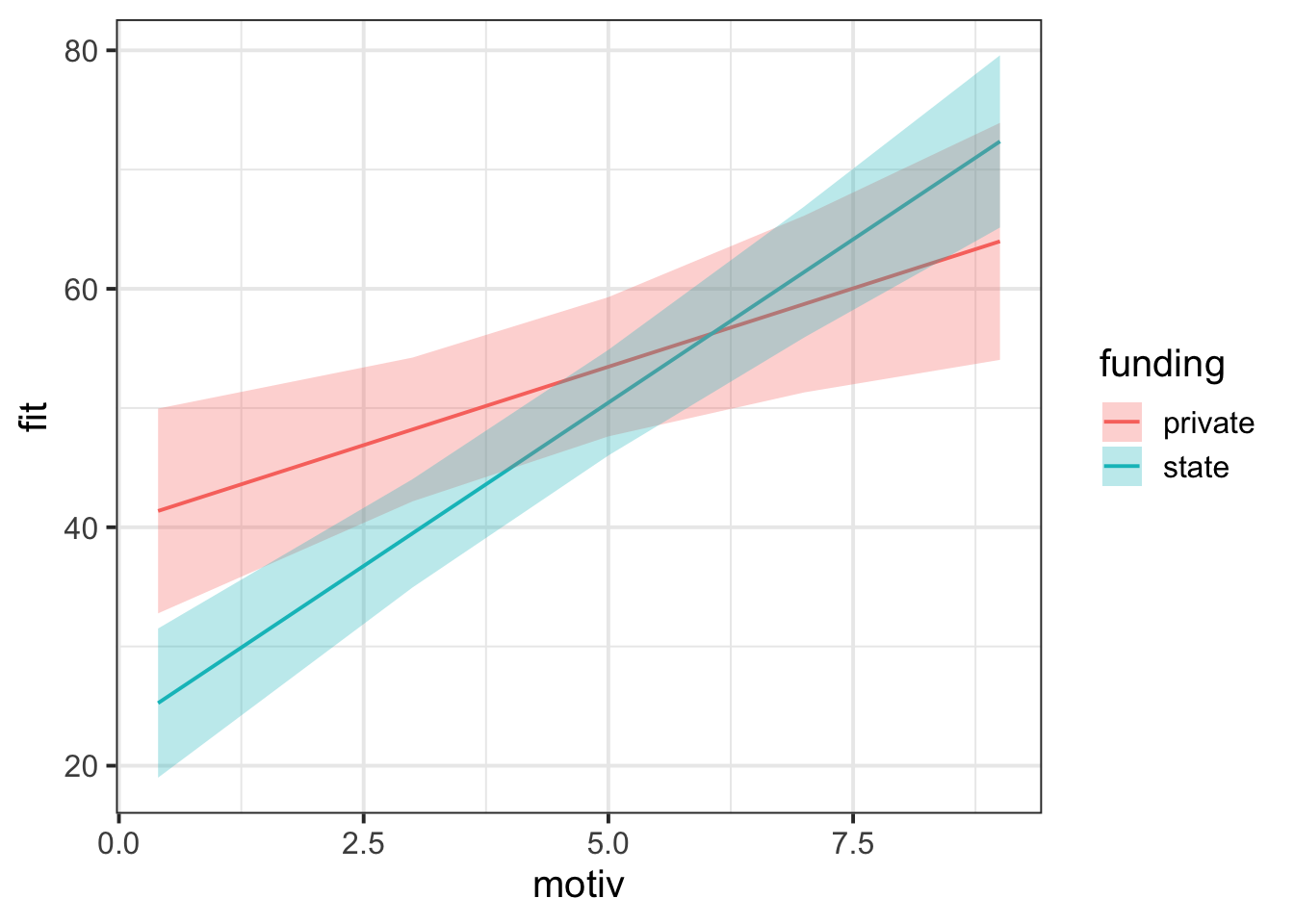
More advanced plotting: Including the group-level lines
First plot group-level lines on their own
augment(grade_mod) |>
  ggplot(aes(x = motiv, y = .fitted, group = schoolid)) +
  geom_line()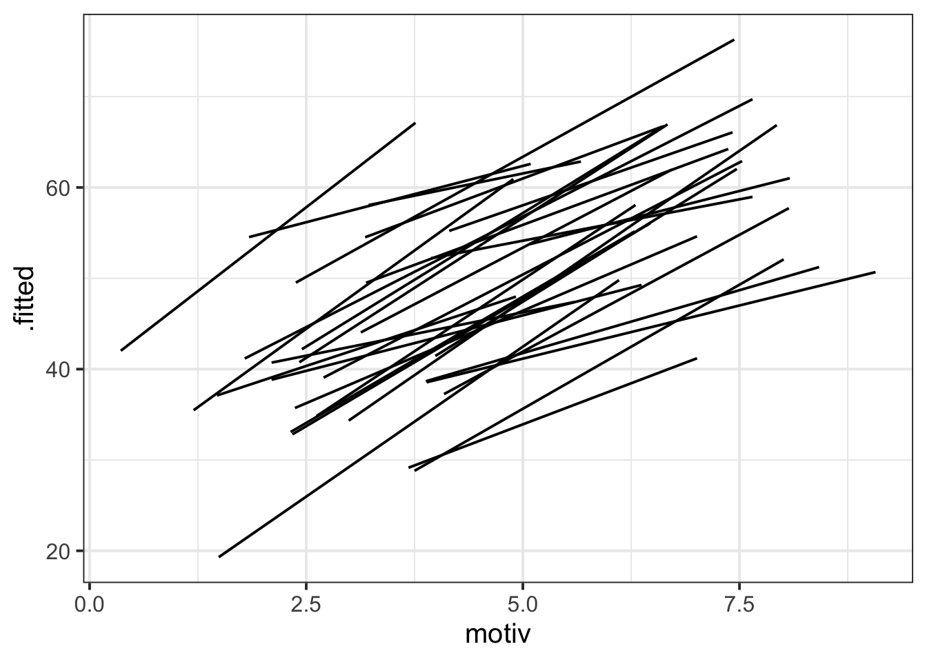
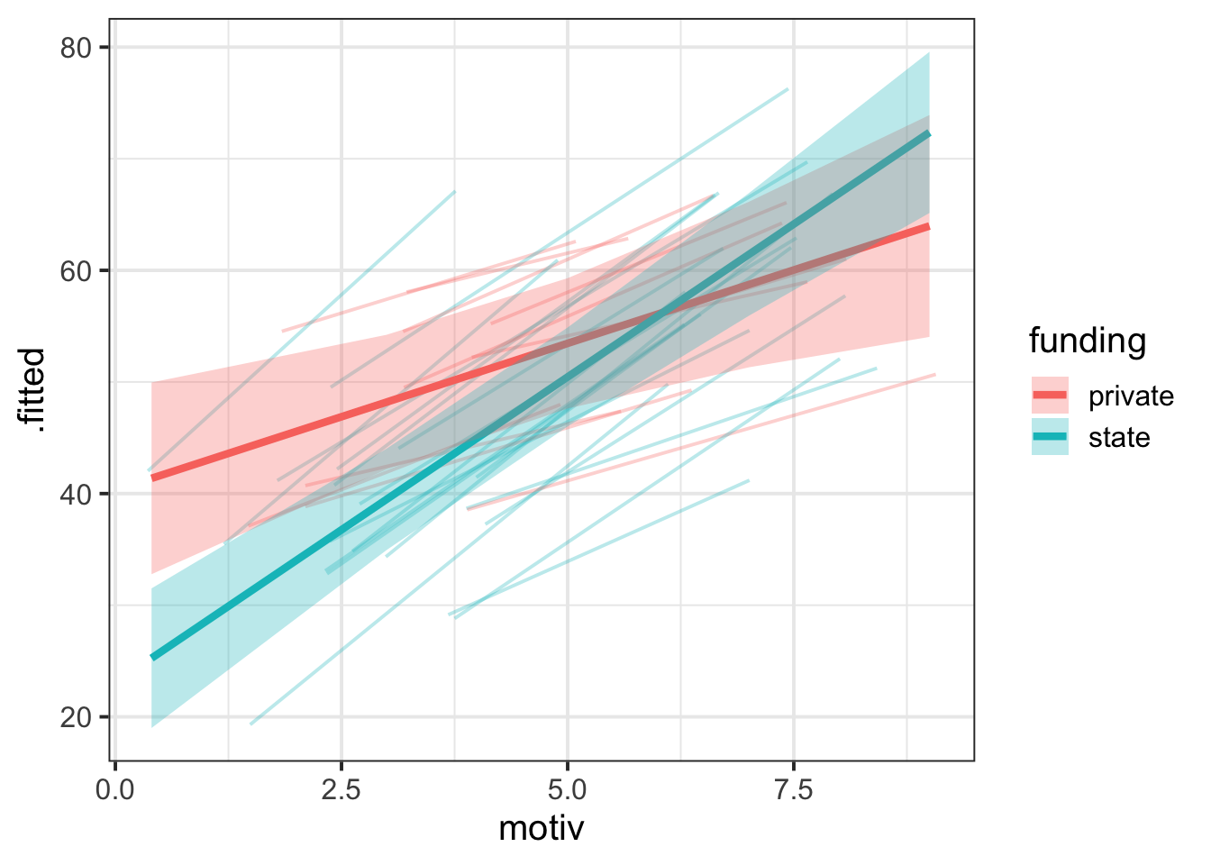
Combine fixed effects and group-level lines, add colour
eff_df <- effect(term = "motiv * funding", mod = grade_mod) |>
  as.data.frame()

augment(grade_mod) |>
  ggplot(aes(x = motiv)) +
  geom_line(aes(y = .fitted, group = schoolid, colour = funding), alpha = 0.3) +
  geom_line(data = eff_df, aes(y = fit, colour = funding), linewidth = 1.5) +
  geom_ribbon(
    data = eff_df,
    aes(y = fit, ymin = lower, ymax = upper, fill = funding),
    alpha = 0.3
  )
Linked flash cards
Outgoing links
- TODO
Backlinks
- TODO