Introducing Multilevel Models
Information about solutions
Solutions for these exercises are available immediately below each question.
We would like to emphasise that much evidence suggests that testing enhances learning, and we strongly encourage you to make a concerted attempt at answering each question before looking at the solutions. Immediately looking at the solutions and then copying the code into your work will lead to poorer learning.
We would also like to note that there are always many different ways to achieve the same thing in R, and the solutions provided are simply one approach.
Preliminaries
- Create a new RMarkdown document or R script (whichever you like) for this week.
Thinking about research questions
One of the biggest challenges in conducting research comes in the translation of our broader research aims to the specification of a statistical model or test. Questions which appear clear-cut and straightforward can turn out to be somewhat confusing when we think in more depth about what exactly it is that we have measured.
These first exercises are designed to help you think through the steps to get from a description of a research study to a model specification.
The study: Hangry hypothesis
The study is interested in evaluating whether hunger influences peoples’ levels of irritability (i.e., “the hangry hypothesis”), and whether this is different for people following a diet that includes fasting. 81 participants were recruited into the study. Once a week for 5 consecutive weeks, participants were asked to complete two questionnaires, one assessing their level of hunger, and one assessing their level of irritability. The time and day at which participants were assessed was at a randomly chosen hour between 7am and 7pm each week. 46 of the participants were following a five-two diet (five days of normal eating, 2 days of fasting), and the remaining 35 were following no specific diet.
| variable | description |
|---|---|
| q_irritability | Score on irritability questionnaire (0:100) |
| q_hunger | Score on hunger questionnaire (0:100) |
| ppt | Participant |
| fivetwo | Whether the participant follows the five-two diet |
What is our outcome variable?
hint: The research is looking at how hunger influences irritability, and whether this is different for people on the fivetwo diet.
What are our explanatory variables?
hint: The research is looking at how hunger influences irritability, and whether this is different for people on the fivetwo diet.
Is there any grouping (or “clustering”) of our data that we consider to be a random sample? If so, what are the groups?
hint: We can split our data in to groups of each participant. We can also split it into groups of each diet. Which of these groups have we randomly sampled? Do we have a random sample of participants? Do we have a random sample of diets? Another way to think of this is “if i repeated the experiment, what these groups be different?”
Based on previous questions, we are starting to be able to think of how our model would look in lmer syntax:
outcome ~ explanatory variables + (???? | grouping)In the explanatory variables, we are interested in the effect of hunger, and whether this effect is different for the five-two diet. So we are interested in the interaction:
lmer(irritability ~ 1 + hunger + diet + hunger:diet + (???? | participant))(remember that hunger + diet + hunger:diet is just a more explicit way of writing hunger*diet).
Let’s try and think about the maximal random effect structure.
What can we model as randomly varying between participants?
some options:
- participants vary in how irritable they are on average
(the intercept,1 | participant) - participants vary in how much hunger influences their irritability
(the effect of hunger,hunger | participant) - participants vary in how much diet influences irritability
(the effect of diet,diet | participant) - participants vary in how much diet effects hunger’s influence on irritability
(the interaction between diet and hunger,diet:hunger | participant)
The data: hangry.csv
The data is available at: https://uoepsy.github.io/data/hangry.csv
Read the data into R and fit the maximal model.
If the model doesn’t converge, try fitting it with a different optimiser before considering simplifying the model structure.
Centering & Scaling revisited
We’re going to quickly return to the data used right back at the beginning of DAPR2. You can find it at: https://uoepsy.github.io/data/dapr2_report1.csv
A description is here:
Researchers were interested in assessing the degree to which urban environments and personality traits contribute towards perceptions of health. They conducted a survey study (n = 750) assessing individual’s personality - as measured by a self report Big Five measure from the International Personality Item Pool (IPIP; 6point Likert scale ranging from 1 to 6), as well as individual’s age, location of residence (city, suburb, countryside) and multiple self-ratings of different aspects of health (sleep, diet, physical health, mental health - high scores = better health). These variables were combined into a single z-score composite variable.
Read in the data, and fit a simple linear regression (one predictor) to evaluate how neuroticism (variable N in the dataset) influences self reported health (variable srh in the dataset).
Provide an interpretation of the intercept and the coefficient for neuroticism.
Mean center your predictor and fit the model again. What (if anything) has changed, and why?
Provide an interpretation of the intercept and the coefficient for neuroticism.
Standardise your predictor and fit the model again. What (if anything) has changed, and why?
Provide an interpretation of the intercept and the coefficient for neuroticism.
Conduct a model comparison between the 3 models you have just fitted, examining whether any of them show a significant reduction in the residual sums of squares.
Think about what changes when you center or scale a predictor in a standard regression model.
- The variance explained by the predictor remains exactly the same
- The intercept will change to be the estimated mean outcome where that predictor is 0 (the significance test will therefore change because the intercept has a different meaning)
- The slope of the predictor will change according to any scaling (e.g. if you divide your predictor by 10, the slope will multiply by 10).
- The test of the slope of the predictor remains exactly the same
Consider the two models you have just fitted:
dap2 <- dap2 %>% mutate(Nz = scale(N))
# raw N
m1 <- lm(srh ~ N, data = dap2)
# standardized N
m3 <- lm(srh ~ Nz, data = dap2)
What will you need to multiply the coefficient of N from model m1 by in order to obtain the coefficient of Nz from model m3?
Group Centering
Returning to the Hangry Hypothesis study, let’s think about our continuous predictor: the level of hunger. It has a mean:
mean(hangry$q_hunger)## [1] 47.37037But it also has a mean for each participant:
hangry %>% group_by(ppt) %>%
    summarise(mean_hunger = mean(q_hunger))
## # A tibble: 81 × 2
## ppt mean_hunger
## <chr> <dbl>
## 1 N1p1 26.6
## 2 N1p10 66.2
## 3 N1p11 80.8
## 4 N1p12 78.8
## 5 N1p2 32.6
## 6 N1p3 43.2
## 7 N1p4 46.6
## 8 N1p5 52.6
## 9 N1p6 53.4
## 10 N1p7 63
## # … with 71 more rowsReturning to the hangry.csv dataset, add a column to the data which is the average hungriness score for each participant.
hint: group_by() %>% mutate()
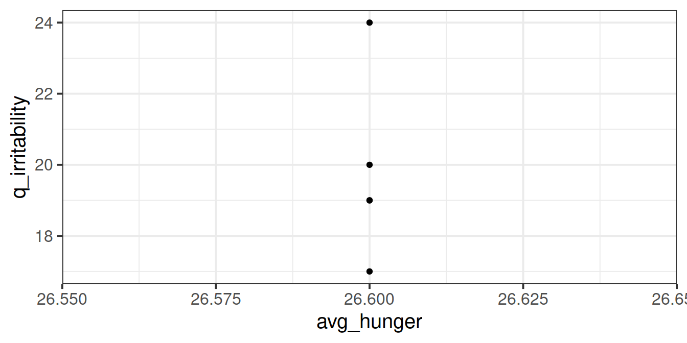
Using the new variable you created in the previous question, plot each participants’ average hunger-score against all of their irritability scores. Can you use stat_summary to make it easier to interpret?
Does it look like hungry people are more irritable than less hungry people?
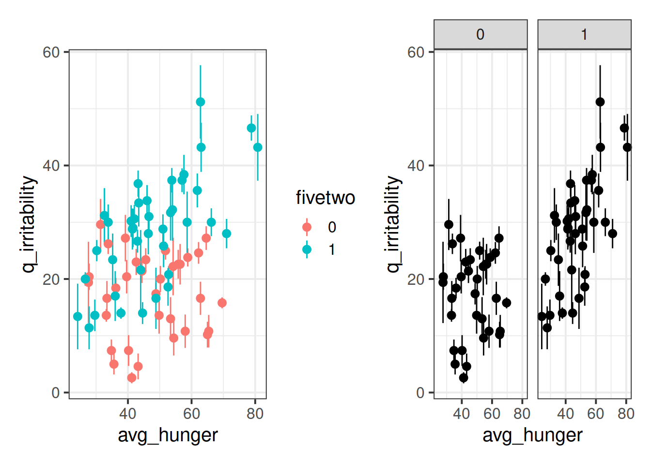
Adjust your plot so that you have some means of telling apart those people who are on the five-two diet vs those who are not.
Add a column to the data, which is the deviation from each person’s hunger score tothat person’s average hunger score.
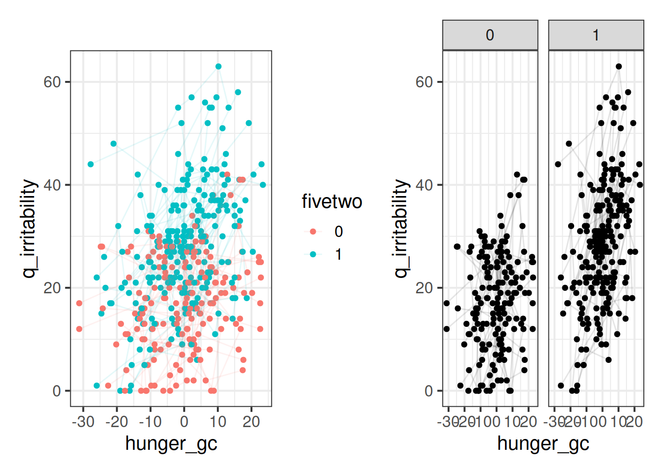
Plot each participant’s deviations from their average hunger scores against their irritability scores. Does it look like when people are more hungry than normal, they are more angry?
Adjust your plot so that you have some means of telling apart those people who are on the five-two diet vs those who are not.
Centering in the MLM
Recall our research aim:
The study is interested in evaluating whether hunger influences peoples’ levels of irritability (i.e., “the hangry hypothesis”), and whether this is different for people following a diet that includes fasting.
Thinking just about the relationship between irritability and hunger (i.e., ignoring the aim of evaluating whether it is different for different diets), how did you initially interpreted what the research aimed to study?
Was it:
A: “Are people more irritable if they are, on average, more hungry than other people?”
B: “Are people more irritable if they are, for them, more hungry than they usually are?”
C: Both
D: Unsure
This is just one demonstration of how the statistical methods we use can constitute an integral part of our development of a research project, and part of the reason that data analysis for scientific cannot be so easily outsourced after designing the study and collecting the data.
We already have variables (created in the questions above) that capture the mean hunger score for each person, and the deviations from the mean hunger score for each person.
We also have our model, which we wrote as something like:
mmod <- lmer(q_irritability ~ q_hunger * fivetwo +
         (1 + q_hunger | ppt), data = hangry,
         control = lmerControl(optimizer="bobyqa"))
We know that the raw hunger scores we were working with are basically hunger_average + hunger deviation, and that these represent different features of a person that can influence the irritability.
So maybe we simply separate out these two aspects of hunger in our model?
Why won’t this model work?
lmer(irritability ~ 1 + avg_hunger + hunger_gc + diet +
                        avg_hunger:diet + hunger_gc:diet +
         (1 + avg_hunger + hunger_gc  | ppt))
(this is a tricky question. hint: it’s because of the random effects).
Fit the following model:
hangrywb <- lmer(q_irritability ~ (avg_hunger + hunger_gc)* fivetwo +
                (1 + hunger_gc | ppt), data = hangry,
            control = lmerControl(optimizer="bobyqa"))
Look at the confidence intervals for the fixed effect estimates from the model below. We will not conduct a thorough model criticism here as we are focusing on the interpretation of the coefficients.
cbind(est = fixef(hangrywb),
      confint(hangrywb, method="boot")[5:10,])
## est 2.5 % 97.5 %
## (Intercept) 17.130958625 5.70457082 26.9975870
## avg_hunger 0.003863468 -0.21347802 0.2235655
## hunger_gc 0.185773032 0.02265834 0.3307145
## fivetwo1 -10.854713234 -22.98575668 2.7353436
## avg_hunger:fivetwo1 0.465896991 0.17311346 0.7192785
## hunger_gc:fivetwo1 0.381411846 0.19543365 0.5947177Try to provide an answer for each of these questions:
- For those following no diet, is there evidence to suggest that people who are on average more hungry are more irritable?
- Is there evidence to suggest that this is different for those following the five-two diet? In what way?
- Do people following no diet tend to be more irritable when they are more hungry than they usually are?
- Is there evidence to suggest that this is different for those following the five-two diet? In what way?
Trickier question: - What does the fivetwo coefficient represent?
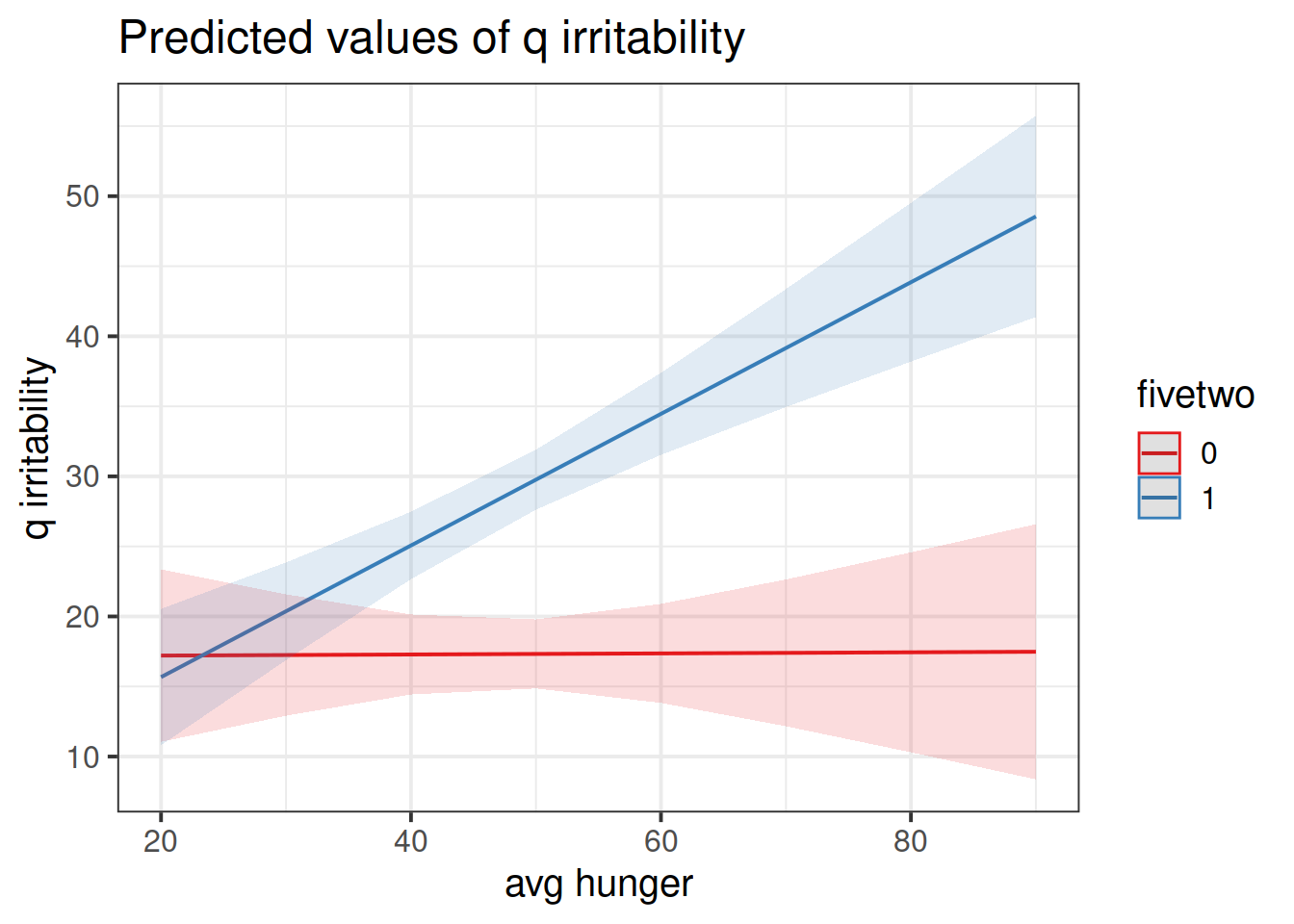
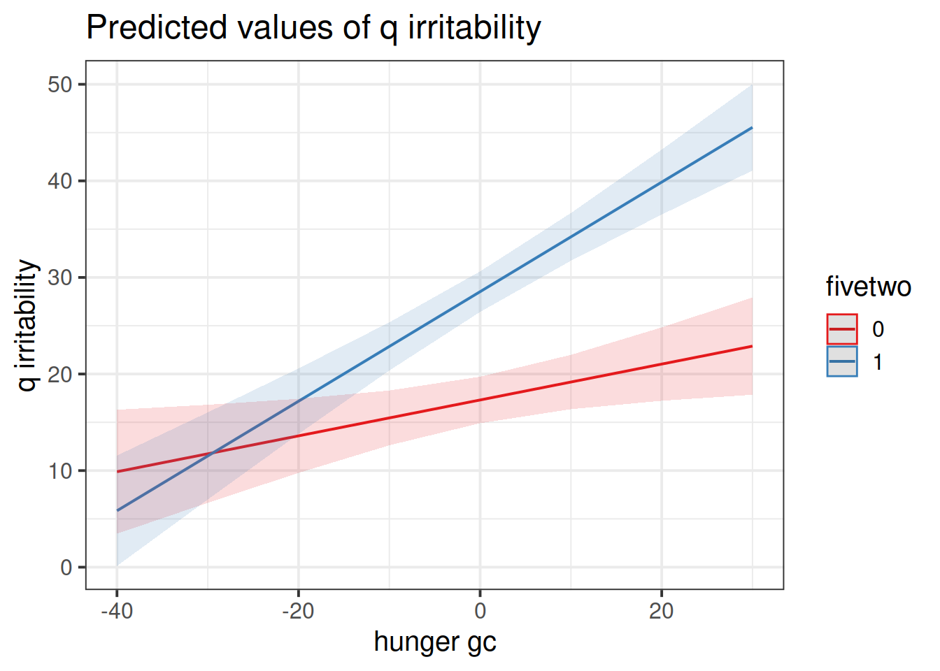
Construct two plots showing the two model estimated interactions.
hint: this isn’t as difficult as it sounds. the sjPlot package can do it in one line of code!
Think about your answers to the previous question, and check that they match with what you are seeing in the plots (do not underestimate the utility of this activity for helping understanding!).
Logistic MLM
Don’t forget to look back at other materials!
Back in DAPR2, we introduced logistic regression in semester 2, week 8. The lab contained some simulated data based on a hypothetical study about inattentional blindness. That content will provide a lot of the groundwork for this week, so we recommend revisiting it if you feel like it might be useful.
lmer() >> glmer()
Remember how we simply used glm() and could specify the family = "binomial" in order to fit a logistic regression? Well it’s much the same thing for multi-level models!
- Gaussian model:
lmer(y ~ x1 + x2 + (1 | g), data = data)
- Binomial model:
glmer(y ~ x1 + x2 + (1 | g), data = data, family = binomial(link='logit'))- or just
glmer(y ~ x1 + x2 + (1 | g), data = data, family = "binomial") - or
glmer(y ~ x1 + x2 + (1 | g), data = data, family = binomial)
- or just
Data: Novel Word Learning
nwl <- read_csv("https://uoepsy.github.io/data/nwl2.csv")In the nwl2 data set (accessed using the code above), participants with aphasia are separated into two groups based on the general location of their brain lesion: anterior vs. posterior. Participants had 9 experimental blocks. In each of these they completed 30 exercises. There is data on the whether participants responded correctly or incorrectly to each exercise. The first 7 blocks were learning blocks, immediately followed by a test (block 8). Finally, participants also completed a follow-up test (block 9).
Research Aims
Compare the two groups (those with anterior vs. posterior lesions) with respect to their accuracy of responses over the course of the study
Figure 1 shows the differences between groups in the average proportion of correct responses at each point in time (i.e., each block, test, and follow-up)
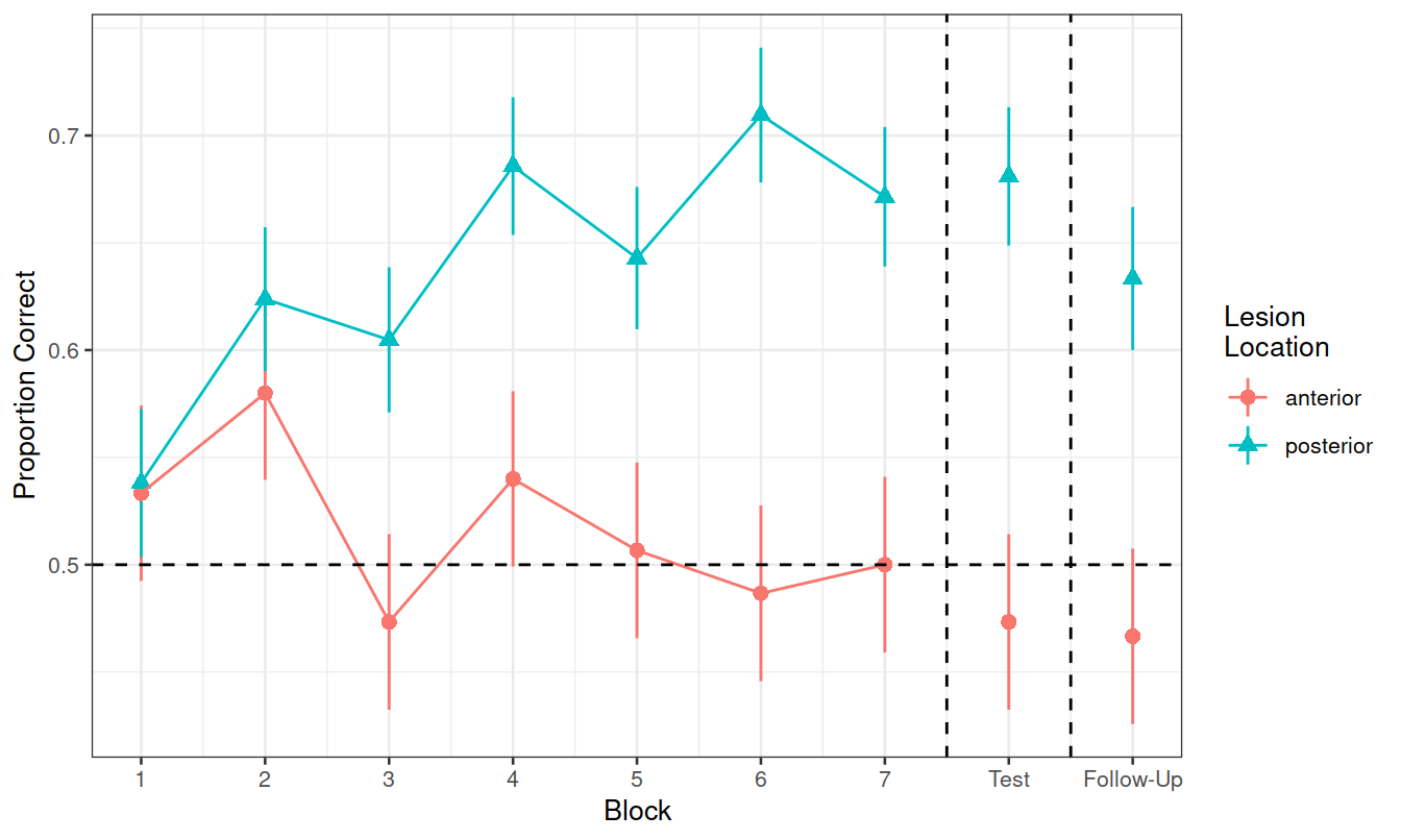
Figure 1: Differences between groups in the average proportion of correct responses at each block
- What is our outcome?
- Is it longitudinal? (simply, is there a temporal sequence to observations within a participant?)
- How many participants with brain lesions do we have data for?
Hint: Think carefully about question 1. There might be several variables which either fully or partly express the information we are considering the “outcome” here.
Research Question 1:
Is the learning rate (training blocks) different between these two groups?
Hints:
- Make sure we’re running models on only the data we are actually interested in.
- Think back to what we have been doing with model comparison to examine the effect of including certain predictors. We could use this approach for this question, to compare:
- A model with just the change over the sequence of blocks
- A model with the change over the sequence of blocks and an overall difference between groups
- A model with groups differing with respect to their change over the sequence of blocks
- What about the random effects part?
- What are our observations grouped by?
- What variables can vary within these groups?
- What do you want your model to allow to vary within these groups?
Optional Extras
This next bit gets a little complicated, and does not contain any unique information that will prove helpful in completing the assessment.
However, it does provide an example of a logistic multi-level model, along with interpretation of the fixed effects. We hope that it may provide a useful learning tool.
Research Question 2
In the testing phase, does performance on the immediate test differ between lesion location groups, and does their retention from immediate to follow-up test differ?
Let’s try a different approach to this. Instead of fitting various models and comparing them via likelihood ratio tests, just fit the one model which could answer both parts of the question above.
This line of code will create a variable specifying whether a block is “learning” (blocks 1-7), an “immediate test” (block 8), or a “followup test” (block 9).
nwl <- nwl %>% mutate(
    phase = ifelse(block <=7, "learning",
                   ifelse(block==8,"immediate","followup"))
)
We can now fit our model:
m.recall.loc <- glmer(correct ~ phase * lesion_location + (phase | id),
                  nwl %>% filter(block>7), family="binomial")
summary(m.recall.loc)
## Generalized linear mixed model fit by maximum likelihood (Laplace
## Approximation) [glmerMod]
## Family: binomial ( logit )
## Formula: correct ~ phase * lesion_location + (phase | id)
## Data: nwl %>% filter(block > 7)
##
## AIC BIC logLik deviance df.resid
## 938.6 970.6 -462.3 924.6 713
##
## Scaled residuals:
## Min 1Q Median 3Q Max
## -3.1670 -1.0193 0.4991 0.9224 1.4210
##
## Random effects:
## Groups Name Variance Std.Dev. Corr
## id (Intercept) 0.28200 0.5310
## phaseimmediate 0.02538 0.1593 1.00
## Number of obs: 720, groups: id, 12
##
## Fixed effects:
## Estimate Std. Error z value Pr(>|z|)
## (Intercept) -0.13828 0.28979 -0.477 0.6332
## phaseimmediate 0.02453 0.24635 0.100 0.9207
## lesion_locationposterior 0.74483 0.38410 1.939 0.0525 .
## phaseimmediate:lesion_locationposterior 0.25436 0.33905 0.750 0.4531
## ---
## Signif. codes: 0 '***' 0.001 '**' 0.01 '*' 0.05 '.' 0.1 ' ' 1
##
## Correlation of Fixed Effects:
## (Intr) phsmmd lsn_lc
## phaseimmedt -0.149
## lsn_lctnpst -0.755 0.113
## phsmmdt:ls_ 0.109 -0.729 -0.164
## optimizer (Nelder_Mead) convergence code: 0 (OK)
## boundary (singular) fit: see ?isSingularTake some time to remind yourself from DAPR2 of the interpretation of logistic regression coefficients.
In family = binomial(link='logit'), we are modelling the log-odds.
We can obtain estimates on this scale using:
fixef(model)summary(model)$coefficientstidy(model)from broom.mixed
- (there are probably more ways, but I can’t think of them right now!)
We can use exp(), to get these back into odds and odds ratios.
Make sure you pay attention to trying to interpret each fixed effect from your models.
These can be difficult, especially when it’s logistic, and especially when there are interactions.
- What is the increase in the odds of answering correctly in the immediate test for someone with a posterior legion compared to someone with an anterior legion?
Can you recreate the visualisation in Figure 2? (try without looking at the solution code!).

Figure 2: Differences between groups in the average proportion of correct responses at each block
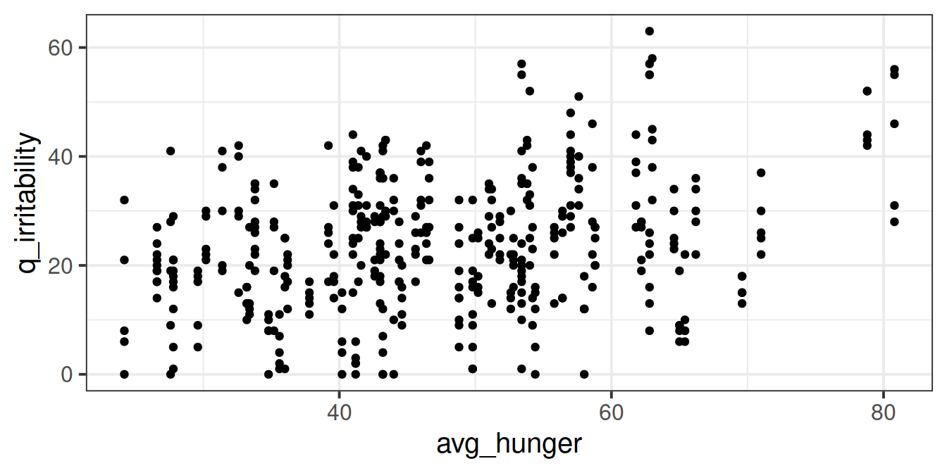 But we might find it easier to look at a plot where each participant is represented as their mean plus an indication of their range of irritability scores:
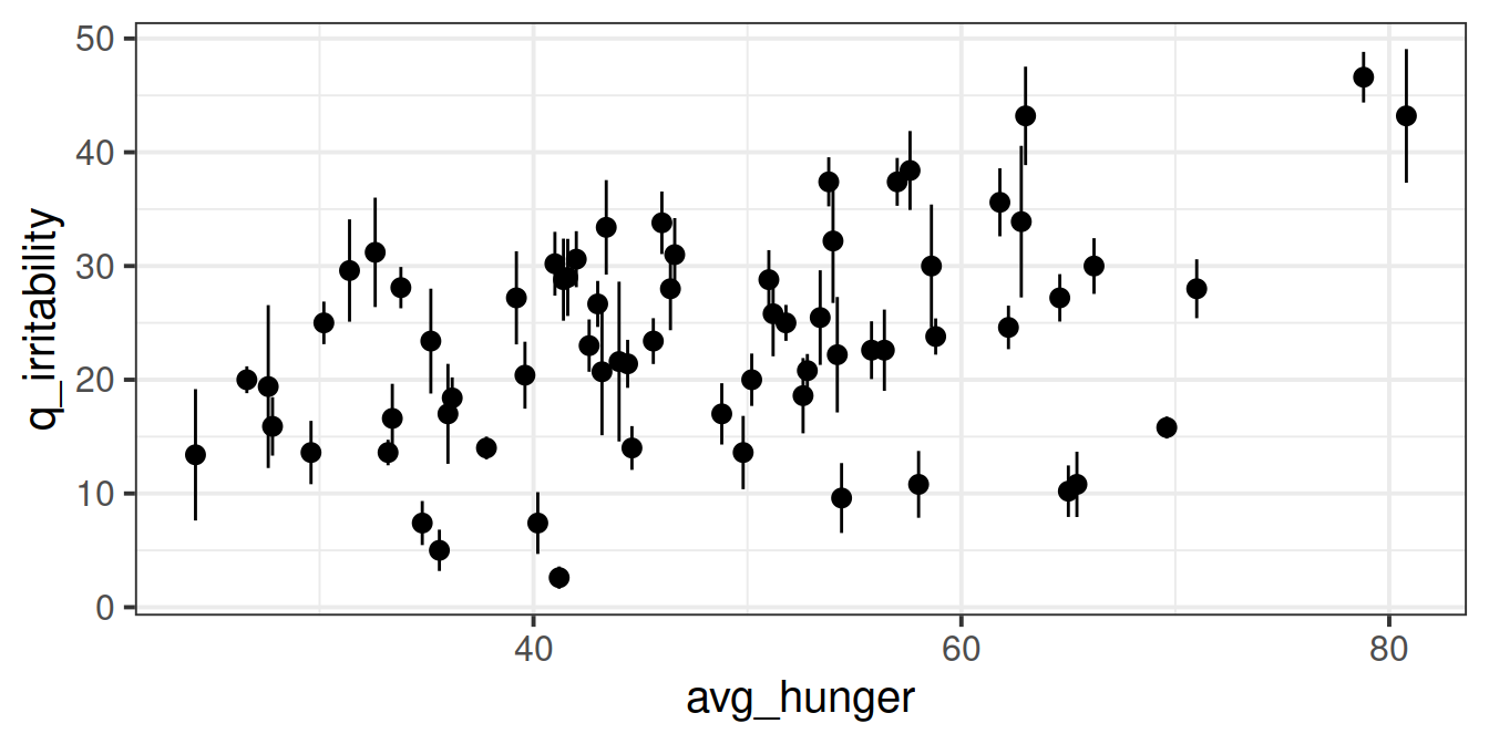 There appears to be a slight positive relationship between a persons’ average hunger and their irritability scores.
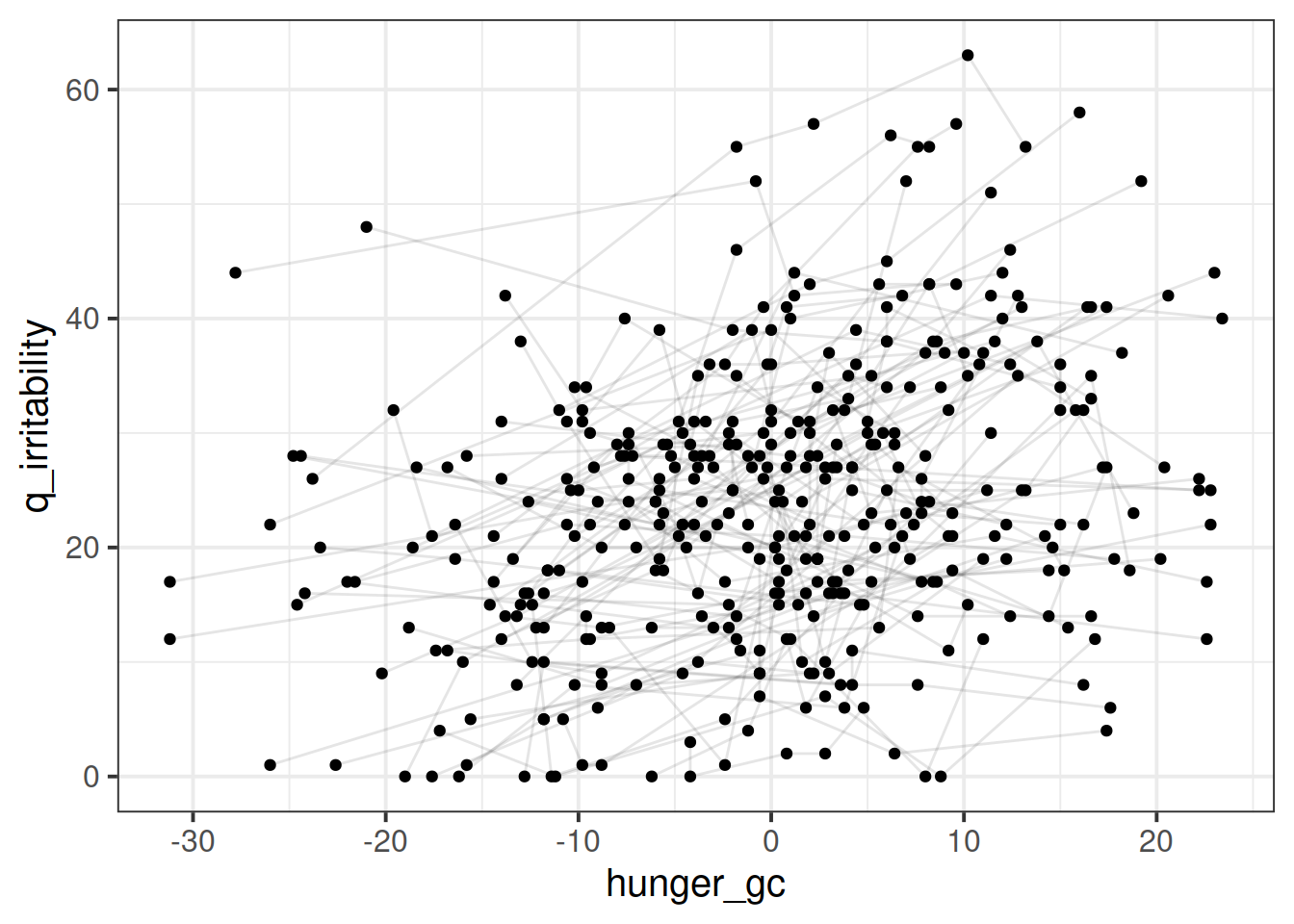 This is harder to tell what the relationship is, because there are a lot of lines. Let’s plot a sample of participants:
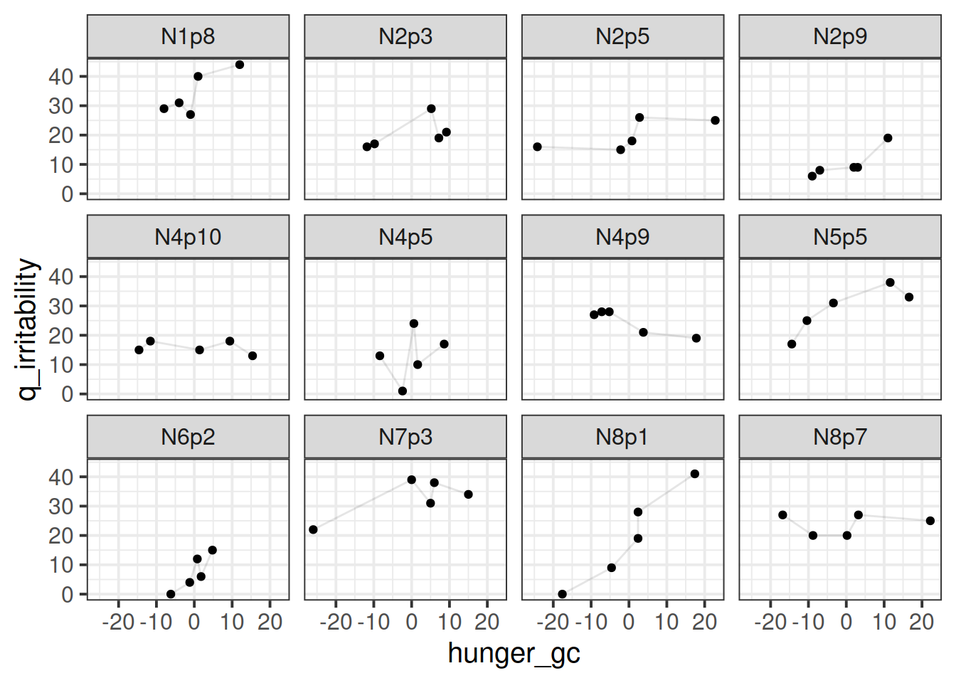 I think there might be a positive trend in here, in that participants tend to be higher irritability when they are higher )for them) on the hunger score.