More Linear Regression
Exercises: More Multiple Regression
In last week’s exercises, we extended the simple linear regression model to multiple regression (one outcome variable, multiple explanatory variables). Specifically, we looked at the case of when we had multiple numeric (or ‘continuous’) explanatory variables.
We’re now going to start by taking a look at a model with a mix of numeric and categorical explanatory variables.
~ Numeric + Categorical
Suppose that the group of researchers were instead wanting to study the relationship between well-being and time spent outdoors after taking into account the relationship between well-being and having a routine.
Note that in the dataset, ‘having a routine’ is categorical (participants either do, or don’t have a routine). So let’s go over the modelling process again, but paying careful attention to where and how the process differs when we have a categorical predictor.
We have already visualised the marginal distribution of weekly outdoor time in questions last week, as well as its relationship with wellbeing scores.
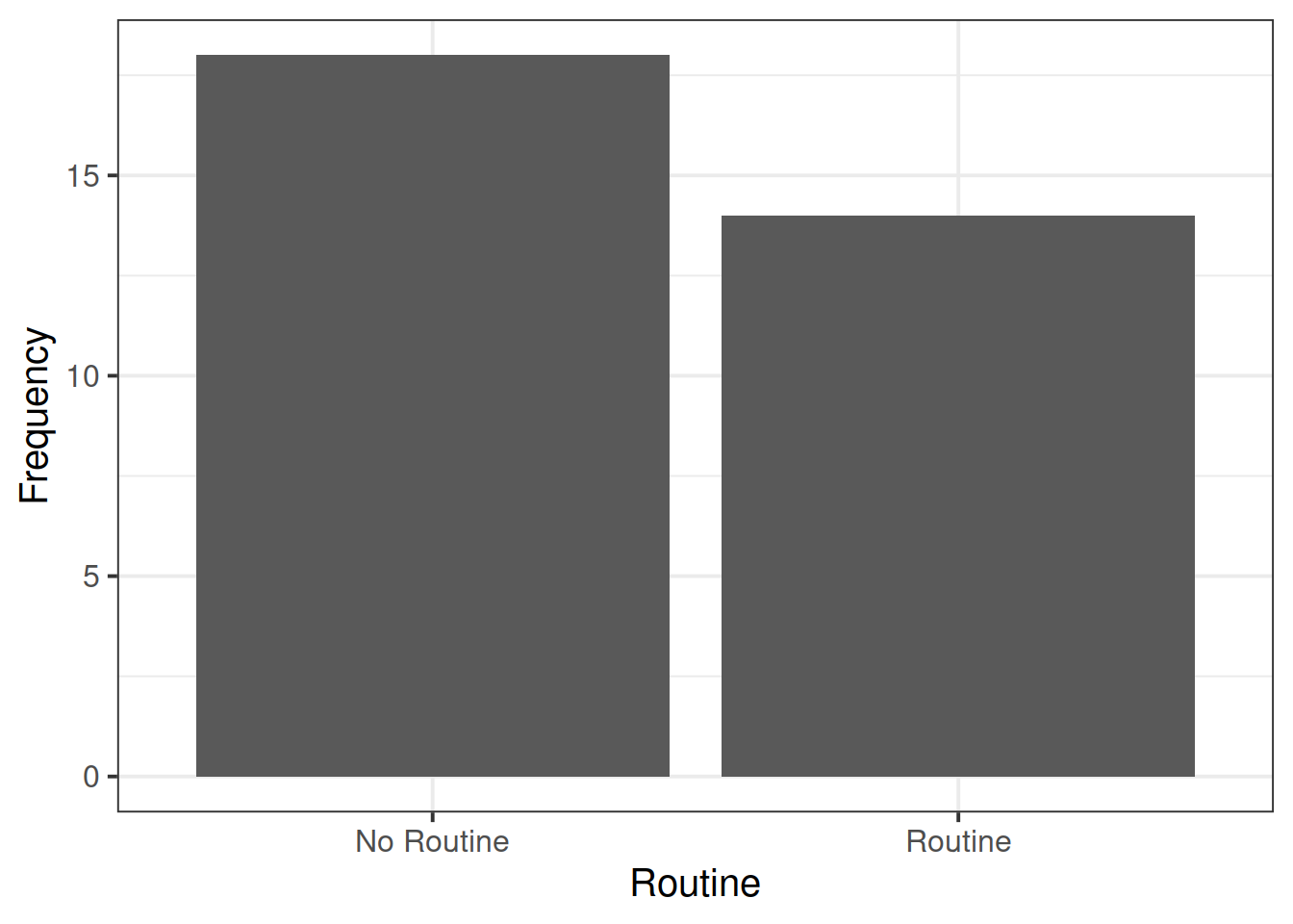
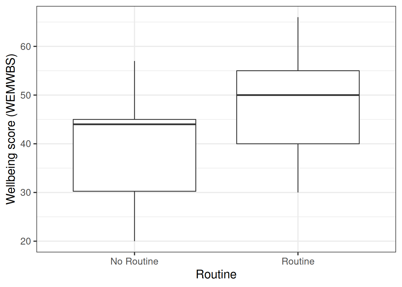
Read in the wellbeing data (https://uoepsy.github.io/data/wellbeing.csv) and produce visualisations of:
- the distribution of the
routinevariable - the relationship between
routineandwellbeing.
Note: We cannot visualise the distribution of routine as a density curve or boxplot, because it is a categorical variable (observations can only take one of a set of discrete response values).
Categorical predictors
When we have a categorical explanatory variable such as this one, what actually gets inputted into our model is a number of dummy variables which are numeric variables that represents categorical data.
For a categorical variable with \(k\) levels, we can express it in \(k-1\) dummy variables.
For example, the “species” column below has three levels, and can be expressed by the two variables “species_dog” and “species_parrot”:
##   species species_dog species_parrot
## 1     cat           0              0
## 2     cat           0              0
## 3     dog           1              0
## 4  parrot           0              1
## 5     dog           1              0
## 6     cat           0              0
## 7 ... ... ...- The “cat” level is expressed whenever both the “species_dog” and “species_parrot” variables are 0.
- The “dog” level is expressed whenever the “species_dog” variable is 1 and the “species_parrot” variable is 0.
- The “parrot” level is expressed whenever the “species_dog” variable is 0 and the “species_parrot” variable is 1.
R will do all of this re-expression for us. If we include in our model a categorical explanatory variable with 4 different levels, the model will estimate 3 parameters - one for each dummy variable. We can interpret the parameter estimates (the coefficients we obtain using coefficients(),coef() or summary()) as the estimated increase in the outcome variable associated with an increase of one in each dummy variable (holding all other variables equal).
Note that in the above example, an increase in 1 of “species_dog” is the difference between a “cat” and a “dog”. An increase in one of “species_parrot” is the difference between a “cat” and a “parrot”. We think of the “cat” category in this example as the reference level - it is the category against which other categories are compared against.
Fit the multiple regression model below using lm(), and assign it to an object named wb_mdl2. Examine the summary output of the model.
\[ Wellbeing = \beta_0 + \beta_1 \cdot OutdoorTime + \beta_2 \cdot Routine + \epsilon \]
\(\hat \beta_0\) (the intercept) is the estimated average wellbeing score associated with zero hours of weekly outdoor time and zero in the routine variable.
What group is the intercept the estimated wellbeing score for when they have zero hours of outdoor time? Why (think about what zero in the routine variable means)?
In last week’s example, we had a visualisation of our model as a regression surface.
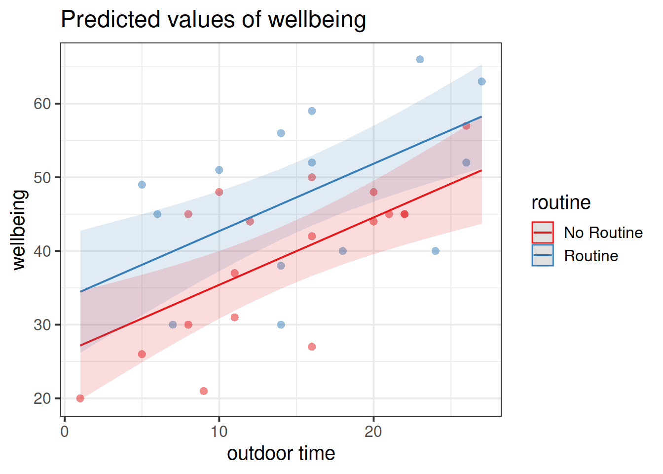
Here, one of our explanatory variables has only two possible responses. How might we best visualise the model?
- one line
- one surface
- two lines
- two surfaces
- a curved (not flat) surface
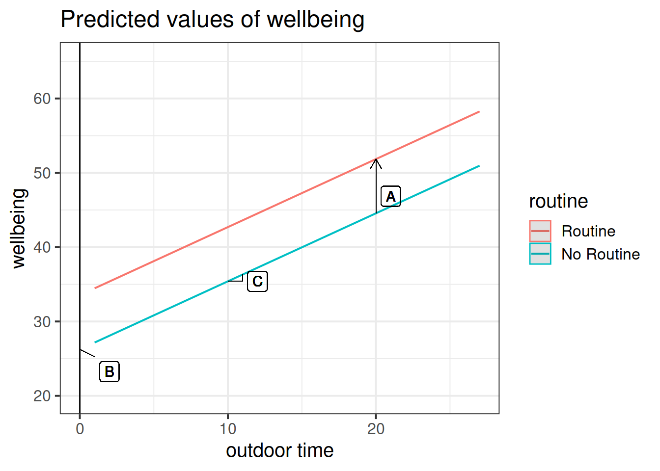
Get a pen and paper, and sketch out the plot shown in Figure 3.
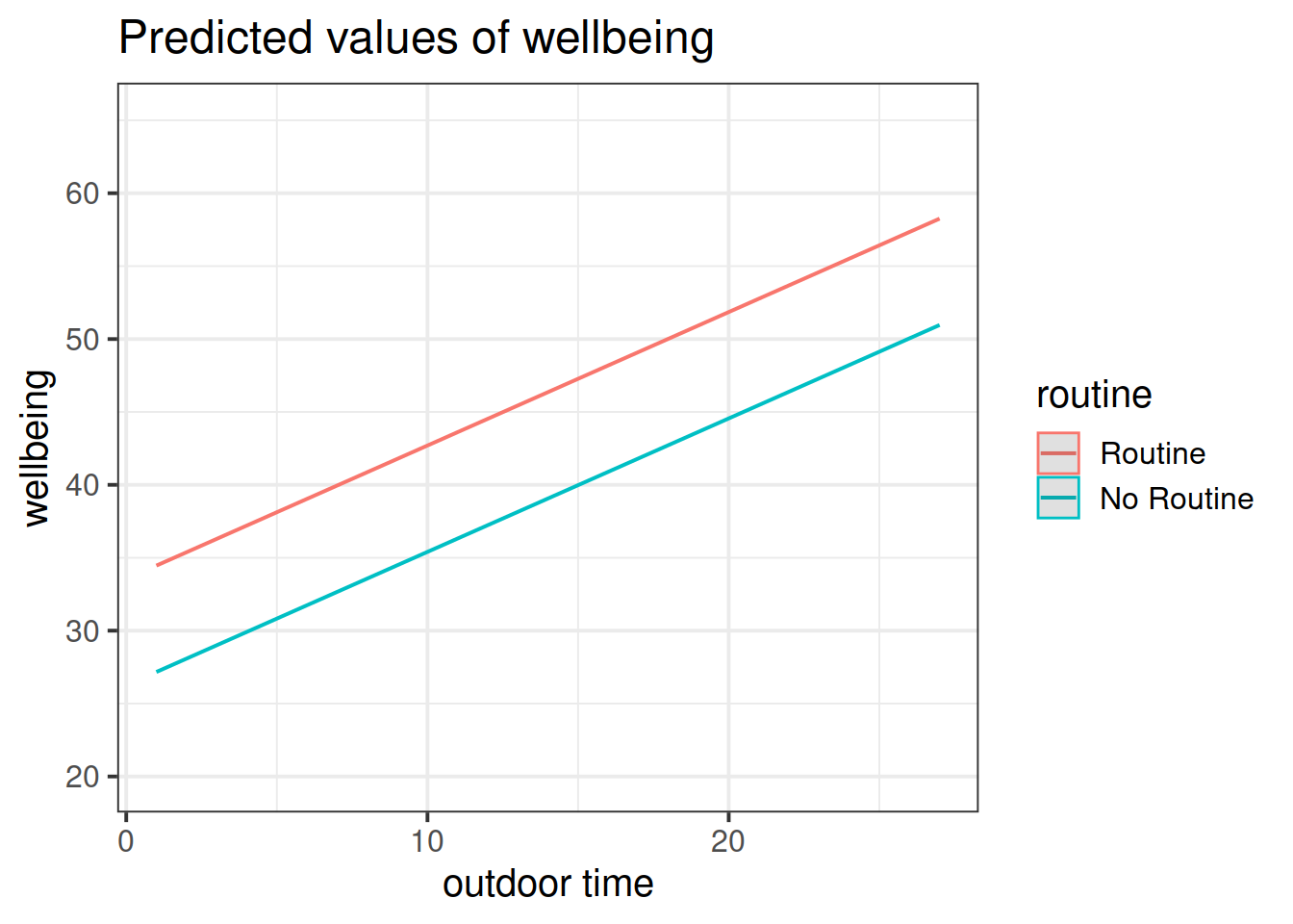
Figure 3: Multiple regression model: Wellbeing ~ Outdoor Time + Routine
Annotate your plot with labels for each of parameter estimates from your model:
| Parameter Estimate | Model Coefficient | Estimate |
|---|---|---|
| \(\hat \beta_0\) | (Intercept) |
26.25 |
| \(\hat \beta_1\) | outdoor_time |
0.92 |
| \(\hat \beta_2\) | routineRoutine |
7.29 |
Load the sjPlot package using library(sjPlot) and try running the code below. (You may already have the sjPlot package installed from previous exercises. If not, you will need to install it first).
library(sjPlot)
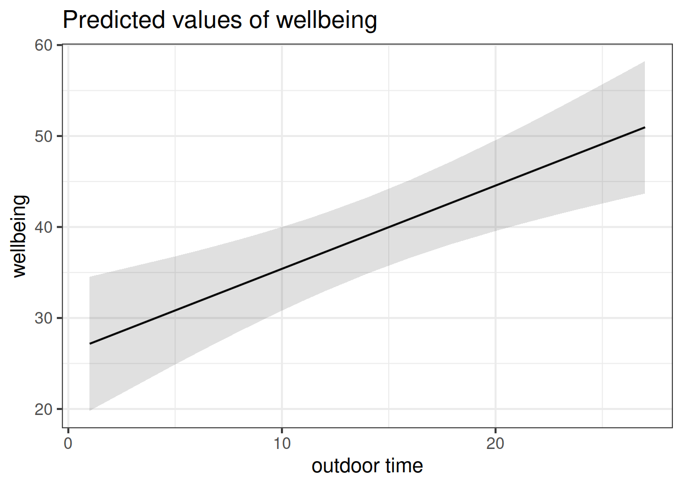
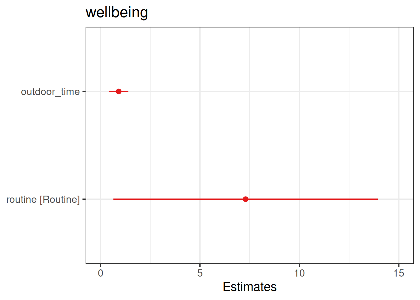
plot_model(wb_mdl2)
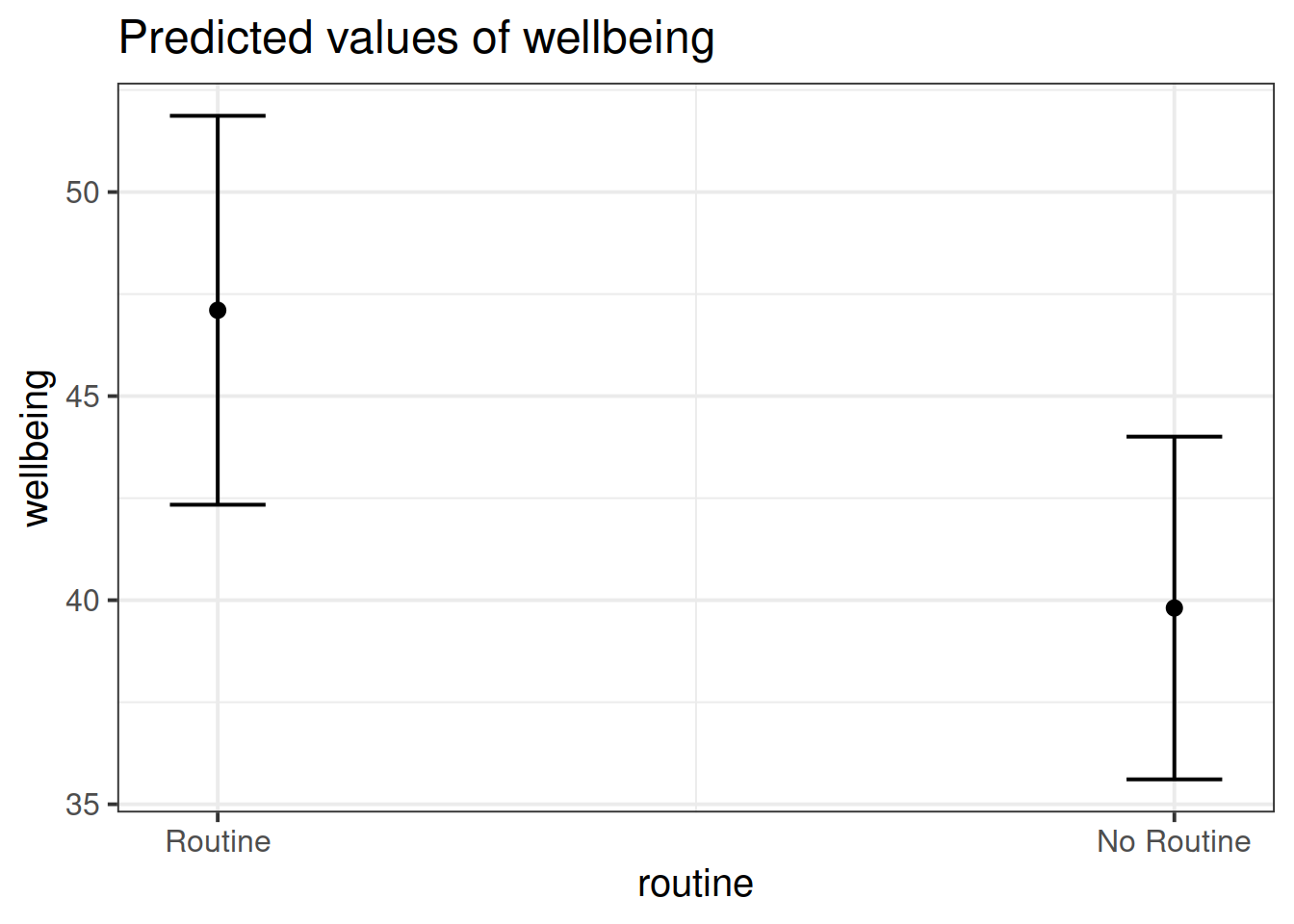
plot_model(wb_mdl2, type = "pred")
plot_model(wb_mdl2, type = "pred",  terms=c("outdoor_time","routine"), show.data=TRUE)
What do you think each one is showing?
The plot_model function (and the sjPlot package) can do a lot of different things. Most packages in R come with tutorials (or “vignettes”), for instance: https://strengejacke.github.io/sjPlot/articles/plot_model_estimates.html
Exercises: Interactions
An interaction is a quantitative researcher’s way of answering the question “what is the relationship between Y and X?” with, “well, it depends…”.
~ Numeric * Categorical
Reseachers have become interested in how the number of social interactions might influence mental health and wellbeing differently for those living in rural communities compared to those in cities and suburbs. They want to assess whether the effect of social interactions on wellbeing is moderated by (depends upon) whether or not a person lives in a rural area.
For the data we have been working with above (from https://uoepsy.github.io/data/wellbeing.csv), count the number of respondents in each location (City/Location/Rural).
Open-ended: Do you think there is enough data to answer this question?
Research Question: Does the relationship between number of social interactions and mental wellbeing differ between rural and non-rural residents?
To investigate how the relationship between the number of social interactions and mental wellbeing might be different for those living in rural communities, the researchers conduct a new study, collecting data from 200 randomly selected residents of the Edinburgh & Lothian postcodes.
Specify a multiple regression model to answer the research question.
Read in the data, and assign it the name mwdata2. Then fully explore the variables and relationships which are going to be used in your analysis.
“Except in special circumstances, a model including a product term for interaction between two explanatory variables should also include terms with each of the explanatory variables individually, even though their coefficients may not be significantly different from zero. Following this rule avoids the logical inconsistency of saying that the effect of \(X_1\) depends on the level of \(X_2\) but that there is no effect of \(X_1\).”
Ramsey and Schafer (2012)
- Tip 1: Install the
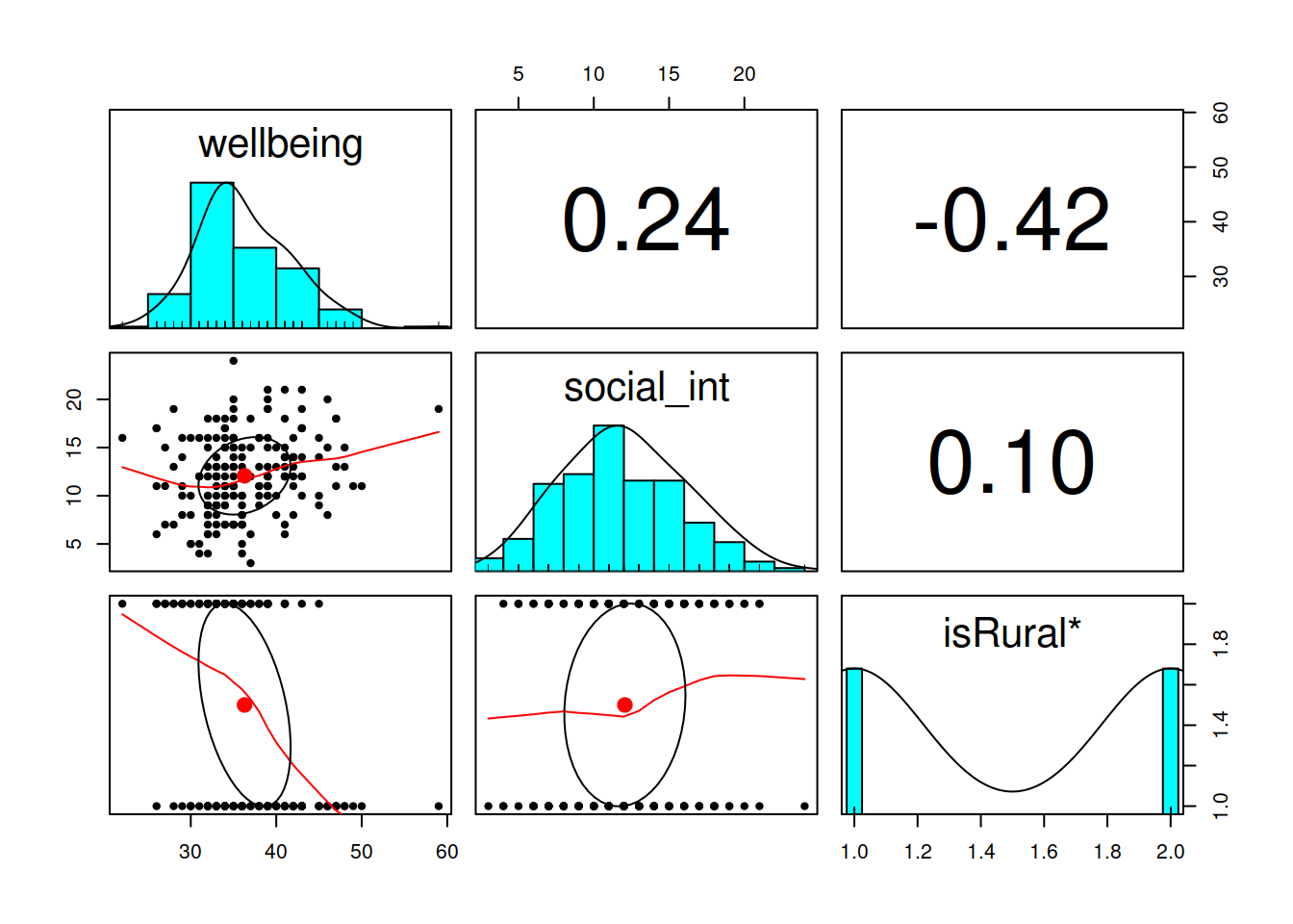
psychpackage (remember to use the console, not your script to install packages), and then load it (load it in your script/Rmarkdown). Thepairs.panels()function from this package will plot all variables in a dataset against one another. This will save you the time you would have spent creating individual plots.
- Tip 2: Check the “location” variable. It currently has three levels (Rural/Suburb/City), but we only want two (Rural/Not Rural). You’ll need to fix this. One way to do this would be to use
ifelse()to define a variable which takes one value (“Rural”) if the observation meets from some condition, or another value (“Not Rural”) if it does not. Type?ifelsein the console if you want to see the help function. You can use it to add a new variable either insidemutate(), or usingdata$new_variable_name <- ifelse(test, x, y)syntax.
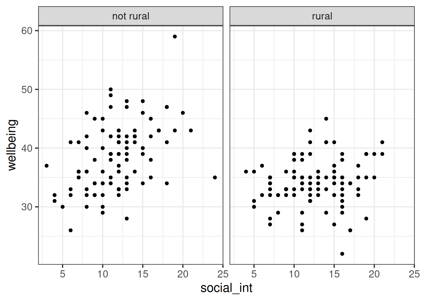
Produce a visualisation of the relationship between weekly number of social interactions and well-being, with separate facets for rural vs non-rural respondents.
Fit your model using lm().
Hint: When fitting a regression model in R with two explanatory variables A and B, and their interaction, these two are equivalent:
- y ~ A + B + A:B
- y ~ A*B
Interpreting coefficients for A and B in the presence of an interaction A:B
When you include an interaction between \(x_1\) and \(x_2\) in a regression model, you are estimating the extent to which the effect of \(x_1\) on \(y\) is different across the values of \(x_2\).
What this means is that the effect of \(x_1\) on \(y\) depends on/is conditional upon the value of \(x_2\).
(and vice versa, the effect of \(x_2\) on \(y\) is different across the values of \(x_1\)).
This means that we can no longer talk about the “effect of \(x_1\) holding \(x_2\) constant”. Instead we can talk about a marginal effect of \(x_1\) on \(y\) at a specific value of \(x_2\).
When we fit the model \(y = \beta_0 + \beta_1\cdot x_1 + \beta_2 \cdot x_2 + \beta_3 \cdot x_1 \cdot x_2 + \epsilon\) using lm():
- the parameter estimate \(\hat \beta_1\) is the marginal effect of \(x_1\) on \(y\) where \(x_2 = 0\)
- the parameter estimate \(\hat \beta_2\) is the marginal effect of \(x_2\) on \(y\) where \(x_1 = 0\)
side note: Regardless of whether or not there is an interaction term in our model, all parameter estimates in multiple regression are “conditional” in the sense that they are dependent upon the inclusion of other variables in the model. For instance, in \(y = \beta_0 + \beta_1 x_1 + \beta_2 x_2 + \epsilon\) the coefficient \(\hat \beta_1\) is conditional upon holding \(x_2\) constant.
Interpreting the interaction term A:B
The coefficient for an interaction term can be thought of as providing an adjustment to the slope.
In our model: \(\text{wellbeing} = \beta_0 + \beta_1\cdot\text{social-interactions} + \beta_2\cdot\text{isRural} + \beta_3\cdot\text{social-interactions}\cdot\text{isRural} + \epsilon\), we have a numeric*categorical interaction.
The estimate \(\hat \beta_3\) is the adjustment to the slope \(\hat \beta_1\) to be made for the individuals in the \(\text{isRural}=1\) group.
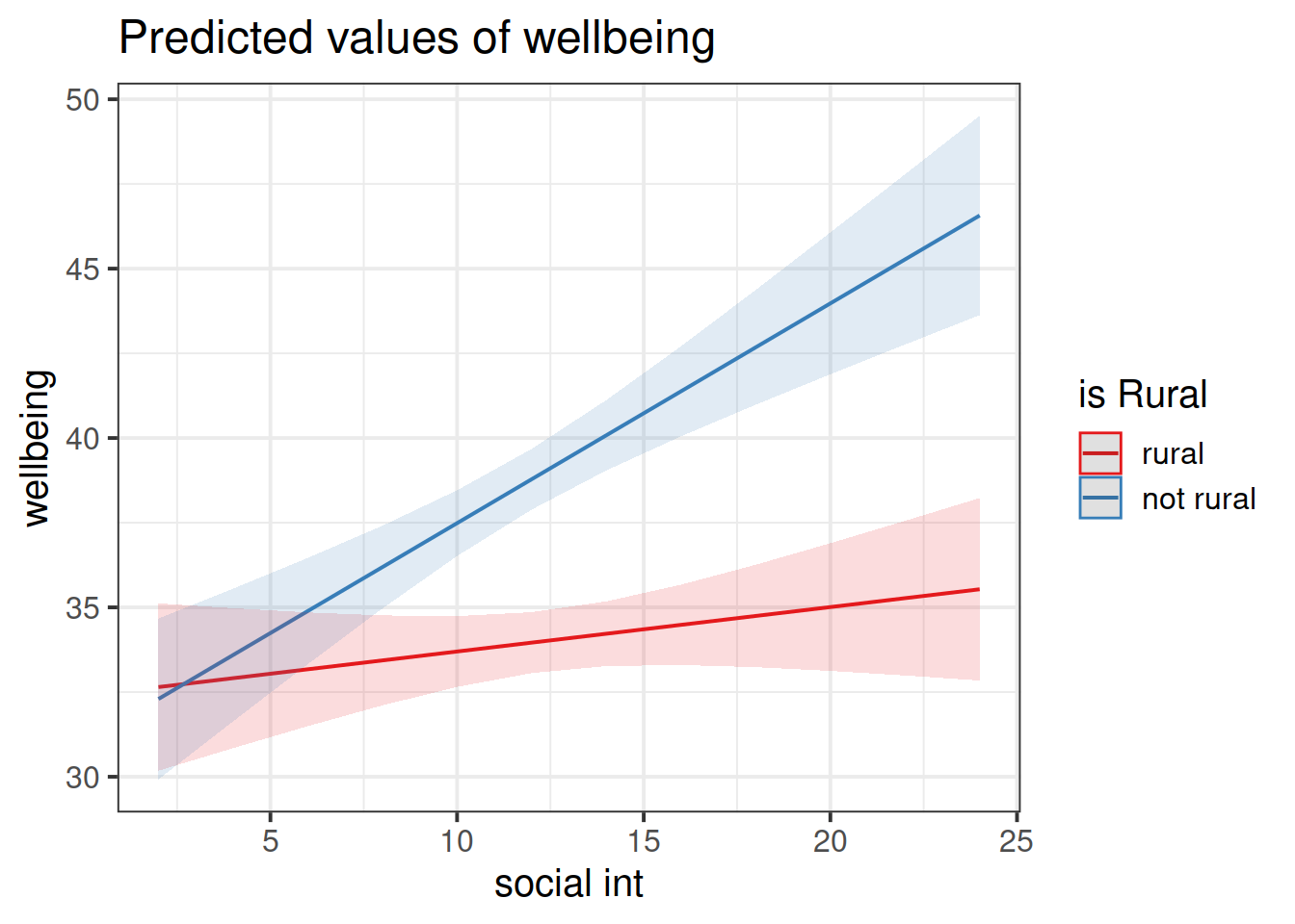
Look at the parameter estimates from your model, and write a description of what each one corresponds to on the plot shown in Figure 4 (it may help to sketch out the plot yourself and annotate it).
“The best method of communicating findings about the presence of significant interaction may be to present a table of graph of the estimated means at various combinations of the interacting variables.”
Ramsey and Schafer (2012)
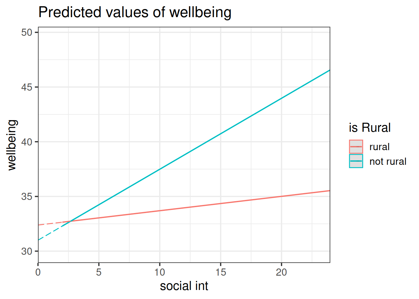
Figure 4: Multiple regression model: Wellbeing ~ Social Interactions * is Rural
Note that the dashed lines represent predicted values below the minimum observed number of social interactions, to ensure that zero on the x-axis is visible
Make sure the sjPlot package is loaded and try using the function plot_model().
The default behaviour of plot_model() is to plot the parameter estimates and their confidence intervals. This is where type = "est".
Try to create a plot like Figure 4, which shows the two lines (Hint: what is this set block of exercises all about? type = ???.)
~ Numeric * Numeric
We will now look at a multiple regression model with an interaction betweeen two numeric explanatory variables.
Research question
Previous research has identified an association between an individual’s perception of their social rank and symptoms of depression, anxiety and stress. We are interested in the individual differences in this relationship.
Specifically:
- Does the effect of social comparison on symptoms of depression, anxiety and stress vary depending on level of neuroticism?
Refresher: Z-scores
When we standardise a variable, we re-express each value as the distance from the mean in units of standard deviations. These transformed values are called z-scores.
To transform a given value \(x_i\) into a z-score \(z_i\), we simply calculate the distance from \(x_i\) to the mean, \(\bar{x}\), and divide this by the standard deviation, \(s\):
\[
z_i = \frac{x_i - \bar{x}}{s}
\]
A Z-score of a value is the number of standard deviations below/above the mean that the value falls.
Specify the model you plan to fit in order to answer the research question (e.g., \(\text{??} = \beta_0 + \beta_1 \cdot \text{??} + .... + \epsilon\))
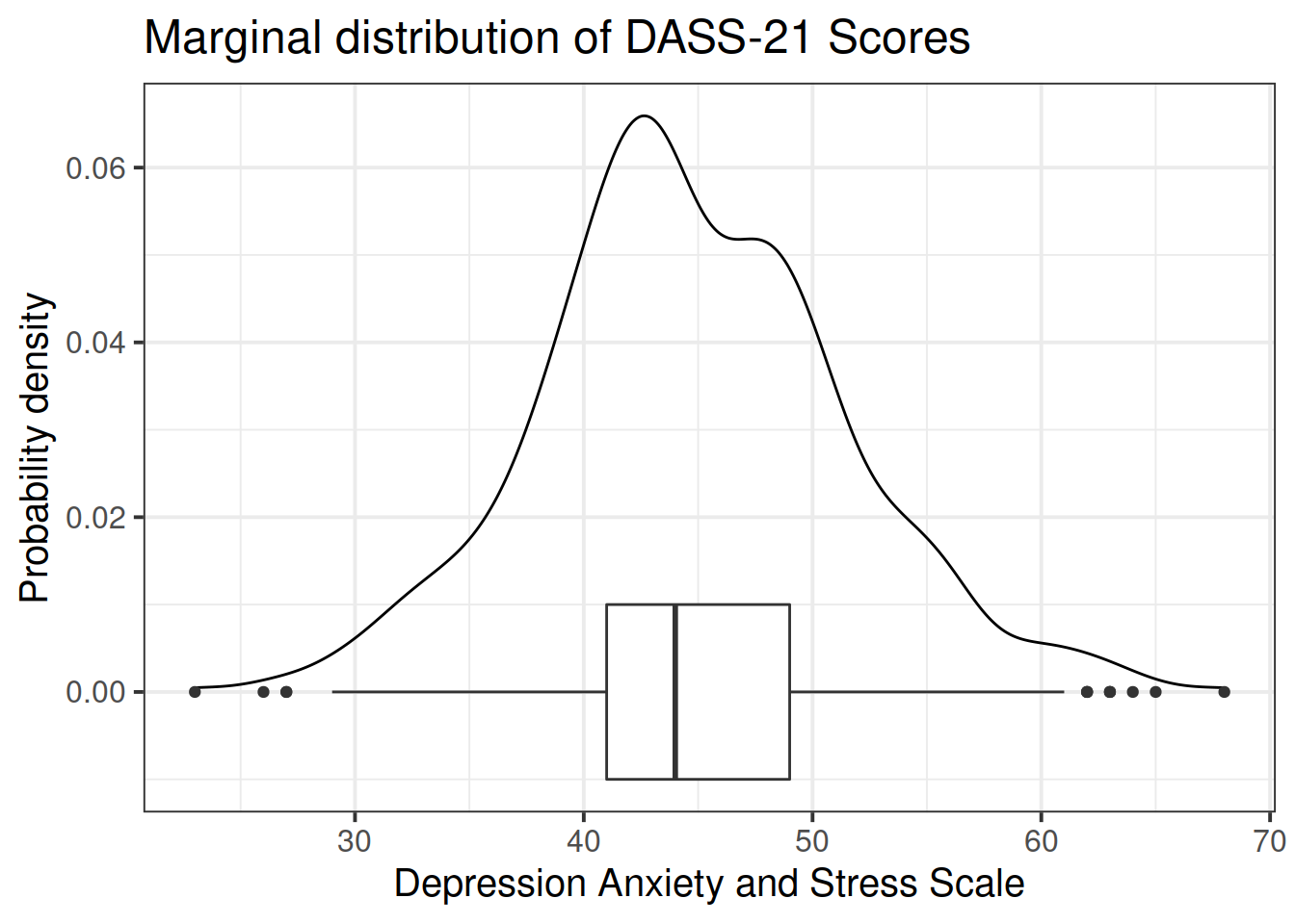
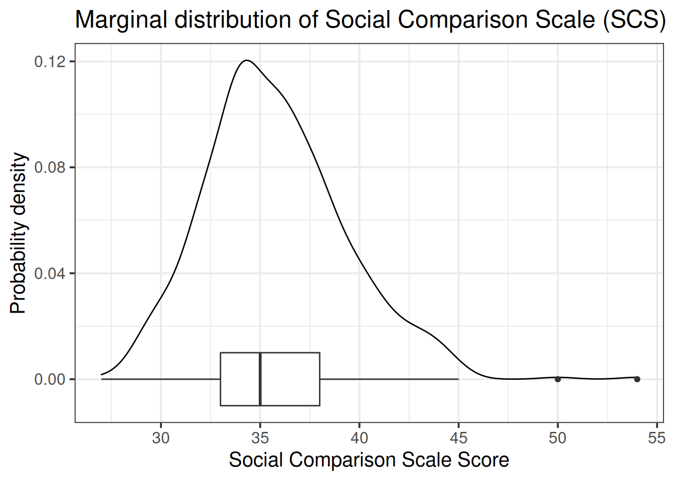
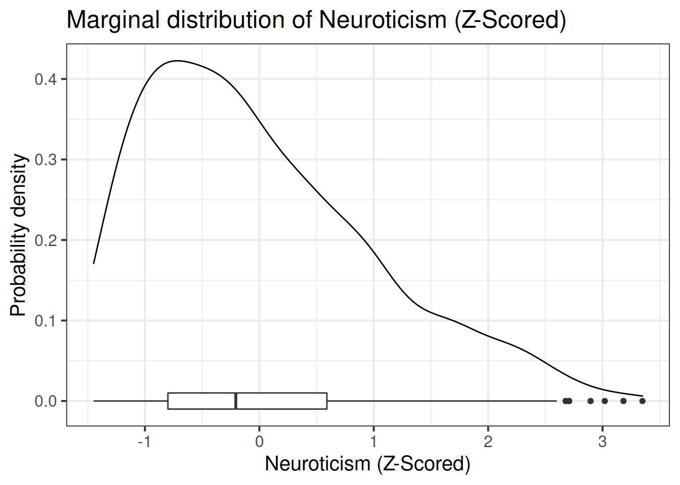
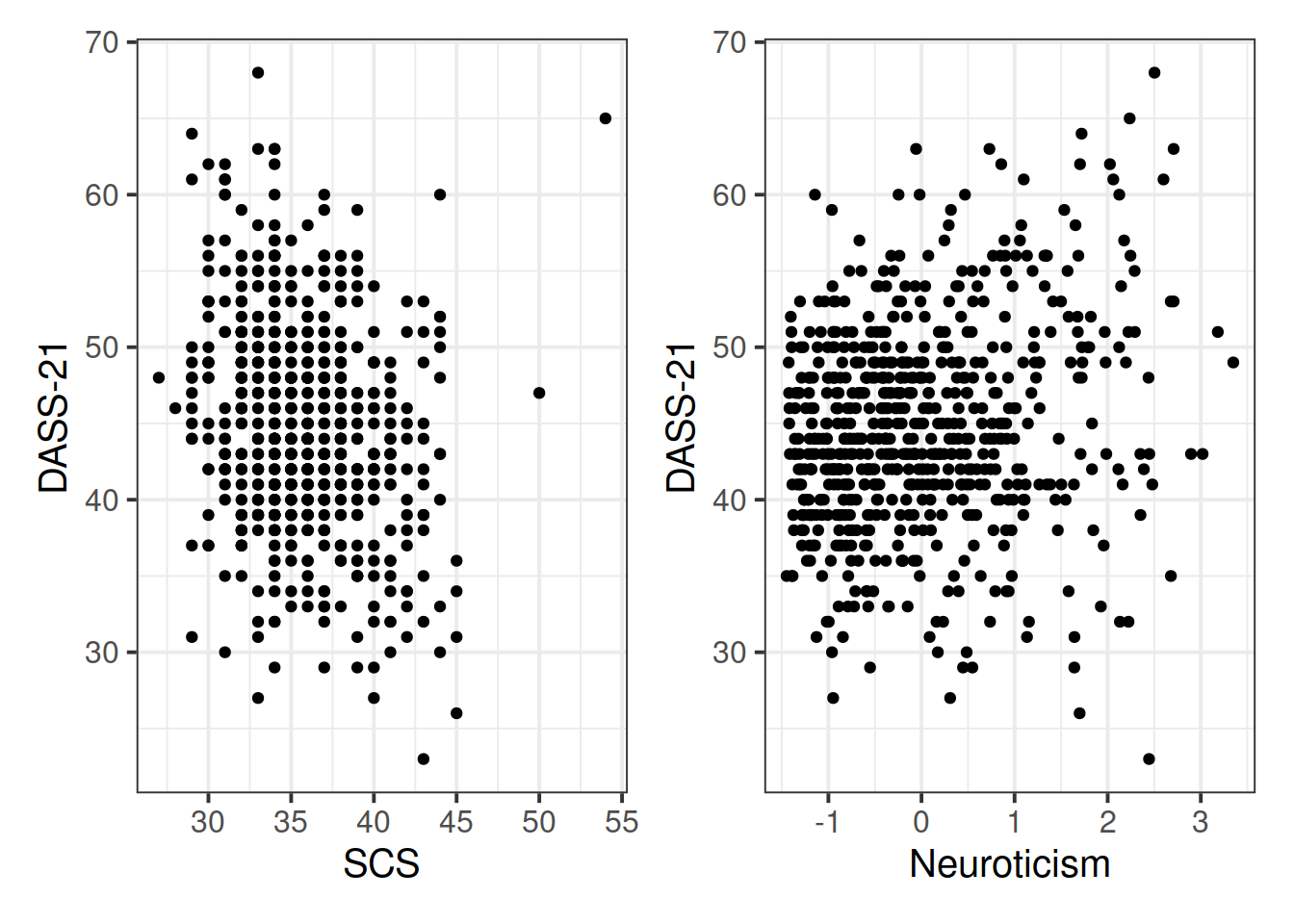
Read in the data and assign it the name scs_study. Produce plots of the relevant distributions and relationships involved in the analysis.
cut() function to add a new variable called “zn_group”, which is the “zn” variable split into 4 groups.Remember: we have re-assign this output as the name of the dataset (the scs_study <- bit at the beginning) to make these changes occur in our environment (the top-right window of Rstudio). If we didn’t have the first line, then it would simply print the output.
scs_study <-
  scs_study %>%
  mutate(
    zn_group = cut(zn, 4)
  )
We can see how it has split the “zn” variable by plotting the two against one another:
(Note that the levels of the new variable are named according to the cut-points).
ggplot(data = scs_study, aes(x = zn_group, y = zn)) +
  geom_point()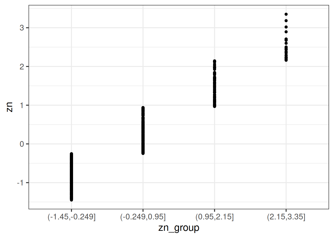
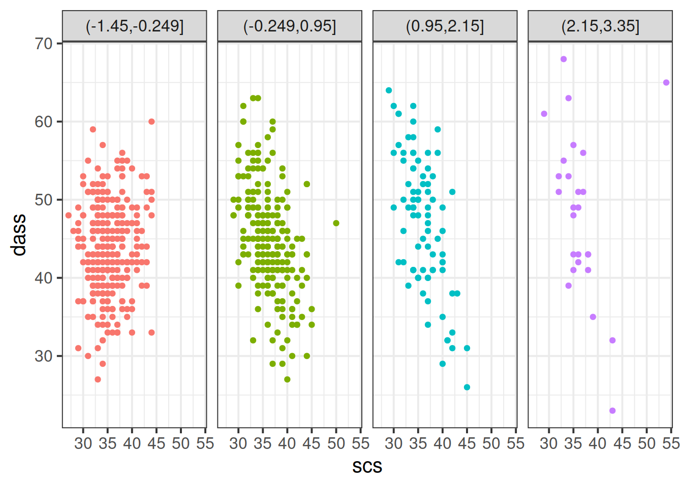
Plot the relationship between scores on the SCS and scores on the DASS-21, for each group of the variable we just created.
How does the pattern change? Does it suggest an interaction?
Tip: Rather than creating four separate plots, you might want to map some feature of the plot to the variable we created in the data, or make use of facet_wrap()/facet_grid().
Cutting one of the explanatory variables up into groups essentially turns a numeric variable into a categorical one. We did this just to make it easier to visualise how a relationship changes across the values of another variable, because we can imagine a separate line for the relationship between SCS and DASS-21 scores for each of the groups of neuroticism. However, in grouping a numeric variable like this we lose information. Neuroticism is measured on a continuous scale, and we want to capture how the relationship between SCS and DASS-21 changes across that continuum (rather than cutting it into chunks).
We could imagine cutting it into more and more chunks (see Figure 5), until what we end up with is a an infinite number of lines - i.e., a three-dimensional plane/surface (recall that in for a multiple regression model with 2 explanatory variables, we can think of the model as having three-dimensions). The inclusion of the interaction term simply results in this surface no longer being necessarily flat. You can see this in Figure 6.
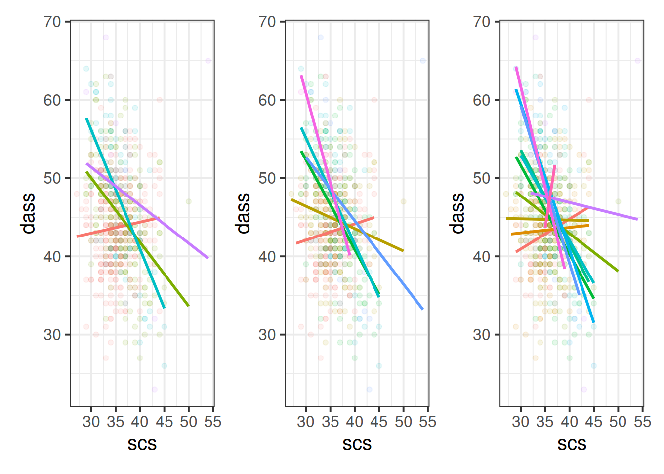
Figure 5: Separate regression lines DASS ~ SCS for neuroticism when cut into 4 (left) or 6 (center) or 12 (right) groups
Figure 6: 3D plot of regression surface with interaction. You can explore the plot in the figure below from different angles by moving it around with your mouse.
Fit your model using lm().
| Estimate | Std. Error | t value | Pr(>|t|) | |
|---|---|---|---|---|
| (Intercept) | 60.8088736 | 2.4539924 | 24.779569 | 0 |
| scs | -0.4439065 | 0.0683414 | -6.495431 | 0 |
| zn | 20.1281319 | 2.3595133 | 8.530629 | 0 |
| scs:zn | -0.5186142 | 0.0655210 | -7.915236 | 0 |
Recall that the coefficients zn and scs from our model now reflect the estimated change in the outcome associated with an increase of 1 in the explanatory variables, when the other variable is zero.
Think - what is 0 in each variable? what is an increase of 1? Are these meaningful? Would you suggest recentering either variable?
Recenter one or both of your explanatory variables to ensure that 0 is a meaningful value
We re-fit the model using mean-centered SCS scores instead of the original variable. Here are the parameter estimates:
dass_mdl2 <- lm(dass ~ 1 + scs_mc * zn, data = scs_study)

# pull out the coefficients from the summary():
summary(dass_mdl2)$coefficients
## Estimate Std. Error t value Pr(>|t|)
## (Intercept) 44.9324476 0.24052861 186.807079 0.000000e+00
## scs_mc -0.4439065 0.06834135 -6.495431 1.643265e-10
## zn 1.5797687 0.24086372 6.558766 1.105118e-10
## scs_mc:zn -0.5186142 0.06552100 -7.915236 1.063297e-14Fill in the blanks in the statements below.
- For those of average neuroticism and who score average on the SCS, the estimated DASS-21 Score is ???
- For those who who score ??? on the SCS, an increase of ??? in neuroticism is associated with a change of 1.58 in DASS-21 Scores
- For those of average neuroticism, an increase of ??? on the SCS is associated with a change of -0.44 in DASS-21 Scores
- For every increase of ??? in neuroticism, the change in DASS-21 associated with an increase of ??? on the SCS is asjusted by ???
- For every increase of ??? in SCS, the change in DASS-21 associated with an increase of ??? in neuroticism is asjusted by ???
Exercises: Revisiting Assumptions
Create a new section header in your Rmarkdown document, as we are moving onto a refresher on checking assumptions.
- You will have just fitted the following interaction model:
- \(\text{DASS-21 Score} = \beta_0 + \beta_1 \cdot \text{SCS Score} + \beta_2 \cdot \text{Neuroticism} + \beta_3 \cdot \text{SCS score} \cdot \text{Neuroticism} + \epsilon\)
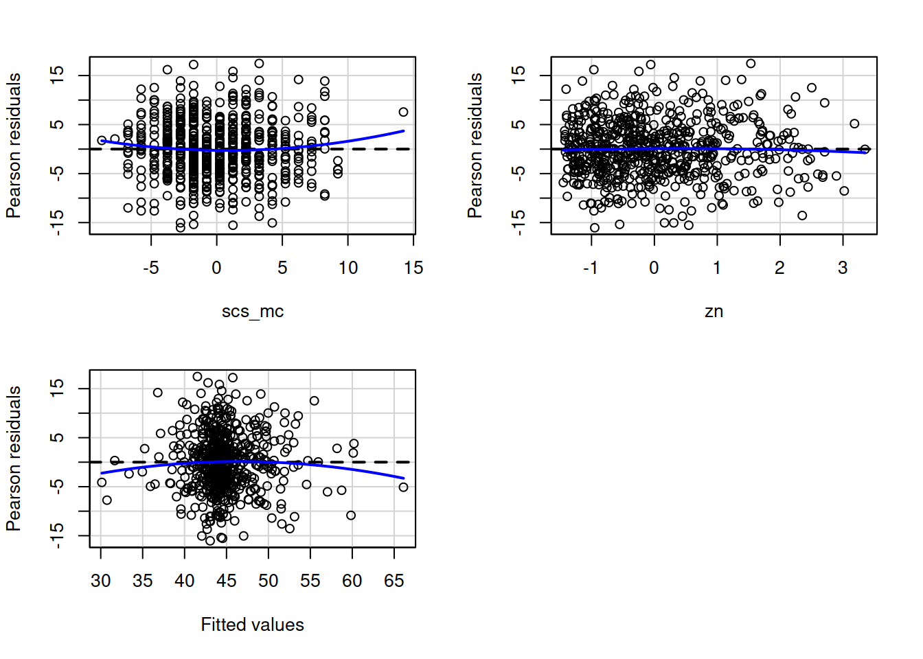
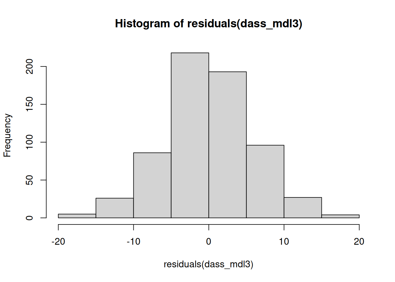
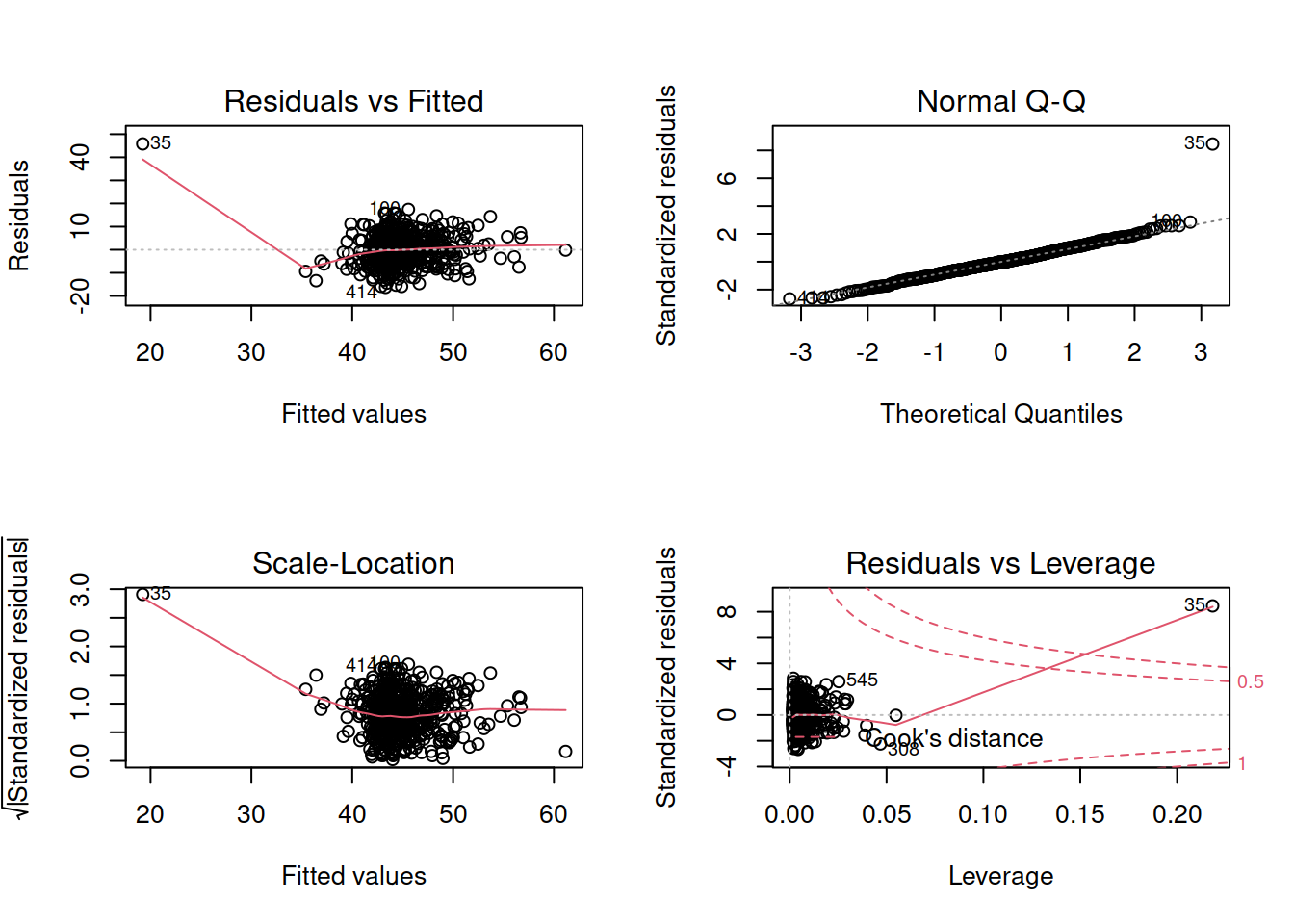
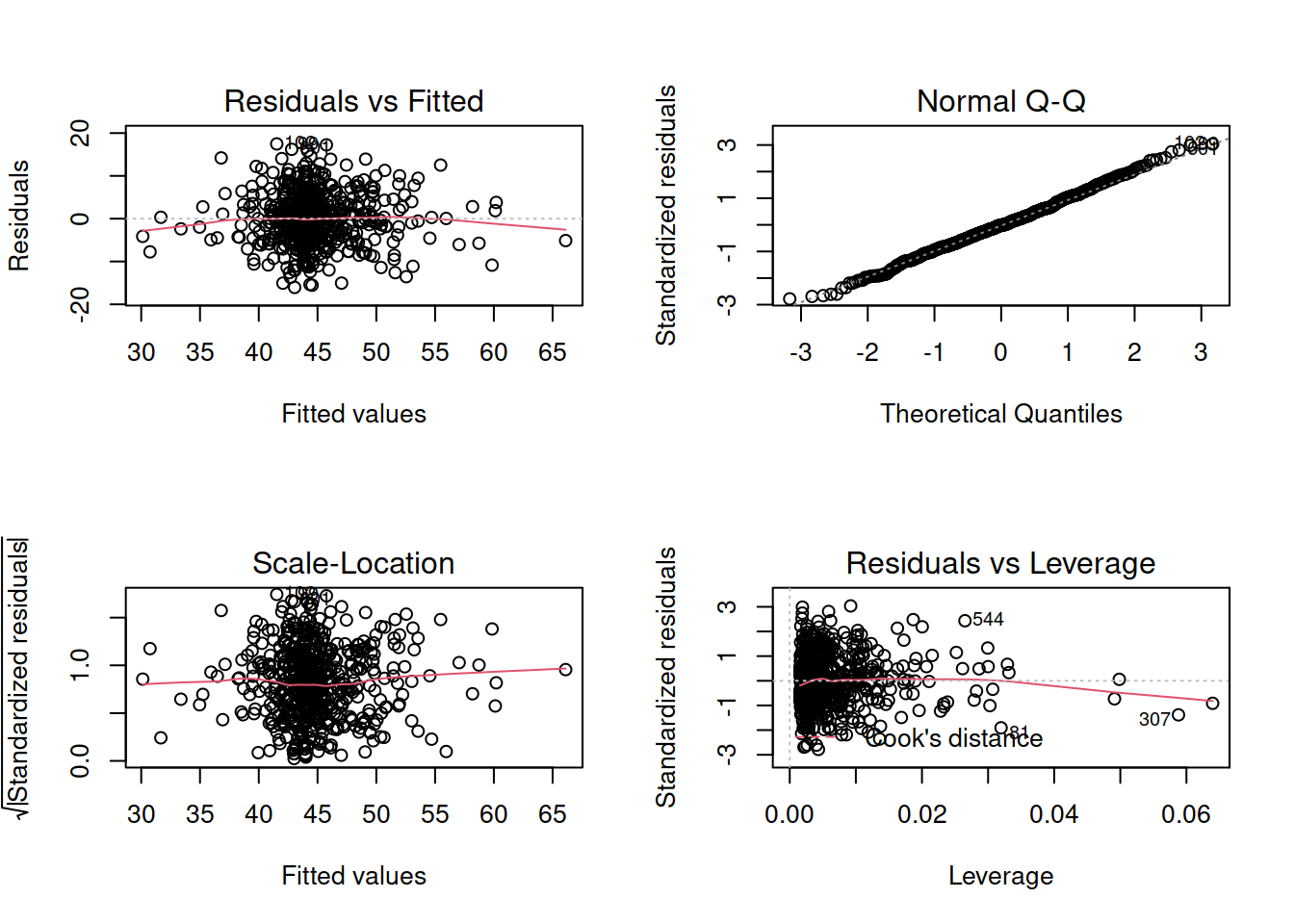
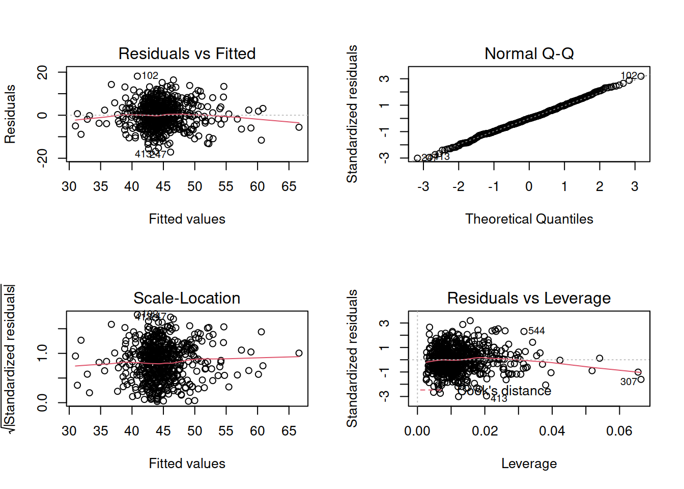
- Check that your model meets the assumptions of the linear model (Tip: to get a broad overview you can pass your model to the
plot()function to get a series of plots). - If you notice any violated assumptions:
- address the issues by, e.g., excluding observations from the analysis, or replacing outliers with the next most extreme value (Winsorisation).
- after fitting a new model which you hope addresses violations, you need to check all of your assumptions again. It can be an iterative process, and the most important thing is that your final model (the one you plan to use) meets all the assumptions.
Tips:
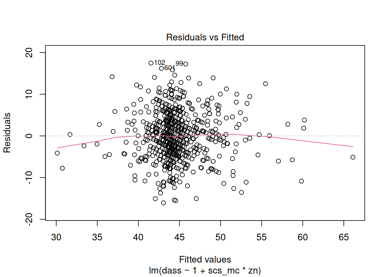
- When there is an interaction in the model, assessing linearity becomes difficult. In fact,
crPlots()will not work. To assess, you can create a residuals-vs-fitted plot like we saw in the previous week.
- Interaction terms often result in multicollinearity, because these terms are made up of the product of some ‘main effects’. Mean-centering the variables like we have here will reduce this source of structural multicollinearity (“structural” here refers to the fact that multicollinearity is due to our model specification, rather than the data itself)
- You can fit a model and exclude specific observations. For instance, to remove the 3rd and 5th rows of the dataset:
lm(y ~ x1 + x2, data = dataset[-c(3,5),]). Be careful to remember that these values remain in the dataset, they have simply been excluded from the model fit.
Take a breather
Exercises: Model Fit and Model Comparison
Model Fit
Adjusted \(R^2\)
We know from our work on simple linear regression that the R-squared can be obtained as: \[ R^2 = \frac{SS_{Model}}{SS_{Total}} = 1 - \frac{SS_{Residual}}{SS_{Total}} \]
However, when we add more and more predictors into a multiple regression model, \(SS_{Residual}\) cannot increase, and may decrease by pure chance alone, even if the predictors are unrelated to the outcome variable. Because \(SS_{Total}\) is constant, the calculation \(1-\frac{SS_{Residual}}{SS_{Total}}\) will increase by chance alone.
An alternative, the Adjusted-\(R^2\), does not necessarily increase with the addition of more explanatory variables, by including a penalty according to the number of explanatory variables in the model. It is not by itself meaningful, but can be useful in determining what predictors to include in a model. \[ Adjusted{-}R^2=1-\frac{(1-R^2)(n-1)}{n-k-1} \\ \quad \\ \begin{align} & \text{Where:} \\ & n = \text{sample size} \\ & k = \text{number of explanatory variables} \\ \end{align} \]
In R, you can view the mutiple and adjusted \(R^2\) at the bottom of the output of summary(<modelname>):
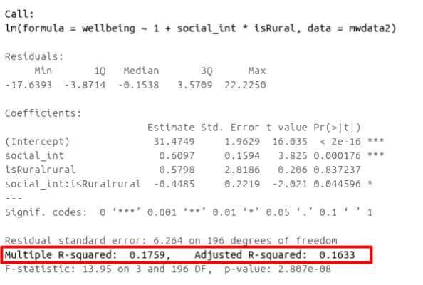
Figure 7: Multiple regression output in R, summary.lm(). R-squared highlighted
F-ratio
As in simple linear regression, the F-ratio is used to test the null hypothesis that all regression slopes are zero.
It is called the F-ratio because it is the ratio of the how much of the variation is explained by the model (per paramater) versus how much of the variation is unexplained (per remaining degrees of freedom).
\[ F_{df_{model},df_{residual}} = \frac{MS_{Model}}{MS_{Residual}} = \frac{SS_{Model}/df_{Model}}{SS_{Residual}/df_{Residual}} \\ \quad \\ \begin{align} & \text{Where:} \\ & df_{model} = k \\ & df_{error} = n-k-1 \\ & n = \text{sample size} \\ & k = \text{number of explanatory variables} \\ \end{align} \]
In R, at the bottom of the output of summary(<modelname>), you can view the F ratio, along with an hypothesis test against the alternative hypothesis that the at least one of the coefficients \(\neq 0\) (under the null hypothesis that all coefficients = 0, the ratio of explained:unexplained variance should be approximately 1):
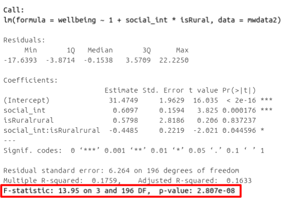
Figure 8: Multiple regression output in R, summary.lm(). F statistic highlighted
Run the code below. It reads in the wellbeing/rurality study data, and creates a new binary variable which specifies whether or not each participant lives in a rural location.
library(tidyverse)
mwdata2<-read_csv("https://uoepsy.github.io/data/wellbeing_rural.csv")
mwdata2 <-
  mwdata2 %>% mutate(
  isRural = ifelse(location=="rural","rural","notrural")
)
Fit the following model, and assign it the name “wb_mdl1”.
- \(\text{Wellbeing} = \beta_0 + \beta_1 \cdot \text{Social Interactions} + \beta_2 \cdot \text{IsRural} + \epsilon\)
Does the model provide a better fit to the data than a model with no explanatory variables? (i.e., test against the alternative hypothesis that at least one of the explanatory variables significantly predicts wellbeing scores).
Model Comparison
Incremental F-test
If (and only if) two models are nested (one model contains all the predictors of the other and is fitted to the same data), we can compare them using an incremental F-test.
This is a formal test of whether the additional predictors provide a better fitting model.
Formally this is the test of:
- \(H_0:\) coefficients for the added/ommitted variables are all zero.
- \(H_1:\) at least one of the added/ommitted variables has a coefficient that is not zero.
The F-ratio for comparing the residual sums of squares between two models can be calculated as:
\[ F_{(df_R-df_F),df_F} = \frac{(SSR_R-SSR_F)/(df_R-df_F)}{SSR_F / df_F} \\ \quad \\ \begin{align} & \text{Where:} \\ & SSR_R = \text{residual sums of squares for the restricted model} \\ & SSR_F = \text{residual sums of squares for the full model} \\ & df_R = \text{residual degrees of freedom from the restricted model} \\ & df_F = \text{residual degrees of freedom from the full model} \\ \end{align} \]
In R, we can conduct an incremental F-test by constructing two models, and passing them to the anova() function: anova(model1, model2).
The F-ratio you see at the bottom of summary(model) is actually a comparison between two models: your model (with some explanatory variables in predicting \(y\)) and the null model. In regression, the null model can be thought of as the model in which all explanatory variables have zero regression coefficients. It is also referred to as the intercept-only model, because if all predictor variable coefficients are zero, then the only we are only estimating \(y\) via an intercept (which will be the mean - \(\bar y\)).
Use the code below to fit the null model.
Then, use the anova() function to perform a model comparison between your earlier model (wb_mdl1) and the null model.
Check that the F statistic is the same as that which is given at the bottom of summary(wb_mdl1).
null_model <- lm(wellbeing ~ 1, data = mwdata2)
Does weekly outdoor time explain a significant amount of variance in wellbeing scores over and above weekly social interactions and location (rural vs not-rural)?
Provide an answer to this question by fitting and comparing two models (one of them you may already have fitted in an earlier question).
Incremental validity - A caution
A common goal for researchers is to determine which variables matter (and which do not) in contributing to some outcome variable. A common approach to answer such questions is to consider whether some variable \(X\)’s contribution remains significant after controlling for variables \(Z\).
The reasoning:
- If our measure of \(X\) correlates significantly with outcome \(Y\) even when controlling for our measure of \(Z\), then \(X\) contributes to \(y\) over and above the contribution of \(Z\).
In multiple regression, we might fit the model \(Y = \beta_0 + \beta_1 \cdot X + \beta_2 \cdot Z + \epsilon\) and conclude that \(X\) is a useful predictor of \(Y\) over and above \(Z\) based on the estimate \(\hat \beta_1\), or via model comparison between that model and the model without \(Z\) as a predictor (\(Y = \beta_0 + \beta_1 \cdot X + \epsilon\)).
A Toy Example
Suppose we have monthly data over a seven year period which captures the number of shark attacks on swimmers each month, and the number of ice-creams sold by beach vendors each month.
Consider the relationship between the two:
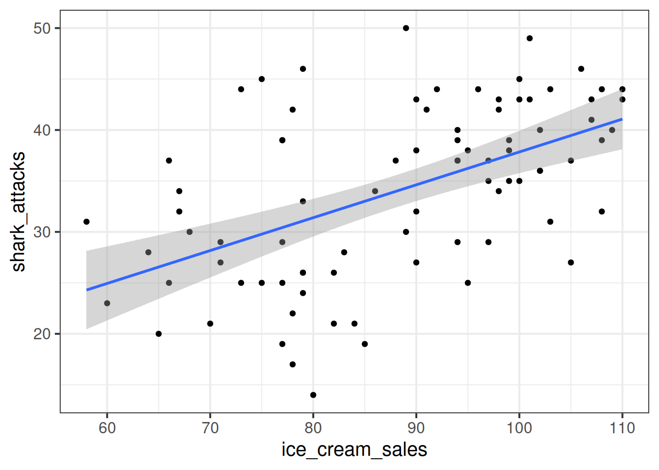
We can fit the linear model and see a significant relationship between ice cream sales and shark attacks:
sharkdata <- read_csv("https://uoepsy.github.io/data/sharks.csv")
shark_mdl <- lm(shark_attacks ~ ice_cream_sales, data = sharkdata)
summary(shark_mdl)
##
## Call:
## lm(formula = shark_attacks ~ ice_cream_sales, data = sharkdata)
##
## Residuals:
## Min 1Q Median 3Q Max
## -17.3945 -4.9268 0.5087 4.8152 15.7023
##
## Coefficients:
## Estimate Std. Error t value Pr(>|t|)
## (Intercept) 5.58835 5.19063 1.077 0.285
## ice_cream_sales 0.32258 0.05809 5.553 3.46e-07 ***
## ---
## Signif. codes: 0 '***' 0.001 '**' 0.01 '*' 0.05 '.' 0.1 ' ' 1
##
## Residual standard error: 7.245 on 81 degrees of freedom
## Multiple R-squared: 0.2757, Adjusted R-squared: 0.2668
## F-statistic: 30.84 on 1 and 81 DF, p-value: 3.461e-07Does the relationship between ice cream sales and shark attacks make sense? What might be missing from our model?
You might quite rightly suggest that this relationship is actually being driven by temperature - when it is hotter, there are more ice cream sales and there are more people swimming (hence more shark attacks).
Is \(X\) (the number of ice-cream sales) a useful predictor of \(Y\) (numbers of shark attacks) over and above \(Z\) (temperature)?
We might answer this with a multiple regression model including both temperature and ice cream sales as predictors of shark attacks:
shark_mdl2 <- lm(shark_attacks ~temperature + ice_cream_sales, data = sharkdata)
anova(shark_mdl2)
## Analysis of Variance Table
##
## Response: shark_attacks
## Df Sum Sq Mean Sq F value Pr(>F)
## temperature 1 3000.00 3000.00 85.7795 2.689e-14 ***
## ice_cream_sales 1 71.71 71.71 2.0503 0.1561
## Residuals 80 2797.87 34.97
## ---
## Signif. codes: 0 '***' 0.001 '**' 0.01 '*' 0.05 '.' 0.1 ' ' 1
What do you conclude?
It appears that numbers of ice cream sales is not a significant predictor of sharks attack numbers over and above the temperature.
However… In psychology, we can rarely observe and directly measure the constructs which we are interested in (for example, personality traits, intelligence, emotional states etc.). We rely instead on measurements of, e.g. behavioural tendencies, as a proxy for personality traits.
Let’s suppose that instead of including temperature in degrees celsius, we asked a set of people to self-report on a scale of 1 to 7 how hot it was that day. This measure should hopefully correlate well with the actual temperature, however, there will likely be some variation:
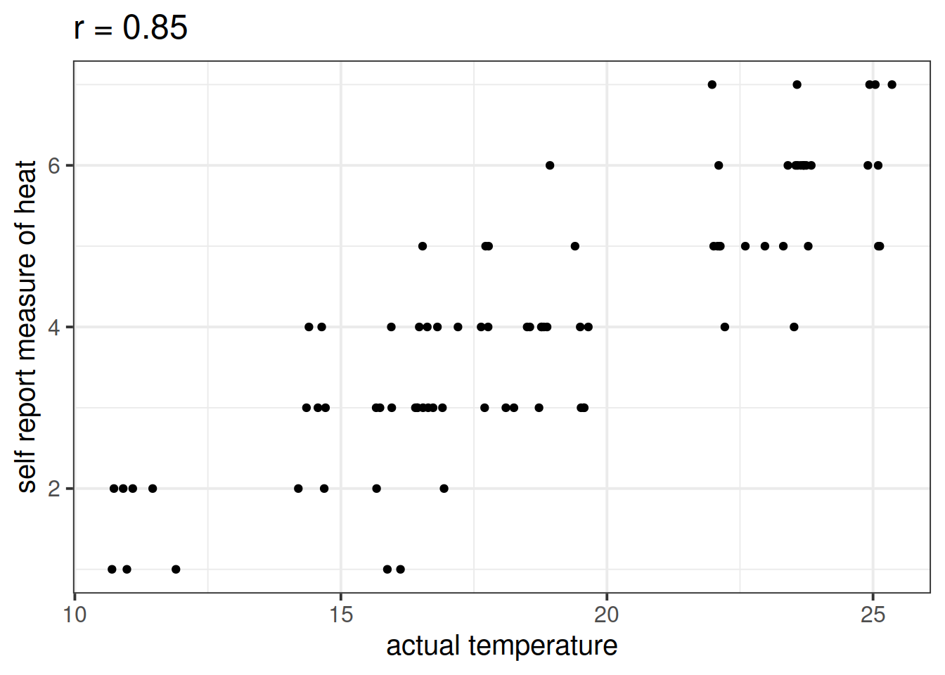
Is \(X\) (the number of ice-cream sales) a useful predictor of \(Y\) (numbers of shark attacks) over and above \(Z\) (temperature - measured on our self-reported heat scale)?
shark_mdl2a <- lm(shark_attacks ~ sr_heat + ice_cream_sales, data = sharkdata)
anova(shark_mdl2a)
## Analysis of Variance Table
##
## Response: shark_attacks
## Df Sum Sq Mean Sq F value Pr(>F)
## sr_heat 1 2683.90 2683.90 73.3080 6.378e-13 ***
## ice_cream_sales 1 256.76 256.76 7.0133 0.009744 **
## Residuals 80 2928.90 36.61
## ---
## Signif. codes: 0 '***' 0.001 '**' 0.01 '*' 0.05 '.' 0.1 ' ' 1
What do you conclude?
Moral of the story: be considerate of what exactly it is that you are measuring.
This example was adapted from Westfall and Yarkoni, 2020 which provides a much more extensive discussion of incremental validity and type 1 error rates.
AIC & BIC
We can also compare models using information criterion statistics, such as AIC and BIC. These combine information about the sample size, the number of model parameters and the residual sums of squares (\(SS_{residual}\)). Models do not need to be nested to be compared via AIC and BIC, but they need to have been fit to the same dataset.
For both of these fit indices, lower values are better, and both include a penalty for the number of predictors in the model, although BIC’s penalty is harsher:
\[ AIC = n\,\text{ln}\left( \frac{SS_{residual}}{n} \right) + 2k \\ \quad \\ BIC = n\,\text{ln}\left( \frac{SS_{residual}}{n} \right) + k\,\text{ln}(n) \\ \quad \\ \begin{align} & \text{Where:} \\ & SS_{residual} = \text{sum of squares residuals} \\ & n = \text{sample size} \\ & k = \text{number of explanatory variables} \\ & \text{ln} = \text{natural log function} \end{align} \]
In R, we can calculate AIC and BIC by using the AIC() and BIC() functions.
The code below fits 5 different models:
model1 <- lm(wellbeing ~ social_int + outdoor_time, data = mwdata2)
model2 <- lm(wellbeing ~ social_int + outdoor_time + age, data = mwdata2)
model3 <- lm(wellbeing ~ social_int + outdoor_time + routine, data = mwdata2)
model4 <- lm(wellbeing ~ social_int + outdoor_time + routine + age, data = mwdata2)
model5 <- lm(wellbeing ~ social_int + outdoor_time + routine + steps_k, data = mwdata2)
For each of the below pairs of models, what methods are/are not available for us to use for comparison and why?
model1vsmodel2model2vsmodel3model1vsmodel4model3vsmodel5
Returning to the data on Big 5 Personality traits, perceptions of social ranks, and depression and anxiety scale scores:
Research question
- Beyond neuroticism and its interaction with social comparison, do other personality traits predict symptoms of depression, anxiety and stress?
Construct and compare multiple regression models to answer this question. Remember to check that your models meet assumptions (for this exercises, a quick eyeball of the diagnostic plots will suffice. Were this an actual research project, you would want to provide a more thorough check, for instance conducting formal tests of the assumptions).
Although the solutions are available immediately for this question, we strongly advocate that you attempt it yourself before looking at them.
Ramsey, Fred, and Daniel Schafer. 2012. The Statistical Sleuth: A Course in Methods of Data Analysis. Cengage Learning.

This workbook was written by Josiah King, Umberto Noe, and Martin Corley, and is licensed under a Creative Commons Attribution 4.0 International License.

 These are the parameter estimates (the