Gapminder data
In this lesson we will work with some of the data from the Gapminder project. This data are available via an R package, which you will need to install in R.
First, install the gapminder package. Then load the gapminder package and the tidyverse package as we will need its functionality to work with data.
The gapminder package provides you with a data table having the same name as the package (unfortunately).
Let’s inspect the contents of the data using the glimpse function from tidyverse:
glimpse(gapminder)
Rows: 1,704
Columns: 6
$ country   <fct> "Afghanistan", "Afghanistan", "Afghanistan", "Afgh…
$ continent <fct> Asia, Asia, Asia, Asia, Asia, Asia, Asia, Asia, As…
$ year      <int> 1952, 1957, 1962, 1967, 1972, 1977, 1982, 1987, 19…
$ lifeExp   <dbl> 28.801, 30.332, 31.997, 34.020, 36.088, 38.438, 39…
$ pop       <int> 8425333, 9240934, 10267083, 11537966, 13079460, 14…
$ gdpPercap <dbl> 779.4453, 820.8530, 853.1007, 836.1971, 739.9811, …
The output tells us that the Gapminder data contain 1704 rows and 6 columns.
An alternative to glimpse() is the str() function, showing the structure of the data
str(gapminder)
tibble [1,704 × 6] (S3: tbl_df/tbl/data.frame)
 $ country  : Factor w/ 142 levels "Afghanistan",..: 1 1 1 1 1 1 1 1 1 1 ...
 $ continent: Factor w/ 5 levels "Africa","Americas",..: 3 3 3 3 3 3 3 3 3 3 ...
 $ year     : int [1:1704] 1952 1957 1962 1967 1972 1977 1982 1987 1992 1997 ...
 $ lifeExp  : num [1:1704] 28.8 30.3 32 34 36.1 ...
 $ pop      : int [1:1704] 8425333 9240934 10267083 11537966 13079460 14880372 12881816 13867957 16317921 22227415 ...
 $ gdpPercap: num [1:1704] 779 821 853 836 740 ...
Handling data
If you have not already done so, install the tidyverse package now. Then, load it via:
Look at the data:
gapminder
# A tibble: 1,704 x 6
   country     continent  year lifeExp      pop gdpPercap
   <fct>       <fct>     <int>   <dbl>    <int>     <dbl>
 1 Afghanistan Asia       1952    28.8  8425333      779.
 2 Afghanistan Asia       1957    30.3  9240934      821.
 3 Afghanistan Asia       1962    32.0 10267083      853.
 4 Afghanistan Asia       1967    34.0 11537966      836.
 5 Afghanistan Asia       1972    36.1 13079460      740.
 6 Afghanistan Asia       1977    38.4 14880372      786.
 7 Afghanistan Asia       1982    39.9 12881816      978.
 8 Afghanistan Asia       1987    40.8 13867957      852.
 9 Afghanistan Asia       1992    41.7 16317921      649.
10 Afghanistan Asia       1997    41.8 22227415      635.
# … with 1,694 more rows
Look at the head (= top 6 rows) or tail (= last 6 rows) of the data
head(gapminder)
# A tibble: 6 x 6
  country     continent  year lifeExp      pop gdpPercap
  <fct>       <fct>     <int>   <dbl>    <int>     <dbl>
1 Afghanistan Asia       1952    28.8  8425333      779.
2 Afghanistan Asia       1957    30.3  9240934      821.
3 Afghanistan Asia       1962    32.0 10267083      853.
4 Afghanistan Asia       1967    34.0 11537966      836.
5 Afghanistan Asia       1972    36.1 13079460      740.
6 Afghanistan Asia 1977 38.4 14880372 786.tail(gapminder)
# A tibble: 6 x 6
  country  continent  year lifeExp      pop gdpPercap
  <fct>    <fct>     <int>   <dbl>    <int>     <dbl>
1 Zimbabwe Africa     1982    60.4  7636524      789.
2 Zimbabwe Africa     1987    62.4  9216418      706.
3 Zimbabwe Africa     1992    60.4 10704340      693.
4 Zimbabwe Africa     1997    46.8 11404948      792.
5 Zimbabwe Africa     2002    40.0 11926563      672.
6 Zimbabwe Africa     2007    43.5 12311143      470.
Inspect the variable names, the number of columns, the length of the data (= ncol), the dimension, and the number of rows:
names(gapminder)
[1] "country"   "continent" "year"      "lifeExp"   "pop"
[6] "gdpPercap"ncol(gapminder)
[1] 6length(gapminder)
[1] 6dim(gapminder)
[1] 1704 6nrow(gapminder)
[1] 1704You can get a quick statistical description of each variable with
summary(gapminder)
        country        continent        year         lifeExp
 Afghanistan:  12   Africa  :624   Min.   :1952   Min.   :23.60
 Albania    :  12   Americas:300   1st Qu.:1966   1st Qu.:48.20
 Algeria    :  12   Asia    :396   Median :1980   Median :60.71
 Angola     :  12   Europe  :360   Mean   :1980   Mean   :59.47
 Argentina  :  12   Oceania : 24   3rd Qu.:1993   3rd Qu.:70.85
 Australia  :  12                  Max.   :2007   Max.   :82.60
 (Other)    :1632
      pop              gdpPercap
 Min.   :6.001e+04   Min.   :   241.2
 1st Qu.:2.794e+06   1st Qu.:  1202.1
 Median :7.024e+06   Median :  3531.8
 Mean   :2.960e+07   Mean   :  7215.3
 3rd Qu.:1.959e+07   3rd Qu.:  9325.5
 Max.   :1.319e+09   Max.   :113523.1
Look at some variables individually
Let’s start by looking at the year variable. Clearly, we are not running the following code otherwise we will get 1704 values printed out and it will be impossible to make any sense of that!
# Don't run this, or you will get 1704 values printed!
gapminder$year
Instead we will use head() to see the first few values:
head(gapminder$year)
[1] 1952 1957 1962 1967 1972 1977If you wish to see more entries,
head(gapminder$year, n = 25)
 [1] 1952 1957 1962 1967 1972 1977 1982 1987 1992 1997 2002 2007 1952
[14] 1957 1962 1967 1972 1977 1982 1987 1992 1997 2002 2007 1952tail(gapminder$year, n = 25)
 [1] 2007 1952 1957 1962 1967 1972 1977 1982 1987 1992 1997 2002 2007
[14] 1952 1957 1962 1967 1972 1977 1982 1987 1992 1997 2002 2007
Year is a numeric vector with entries being whole numbers (no decimals), in R these are also called integers.
class(gapminder$year)
[1] "integer"We can get a quick summary of the data with the summary() function:
summary(gapminder$year)
   Min. 1st Qu.  Median    Mean 3rd Qu.    Max.
   1952    1966    1980    1980    1993    2007
Next, we can compute how many times each year appears in the data. This is also called a frequency table, as it shows the absolute frequency (or count) of how many times each year is present in the data:
table(gapminder$year)
1952 1957 1962 1967 1972 1977 1982 1987 1992 1997 2002 2007
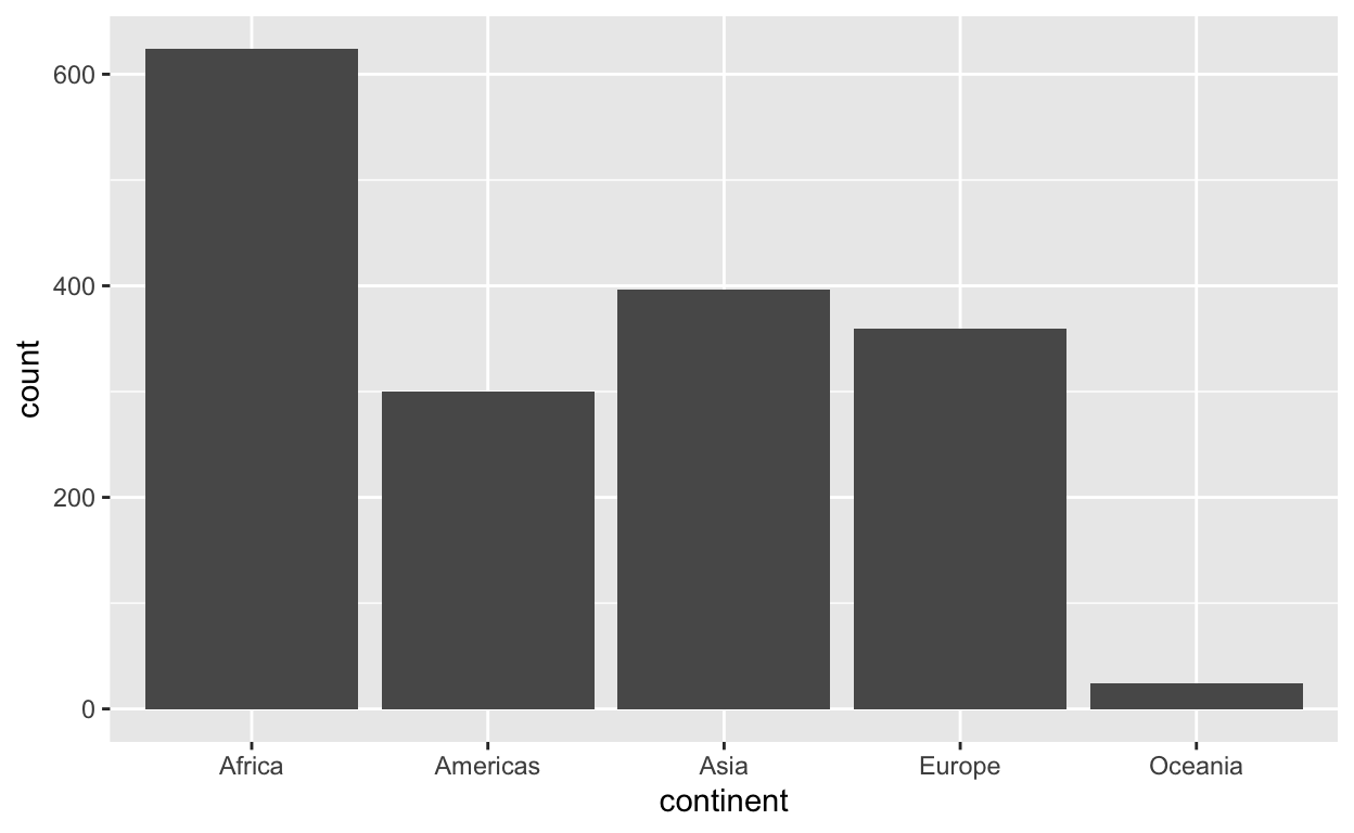
142 142 142 142 142 142 142 142 142 142 142 142 Let’s now focus on the continent variable:
class(gapminder$continent)
[1] "factor"head(gapminder$continent)
[1] Asia Asia Asia Asia Asia Asia
Levels: Africa Americas Asia Europe Oceania
We can see that continent is a factor object. The distinct categories it can take (= levels) and the number of levels are:
levels(gapminder$continent)
[1] "Africa" "Americas" "Asia" "Europe" "Oceania" nlevels(gapminder$continent)
[1] 5Performing a summary() on an object of class factor will perform a frequency table
summary(gapminder$continent)
  Africa Americas     Asia   Europe  Oceania
     624      300      396      360       24
That is, the same as
table(gapminder$continent)
  Africa Americas     Asia   Europe  Oceania
     624      300      396      360       24
For small data tables, you can look at the data directly by typing
View(gapminder)Plotting
We can create a barplot showing how many times each continent appears in the data
ggplot(data = gapminder, aes(x = continent)) +
    geom_bar()
Let’s focus on Europe:
# A tibble: 6 x 6
country continent year lifeExp pop gdpPercap
<fct> <fct> <int> <dbl> <int> <dbl>
1 Albania Europe 1952 55.2 1282697 1601.
2 Albania Europe 1957 59.3 1476505 1942.
3 Albania Europe 1962 64.8 1728137 2313.
4 Albania Europe 1967 66.2 1984060 2760.
5 Albania Europe 1972 67.7 2263554 3313.
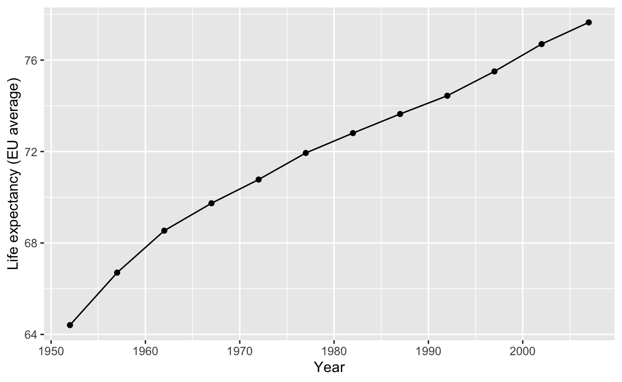
6 Albania Europe 1977 68.9 2509048 3533.Average life expectancy over european countries for each year:
gapminder_avg <- gapminder_eu %>%
    group_by(year) %>%
    summarise(mean_life_exp = mean(lifeExp))

gapminder_avg
# A tibble: 12 x 2
    year mean_life_exp
   <int>         <dbl>
 1  1952          64.4
 2  1957          66.7
 3  1962          68.5
 4  1967          69.7
 5  1972          70.8
 6  1977          71.9
 7  1982          72.8
 8  1987          73.6
 9  1992          74.4
10  1997          75.5
11  2002          76.7
12  2007          77.6
Let’s show it as a plot
ggplot(data = gapminder_avg, aes(x = year, y = mean_life_exp)) +
    geom_point() +
    geom_line() +
    labs(x = 'Year', y = 'Life expectancy (EU average)')
What if we wanted to compare these curves across different continents?
gapminder_cont <- gapminder %>%
    group_by(continent, year) %>%
    summarise(mean_life_exp = mean(lifeExp))

gapminder_cont
# A tibble: 60 x 3
# Groups:   continent [5]
   continent  year mean_life_exp
   <fct>     <int>         <dbl>
 1 Africa     1952          39.1
 2 Africa     1957          41.3
 3 Africa     1962          43.3
 4 Africa     1967          45.3
 5 Africa     1972          47.5
 6 Africa     1977          49.6
 7 Africa     1982          51.6
 8 Africa     1987          53.3
 9 Africa     1992          53.6
10 Africa     1997          53.6
# … with 50 more rowsggplot(data = gapminder_cont,
aes(x = year, y = mean_life_exp, color = continent)) +
geom_point() +
geom_line() +
labs(x = 'Year', y = 'Average life expectancy')
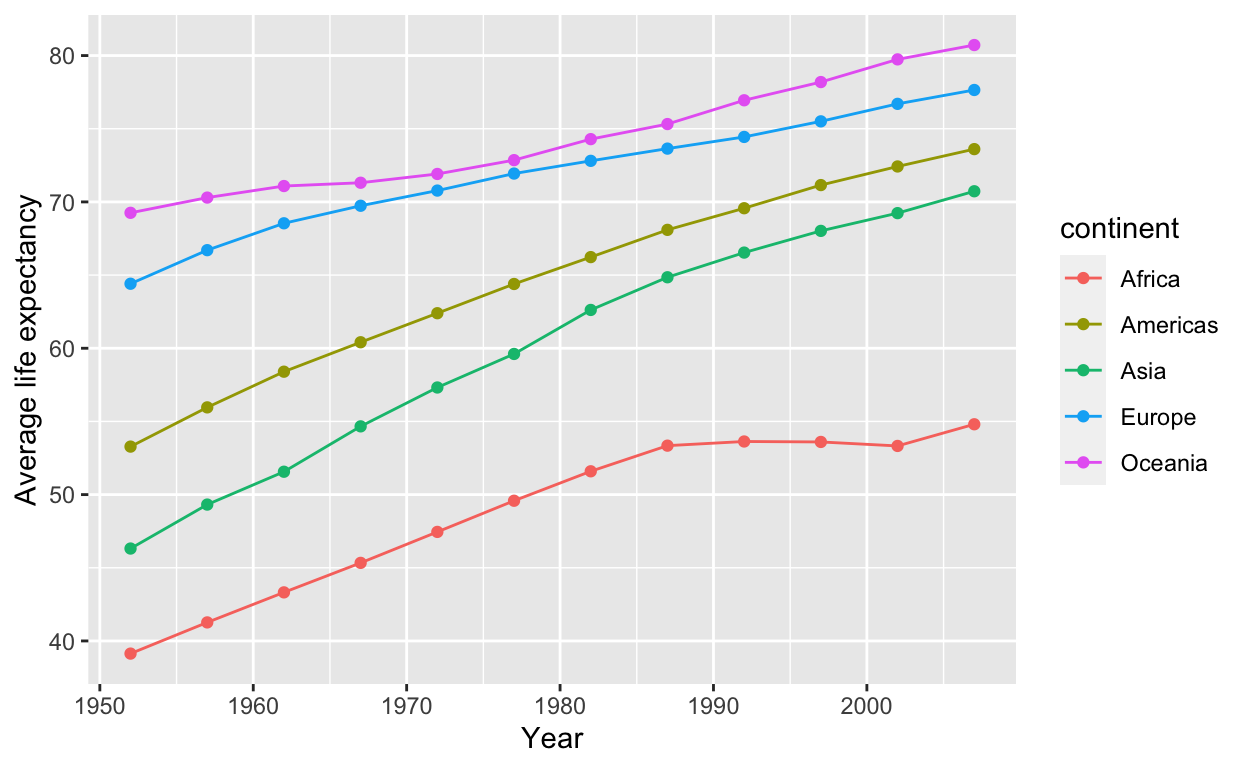
Wow! this plot is definitely much more informative than all that huge table of numbers you get from View(gapminder).
From the plot we can see the increasing trend over time of average life expectancy in each continent, and we see that Oceania consistently had the highest average life expectancy than any other country, while Africa had the lowest.
Q1
Exercise
Group the Gapminder data by continent and country, and compute for each the average (over the different years) life expectancy and average GDP per capita.
Create a plot where each country is shown as a point, the x-axis has the average GDP per capita, the y-axis the average life expectancy, and the points are coloured by continent.
Answer
gapminder_le_gdp <- gapminder %>%
    group_by(continent, country) %>%
    summarise(mean_le = mean(lifeExp),
              mean_gdp = mean(gdpPercap))

gapminder_le_gdp
# A tibble: 142 x 4
# Groups:   continent [5]
   continent country                  mean_le mean_gdp
   <fct>     <fct>                      <dbl>    <dbl>
 1 Africa    Algeria                     59.0    4426.
 2 Africa    Angola                      37.9    3607.
 3 Africa    Benin                       48.8    1155.
 4 Africa    Botswana                    54.6    5032.
 5 Africa    Burkina Faso                44.7     844.
 6 Africa    Burundi                     44.8     472.
 7 Africa    Cameroon                    48.1    1775.
 8 Africa    Central African Republic    43.9     959.
 9 Africa    Chad                        46.8    1165.
10 Africa    Comoros                     52.4    1314.
# … with 132 more rowsggplot(data = gapminder_le_gdp,
aes(x = mean_gdp, y = mean_le, color = continent)) +
geom_point() +
labs(x = 'Average GDP per capita', y = 'Average life expectancy')
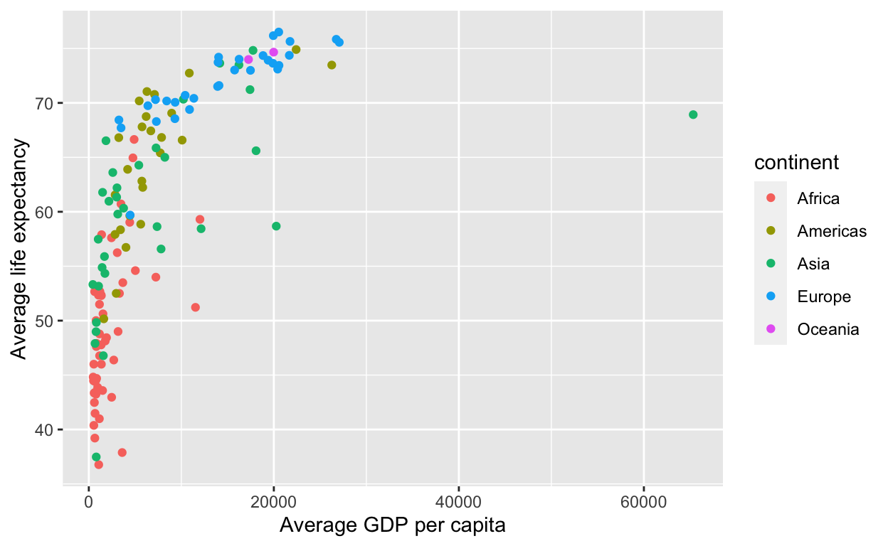
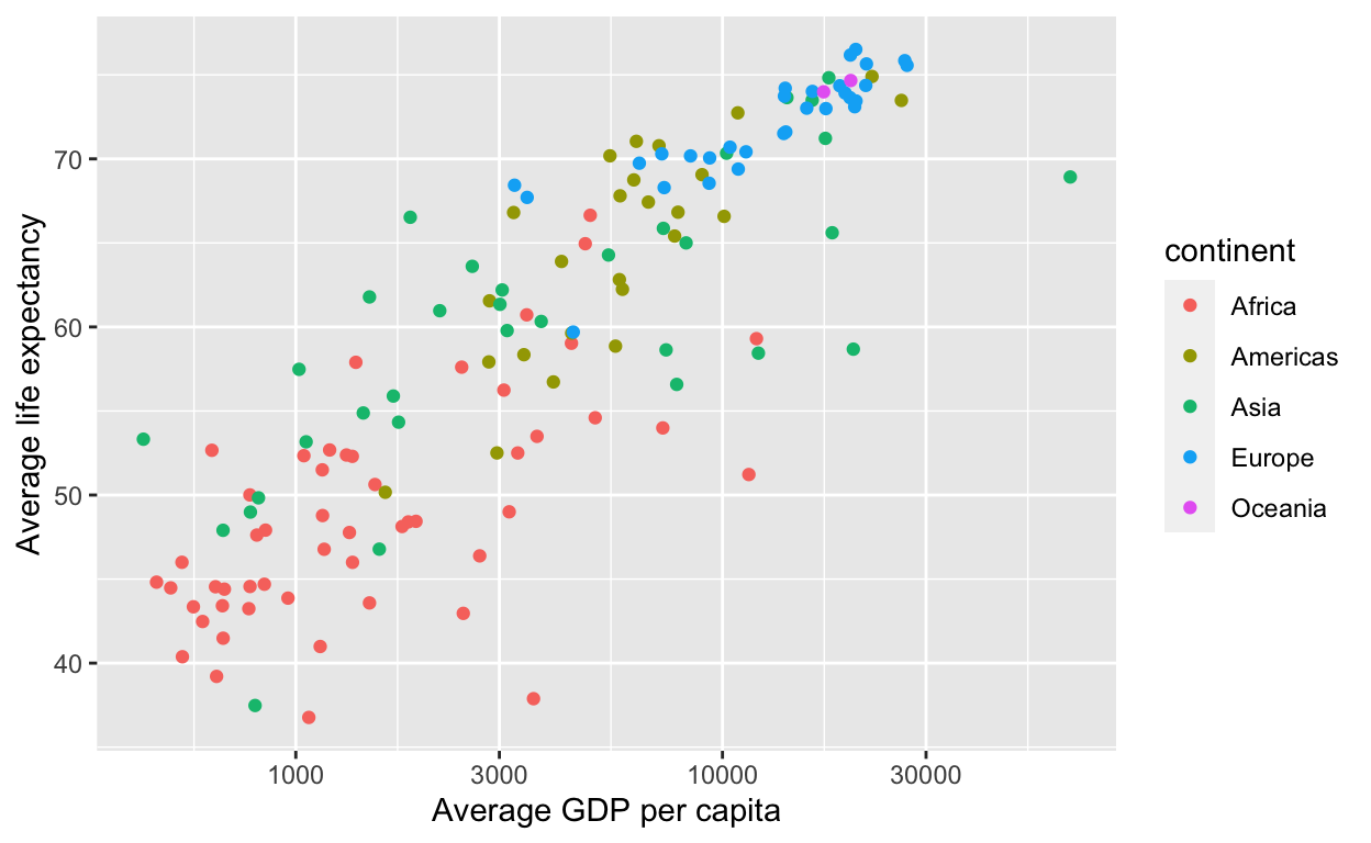
To make it easier to read, we can change the x-axis to increase in powers of 10.
ggplot(data = gapminder_le_gdp,
       aes(x = mean_gdp, y = mean_le, color = continent)) +
    geom_point() +
    scale_x_log10() +
    labs(x = 'Average GDP per capita', y = 'Average life expectancy')
Q2
Exercise
Create a new column called pop_m, storing the population in millions.
Store the result in a new tibble called gapminder_new.
Answer
gapminder_new <- gapminder %>%
    mutate(pop_m = pop / 1000000)

gapminder_new
# A tibble: 1,704 x 7
   country     continent  year lifeExp      pop gdpPercap pop_m
   <fct>       <fct>     <int>   <dbl>    <int>     <dbl> <dbl>
 1 Afghanistan Asia       1952    28.8  8425333      779.  8.43
 2 Afghanistan Asia       1957    30.3  9240934      821.  9.24
 3 Afghanistan Asia       1962    32.0 10267083      853. 10.3
 4 Afghanistan Asia       1967    34.0 11537966      836. 11.5
 5 Afghanistan Asia       1972    36.1 13079460      740. 13.1
 6 Afghanistan Asia       1977    38.4 14880372      786. 14.9
 7 Afghanistan Asia       1982    39.9 12881816      978. 12.9
 8 Afghanistan Asia       1987    40.8 13867957      852. 13.9
 9 Afghanistan Asia       1992    41.7 16317921      649. 16.3
10 Afghanistan Asia       1997    41.8 22227415      635. 22.2
# … with 1,694 more rows
Q3
Exercise
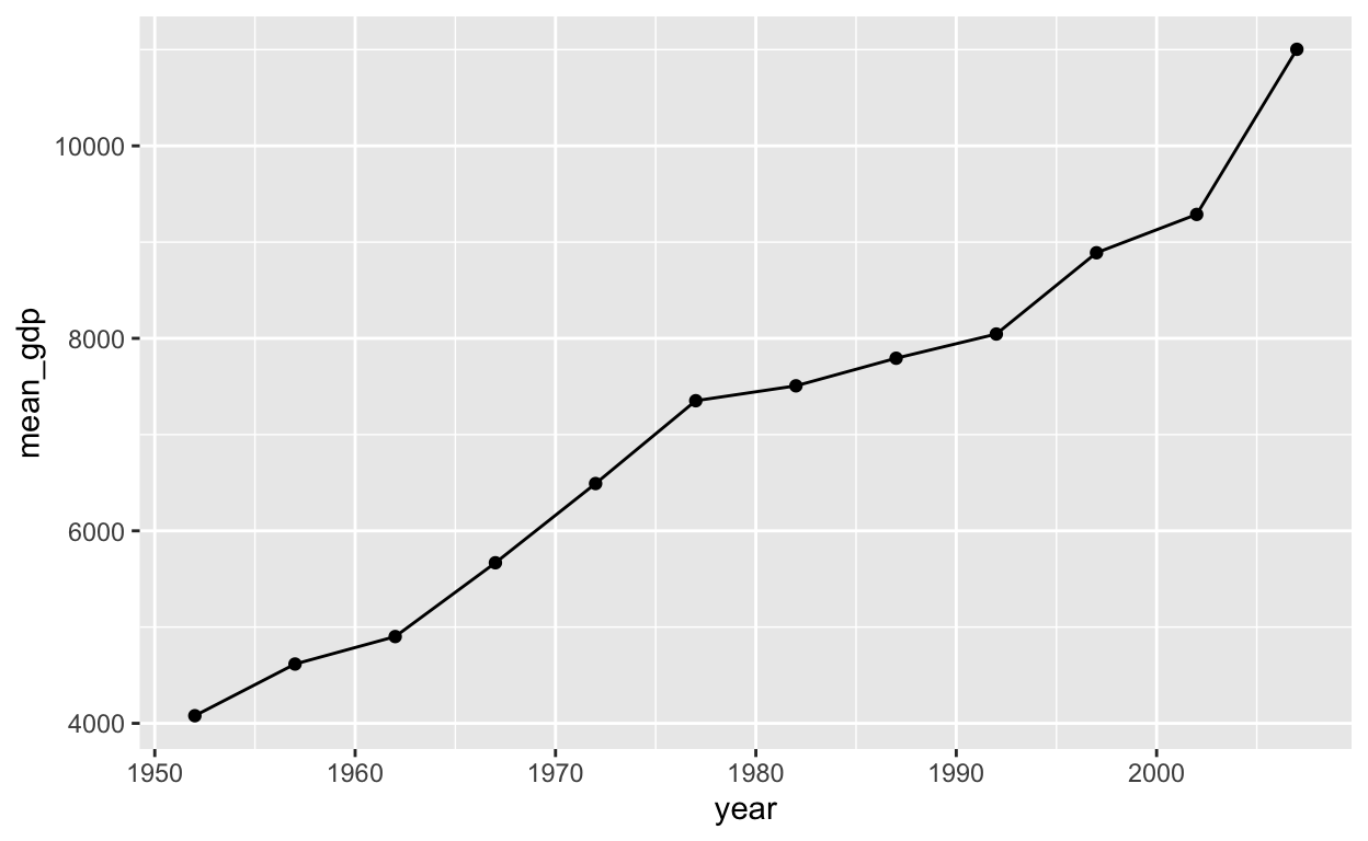
Consider now only the countries in the Americas. Plot the average GDP per capita as a function of year.
Answer
gapminder_am <- gapminder %>%
    filter(continent == 'Americas') %>%
    group_by(year) %>%
    summarise(mean_gdp = mean(gdpPercap))
gapminder_am
# A tibble: 12 x 2
    year mean_gdp
   <int>    <dbl>
 1  1952    4079.
 2  1957    4616.
 3  1962    4902.
 4  1967    5668.
 5  1972    6491.
 6  1977    7352.
 7  1982    7507.
 8  1987    7793.
 9  1992    8045.
10  1997    8889.
11  2002    9288.
12 2007 11003.ggplot(data = gapminder_am,
aes(x = year, y = mean_gdp)) +
geom_point() +
geom_line()