A questionnaire was sent to all UK civil service departments, and the lmm_jsup.csv dataset contains all responses that were received. Some of these departments work as hybrid or ‘virtual’ departments, with a mix of remote and office-based employees. Others are fully office-based.
The questionnaire included items asking about how much the respondent believe in the department and how it engages with the community, what it produces, how it operates and how treats its people. A composite measure of ‘workplace-pride’ was constructed for each employee. Employees in the civil service are categorised into 3 different roles: A, B and C. The roles tend to increase in responsibility, with role C being more managerial, and role A having less responsibility. We also have data on the length of time each employee has been in the department (sometimes new employees come straight in at role C, but many of them start in role A and work up over time).
We’re interested in whether the different roles are associated with differences in workplace-pride.
Whether the department functions as hybrid department with various employees working remotely (1), or as a fully in-person office (0)
role
Employee role (A, B or C)
seniority
Employees seniority point. These map to roles, such that role A is 0-4, role B is 5-9, role C is 10-14. Higher numbers indicate more seniority
employment_length
Length of employment in the department (years)
wp
Composite Measure of 'Workplace Pride'
Question 1
Read in the data and provide some descriptive plots and statistics of each individual variable.
Hints
Don’t remember how to do descriptives? Think back to previous courses – it’s time for some means, standard deviations, mins and maxes. For categorical variables we can do counts or proportions.
We’ve seen various functions such as summary(), and also describe() from the psych package.
For continuous variables, histograms are a good first port of call: try hist(). For categorical variables, you could try plotting the outcome of table().
Solution 1. Here’s the dataset:
library(tidyverse) # for data wranglinglibrary(psych) jsup <-read_csv("https://uoepsy.github.io/data/lmm_jsup.csv")
Let’s take just the numeric variables and get some descriptives:
jsup |>select(employment_length, wp) |>describe()
                  vars   n mean   sd median trimmed  mad  min  max range  skew
employment_length    1 295 12.6 4.28   13.0    12.6 4.45 0.00 30.0  30.0  0.08
wp                   2 295 25.5 5.27   25.4    25.5 5.93 6.34 38.5  32.1 -0.05
                  kurtosis   se
employment_length     0.38 0.25
wp                   -0.14 0.31
And make frequency tables for the categorical ones:
table(jsup$role)
  A   B   C
109  95  91
I’m going to use dept rather than department_name as the output will be easier to see:
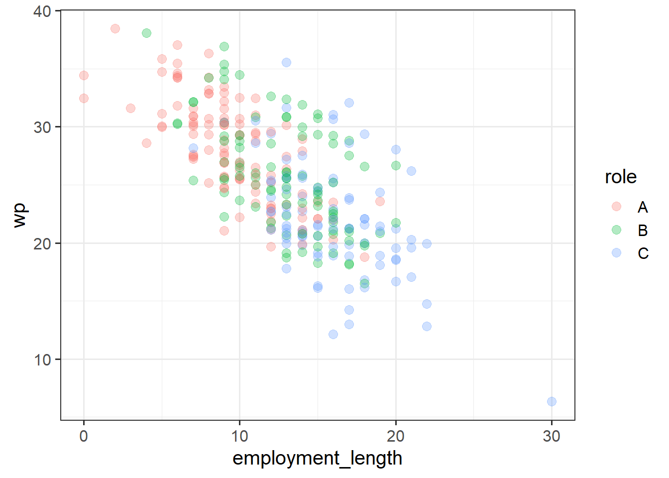
Are there differences in ‘workplace-pride’ between people in different roles?
First, plot these two variables together. Based on this plot and your training from DAPR2, try to answer these questions:
If you fit a model to this data, how would the predictor be coded?
What coefficients would the model estimate?
Would the sign of the coefficients be positive or negative?
Once you’ve made a good effort to predict the answers to these questions, fit a model and see if your predictions are borne out. (If your predictions are different from the outcomes, reflect on why the outcomes are the way they are.)
Hints
does y [continuous variable] differ by x [three groups]? lm(y ~ x)?
By default, R uses treatment coding (aka dummy coding), and the reference level is the one that comes first in the alphabet.
Solution 2.
mod1 <-lm(wp ~ role, data = jsup)
Rather than doing summary(model) - I’m just going to use the broom package to pull out some of the stats in nice tidy dataframes.
The glance() function will give us things like the \(R^2\) values and \(F\)-statistic (basically all the stuff that is at the bottom of the summary()):
It looks like roles do differ in their workplace pride. Specifically, compared to people in role A, people who are in roles B and C on average report less pride in the workplace.
Question 3
One possibility: Something about the roles themselves makes people report differences in workplace pride.
Another possibility: People who are newer to the company feel more pride (they’re less jaded), and people in Role A tend to be newer. So something else is at play, but the model above makes it look like it’s about role.
In other words, if we were to compare people in each role but hold constant their employment_length, might we see something different?
Make a plot that shows all these relevant variables. Based on that plot, have a guess at the following questions:
What coefficients will be estimated by a model fit to this data?
Would the sign of the coefficients be positive or negative?
Once you’ve made a good effort to predict the answers to these questions, fit a model and see. (If your predictions are different from the outcomes, reflect on why the outcomes are the way they are.)
Hints
So we want to adjust for how long people have been part of the company..
Remember - if we want to estimate the effect of x on y while adjusting for z, we can do lm(y ~ z + x).
For the plot - put something on the x, something on the y, and colour it by the other variable.
Solution 3.
mod2 <-lm(wp ~ employment_length + role, data = jsup)tidy(mod2)
Note that, after adjusting for employment length, there are no significant differences in wp between roles B or C compared to A.
If we plot the data to show all these variables together, we can kind of see why! Given the pattern of wp against employment_length, the wp for different roles are pretty much where we would expect them to be if role doesn’t make any difference (i.e., if role doesn’t shift your wp up or down).
Let’s take a step back and remember what data we actually have. We’ve got 295 people in our dataset, from 16 departments.
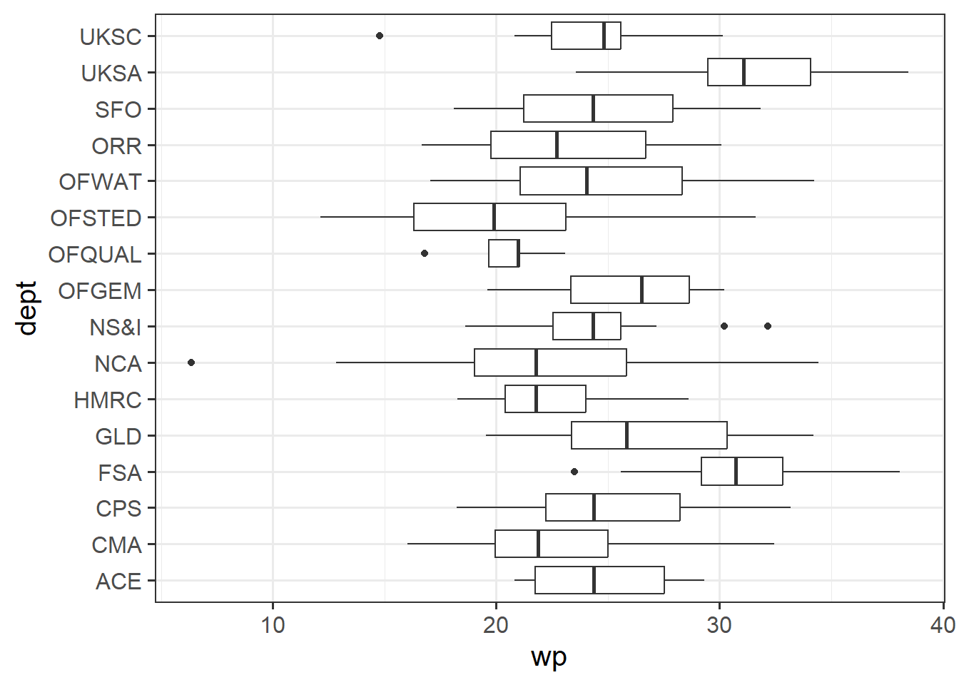
Departments may well differ in the general amount of workplace-pride people report. People love to say that they work in the “National Crime Agency”, but other departments might not elicit such pride (*cough* HM Revenue & Customs *cough*). We need to be careful not to mistake department differences as something else (like differences due to the job role).
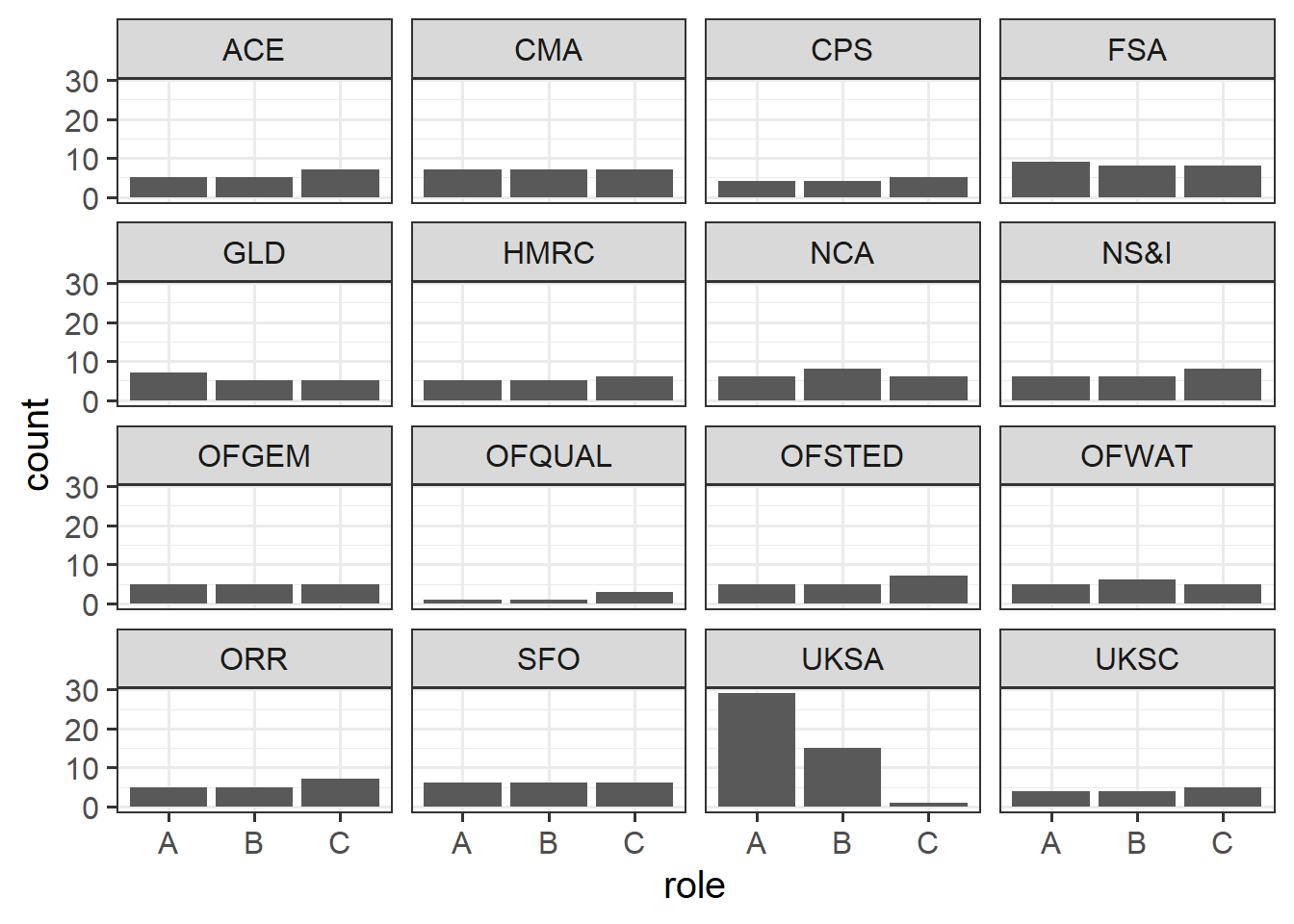
Make a couple of plots to look at:
how many of each role we have from each department
how departments differ in their employees’ pride in their workplace
In this case, it looks like most of the departments have similar numbers of each role, apart from the UKSA (“UK Statistics Authority”), where we’ve got loads more of role A, and very few role C..
Note also that in the plot below, the UKSA is, on average, full of employees who take a lot of pride in their work. Is this due to the high proportion of people in role A? or is the effect of role we’re seeing more due to differences in departments?
Even if we had perfectly equal numbers of roles in each department, we’re also adjusting for other things such as employment_length, and the extent to which this differs by department can have trickle-on effects on our coefficient of interest (the role coefficients).
Question 5
Adjusting for both length of employment and department, are there differences in ‘workplace-pride’ between the different roles? Fit a model to find out.
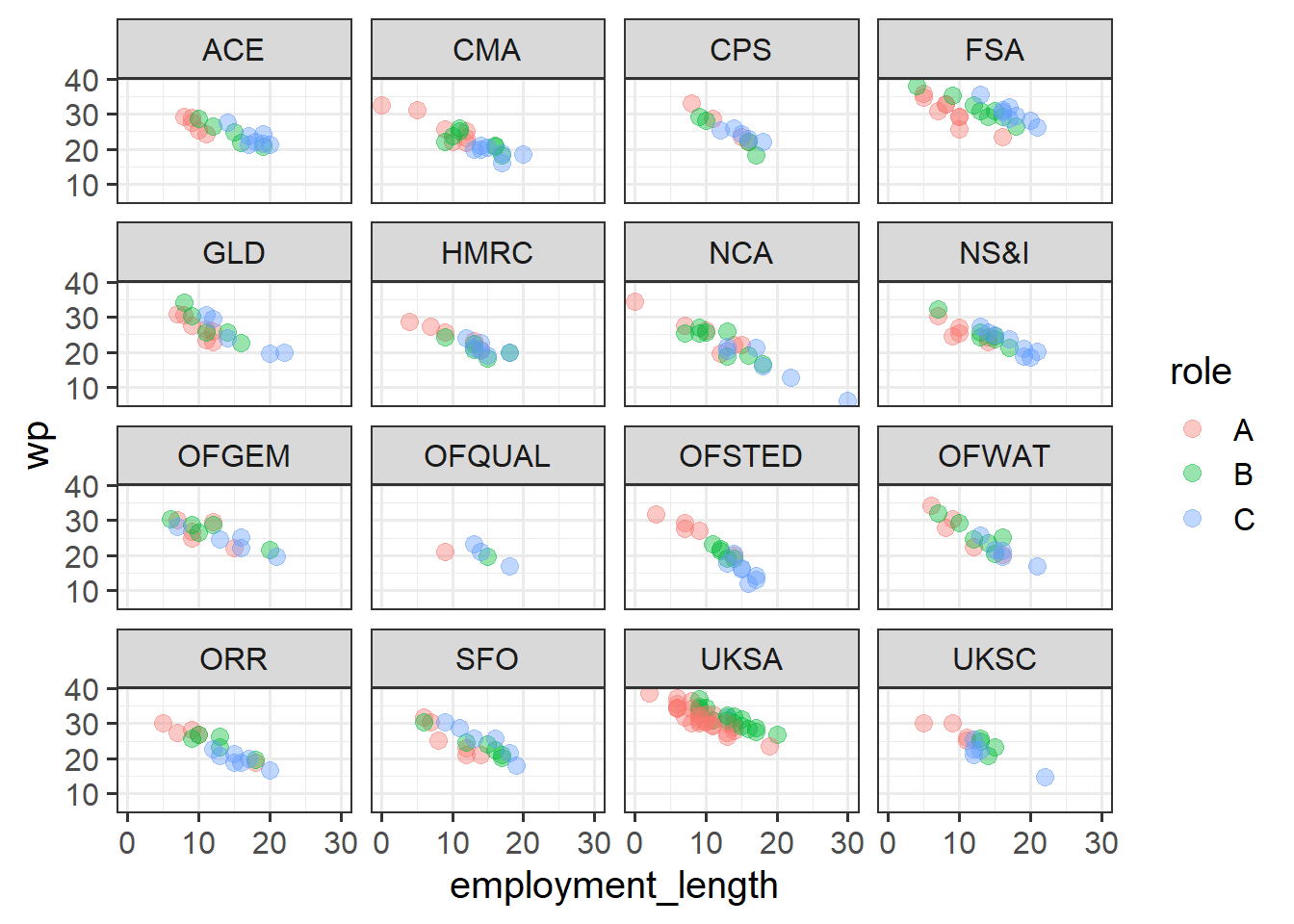
Can you make a plot of all four of the variables involved in our model?
Hints
Making the plot might take some thinking. We’ve now added dept into the mix, so a nice way might be to use facet_wrap() to make the same plot as the one we did previously, but for each department.
In a way, adding predictors to our model is kind of like splitting up our plots by that predictor to see the patterns. This becomes more and more difficult (/impossible) as we get more variables, but right now we can split the data into all the constituent parts.
ggplot(jsup, aes(x = employment_length, y = wp, col = role)) +geom_point(size=3,alpha=.4)+facet_wrap(~dept)
The association between wp and employment_length is clear in all these little sub-plots - there’s a downward trend. The department differences can be seen too: UKSA is generally a bit higher, HMRC and UKSC a bit lower, and so on. By default, the model captures these coefficients as ‘differences from the reference group’, so all these coefficients are in relation to the “ACE” department.
Seeing the role differences is a bit harder in this plot, but think about what you would expect to see if there were no differences in roles (i.e. imagine if they were all in role A). Take for instance the FSA department, where this is easiest to see - for the people who are in role C, for people of their employment length we would expect their wp to be lower if they were in role A. Likewise for those in role B. Across all these departments, the people in role B and C (green and blue dots respectively) are a bit higher than we would expect. This is what the model coefficients tell us!
Question 6
Now we’re starting to acknowledge the grouped structure of our data - these people in our dataset are related to one another in that some belong to dept 1, some dept 2, and so on..
Let’s try to describe our sample in a bit more detail.
how many participants do we have, and from how many departments?
how many participants are there, on average, from each department? what is the minimum and maximum?
what is the average employment length for our participants?
how many departments are ‘virtual departments’ vs office-based?
what is the overall average reported workplace-pride?
how much variation in workplace-pride is due to differences between departments?
# A tibble: 1 × 3
    min   max median
  <int> <int>  <dbl>
1     5    45     17
What is the average employment length of respondents?
mean(jsup$employment_length)
[1] 12.6
How many departments are virtual vs office based? This requires a bit more than just table(jsup$virtual), because we are describing a variable at the department level.
What is the overall average ‘workplace-pride’? What is the standard deviation?
mean(jsup$wp)
[1] 25.5
sd(jsup$wp)
[1] 5.27
Finally, how much variation in workplace-pride is attributable to department-level differences?
ICC::ICCbare(x = dept, y = wp, data = jsup)
[1] 0.439
Question 7
What if we would like to know whether, when adjusting for differences due to employment length and department and roles, workplace-pride differs between people working in virtual-departments compared to office-based ones?
Can you add this to the model? What happens?
Solution 7. Let’s add the virtual predictor to our model. Note that we don’t actually get a coefficient here - it is giving us an NA!
mod4 <-lm(wp ~ employment_length + dept + role + virtual, data = jsup)summary(mod4)
Call:
lm(formula = wp ~ employment_length + dept + role + virtual,
    data = jsup)

Residuals:
   Min     1Q Median     3Q    Max
-6.690 -1.404 -0.027  1.178  5.054

Coefficients: (1 not defined because of singularities)
                  Estimate Std. Error t value Pr(>|t|)
(Intercept)        36.3522     0.6310   57.61  < 2e-16 ***
employment_length  -0.8817     0.0344  -25.66  < 2e-16 ***
deptCMA            -3.7969     0.6490   -5.85  1.4e-08 ***
deptCPS            -0.2173     0.7304   -0.30  0.76627
deptFSA             4.7448     0.6245    7.60  4.7e-13 ***
deptGLD             0.0582     0.6822    0.09  0.93212
deptHMRC           -3.7859     0.6924   -5.47  1.0e-07 ***
deptNCA            -3.8503     0.6549   -5.88  1.2e-08 ***
deptNS&I           -0.5737     0.6537   -0.88  0.38095
deptOFGEM          -0.6479     0.7050   -0.92  0.35885
deptOFQUAL         -4.9413     1.0104   -4.89  1.7e-06 ***
deptOFSTED         -5.8846     0.6831   -8.61  5.5e-16 ***
deptOFWAT          -1.2087     0.6917   -1.75  0.08169 .
deptORR            -2.8452     0.6813   -4.18  4.0e-05 ***
deptSFO            -1.3550     0.6719   -2.02  0.04469 *
deptUKSA            4.2820     0.5759    7.43  1.3e-12 ***
deptUKSC           -2.3131     0.7325   -3.16  0.00177 **
roleB               1.4179     0.3029    4.68  4.5e-06 ***
roleC               1.3148     0.3663    3.59  0.00039 ***
virtual                 NA         NA      NA       NA
---
Signif. codes:  0 '***' 0.001 '**' 0.01 '*' 0.05 '.' 0.1 ' ' 1

Residual standard error: 1.98 on 276 degrees of freedom
Multiple R-squared:  0.867, Adjusted R-squared:  0.859
F-statistic:  100 on 18 and 276 DF,  p-value: <2e-16
So what is happening? If we think about it, if we separate out “differences due to departments” then there is nothing left to compare between departments that are virtual vs office based. Adding the between-department predictor of virtual doesn’t explain anything more - the residual sums of squares doesn’t decrease at all:
anova(lm(wp ~ employment_length + dept + role, data = jsup),lm(wp ~ employment_length + dept + role + virtual, data = jsup))
Analysis of Variance Table

Model 1: wp ~ employment_length + dept + role
Model 2: wp ~ employment_length + dept + role + virtual
  Res.Df  RSS Df Sum of Sq F Pr(>F)
1    276 1084
2    276 1084  0         0
Another way of thinking about this: knowing the average workplace-pride for the department that someone is in tells me what to expect about that person’s workplace pride. But once I know their department’s average workplace-pride, knowing whether it is ‘virtual’ or ‘office-based’ doesn’t tell me anything new, for the very fact that the virtual/office-based distinction comes from comparing different departments.
But we’re not really interested in these departments specifically! What would be nice would be if we can look at the relevant effects of interest (things like role and virtual), but then just think of the department differences as just some sort of random variation. So we want to think of departments in a similar way to how we think of our individual employees - they vary randomly around what we expect - only they’re at a different level of observation.