| Variable Name | Description |
|---|---|
| Bill | Size of the bill (in dollars) |
| Tip | Size of the tip (in dollars) |
| Credit | Paid with a credit card? n or y |
| Guests | Number of people in the group |
| Day | Day of the week: m=Monday, t=Tuesday, w=Wednesday, th=Thursday, or f=Friday |
| Server | Code for specific waiter/waitress: A, B, or C |
| PctTip | Tip as a percentage of the bill |
Formative report B
Semester 1 - Week 11
1 Formative Report B
Instructions and data were released in week 7.
This week: Submission of Formative Report B
- Your group must submit one PDF file for formative report B by 12 noon on Friday 28th of November 2025.
- No extensions are possible for this formative/practice report, see “Assessment Information” page on LEARN.
- To submit, go to the course Learn page > click “Assessment” > click “Submit Formative Report B (PDF file only)”.
- Only one person per group is required to submit on behalf of the entire group. Once submitted, let your group know on the Group Discussion Space. The other members in the group don’t have to do anything else.
- Ensure that everyone in the group has joined the group on LEARN. Otherwise, you won’t see the feedback when it is released.
- If more than one submission is made per group, only the most recent one will be considered.
- The submitted report must be a PDF file of max 6 sides of A4 paper.
- Keep the default settings in terms of Rmd knitting font and page margins.
- Ensure your report title includes the group name: Group NAME.LETTER
- In the author section, ensure the report lists the exam numbers of all group members: B000001, B000002, …
- At the end of the file, you will place the appendices and these will not count towards the six-page limit.
You can include an optional appendix for additional tables and figures which you can’t fit in the main part of the report;
-
You must include a compulsory appendix listing all of the R code used in the report. This is done automatically if you end your file with the following section, which is already included in the template Rmd file:
# Appendix: R code

```{r ref.label=knitr::all_labels(), echo=TRUE, eval=FALSE}

```
Excluding the Appendix, the report should not include any reference to R code or functions, but be written for a generic reader who is only assumed to have a basic statistical understanding without any R knowledge.
- Next week:
- Solutions to Formative Report B will be posted on LEARN next week as study material.
- At the end of next week, we will send an announcement when we will have finished providing feedback on your submissions. Please review your feedback when we announce it is ready.
- In between semesters:
- There will be no lectures, no labs, no weekly quizzes, and no office hours between 29 November and 11 January.
- Lectures, labs, weekly quizzes, and office hours will resume as normal in week 1 of semester 2 (week commencing 12 January 2026).
Formatting resources
At this page you can find resources to help you with your report formatting.
1.1 This week’s task
Task B5
B5) Finish the report write-up and formatting, knit to PDF, and submit the PDF for formative feedback.
Sub-steps
Below there are sub-steps you need to consider to complete this week’s task.
Tip
To see the hints, hover your cursor on the superscript numbers.
Ensure all group members have joined the group on LEARN. If you have not done so yet, go to the course LEARN page, click “Groups” from the top menu bar, click “Labs_1_2_3_4”, and join the group with the same name as your table label.
Reopen last week’s Rmd file, and continue building on last week’s work. Make sure you are still using the movies dataset filtered to only include the top 3 genres.1
Formatting Resources
Use the Formatting Resources page to help you with the formatting of your report. For example:
- To save space by placing figures side by side, or change figure height/width.
- To reference figures or tables in the text.
- To knit the Rmd file to PDF.
-
Organise the report to have the following structure:
-
Introduction:
- What are the data that you are analysing (i.e. give a brief intro) and where can these be found?
- Which questions of interest are you investigating in the report?
- Which variables will you use to answer those questions and what do those variables represent?
- What is the type of these variables?
- Are there any missing values in these variables?
Analysis: Present and interpret your results. This section should only contain text, figures, and tables. No R code or R output printout should be visible.
Discussion: Summarise the key findings from the analysis section, and provide take-home messages that directly answer the questions of interest. Link your answers to the questions detailed in the introduction. No new statistical results should be presented in the discussion.
Appendix A (optional): For additional figures and tables that don’t fit in the page limit. Any figures/tables presented here should be referenced in the main part of the report and have a caption. Appendix A doesn’t count in the page limit.
Appendix B (compulsory): Presents all the R code used. This is automatically created for you if you used the template Rmd file. If you haven’t copy and paste that section from the template into your file. Appendix B doesn’t count in the page limit.
-
Edit your figures/tables formatting as required to ensure that your report meets the page limit.
Knit the document to PDF: click File > Knit Document. Ensure the page limit is met, see instructions at the top.
Successful knitting checklist
If you encounter errors when knitting the Rmd file, go through the following checklist to try finding the source of the errors.
- Submit the PDF file on Learn by 12 noon on Friday 28th of November 2025:
- Go to the Learn page of the course
- Click Assessments
- Click Submit Formative Report B (PDF file only)
- Follow the instructions
2 Worked example (on Lecture content, not on Lab content)
The dataset available at https://uoepsy.github.io/data/RestaurantTips.csv was collected by the owner of a US bistro, and contains 157 observations on 7 variables.2
The bistro servers are concerned that some shifts are more profitable than others, and that their rota needs to be updated so that they all get the chance to maximise their tips. They have asked the owner to find out what days the highest percentage of tips are given, on average. They have also asked the owner to tell them the days on which variation in percentage tips is highest and lowest. We need to advise the bistro owner so that they can update their servers with the requested information.
library(tidyverse)
library(patchwork)
tips <- read_csv("https://uoepsy.github.io/data/RestaurantTips.csv")
head(tips)
# A tibble: 6 × 7
Bill Tip Credit Guests Day Server PctTip
<dbl> <dbl> <chr> <dbl> <chr> <chr> <dbl>
1 23.7 10 n 2 f A 42.2
2 36.1 7 n 3 f B 19.4
3 32.0 5.01 y 2 f A 15.7
4 17.4 3.61 y 2 f B 20.8
5 15.4 3 n 2 f B 19.5
6 18.6 2.5 n 2 f A 13.4- First we want to prepare our data, and check for any unusual or impossible values (e.g., outliers). One useful way to do this would be to plot our data:
ggplot(tips, aes(x = PctTip)) +
    geom_histogram()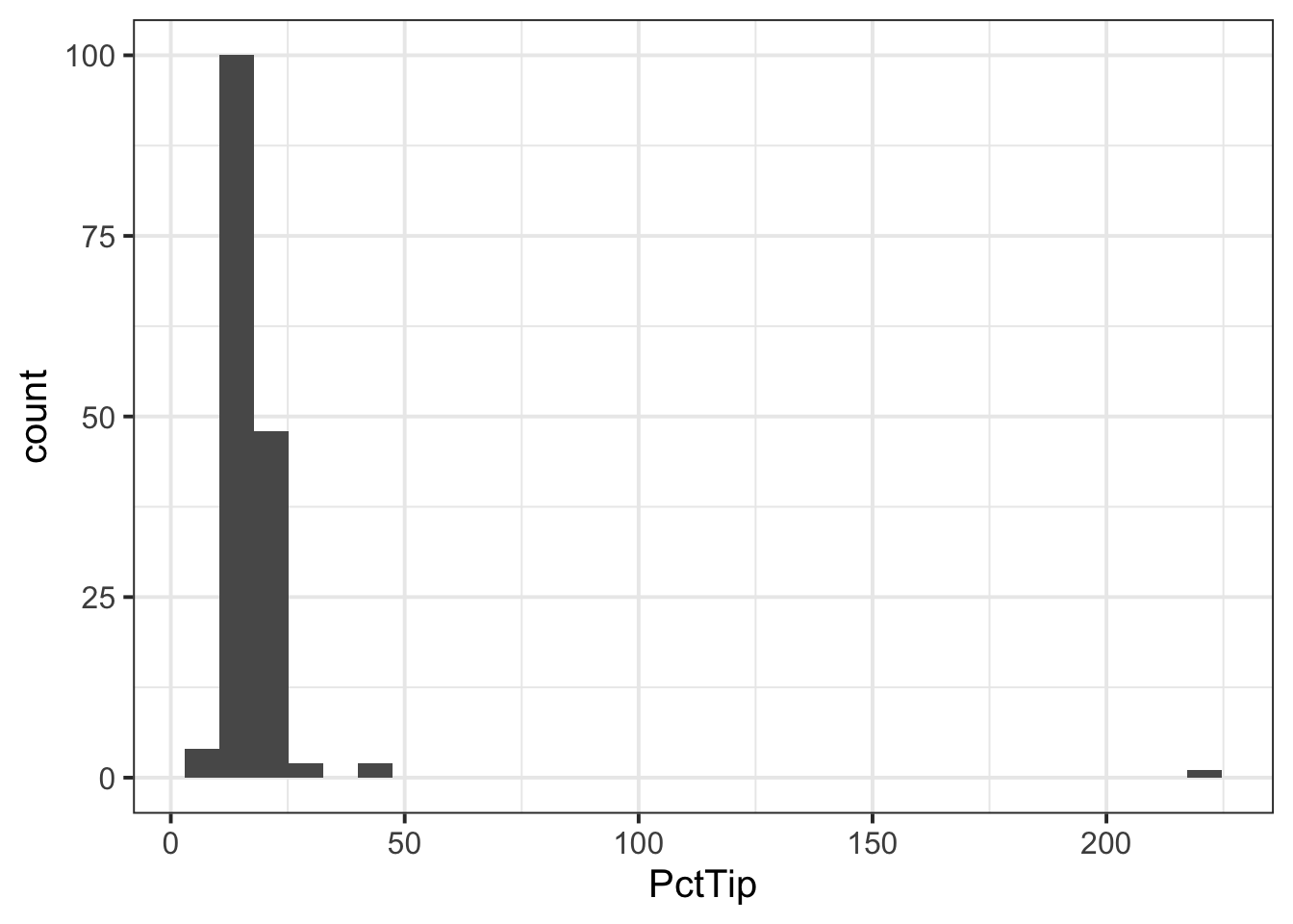
We can see one outlier (on the far right of the plot), where the percentage tip appears to be more than 2 x the total bill(!), so lets inspect that outlier:
tips |>
    filter(PctTip > 100)
# A tibble: 1 × 7
Bill Tip Credit Guests Day Server PctTip
<dbl> <dbl> <chr> <dbl> <chr> <chr> <dbl>
1 49.6 NA y 4 th C 221We can see that the ‘Tip’ column has an NA value, so perhaps the ‘PctTip’ value of 221 was a data input error? If so, we want to remove the outlier:
tips <- tips |>
filter(PctTip <= 100)- Since we are interested in looking at the percentage tips across weekdays, we may want to give our ‘Day’ variable better labels for levels:
- If we were asked to visualise the shape of the distribution of the ‘PctTip’ variable, we could use either a histogram, a density plot, or a boxplot:
ggplot(tips, aes(x = PctTip)) +
    geom_histogram(colour = 'white')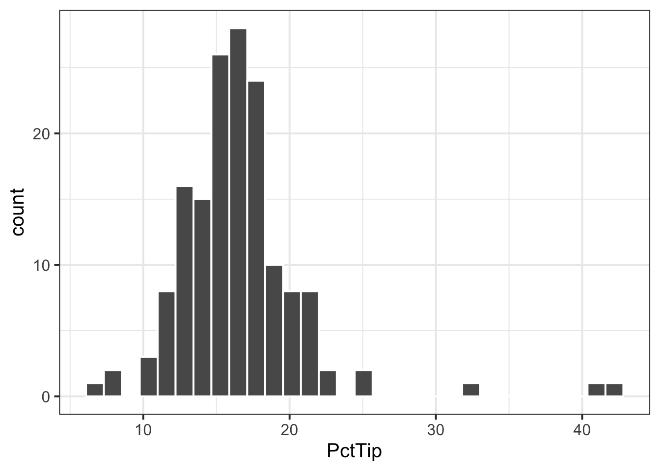
ggplot(tips, aes(x = PctTip)) +
    geom_density()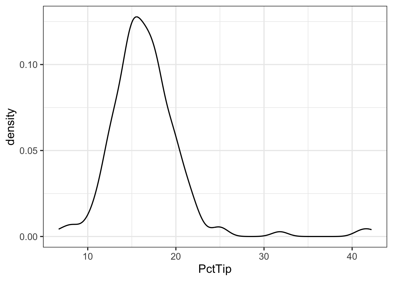
ggplot(tips, aes(x = PctTip)) +
    geom_boxplot()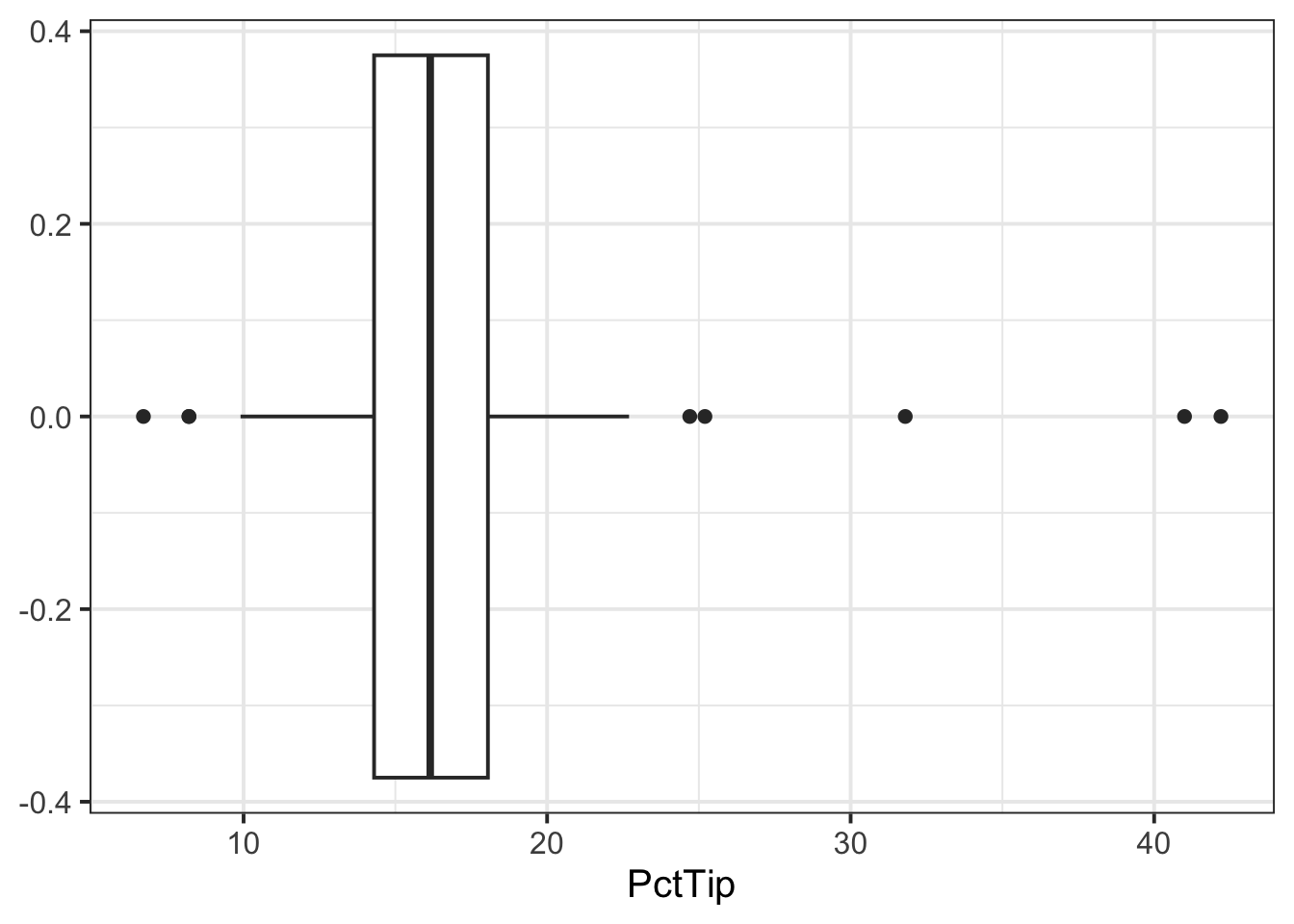
The distribution of percentage tip is not exactly normal as it shows a slight skew to the right. This suggests that there were more individuals tipping well above the mean than below (i.e., more extremely high tips)
- Now that we have visualised our distribution, it would be useful to estimate the centre and spread of our data. In other words, calculate the sample mean and standard error of the mean.
We can calculate our sample statistics as follows:
n_tips <- nrow(tips)
n_tips
[1] 156xbar_tips <- mean(tips$PctTip)
xbar_tips[1] 16.59103[1] 0.3511618- We can then check how our sample statistics vary across each day of the week:
| Day | n | M | SE |
|---|---|---|---|
| Mon | 20 | 15.94 | 0.72 |
| Tue | 13 | 18.02 | 2.11 |
| Wed | 62 | 16.55 | 0.44 |
| Thu | 35 | 16.75 | 0.57 |
| Fri | 26 | 16.26 | 1.21 |
-
If we were asked to interpret the sample statistics for each day, we could summarise as below:
- Interpreting \(\bar{x}\) / \(\hat{\mu}\)
- Of the days of the week, Tuesday was when the highest average percentage tips were received, and Monday the lowest.
- Apart from Tuesday (when the average percentage tip is likely to be above average), the other days of the week are very close to 16%.
- Interpreting \(SE\)
- The percentage of tips varied most on Tuesdays on Fridays, where tips could either be very generous or measly.
- Interpreting \(\bar{x}\) / \(\hat{\mu}\)
- Next we want to visualise the association between days and percentage tip. We can do this using
ggplot()and the tibble we created above (tbl_tips):
plt_tips <- ggplot(tbl_tips) +
    geom_pointrange(aes(x = Day, y = M,
                        ymin = M - 2 * SE,
                        ymax = M + 2 * SE)) +
    ylim(0,50)
plt_tips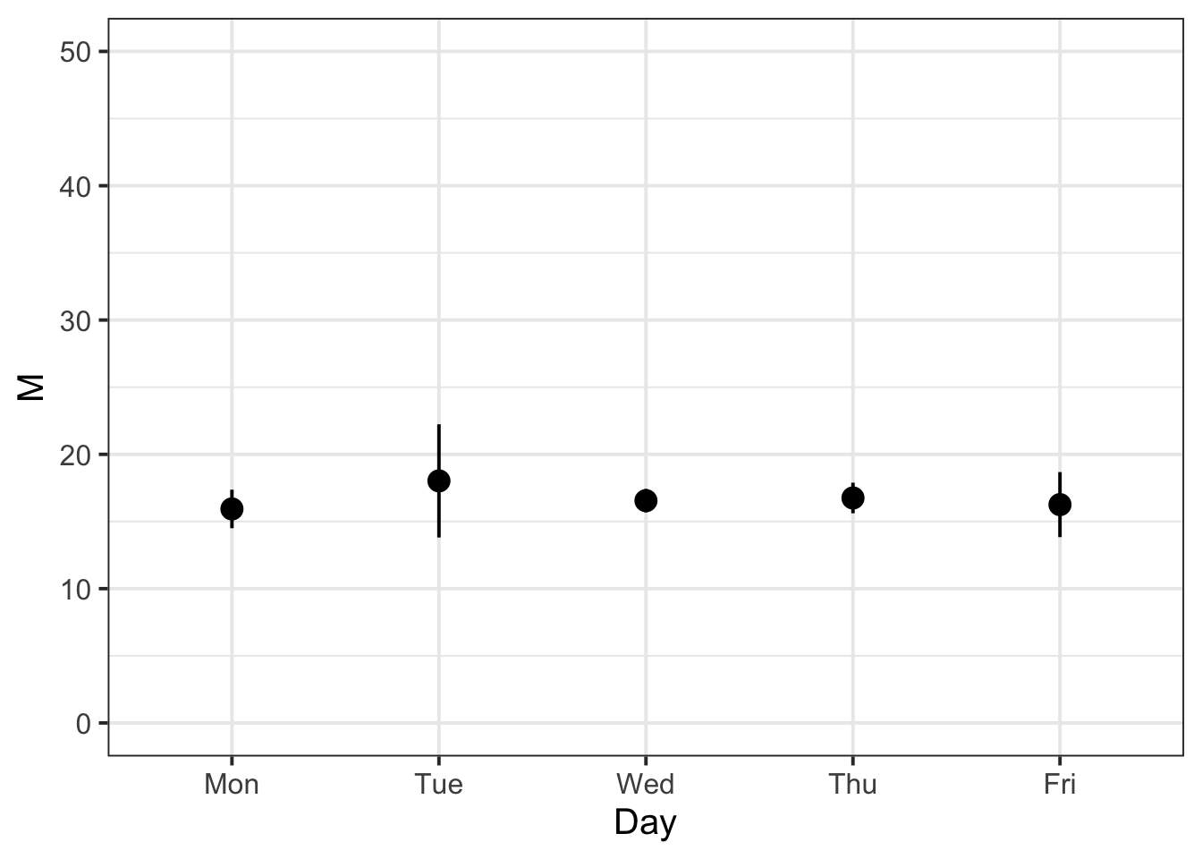
- We know that the variability of the mean Percentage Tip across each day of the week should be less than or equal to the variability of the sample data. We can check that this is the case with the following:
tips |>
    group_by(Day) |>
    summarise(n = n(),
              M = mean(PctTip),
              SD = sd(PctTip),
              SE = SD / sqrt(n)) |>
    mutate(IsSESmaller = SE < SD)
# A tibble: 5 × 6
Day n M SD SE IsSESmaller
<fct> <int> <dbl> <dbl> <dbl> <lgl>
1 Mon 20 15.9 3.20 0.716 TRUE
2 Tue 13 18.0 7.60 2.11 TRUE
3 Wed 62 16.6 3.43 0.436 TRUE
4 Thu 35 16.8 3.37 0.569 TRUE
5 Fri 26 16.3 6.17 1.21 TRUE For each entry in the ‘IsSESmaller’ column, we can see that it is true!
Example writeup
The bistro servers are correct - percentage tips do vary by day (see Table 1). These differences are displayed in Figure 1, showing that Tuesdays are when servers received the highest average percentage tips (18.02%), and Mondays were the lowest (15.94%). The other days of the week had average percentage tips roughly close to 16%. In terms of variability, Tuesday also had the highest variability of average percentage tips (SE = 2.11), followed by Friday (SE = 1.21). This indicates that, while customers tend to tip higher than other days on average, there is also more variability - meaning that there may be very generous or measly tips.
References
Lock, Robin H, Patti Frazer Lock, Kari Lock Morgan, Eric F Lock, and Dennis F Lock. 2020. Statistics: Unlocking the Power of Data. John Wiley & Sons.
Footnotes
Hint: access the Rmd file from the Group Discussion Space.
If last week’s driver hasn’t uploaded it yet, please ask them to share it with the group via the Group Discussion Space, email, or Teams.
To download the file from the server, go to the RStudio Files pane, tick the box next to the Rmd file, and select More > Export.↩︎