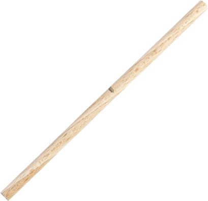
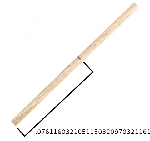
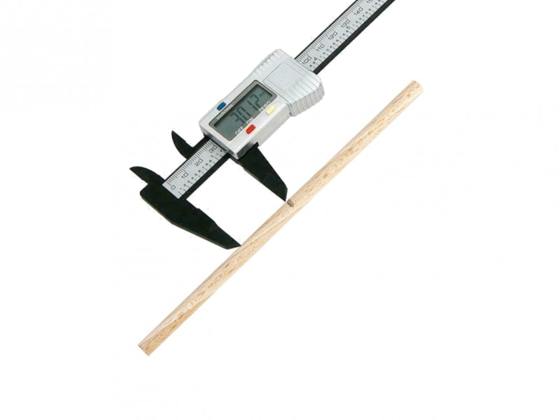
class: center, middle, inverse, title-slide # <b>Week 2: Measurement and Distributions</b> ## Univariate Statistics and Methodology using R ### Martin Corley ### Department of Psychology<br/>The University of Edinburgh --- class: inverse, center, middle # Part 1 .center[  ] --- # Notch on a stick .flex.items-center[ .w-50.pa2[  ] .w-50.pa2[  ]] --- count: false class: middle .br3.center.pa2.pt2.bg-gray.white.f3[ It is a truth universally acknowledged, that a single man in possession of a good fortune, must be in want of a wife. ] --- # Problem is... .pull-left[ - we don't have any way of measuring accurately enough - our measurements are likely to be _close to_ the truth - they might vary, if we measure more than once ] .pull-right[  ] --- # Measurement .pull-left[  ] .pull-right[ - we might _expect_ values close to the "true" measurement to be more frequent - something like this: .center[ <!-- --> ]] ??? - so let's do a thought experiment and imagine what things would look like if lots and lots of people tried to measure the "true" distance of the notch from the end of the stick. - most of them would be quite competent, and we would expect the majority of the measurements to be close to the "true" value. - every now and again, someone would overshoot or undershoot by rather more. - _theoretically_ they might be completely off-beam, although the chances of being way off get vanishingly small quite quickly. --- # Something quite familiar .center[ <!-- --> ] ??? - if we think a bit more about our thought experiment, we've actually described something quite familiar: A bell curve - but what is a "bell curve"? - to answer that question, let's start back where we were last week, with dice. --- # Dice again .center[ <!-- --> ] ??? - the height of the bars represent the numbers of times we obtain each value - but why are the bars not touching each other? --- # Dice throws aren't really numbers .pull-left[ - **A** =  - **B** =  or  - **C** =  or  or  ] .pull-right[ .center[ <!-- --> ]] .pt3[ - bar plot ("bar chart") always has gaps between bars - represents frequencies of _discrete categories_ (`factors`) ] ??? - I could just label the possible outcomes of throwing two dice arbitrarily - if you think about it, there are only 11 possible values that the sum of two dice can take. - and if the dice didn't have actual numbers on their faces, you could still enumerate the outcomes - so the outcomes are _discrete_ (you can never throw a value between 3 and 4, or between "B and C") - and the bars on a bar plot have gaps between them to show this. --- # Back to the Stick - let's look at our stick measurement again .flex.items-center[.w-30.pa2[ <img src="lecture_2_files/img/stick_numnum.png" width="587" /> ] .w-10[ ] .w-30.pa2[ <!-- --> ] .w-30.pa2[ - "true measurement" on graph _must_ be approximate ] ] ??? - the line we used to indicate the "true measure" isn't fully accurate - we would have to draw an infinitely thin line with infinite precision --- # Zooming In... .pull-left[ <!-- --> ] .pull-right[ - we are using the _width_ of the line to show measurement precision - here, we know the value is between 0.0761 and 0.0762 + but we can't be any more precise ] --- # Histograms .pull-left[ - this principle allows us to draw a _histogram_ of all the measurements taken - the bars are touching because this represents _continuous_ data ] .pull-right[ <!-- --> ] --- count: false # Histograms .pull-left[ - this principle allows us to draw a _histogram_ of all the measurements taken - the bars are touching because this represents _continuous_ data - we know that there were 12 measurements around 0.076 + strictly, between 0.0755 and 0.0765 ] .pull-right[ <!-- --> ] --- # Histograms (2) .pull-left[ - note that the _bin width_ of the histogram matters - these show same data as on the previous slide ] .pull-right[ <!-- --> ] --- count: false # Histograms (2) .pull-left[ - note that the _bin width_ of the histogram matters - these show same data as on the previous slide ] .pull-right[ <!-- --> ] --- # Histograms in R .pull-left[ ```r head(notches) # some measurements ``` ``` ## [1] 0.07432 0.07612 0.07955 0.07861 0.07653 0.07422 ``` ```r hist(notches) ``` ] .pull-right[ <!-- --> ] .flex.items-center[ .w-5.pa1[  ] .w-95.pa1[ - you can make prettier graphs using `ggplot()` - `hist()` and friends are useful for exploring data ]] --- class: inverse, center, middle, animated, swing # End of Part 1 --- class: inverse, center, middle # Part 2 ## The Normal Distribution --- # Histograms .flex.items-top[ .w-50.br3.pa2.bg-light-green[ ### The Good - way to examine the _distribution_ of data - easy to interpret ( `\(y\)` axis = counts ) - sometimes helpful in spotting weird data ] .w-50.br3.pa2.bg-light-red[ ### The Bad - changing bin width can completely change graph + can lack precision if bins too wide + can appear sparse if bins too narrow ]] --- # Density Plots .center[  ] - can "squeeze" the bars until they're "infinitely thin" --- # Density Plots .center[ <!-- --> ] --- count: false # Density Plots .center[ <!-- --> ] - values are _interpolated_ - depends on a kernel (smoothing) function --- # Density Plots .center[ <!-- --> ] - note that `\(y\)` axis is no longer a count - multiplied by a _range_ on the `\(x\)` axis, gives **proportion** of cases (0.1714 ) - _total area_ under curve = "all possibilities" = **1** ??? - note that this isn't the whole curve, because the curve is **asymptotic** + tiny possibility that someone will say the distance is -1000 or 873 --- # A Famous Density Plot .pull-left[ - when we started thinking about measurement, we thought things might look a bit like this - the so-called **normal curve** + a hypothetical density plot ] .pull-right[ <!-- --> ] ??? - in part 3, we'll look at where the normal curve comes from - for now, let's look at some of its features --- # Normal Curves .center[ <!-- --> ] - normal curves are centred about the **mean** (or "true measurement") - the area under the (asymptotic) curve is always **1** ??? - the y value here is just what is needed to ensure that the area under the is 1 --- # Standard Deviation .pull-left[ - normal curves can be defined in terms of _two parameters_ - one is the centre or **mean** of the distribution ( `\(\bar{x}\)`, or sometimes `\(\mu\)` ) - the other is the **standard deviation** ( `\(\textrm{sd}\)`, or sometimes `\(\sigma\)` ) `$$\textrm{sd}=\sqrt{\frac{\sum{(x-\bar{x})^2}}{n-1}}$$` ] .pull-right[ <!-- --> ] .pt3.pa2[ - standard deviation is the "average distance of observations from the mean" ] --- # The Standard Normal Curve .pull-left[ - we can **standardize** any value on any normal curve by - subtracting the mean + the effective mean is now **zero** - dividing by the standard deviation + the effective standard deviation is now **one** ] .pull-right[ <!-- --> $$ z_i = \frac{x_i - \bar{x}}{\sigma} $$ ] --- # The Standard Normal Curve .pull-left[ - the normal curve is a _density plot_ - the area between 1 standard deviation below the mean and 1 standard deviation above the mean is _always_ 0.6827 ] .pull-right[ <!-- --> ] --- count: false # The Standard Normal Curve .pull-left[ - the normal curve is a _density plot_ - the area between 1 standard deviation below the mean and 1 standard deviation above the mean is _always_ 0.6827 - we can ask the question the other way around: _an area of .95_ lies between -1.96 and 1.96 standard deviations from the mean + "95% of the predicted observations" (the 95% confidence interval) ] .pull-right[ <!-- --> ] --- class: inverse, center, middle, animated, swing # End of Part 2 --- class: inverse, center, middle # Part 3 ## Sampling from a Population --- background-image: url("lecture_2_files/img/playmo_pop.jpg") ??? We want to say something about the population, rather than about one stick. For example -- what's their average height? (We know this, it's on the packet, 7.5cm, but in the real world people differ...) Let's go into RStudio and do a little simulation. --- class: inverse, center, middle, animated, swing # End of Part Three --- class: inverse, center, middle # Part 4 # Towards Statistical Testing --- # Central Limit Theorem - what we have just see is a demonstration of **Central Limit Theorem** - lay version: _sample means will be normally distributed about the true mean_ .br3.center.pa2.pt2.bg-gray.white.f3[ the standard deviation ("width") of the distribution of sample means is referred to as the **standard error** of the distribution ] --- # Central Limit Theorem (2) - if you look up CLT on Wikipedia you'll see it's defined in terms of _adding two numbers_ + the sample mean is a sum of _many_ numbers, divided by `\(n\)` + adding many numbers is like adding two numbers: .pt0[ `\(1 + 3 + 2 + 5 = (1 + 3 + 2) + 5 = 6 + 5\)` ] + dividing by something doesn't make any difference --- # `\(n-1\)` - we've just shown how adding many numbers is equivalent to adding two numbers - so _if we know the sum_ of a bunch of numbers, `\(n-1\)` of those numbers can be anything .center[ <style>html { font-family: -apple-system, BlinkMacSystemFont, 'Segoe UI', Roboto, Oxygen, Ubuntu, Cantarell, 'Helvetica Neue', 'Fira Sans', 'Droid Sans', Arial, sans-serif; } #gohfmndpic .gt_table { display: table; border-collapse: collapse; margin-left: auto; margin-right: auto; color: #333333; font-size: 16px; font-weight: normal; font-style: normal; background-color: #FFFFFF; width: auto; border-top-style: solid; border-top-width: 2px; border-top-color: #A8A8A8; border-right-style: none; border-right-width: 2px; border-right-color: #D3D3D3; border-bottom-style: solid; border-bottom-width: 2px; border-bottom-color: #A8A8A8; border-left-style: none; border-left-width: 2px; border-left-color: #D3D3D3; } #gohfmndpic .gt_heading { background-color: #FFFFFF; text-align: center; border-bottom-color: #FFFFFF; border-left-style: none; border-left-width: 1px; border-left-color: #D3D3D3; border-right-style: none; border-right-width: 1px; border-right-color: #D3D3D3; } #gohfmndpic .gt_title { color: #333333; font-size: 125%; font-weight: initial; padding-top: 4px; padding-bottom: 4px; border-bottom-color: #FFFFFF; border-bottom-width: 0; } #gohfmndpic .gt_subtitle { color: #333333; font-size: 85%; font-weight: initial; padding-top: 0; padding-bottom: 4px; border-top-color: #FFFFFF; border-top-width: 0; } #gohfmndpic .gt_bottom_border { border-bottom-style: solid; border-bottom-width: 2px; border-bottom-color: #D3D3D3; } #gohfmndpic .gt_col_headings { border-top-style: solid; border-top-width: 2px; border-top-color: #D3D3D3; border-bottom-style: solid; border-bottom-width: 2px; border-bottom-color: #D3D3D3; border-left-style: none; border-left-width: 1px; border-left-color: #D3D3D3; border-right-style: none; border-right-width: 1px; border-right-color: #D3D3D3; } #gohfmndpic .gt_col_heading { color: #333333; background-color: #FFFFFF; font-size: 100%; font-weight: normal; text-transform: inherit; border-left-style: none; border-left-width: 1px; border-left-color: #D3D3D3; border-right-style: none; border-right-width: 1px; border-right-color: #D3D3D3; vertical-align: bottom; padding-top: 5px; padding-bottom: 6px; padding-left: 5px; padding-right: 5px; overflow-x: hidden; } #gohfmndpic .gt_column_spanner_outer { color: #333333; background-color: #FFFFFF; font-size: 100%; font-weight: normal; text-transform: inherit; padding-top: 0; padding-bottom: 0; padding-left: 4px; padding-right: 4px; } #gohfmndpic .gt_column_spanner_outer:first-child { padding-left: 0; } #gohfmndpic .gt_column_spanner_outer:last-child { padding-right: 0; } #gohfmndpic .gt_column_spanner { border-bottom-style: solid; border-bottom-width: 2px; border-bottom-color: #D3D3D3; vertical-align: bottom; padding-top: 5px; padding-bottom: 6px; overflow-x: hidden; display: inline-block; width: 100%; } #gohfmndpic .gt_group_heading { padding: 8px; color: #333333; background-color: #FFFFFF; font-size: 100%; font-weight: initial; text-transform: inherit; border-top-style: solid; border-top-width: 2px; border-top-color: #D3D3D3; border-bottom-style: solid; border-bottom-width: 2px; border-bottom-color: #D3D3D3; border-left-style: none; border-left-width: 1px; border-left-color: #D3D3D3; border-right-style: none; border-right-width: 1px; border-right-color: #D3D3D3; vertical-align: middle; } #gohfmndpic .gt_empty_group_heading { padding: 0.5px; color: #333333; background-color: #FFFFFF; font-size: 100%; font-weight: initial; border-top-style: solid; border-top-width: 2px; border-top-color: #D3D3D3; border-bottom-style: solid; border-bottom-width: 2px; border-bottom-color: #D3D3D3; vertical-align: middle; } #gohfmndpic .gt_from_md > :first-child { margin-top: 0; } #gohfmndpic .gt_from_md > :last-child { margin-bottom: 0; } #gohfmndpic .gt_row { padding-top: 8px; padding-bottom: 8px; padding-left: 5px; padding-right: 5px; margin: 10px; border-top-style: solid; border-top-width: 1px; border-top-color: #D3D3D3; border-left-style: none; border-left-width: 1px; border-left-color: #D3D3D3; border-right-style: none; border-right-width: 1px; border-right-color: #D3D3D3; vertical-align: middle; overflow-x: hidden; } #gohfmndpic .gt_stub { color: #333333; background-color: #FFFFFF; font-size: 100%; font-weight: initial; text-transform: inherit; border-right-style: solid; border-right-width: 2px; border-right-color: #D3D3D3; padding-left: 12px; } #gohfmndpic .gt_summary_row { color: #333333; background-color: #FFFFFF; text-transform: inherit; padding-top: 8px; padding-bottom: 8px; padding-left: 5px; padding-right: 5px; } #gohfmndpic .gt_first_summary_row { padding-top: 8px; padding-bottom: 8px; padding-left: 5px; padding-right: 5px; border-top-style: solid; border-top-width: 2px; border-top-color: #D3D3D3; } #gohfmndpic .gt_grand_summary_row { color: #333333; background-color: #FFFFFF; text-transform: inherit; padding-top: 8px; padding-bottom: 8px; padding-left: 5px; padding-right: 5px; } #gohfmndpic .gt_first_grand_summary_row { padding-top: 8px; padding-bottom: 8px; padding-left: 5px; padding-right: 5px; border-top-style: double; border-top-width: 6px; border-top-color: #D3D3D3; } #gohfmndpic .gt_striped { background-color: rgba(128, 128, 128, 0.05); } #gohfmndpic .gt_table_body { border-top-style: solid; border-top-width: 2px; border-top-color: #D3D3D3; border-bottom-style: solid; border-bottom-width: 2px; border-bottom-color: #D3D3D3; } #gohfmndpic .gt_footnotes { color: #333333; background-color: #FFFFFF; border-bottom-style: none; border-bottom-width: 2px; border-bottom-color: #D3D3D3; border-left-style: none; border-left-width: 2px; border-left-color: #D3D3D3; border-right-style: none; border-right-width: 2px; border-right-color: #D3D3D3; } #gohfmndpic .gt_footnote { margin: 0px; font-size: 90%; padding: 4px; } #gohfmndpic .gt_sourcenotes { color: #333333; background-color: #FFFFFF; border-bottom-style: none; border-bottom-width: 2px; border-bottom-color: #D3D3D3; border-left-style: none; border-left-width: 2px; border-left-color: #D3D3D3; border-right-style: none; border-right-width: 2px; border-right-color: #D3D3D3; } #gohfmndpic .gt_sourcenote { font-size: 90%; padding: 4px; } #gohfmndpic .gt_left { text-align: left; } #gohfmndpic .gt_center { text-align: center; } #gohfmndpic .gt_right { text-align: right; font-variant-numeric: tabular-nums; } #gohfmndpic .gt_font_normal { font-weight: normal; } #gohfmndpic .gt_font_bold { font-weight: bold; } #gohfmndpic .gt_font_italic { font-style: italic; } #gohfmndpic .gt_super { font-size: 65%; } #gohfmndpic .gt_footnote_marks { font-style: italic; font-size: 65%; } </style> <div id="gohfmndpic" style="overflow-x:auto;overflow-y:auto;width:auto;height:auto;"><table class="gt_table"> <thead class="gt_col_headings"> <tr> <th class="gt_col_heading gt_columns_bottom_border gt_right" rowspan="1" colspan="1">sum of n-1 numbers</th> <th class="gt_col_heading gt_columns_bottom_border gt_right" rowspan="1" colspan="1">nth number</th> <th class="gt_col_heading gt_columns_bottom_border gt_right" rowspan="1" colspan="1">sum</th> </tr> </thead> <tbody class="gt_table_body"> <tr> <td class="gt_row gt_right">90</td> <td class="gt_row gt_right">10</td> <td class="gt_row gt_right">100</td> </tr> <tr> <td class="gt_row gt_right">102</td> <td class="gt_row gt_right">-2</td> <td class="gt_row gt_right">100</td> </tr> <tr> <td class="gt_row gt_right">67</td> <td class="gt_row gt_right">33</td> <td class="gt_row gt_right">100</td> </tr> </tbody> </table></div> ] - so if we know a summary statistic (e.g., mean, sd) we know about the data with `\(n-1\)` **degrees of freedom** --- # Statistical Estimates - so far, we've talked about sampling repeatedly from a population - this might not be possible(!) - if we only have one sample we can make _estimates_ of the mean and standard error + the estimated _mean_ is the sample mean (we have no other info) + the estimated _standard error_ of the mean is defined in terms of the sample standard deviation $$ \textrm{se} = \frac{\sigma}{\sqrt{n}} = \frac{\sqrt{\frac{\sum{(x-\bar{x})^2}}{n-1}}}{\sqrt{n}} $$ --- # Putting it Together - the _normal curve_ is a density plot with known properties + it can be defined in terms of two parameters, mean, and standard deviation - if we repeatedly sample from a population and measure the mean of a population, we'll get a normal distribution + the mean will be (close to) the population mean - if we sample once from a population which is approximately normal + our estimated mean and sd for the population are the sample mean and sd + the _standard error_, or standard deviation of the sample means can be estimated as `\(\sigma/\sqrt{n}\)` --- # Can We Use This For Real? - we have some survey data from the USMR class, including _height_ in cm - perhaps we're interested in the "average height of a young statistician" (!) + "young statisticians" are a **population** + the USMR class of 2020 is a **sample** .pt2[ ] .br3.center.pa2.pt2.bg-gray.white.f3[ can we use the information from the sample of 41 responses we have to say anything about the population? ] --- # Looking at the class data .pull-left[ ```r # the class heights in cm are in hData hist(hData, xlab="height in cm") ``` ] .pull-right[ <!-- --> ] .flex.items-center[ .w-5.pa1[  ] .w-95.pa1[ - data taken directly from the class survey responses - uses the `googlesheets4` library ]] --- # Mean, Standard Deviation .pull-left[ - information about the distribution of the sample ```r mean(hData) ``` ``` ## [1] 167.9 ``` ```r sd(hData) ``` ``` ## [1] 9.264 ``` ] .pull-right[ <!-- --> ] --- # Standard Error .pull-left[ - **standard error** is the "standard deviation of the mean" - as we saw in the simulation - can be _estimated_ as `\(\frac{\sigma}{\sqrt{n}}\)` ```r n <- length(hData) # standard error sd(hData) / sqrt(n) ``` ``` ## [1] 1.447 ``` ] .pull-right[ <!-- --> ] --- # Statistically Useful Information .flex.items-center[.w-50.pa2[ <!-- --> - we know that the area between `\(\bar{x}-1.96\sigma\)` and `\(\bar{x}+1.96\sigma\)` is 0.95 ] .w-50.pa2[ .br3.center.pa2.pt2.bg-gray.white.f3[ if we measure the mean height of 41 people from the same population as the USMR class, we estimate that the answer we obtain will lie between 165.1cm and 170.8cm 95% of the time ] ]] --- # The Aim of the Game - as statisticians, a major goal is to infer from **samples** to **populations** - more about how we do this next time --- class: inverse, center, middle, animated, swing # End --- # Acknowledgements - icons by Diego Lavecchia from the [Noun Project](https://thenounproject.com/)