class: center, middle, inverse, title-slide # <b>Week 4: Describing Relationships </b> ## Data Analysis for Psychology in R 1<br><br> ### ALEX DOUMAS & TOM BOOTH ### Department of Psychology<br>The University of Edinburgh --- # Weeks Learning Objectives 1. Understand the relation between X-Y (explanatory/outcome) specification and practical research questions. 2. Understand how to summarise and visualize categorical-categorical relationships. 3. Understand how to summarise and visualize numeric-categorical relationships. 4. Understand how to summarise and visualize numeric-numeric relationships. --- # Topics for today + We have looked at how to describe individual variables. + Recall: A variable is a symbol specifying a value that may change or that we don't know yet. + But we also need to describe the relationships between variables. + These relationships are also the core of the statistical models we are going to move on to discuss. + Today we will look at basic descriptions. --- # What is a relationship? + A connection between two or more entities. -- + In science, a connection between two things (or a relation between two things) is defined as a mapping between the elements of those two things. <img src="./figures/Mapping_example_DAPR1_lect4.png" width="75%" /> -- + Aside: We will usually prefer to define the relationship using a function (we'll go over what those are next lecture...) --- # Why are relationships important? + We typically have theories about relationships or predictions between variables. + Our study designs distinguish between: -- + **Dependent variables**: The thing we want to predict/understand. + Also referred to as the outcome. + or as `\(y\)` in stats notation -- + **Independent variables**: The things we hypothesize influence the DV. + Also referred to as the predictor, explanatory variable. + or as `\(x\)` in stats notation -- + **Covariates**: Things that will influence the outcome, but we may not have a hypothesis about. + Also called nuisance variables. + We typically try and control nuisance variables either statistically or by design, so as to minimize their effect. + These are also `\(x\)`'s --- # Why are relationships important? + So our questions are built on relationships. + Before we statistically try to model these, it is important to describe them + Note: A model is a representation of a system in formal language. + In a model we try to represent the important aspects of a system and ignore anything extraneous. + Today we will look at how to describe and summarise relationships. --- # Our data .pull-left[ + Recall our data: + `ID` = unique identifier + `Degree` = degree studied + `Year` = year of study + `Score1` = pre-summer school score + `Score2` = post-summer school score ] .pull-right[ <table> <thead> <tr> <th style="text-align:left;"> ID </th> <th style="text-align:left;"> Degree </th> <th style="text-align:right;"> Year </th> <th style="text-align:right;"> Score1 </th> <th style="text-align:right;"> Score2 </th> </tr> </thead> <tbody> <tr> <td style="text-align:left;"> ID101 </td> <td style="text-align:left;"> Psych </td> <td style="text-align:right;"> 2 </td> <td style="text-align:right;"> 71 </td> <td style="text-align:right;"> 74 </td> </tr> <tr> <td style="text-align:left;"> ID102 </td> <td style="text-align:left;"> Ling </td> <td style="text-align:right;"> 2 </td> <td style="text-align:right;"> 65 </td> <td style="text-align:right;"> 72 </td> </tr> <tr> <td style="text-align:left;"> ID103 </td> <td style="text-align:left;"> Ling </td> <td style="text-align:right;"> 2 </td> <td style="text-align:right;"> 64 </td> <td style="text-align:right;"> 72 </td> </tr> <tr> <td style="text-align:left;"> ID104 </td> <td style="text-align:left;"> Phil </td> <td style="text-align:right;"> 1 </td> <td style="text-align:right;"> 69 </td> <td style="text-align:right;"> 74 </td> </tr> <tr> <td style="text-align:left;"> ID105 </td> <td style="text-align:left;"> Ling </td> <td style="text-align:right;"> 3 </td> <td style="text-align:right;"> 62 </td> <td style="text-align:right;"> 69 </td> </tr> <tr> <td style="text-align:left;"> ID106 </td> <td style="text-align:left;"> Ling </td> <td style="text-align:right;"> 1 </td> <td style="text-align:right;"> 68 </td> <td style="text-align:right;"> 72 </td> </tr> <tr> <td style="text-align:left;"> ID107 </td> <td style="text-align:left;"> Phil </td> <td style="text-align:right;"> 3 </td> <td style="text-align:right;"> 66 </td> <td style="text-align:right;"> 75 </td> </tr> <tr> <td style="text-align:left;"> ID108 </td> <td style="text-align:left;"> Psych </td> <td style="text-align:right;"> 1 </td> <td style="text-align:right;"> 64 </td> <td style="text-align:right;"> 71 </td> </tr> <tr> <td style="text-align:left;"> ID109 </td> <td style="text-align:left;"> Psych </td> <td style="text-align:right;"> 3 </td> <td style="text-align:right;"> 65 </td> <td style="text-align:right;"> 73 </td> </tr> <tr> <td style="text-align:left;"> ID110 </td> <td style="text-align:left;"> Ling </td> <td style="text-align:right;"> 1 </td> <td style="text-align:right;"> 64 </td> <td style="text-align:right;"> 72 </td> </tr> </tbody> </table> ] --- # Categorical-Categorical + Let's look at the association between `Degree` and `Year`. + When describing a single categorical variable, we used a frequency table. + The equivalent for two categorical variables is called a **contingency table** + It shows the frequency of one level within levels of the other. + In our example, the number of students from each `Degree` in each `Year` + We can then visualize this table as a **mosaic plot** --- # Contingency Tables .pull-left[ ```r ex1 %>% * select(.,Degree, Year) %>% * table() ``` + `ex1` is our data set + `select` is used to pick variables from the data set + `.` is used to indicate that the select function should use the data set passed by the `%>%` + `Degree` and `Year` are names of variables in our data set + `table()` produces the frequency table + when two variables are given, it produces a contingency table ] .pull-right[ ``` ## Year ## Degree 1 2 3 4 ## Psych 7 17 7 1 ## Ling 17 42 17 6 ## Phil 6 10 9 1 ## Joint 3 2 3 2 ``` ] --- # Mosaic Plot .pull-left[ ```r ex1 %>% ggplot(.)+ * geom_mosaic(aes(x = product(Degree, Year), fill=Degree)) + labs(x = "\n Year") ``` + `geom_mosaic` is a add-on geom from the `ggmosaic()` library + It makes mosaic plots + `product()` is used to indicate which variables to use. ] .pull-right[ <!-- --> ] --- # Categorical-Continuous + When describing continuous-categorical pairs, we typically look at grouped statistics. -- + Specifically,... -- + the mean, + standard deviation, and + distribution shape -- + ...of the continuous variable at each level of the categorical variable. -- + In our example, what is the mean pre-test score for students from each degree. --- # Grouped summary statistics .pull-left[ ```r ex1 %>% * group_by(Degree) %>% summarise( Average = round(mean(Score1),2), SD = round(sd(Score1),2) ) ``` + Key code here is `group_by` + `group_by` splits the data by the categorical variable stated + It then does the next instructions for each level. ] .pull-right[ ``` ## # A tibble: 4 × 3 ## Degree Average SD ## <fct> <dbl> <dbl> ## 1 Psych 66.4 3.16 ## 2 Ling 65.8 2.58 ## 3 Phil 65.5 3.05 ## 4 Joint 66.4 2.27 ``` ] --- # Grouped histograms .pull-left[ ```r ex1 %>% ggplot(., aes(x=Score1)) + geom_histogram(bins = 15, color = "white", fill = "steelblue4") + * facet_wrap(~Degree) ``` + The top section of code is identical to last week + `facet_wrap` is used to produce a plot per value of the variable given. + Notice how different these plots look. + But the mean and SD in each group are quite similar. + **What differs across the groups?** ] .pull-right[ <!-- --> ] ??? The shape of the distributions are different. There is positive skew in the psychology students; bimodality in the linguistics students. --- # Continuous-Continuous + When describing two continuous variables (`Score1` and `Score2`), we can not compute summary stats of one at each level of the other. + Far too many values! + So we want a way to visually and numerically summarise the degree of relatedness. -- + **Scatterplots** + lot points at the (x,y) co-ordinates for two measured variables. + We plot these points for each individual in our data set. + This produces the clouds of points. --- # Scatterplot of scores .pull-left[ ```r ex1 %>% * ggplot(., aes(x=Score1, y=Score2)) + * geom_point(colour = "steelblue4") + labs(x = "\n Pre Test Score", y = "Post Test Score \n") ``` ] .pull-right[ <!-- --> ] --- # Understanding a scatterplot .pull-left[ ```r ex1 %>% slice(1) %>% select(., Score1, Score2) ``` ``` ## # A tibble: 1 × 2 ## Score1 Score2 ## <dbl> <dbl> ## 1 71 74 ``` ] .pull-right[ <!-- --> ] --- # Understanding a scatterplot .pull-left[ + How do we read a scatterplot? + If the cloud of points goes: + bottom left to top right, there is a positive relationship + Top left to bottom right, there is a negative relationship + no pattern = no relationship + the closer the points are to a straight line, the closer the relationship ] .pull-right[ <img src="./figures/corplot.png" width="1179" /> ] --- # Covariance + **Covariance** + Numerical value representing the degree to which variables vary in the same way. + To understand covariance, it is useful to briefly recap the idea of variance. `$$Var_x = \frac{\sum_{i=1}^{n}{(x_i - \bar{x})}^2}{n-1}$$` + So variance = deviation around the mean of a single variable. --- # Variance to covariance + **Co**variance concerns variation in two variables. + To think about the equation for covariance, suppose we re-write variance as follows: `$$Cov_{xx} = \frac{\sum_{i=1}^{n}{(x_i - \bar{x})(x_i - \bar{x})}}{n-1}$$` + We can then think about covariance of `\(x\)` and `\(y\)` as... `$$Cov_{xy} = \frac{\sum_{i=1}^{n}{(x_i - \bar{x})(y_i - \bar{y})}}{n-1}$$` + So our covariance is identical to our variance, with the exception that our summed termed is the combined deviance from the respective means of both `\(x\)` and `\(y\)`. --- # Calculating Covariance + For our data: ```r cov(ex1$Score1, ex1$Score2) ``` ``` ## [1] 3.359732 ``` + Interpreting covariance can be tricky. + The scale is dependent on the scale of the original variables + What is we multiply `Score1` by 100? ```r cov((ex1$Score1*100), ex1$Score2) ``` ``` ## [1] 335.9732 ``` + Later in the course we will discuss correlation + A standardized covariance --- # Descriptive statistics can deceive <table class="table table-striped" style="width: auto !important; margin-left: auto; margin-right: auto;"> <thead> <tr> <th style="text-align:left;"> set </th> <th style="text-align:right;"> mean </th> <th style="text-align:right;"> sd </th> </tr> </thead> <tbody> <tr> <td style="text-align:left;"> x1 </td> <td style="text-align:right;"> 9.0 </td> <td style="text-align:right;"> 3.32 </td> </tr> <tr> <td style="text-align:left;"> x2 </td> <td style="text-align:right;"> 9.0 </td> <td style="text-align:right;"> 3.32 </td> </tr> <tr> <td style="text-align:left;"> x3 </td> <td style="text-align:right;"> 9.0 </td> <td style="text-align:right;"> 3.32 </td> </tr> <tr> <td style="text-align:left;"> x4 </td> <td style="text-align:right;"> 9.0 </td> <td style="text-align:right;"> 3.32 </td> </tr> <tr> <td style="text-align:left;"> y1 </td> <td style="text-align:right;"> 7.5 </td> <td style="text-align:right;"> 2.03 </td> </tr> <tr> <td style="text-align:left;"> y2 </td> <td style="text-align:right;"> 7.5 </td> <td style="text-align:right;"> 2.03 </td> </tr> <tr> <td style="text-align:left;"> y3 </td> <td style="text-align:right;"> 7.5 </td> <td style="text-align:right;"> 2.03 </td> </tr> <tr> <td style="text-align:left;"> y4 </td> <td style="text-align:right;"> 7.5 </td> <td style="text-align:right;"> 2.03 </td> </tr> </tbody> </table> --- # Always visualize data 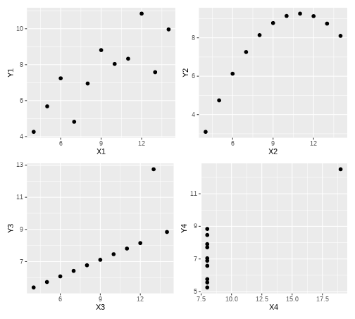<!-- --> --- # Summary of today + Categorical-categorical + Contingency tables + Mosaic plots + Categorical-continuous + Grouped summary stats + Grouped histograms + Continuous-Continuous + Scatterplots + Covariance --- # Next tasks + Next week, we will look at functions. + How we calculate, visualize and use them in statistics. + This week: + Complete your lab + Come to office hours + Weekly quiz - on weeks 2 and 3 content + Open Monday 09:00 + Closes Sunday 17:00